Clean overlays are a big part of modern YouTube channels. From lower thirds to live widgets, they help viewers focus, understand, and stay engaged. This guide walks through how to make YouTube overlays in After Effects, focusing on practical, reusable workflows that fit real-world editing pipelines.Browse overlay templates
📋 Table of Contents
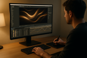
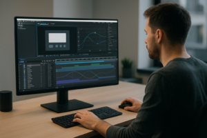
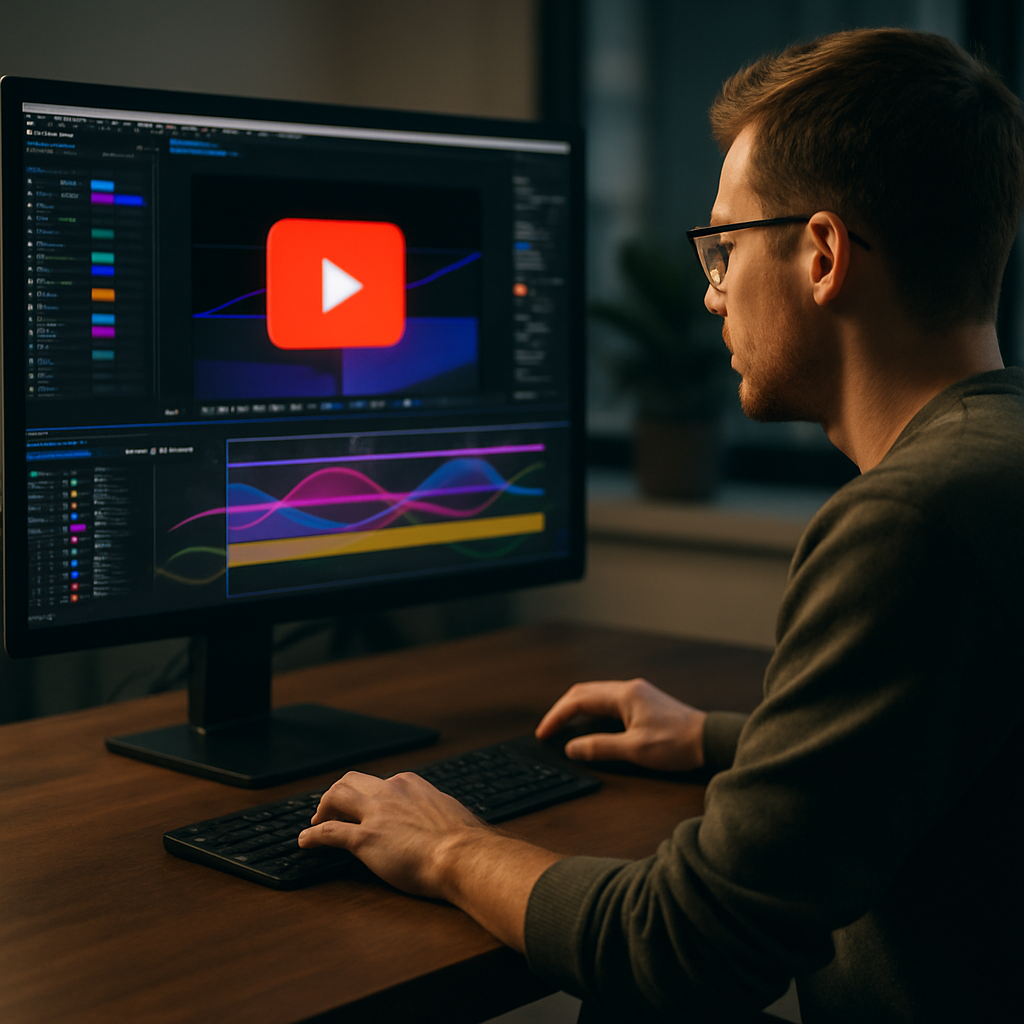
Understanding YouTube overlays in After Effects
What are YouTube overlays
YouTube overlays are graphical elements that sit on top of your footage: lower thirds, subscribe popups, social handles, like and comment prompts, stream alerts, progress bars, and info panels. In After Effects, they live in transparent compositions that you export and stack over your edit.
Instead of rebuilding graphics in your NLE, you design them once in After Effects as reusable assets. That means you can keep animation quality high, maintain brand consistency, and iterate without breaking your edit.
Why build overlays in After Effects
After Effects is ideal for YouTube overlays because it offers:
- Keyframe control for smooth easing, bounces, and overshoots.
- Shape layers and masks for clean vector graphics that scale to 4K and beyond.
- Precomps to manage complex systems like multi-step subscribe animations.
- Essential properties and expressions to let editors change text and colors quickly.
Compared with static PNGs or simple editor titles, motion overlays created in After Effects feel more polished and intentional. This level of motion design helps channels stand out in competitive niches.
Who needs YouTube overlays
YouTube overlays are useful for:
- Solo creators and streamers who want branded, consistent visuals across videos and live sessions.
- Editors assembling content for agencies, brands, and YouTube channels who require templates that are fast to customize.
- Motion designers creating overlay packs as deliverables or digital products.
- Marketing teams using YouTube for launches, training, or support content where clear information hierarchy matters.
Core elements of a YouTube overlay system
When planning how to make YouTube overlays in After Effects, think in terms of a system, not one-off elements. A basic overlay system might include:
- Lower thirds for names, titles, and segment labels.
- Subscribe and notification prompts.
- Like, comment, and share reminders.
- Chapter or progress indicators.
- Corner bugs and logos.
- Callout boxes for on-screen items.
Each of these should share consistent color, typography, spacing, and animation timing. Once your system is defined, you can expand into more advanced elements such as a dynamic YouTube widget overlay that shows channel stats or engagement highlights.
Raster vs motion-first thinking
When designing overlays, avoid thinking like static thumbnails. You are building motion assets, so consider:
- Where they enter and exit the frame.
- How long they stay visible without distracting.
- How multiple overlays overlap in busy sections.
- How they look on mobile, TV, and desktop at different resolutions.
With that foundation, you are ready to explore widgets and more specialized overlay types in After Effects.
YouTube widget overlays and variations
What is a YouTube widget in After Effects
A YouTube widget After Effects project is a prebuilt composition that behaves like a dynamic info panel. It can display subscriber counts, recent uploads, social handles, or call-to-action prompts inside a compact, animated frame. Think of it as a reusable, resizable overlay module.
Unlike simple lower thirds, widgets usually combine multiple elements: icons, text, profile images, progress bars, and sometimes looping micro-animations like ticking counters or waveform lines.
Common YouTube widget types
- Channel info widgets – show channel name, avatar, and subscribe prompt.
- Engagement widgets – like, comment, subscribe, bell reminder groups.
- Now playing widgets – track or segment info for podcasts or music channels.
- Stats widgets – display milestones like “100K subscribers” or “1M views”.
- Livestream widgets – alerts, chat frames, or on-screen reactions.
Well-built widget overlays are usually modular: you can turn sub-elements on and off, move them between corners, or swap text and icons without touching the core animation layers.
Internal variations and layout options
When you design your own After Effects YouTube widgets, plan for variations:
- Placement – top vs bottom, left vs right, center overlay vs side panel.
- Duration – quick 1–2 second blips vs longer 5–8 second info holds.
- Shape – pill-style buttons, rounded rectangles, ribbons, or circle badges.
- Density – minimal icon plus one line of text vs detailed panels.
This lets you use the same visual language across different video types: long-form tutorials, YouTube Shorts, product demos, or live sessions. For example, a compact square widget may work well for Shorts, while a wider bar-style widget fits long 16:9 content.
How widgets differ from other overlays
Widgets usually require more setup than simple text overlays, because you might need:
- Precomps for avatars or thumbnails.
- Animated icons and micro-loops.
- Expressions to drive counters or automated fades.
- Multiple text layers tied to a master control comp.
They are also prime candidates for template-based workflows. Once you have a well-structured widget comp, you can reuse it across clients or series with small adjustments.
Related overlay ideas
YouTube widgets conceptually overlap with other on-screen UI-style elements. For example, a picture-in-picture frame styled like a video call widget can become a talking-head insert in your tutorial layout. A compact location callout inspired by a map widget overlay can work well in travel vlogs.
Once you understand the pattern (container + content + micro-animation), you can reuse the logic for almost any kind of informational overlay, not just subscriber prompts or simple buttons.
Common mistakes when building overlays in After Effects
Overcomplicating timing and animation
One of the biggest issues when people first learn how to make YouTube overlays in After Effects is over-animating every element. Long, elaborate transitions look great in isolation but slow down real edits. When stacked across a whole timeline, they become exhausting.
- Keep entrance animations under 12–18 frames for most overlays.
- Avoid more than two major motion beats (e.g., slide + overshoot).
- Use easing sparingly; not every layer needs its own curve.
Ignoring the graph editor
Linear motion looks robotic, but chaotic curves are worse. Editors often skip the graph editor or apply random easing presets that result in jittery movement. Instead, build a few reusable ease profiles and apply them consistently across your overlay system.
Messy comps and naming
Disorganized projects are the most common pain point for editors receiving After Effects files. Typical issues include:
- Unnamed layers like “Shape Layer 23” or “Text 5”.
- Mixed frame rates and resolutions inside the same project.
- No master color or text controls.
- Multiple duplicates instead of precomps and instances.
These mistakes make even simple changes feel risky. A clean overlay template should make it obvious where to change text, colors, or durations.
Heavy effects and slow previews
Glows, blurs, and third-party plugins can make YouTube overlays render painfully slow, especially on laptops. For overlays that appear dozens of times in a video, performance matters more than maximal stylization.
- Prefer shape layer strokes and gradients over heavy layer styles.
- Use blur and glow sparingly, and test in Draft 3D or lower preview resolutions.
- Cache or pre-render complex background elements.
Forgetting about readability
On small screens, thin fonts, subtle colors, and transparent elements can disappear. Common mistakes include:
- Text too small or too light on busy footage.
- Poor contrast against the video background.
- Long sentences where quick phrases would work.
Always test overlays at 25% and 50% viewer size, simulating mobile viewing distance.
Not planning for different aspect ratios
Overlays designed only for 16:9 might crop badly in 9:16 or 1:1. If you also publish Shorts or reels, design with safe areas. Keep key UI elements away from edges so they survive cropping.
Checklist to avoid pain later
- Use one main composition size (e.g., 1920×1080, 30 fps) and clearly label alternatives.
- Name layers descriptively and group them in color-coded categories.
- Use nulls and control layers instead of editing raw keyframes everywhere.
- Minimize unique animations; reuse motion systems where possible.
- Test render time and readability before sending overlays to clients or editors.
Choosing the right overlay strategy for your channel
Match overlays to content type
The best overlay strategy depends on what you publish. A cinematic travel film needs different graphics than a talking-head tutorial or a product ad. Start with your format, then decide how aggressive or minimal your overlays should be.
- Tutorials and how-tos – Frequent lower thirds, keyboard shortcut popups, and chapter markers. Widgets may highlight resources or timestamps.
- Vlogs and lifestyle – Softer lower thirds, location tags, and occasional subscribe prompts. Less on-screen noise, more emphasis on footage.
- Gaming and streaming edits – Persistent widgets: chat frames, recent subscriber alerts, kill feeds, and social bars.
- Product reviews and tech – Spec callouts, price tags, and side-by-side comparison overlays.
- Ads and promos – Bold, on-brand call-to-action overlays and time-limited offer badges.
Deciding between custom and template-based builds
If you are an experienced motion designer with time, custom overlays let you tailor every pixel to the channel identity. But many editors and creators work under tight deadlines where building from scratch is not realistic.
Template-driven workflows are ideal when you:
- Deliver recurring videos for the same channel or brand.
- Need a consistent look across dozens of uploads.
- Work with teams where non-designers will update text and colors.
- Want to test new overlay styles quickly without full redesigns.
A well-structured overlay or widget template lets you focus on storytelling and pacing rather than redoing graphic work every week.
When to introduce widgets
Not every channel needs a complex YouTube widget After Effects system from day one. Consider introducing widgets when:
- Your channel has a clear upload rhythm and series format.
- You consistently highlight calls to action, offers, or recurring segments.
- You collaborate with other creators and need a strong identity.
Widgets work especially well for channels aligned with the growth advice and tools you will find on resources like YouTube Creators, where watch time and audience retention are central. Smart overlays can support those goals by surfacing key information without pausing the content.
Balancing style and speed
Before animating, ask:
- How often will this overlay appear per video?
- Will editors need to batch-update it for multiple languages or campaigns?
- Does the animation still feel good at 1.25x and 1.5x playback speeds?
- Is it readable on phones held at arm’s length?
Choosing the right overlay strategy means prioritizing clarity and speed of use, not just visual flair. Once you have that strategy, you can decide which elements you build once, and which you offload to reusable template projects or an Unlimited After Effects Templates Subscription that fits your production volume.
Practical workflow to build YouTube overlays and widgets
Start with project setup
Before keyframing anything, set up After Effects correctly. Decide your primary sequence format based on your edit:
- Resolution: 1920×1080 for standard YouTube, 3840×2160 for 4K, and 1080×1920 for Shorts.
- Frame rate: Match your edit (commonly 23.976, 25, or 29.97 fps). Do not mix random fps values in the same project.
- Color space: Use the same color management as your NLE to avoid shifts.
Create a “MASTER_CONTROLS” composition with color controls, global scale sliders, and maybe a logo precomp. Keep all your overlay comps referencing this master where possible.
Build a base lower third
Instead of jumping into complex widgets, start with a simple lower third system:
- Create a new 1920×1080 comp named “LT_Name_Title”.
- Add a solid or shape layer for the background bar.
- Use one or two text layers for name and role/title.
- Parent everything to a null for global position and scale.
Add a short slide-and-fade animation using 2–3 keyframes per property (position, opacity, maybe scale). Use the graph editor to apply a simple ease-in/ease-out curve. Once this feels good, save it as your base motion style for the rest of the system.
Create a reusable subscribe widget
Now move into a more advanced YouTube widget After Effects build:
- Set up a 1920×1080 comp called “W_Subscribe”.
- Inside, create a precomp “W_UI” where you design the static layout: avatar circle, channel name, subscribe button, bell icon, and optional counter.
- Add shape layers for button and avatar outline. Use rounded rectangles for modern UI feel.
- Create text layers linked to master controls via expressions or Essential Graphics.
Animate in three stages:
- Entrance – Slide and fade in from off-screen.
- Micro motion – A quick scale bump on the button, icon wiggle, or counter tick.
- Exit – Fast slide or fade out, no long tails that slow edits.
Keep timing short and punchy. For example: 6 frames ease-in, 12–18 frame hold, 6–8 frames exit.
Organize keyframes and precomps
Good overlays are easy to tune. Follow these structural rules:
- Use one null per overlay for global transforms.
- Group text layers in a precomp if they share in/out animations.
- Mark key moments with layer markers (e.g., “IN”, “HOLD”, “OUT”).
- Color-code layers: text, controls, icons, and backgrounds.
When a client or collaborator asks for shorter overlays, you can quickly compress timing by sliding “HOLD” markers instead of re-timing every keyframe.
Performance and preview tips
To keep overlays snappy:
- Turn off motion blur except where it really adds value.
- Preview at half or quarter resolution while animating.
- Limit nested glow or blur stacks; try using a single, subtle glow on a precomp.
- Pre-render complex widgets if you use them repeatedly in long videos.
You can also use lightweight mockups or placeholders early on, then swap to detailed graphics once animation is locked.
Plugin dependencies and safe alternatives
Third-party plugins can speed up design but make your projects harder to share. Ask yourself:
- Does this glow, distortion, or particle effect justify making the project dependent on a plugin?
- Is there a shape layer or native effect equivalent?
- Will the editor or client have the same plugin versions installed?
When you do rely on plugins, document them in a text layer at the top of the comp and offer a simplified, native version for teams without licenses.
Smart customization workflow
A professional overlay system lets you update content in seconds. Use this structure:
- Keep a “CONTROLS” layer using Expression Controls (Color, Checkbox, Slider) for global parameters.
- Use Essential Graphics to expose the most important fields: text, logo, accent colors, toggle switches.
- Lock layers that editors should not touch.
- Store example versions in a “RENDERS” folder so people can see how overlays are meant to look.
From there, editors can quickly localize overlays for different languages or campaigns, swap logos for white-label versions, or update call-to-action text across multiple videos.
Different formats and use cases
Plan your overlay system with multiple platforms in mind:
- Long-form tutorials – Detailed lower thirds, chapter markers, keyboard shortcut widgets, and picture-in-picture frames similar to a dual-screen tutorial layout.
- YouTube Shorts and reels – Bolder, simplified overlays with larger typography and minimized fine detail.
- Ads and product promos – Strong corner bug, CTA bars, and dynamic price tags.
- Cinematic edits – Subtle, minimal overlays that reinforce brand while leaving shots clean.
Exporting overlays for editors
Most YouTube overlays are best exported with an alpha channel:
- Use QuickTime with ProRes 4444 or similar codec that supports transparency.
- Confirm your background is transparent (checkerboard visible) before rendering.
- Keep durations manageable; editors can trim and loop as needed.
If your editor uses Premiere Pro, you can work via dynamic link, but for heavy widget systems it is often safer to pre-render lightweight overlay clips and keep the After Effects project for deeper updates only.
Template organization for ongoing work
Create a dedicated overlays folder structure on disk:
- 01_Project_Files
- 02_Renders_Overlays
- 03_Documentation / usage notes
- 04_Assets (logos, icons, photos)
This is especially important if you collaborate with other editors or motion designers worldwide, or if you plan to hand off overlay systems as part of a larger video graphics package. Clear structure avoids versioning mistakes and lets teams plug your overlays into larger campaigns with minimal friction.
Advanced overlay systems and long term optimization
Design for consistency across a whole channel
Once you have basic overlays working, focus on building a system instead of one-off graphics. This means:
- Shared motion language (same easing profiles and speeds across all elements).
- Consistent corner usage (e.g., lower-left for names, upper-right for widgets).
- A limited color palette and typographic scale.
- Reusable patterns like slide-and-fade or pop-and-settle animations.
When every video on the channel uses the same visual logic, viewers recognize your content faster, even when autoplaying from recommendations.
Modular overlay libraries
Create a central After Effects project that holds your best overlays and widgets as modules. For example:
- “LT_01_Name_Title”
- “CTA_01_Subscribe”
- “W_Stats_01_Milestone”
- “BUG_01_Logo_Corner”
Each module should be self-contained, with clear in/out points and control layers. When a new series launches or a client requests a tweak, you can duplicate and adapt modules instead of rewriting animations from scratch.
Reusable animation systems
Consider building overlay rigs driven by a few master controllers. For instance, a widget bar with items that slide in based on a slider value, or icons that enable/disable via checkboxes. This approach works especially well for stat or milestone overlays similar in complexity to a stylized performance stats widget.
These systems require more initial setup but pay off over dozens of videos, as you can quickly swap content while preserving animation logic.
Quality control and review passes
Before exporting overlays, run a quick QC checklist:
- Check spelling and alignment across all variants.
- Test overlays over different footage types (bright, dark, busy, clean).
- Validate safe margins for both desktop and mobile views.
- Confirm all essential text fields are exposed in Essential Graphics, if used.
For ongoing series, save reference frames or short preview videos to keep visual consistency over time.
Export and render strategy
Rendering overlays can become a bottleneck on complex projects. To keep things smooth:
- Batch-render families of overlays overnight.
- Use clear file naming (e.g., “OL_Subscribe_BRAND_v03.mov”).
- Keep a “FAST” version without heavy effects for quick edits.
- For multi-language projects, use the same motion file and swap text layers in separate language versions of the AE project.
When working with NLEs, avoid constantly re-rendering minor color tweaks. Instead, centralize color controls in one After Effects project and export a fresh batch when major visual changes are required.
Dynamic link and project weight
Dynamic link can be convenient but easy to overload. To prevent slowdowns:
- Limit each linked comp to a specific purpose (e.g., one link per overlay type).
- Avoid stacking multiple heavy AE comps directly on top of each other in the NLE.
- Pre-render widgets with alpha once they are approved, especially for frequently used animations.
Keeping projects lightweight helps when collaborating across remote teams or when sending files to clients for internal editing.
Document your system
Finally, treat your overlay and YouTube widget After Effects setup as a living design system. Maintain a simple usage document with:
- Short descriptions and thumbnails of each overlay module.
- Notes on which comps to open for customization.
- Lists of any required fonts or plugins.
- Guidelines for where and when to use each overlay on the timeline.
Good documentation makes it easy for any editor to plug your overlays into their workflow, keep results consistent, and scale production without confusion.
SEO focused questions about YouTube overlays
Common search intent topics
When editors and creators look up how to make YouTube overlays in After Effects, their questions usually cluster around a few themes. Addressing these helps you refine your own workflow and plan future overlay modules.
- “How do I add animated subscribe buttons to my videos” – Build a short subscribe widget with a clear on/off animation, export with alpha, then drop it into your editor as a reusable asset.
- “What is the best size for YouTube overlays” – Design at your main video resolution (usually 1920×1080 or 3840×2160) and keep critical text within safe margins so it works on TVs and phones.
- “How can I quickly change overlay colors for different series” – Centralize color controls in one control layer or master comp. Swap palettes there instead of editing each layer individually.
- “Do I need plugins to make professional YouTube widgets” – No. Most overlays and widgets can be built with native shape layers, text, masks, and a few expressions. Plugins help but are not required.
- “How do I keep overlays from distracting viewers” – Use short, confident animations, soft easing, and limit how many elements appear at once. Prioritize legibility and timing over spectacle.
- “Can I reuse overlays across multiple channels” – Yes. Build neutral, easily customizable base templates. Swap logos, colors, and text for each channel while keeping core motion the same.
Long tail ideas for future overlay builds
If you are planning a broader motion design library, consider:
- Overlays for episodic content (“Episode 5”, “Season 2”).
- Countdown or timer widgets for live premieres and streams.
- Multilingual lower thirds ready for fast localization.
- Review and rating widgets for tech and product channels.
- Minimal overlays designed specifically for Shorts and vertical platforms.
Each of these ideas can start from a simple core overlay, then expand as your channel or client base grows.
Bringing everything together for a scalable overlay workflow
Recap of key principles
Effective YouTube overlays start with clear roles: each graphic should support story, context, or action without clutter. After Effects gives you the tools to build lower thirds, callouts, and YouTube widget overlays as a cohesive system rather than disconnected animations.
By planning project settings carefully, organizing comps and controls, minimizing heavy effects, and prioritizing readability, you create overlays that editors can rely on for hundreds of uploads. A small library of well-structured overlays can serve long-form tutorials, Shorts, livestream edits, and brand campaigns with minimal rework.
Next steps for your own projects
Choose one overlay type you use most often—lower third, subscribe button, or stats widget—and rebuild it with a cleaner structure: named layers, master controls, and alpha-ready exports. Once that feels solid, expand into a small library and standardize your motion language across the whole channel.
With a robust overlay workflow in place, you can deliver more consistent visuals, edit faster, and focus more of your energy on storytelling, pacing, and performance rather than rebuilding the same graphics from scratch for every video.
Conslusion
A solid YouTube overlay system in After Effects makes your channel look cohesive, helps viewers follow your stories, and saves significant editing time. By treating overlays and widgets as reusable motion assets, you can scale production, keep visuals on-brand, and concentrate on making better content instead of rebuilding graphics.
FAQ
What is the best format to export YouTube overlays from After Effects
Export overlays with transparency using a codec like ProRes 4444 or similar, so editors can stack them over footage in any NLE.
Do I need advanced plugins to create YouTube widgets in After Effects
No. Most YouTube widgets can be built using native shape layers, text, masks, and basic expressions without third party plugins.
How long should YouTube overlay animations be
Aim for short, efficient animations: 6–12 frames for entrances, a brief hold, and 6–8 frames for exits, so they do not slow down the edit.
Can I reuse the same overlay templates for multiple YouTube channels
Yes. Design neutral templates with centralized controls for logos, colors, and fonts, then customize for each channel as needed.
How do I keep overlays readable on mobile devices
Use clear fonts, strong contrast, and larger text sizes, and keep key information within safe margins away from screen edges.
What frame rate should I use when creating YouTube overlays
Match the frame rate of your main edit, commonly 23.976, 25, or 29.97 fps, to avoid stutter or mismatch when overlays are composited.