Luxury motion graphics used to be reserved for big-budget brands and studio teams. Today, editors and motion designers can build premium looks directly in After Effects with the right structure, references, and template-driven workflows. This guide breaks down what makes motion feel expensive, and how to replicate that quality on everyday projects.Explore premium AE assets
📋 Table of Contents
Luxury motion graphics explained
What makes motion feel luxurious
Luxury motion graphics examples share a few consistent traits: restraint, precision, and intention. Instead of loud transitions and excessive effects, you see carefully timed animations, clean typography, subtle texture, and premium lighting or shading. Every move on screen feels motivated and considered.
Key characteristics of luxury motion
- Minimal but expressive typography, often with refined tracking and line spacing.
- Controlled pacing, with space to breathe between cuts and transitions.
- Polished easing and velocity curves that avoid harsh, linear movement.
- High-quality imagery or 3D renders with smooth motion blur and depth.
- Limited, cohesive color palettes that echo premium brand aesthetics.
Why it matters for editors and designers
Clients increasingly expect a premium look, even for social content. If you understand how high-end animation is constructed, you can:
- Pitch stronger concepts that align with luxury brands.
- Elevate basic footage or static assets.
- Reuse animation systems across campaigns for consistency.
- Charge appropriately for work that looks studio-grade.
Who this approach is for
This mindset benefits:
- Freelance editors who want to push beyond basic title cards.
- In-house designers building ongoing brand systems.
- Agencies producing pitch videos, sizzle reels, or product launches.
- Content creators who want their channels to feel curated and premium.
Luxury vs. loud motion graphics
Luxury motion is rarely about maximum energy. Instead of explosive transitions, you often see slow reveals, smooth camera moves, and understated typography. The value comes from control and detail. Once you understand these fundamentals, every new project becomes an opportunity to apply them with confidence.
High end animation inspiration and style directions
Where luxury animation ideas come from
When people search for high-end animation inspiration, they are usually looking for usable patterns: pacing, layout, and transition language they can adapt. The most effective way to collect references is to break inspiration into categories rather than individual shots.
Core luxury animation styles
- Monochrome minimalism – clean layouts, high contrast, subtle type animation, and simple wipes. Great for corporate reels and product explainers.
- Editorial kinetic type – bold serif or neo-grotesk type, animated like magazine layouts. Ideal for trailers or lyric-style sequences.
- Product-first macro shots – slow, detailed camera moves and elegant UI callouts, similar to luxury tech advertising.
- Grainy cinematic titles – soft glows, film-like grain, and gentle blur for intros, docs, or premium YouTube channels.
Matching intent to style
Different projects require different types of luxury motion graphics examples:
- Brand launches – prefer controlled kinetic type and logo systems.
- Fintech or SaaS – smooth UI animations and widget-like overlays, similar to a polished finance UI motion piece.
- Automotive or lifestyle – dynamic but precise movement, with subtle parallax and lighting, like a refined car HUD-style overlay.
- Utility overlays – clean, legible UI elements that feel integrated, as in a map or meeting widget; think along the lines of a map callout or meeting interface overlay.
Templates as inspiration catalog
Even if you do not use a template as-is, browsing structured animation systems gives you ideas for:
- How many variations a single transition language can support.
- Where to place callouts, tags, or captions for legibility.
- How to balance footage, type, and graphic elements in a frame.
Turning inspiration into a repeatable look
Build a private moodboard: export stills, loop short renders, and collect links to reference projects. Tools like YouTube overlay-style layouts and curated showcase sites help ground your taste in structures you can actually rebuild inside After Effects.
Common mistakes that break the luxury look
Why expensive animation can suddenly look cheap
Luxury motion is fragile. A few rushed decisions in After Effects can undo the entire premium feel. Recognizing these pitfalls early saves time and keeps your projects consistent.
Frequent technical and design issues
- Chaotic easing – default linear keyframes or random Easy Ease with no curve control lead to robotic or jittery motion.
- Overloaded comps – stacking effects, glows, and blurs on a single layer without precomps creates muddy, noisy results.
- Inconsistent motion blur – forgetting to enable motion blur on some layers or using extreme shutter angles breaks realism.
- Messy typography – poor kerning, inconsistent tracking, and too many typefaces instantly reduce perceived quality.
- Unplanned color palettes – using every brand color at once instead of a focused selection weakens the upscale look.
Workflow mistakes in After Effects
- No precomp strategy – throwing all layers into a single comp makes it hard to adjust timing or reuse blocks.
- Ignoring project settings – mismatched fps, resolution, or pixel aspect ratio leads to stuttery playback and inconsistent exports.
- Heavy plugins by default – reaching for particle systems or complex 3D plugins before trying native tools slows previews and invites crashes.
- Untidy timelines – unnamed layers, hidden shy states, and no color labeling waste time when you need revisions.
Checklist to protect the premium feel
- Lock in fps, resolution, and color profile before animating.
- Decide on 1–2 core typefaces and 2–3 weights max.
- Set up consistent easing in the graph editor and reuse it.
- Structure precomps by function: titles, overlays, transitions, product shots.
- Test your motion with a simple, neutral color palette before applying brand colors.
Consequences of skipping these steps
Ignoring these basics means more fix work later. You will spend hours repairing timing, rebuilding comps, or cleaning typography that could have been resolved at the setup stage. High-end animation inspiration only becomes reality when the technical foundation supports it.
Choosing the right luxury motion approach for each project
Different outputs, different strategies
Editors handle everything from short social clips to cinematic trailers. Each format benefits from a different interpretation of luxury motion graphics examples, so your first step is always to define context.
Luxury motion for social reels and shorts
- Use bold, legible type and rapid but smooth transitions.
- Favor simple, loopable motions that support repeated viewing.
- Keep layouts modular so you can swap content without rebuilding.
Premium ad spots and product promos
For 15–30 second spots or product edits, premium motion often means subtle precision:
- Introduce the product early with clean macro moves.
- Use restrained UI-style callouts, similar to polished split-screen and duo layouts.
- Anchor timing to music accents while leaving room for breathing moments.
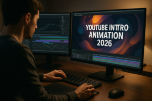
YouTube intros and channel packages
High-end animation inspiration for YouTube usually blends cinematic and functional design:
- Consistent lower thirds and intro cards across episodes.
- Modular sections for titles, chapters, and end screens.
- Cohesive transition language that feels part of the brand.
Cinematic or corporate storytelling
Longer pieces need sustainable motion systems, not one-off shots.
- Design a typography system before designing individual frames.
- Use recurring shapes, dividers, and reveals to tie sections together.
- Reserve complex animations for key story beats.
Using curated references wisely
When reviewing luxury work on inspiration sites like Awwwards, translate what you see into concrete decisions: pacing, grid, type size relationships, and transition patterns. Decide what fits your project and ignore the rest.
Where templates fit in
Templates can serve as a base language: a reusable structure of comps, transitions, and type styles. An Unlimited After Effects Templates Subscription lets you:
- Pull a matching structure quickly for different formats (reels, widescreen, vertical ads).
- Study how professional luxury motion is organized under the hood.
- Adapt one template into multiple deliverables without starting from zero.
Once you know the project type, you can select a visual language and system that stays consistent from first frame to export, instead of assembling random effects.Compare motion plan options
Practical workflow guide for luxury templates in After Effects
Start with technical alignment
Before you touch design, confirm that any luxury motion template aligns with your project specs.
- After Effects version – check minimum version and whether it requires specific features (3D renderer, expressions).
- Frame rate – match fps to delivery (e.g., 23.976 for filmic, 25 or 30 for broadcast and social). Mixing fps can ruin smoothness.
- Resolution and format – decide upfront: 4K, 1080p, vertical, square. Duplicate comps and adjust them cleanly if you need multiple sizes.
Smart import and project structure
Treat the template project like a client-ready base.
- Keep original folder structure for comps, solids, and assets.
- Create a dedicated folder for your media: footage, logos, audio.
- Duplicate master comps before experimenting so you always have a clean reference.
Keyframe organization and precomps
Luxury motion relies on consistency. That starts with clean timing.
- Label key layers (e.g., Main Title, Background, Accent Shape).
- Group complex title or overlay sequences into precomps, named by function (Title_Main, Transition_01).
- Keep animation controls on as few layers as possible so revisions are fast.
Naming conventions that scale
For ongoing clients, define reusable naming patterns:
- Use prefixes like TT_ for titles, TX_ for text, BG_ for backgrounds.
- Include version numbers for key comps (Intro_v01, Intro_v02).
- Color-label layers by category: text, footage, adjustment layers.
Performance and preview tips
Luxury animation often includes subtle glows, blur, and texture. Keep it responsive:
- Work at 1/2 or 1/3 resolution while blocking timing.
- Disable heavy effects using adjustment layer switches until final passes.
- Use proxies or lower-res placeholders for 4K or RAW footage.
- Trim comps to work area so RAM previews stay focused.
Plugin dependencies and safe alternatives
High-end motion templates may rely on third-party plugins. Before committing:
- Check which plugins are required and whether there is a no-plugin version.
- Consider replacing light plugins with native AE tools (e.g., using built-in glows, blur, or simple 3D instead of heavy suites).
- Test one scene with disabled plugins to see if the look is still acceptable.
Clean customization workflow
Approach every template like a design system, not a finished ad.
- Colors – Start with a neutral base, then map brand colors to a small palette. Use global controls or color expressions where possible.
- Typography – Substitute typefaces carefully, maintaining hierarchy (title, subtitle, body). Adjust size and tracking before changing animation.
- Transitions – Adapt timing to your edit. Luxury transitions are usually slightly slower with strong easing but minimal overshoot.
- Timing – Lock your audio and story beats first, then align key motion accents to them.
Use-case specific setups
- Reels and shorts – Use shorter master comps with quick but smooth in-out animations. Loop-friendly motion is valuable.
- Ads and promos – Build a clear narrative arc: intro, product highlight, proof, CTA. Ensure every animation supports this structure.
- Product UI overlays – For app or map-focused content, base layouts on real usage patterns, like a clean UI and widget overlay collection would.
- Cinematic edits – Favor long camera moves, slow type reveals, and restrained transitions. Apply grain or vignette late in the process.
Final refinement passes
Once structure is locked, you can afford to obsess over micro-details:
- Fine-tune easing in the graph editor for each key moment.
- Check motion blur consistency and shutter angle across comps.
- Balance brightness and contrast so type remains legible on all screens.
- Review at 100 percent scale to catch jitter or aliasing.
Treat luxury motion templates as frameworks: you are not just filling text; you are steering a refined system toward your client’s story.
Advanced techniques and long term workflow for premium motion
Building reusable luxury systems
Once you understand a few luxury motion graphics examples, the next step is to turn them into modular systems you can reuse for months.
- Create a central style comp that holds color, typography, and basic layout rules.
- Use expressions or master controls to unify key properties across multiple scenes.
- Build a library of precomposed transitions and titles that share the same easing and motion language.
Consistency across a full edit
To maintain an elevated feel from first frame to last:
- Limit yourself to 2–3 transition types and reuse them.
- Keep margins, safe areas, and alignments consistent across scenes.
- Use recurring motifs: a line, a shape, or a masked reveal that becomes part of the brand’s visual identity.
Styleframes as alignment tools
Before animating an entire sequence, create a few key stills:
- Design opening, mid-sequence, and closing frames.
- Confirm type size and color across those frames.
- Use feedback on stills to avoid reanimating full sequences later.
Quality control for luxury outcomes
Premium work requires deliberate review stages.
- Watch at normal and reduced speed to catch stutter.
- Check for clipped highlights or crushed shadows that reduce subtle detail.
- Review with and without audio to ensure motion holds on its own.
Export and render considerations
Your render pipeline affects perceived quality as much as design.
- Use lossless or visually lossless masters, then compress with a dedicated encoder.
- Test different bitrates for web platforms to avoid banding in gradients.
- Ensure color management remains consistent between AE, encoder, and final platform.
Dynamic link and lightweight projects
Advanced workflows sometimes rely on dynamic link with editing software, but luxury projects are often heavy:
- Pre-render complex sections into intermediate files to reduce recomputing.
- Avoid deep nesting and excessive effects when live-linked, or expect lags.
- Archive clean project versions occasionally, stripping unused assets and layers.
Long-term benefits
With a structured system, your future edits become faster and more reliable. You can adapt high-end animation inspiration to new clients without rebuilding from scratch, preserving that premium look while staying efficient on every project.
Extended search questions about luxury motion graphics
Addressing common search intents
People exploring luxury motion graphics examples and high-end animation inspiration often ask similar questions. Treat these as prompts you can solve through your workflow.
- How do I make simple titles look expensive? Focus on typography, easing, and subtle opacity or position shifts instead of big effects.
- What frame rate feels most cinematic? 23.976 or 24 fps typically feels filmic, especially with carefully tuned motion blur.
- Can I get a luxury look with basic footage? Yes, if you control color, type, and composition; premium overlays and subtle transitions help unify everything.
- Do I need 3D for high-end animation? Not always. Many luxury systems rely solely on 2D type, grids, and shape layers.
- How many fonts should I use? Often one family with 2–3 weights is enough; more can weaken the upscale feel.
- What is the fastest way to test styles? Build a small sequence of 3–5 shots and iterate lighting, type, and color there before rolling changes across the full edit.
- How can I adapt horizontal luxury edits to vertical? Design with safe zones and modular layouts, then create a dedicated vertical comp that repositions key elements without stretching.
- Are templates acceptable for premium client work? Yes, when used as a structured base that you customize heavily to match brand and story.
Using search behavior as a roadmap
When you notice repeated questions from clients or peers, turn those into internal checklists. Over time, your process will naturally align with what editors and motion designers worldwide search for when they need truly premium motion outcomes.
Bringing luxury motion graphics into your daily workflow
From inspiration to repeatable practice
Luxury motion graphics examples are most valuable when they inform habits, not just moodboards. Focus on building a consistent approach to pacing, typography, and structure in every project, whether it is a social clip or a full campaign.
Key takeaways to apply immediately
- Decide on a clear visual language before animating.
- Use templates and structured projects as systems, not shortcuts.
- Protect premium quality with organized comps, consistent easing, and controlled color.
- Review with an editorial mindset: does every movement earn its place.
Building your premium toolkit
Over time, assemble a curated set of layouts, transitions, and title systems that reliably deliver a high-end animation feel. An Unlimited After Effects Templates Subscription can anchor that toolkit, giving you a deep library of polished structures to adapt to each new brief.
Next steps
Pick one current or upcoming project and decide how you will apply these ideas: cleaner type systems, better precomp structure, or a refined transition language. Treat it as your first deliberate luxury case study, then refine and reuse that framework on the next edit.
Start building your luxury toolkit
Conclusions
Luxury motion design is not about complexity; it is about deliberate, consistent decisions. With tight typography, clean structures, and smart use of templates, you can deliver premium animation on everyday timelines while keeping your After Effects workflow efficient and reliable.
FAQ
What defines luxury motion graphics in After Effects
Luxury motion graphics rely on controlled pacing, refined typography, cohesive color, and precise easing, with every movement serving a clear visual or narrative purpose.
Can beginners create high end animation inspiration pieces
Yes. Start by studying simple luxury layouts, use structured templates, focus on typography and timing, and build short sequences instead of full spots at first.
Do I need third party plugins for a premium look
Not necessarily. Many upscale results come from native tools like shape layers, motion blur, and graph editor control. Plugins are helpful but not mandatory.
How do templates fit into professional luxury workflows
Templates act as organized bases. You customize type, color, timing, and content heavily so the final piece matches the client brand while benefiting from proven structures.
What is the best frame rate for luxury motion graphics examples
23.976 or 24 fps offers a cinematic feel, while 25 or 30 fps can work better for broadcast or social. Choose based on platform and keep it consistent throughout.
How can I keep luxury projects manageable on slower machines
Use proxies, reduce resolution during previews, disable heavy effects until final passes, and keep comps modular so you preview only the sections you are adjusting.