Payment notifications are everywhere in finance apps, banking dashboards, and fintech promos. Getting them right in After Effects means more than sliding a card on screen; they need timing, weight, and clarity. This guide walks through a practical workflow for animating believable payment alerts and finance UI, step by step.Browse AE templates now
📋 Table of Contents
Understanding payment notification animation basics
What payment notification animation means
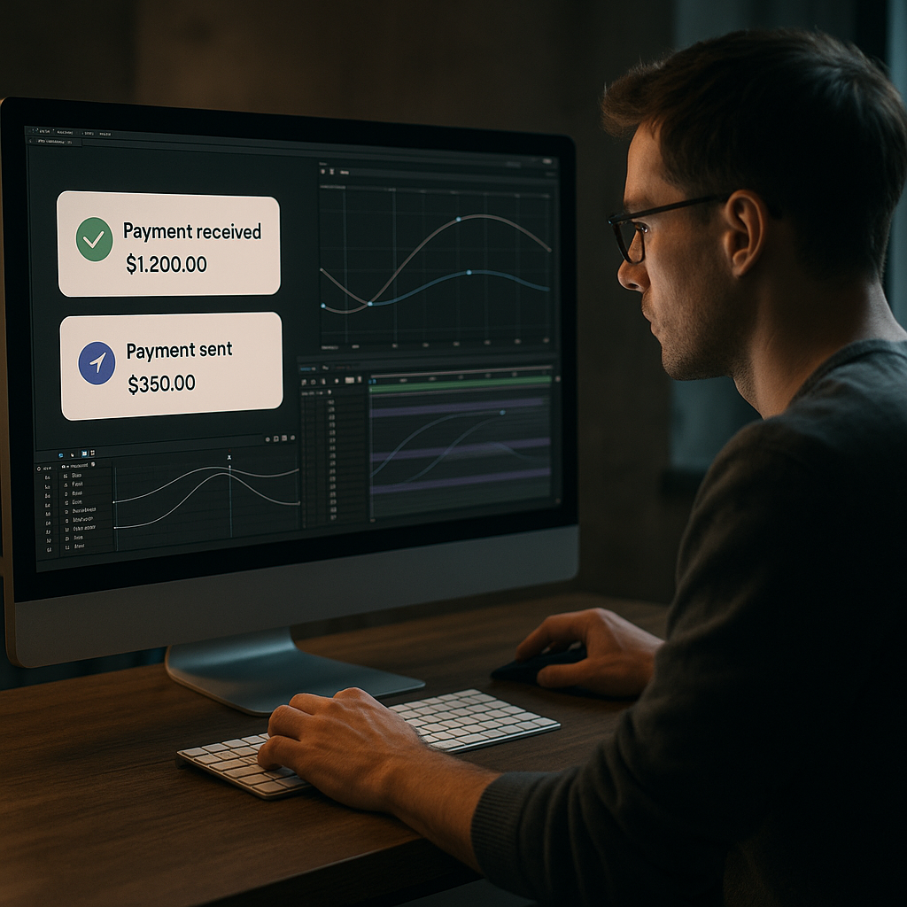
When motion designers talk about learning how to animate payment notifications, they typically mean those small UI elements that appear when a transaction is sent, received, or approved. Think of the card that pops up saying “Payment received 25.00” or a success badge confirming a card top-up.
In Adobe After Effects, this usually involves animating a compact UI card, icon, amount, and bit of text in a way that feels instant but not jarring. It needs to be readable, elegant, and consistent with the rest of your product or video design.
Why payment notifications matter
In finance, trust is visual. A clumsy or cheap-looking notification animation makes an otherwise polished finance app or product video feel unreliable. Clean micro-interactions tell viewers the product is stable, secure, and carefully considered.
For motion designers and editors, notification animations matter because they:
- Communicate status changes clearly (payment sent, failed, or pending).
- Add polish to product demos, explainers, and fintech ads.
- Guide the viewer’s eye around complex dashboards or multi-step flows.
- Provide a rhythm to edits, syncing nicely with music or sound design.
Who this workflow is for
This tutorial focuses on editors, motion designers, and content creators who build:
- Fintech product videos and app previews.
- Banking and crypto UI walkthroughs.
- Explainers about budgeting, investing, or payments.
- Social content showing “money received” or “card approved” moments.
If you already know the basics of keyframing and precomps, you will be able to follow along. If you are a beginner, this will give you a structured way to think about UI motion before you dive into more advanced graph editor tweaks.
Core elements of a payment notification
Before we dive into finance app animation AE workflows, let’s define the building blocks of a notification card:
- Container: the main rounded rectangle or panel.
- Icon: check mark, card icon, arrow, or avatar.
- Amount: number and currency symbol.
- Label: short message like “Payment received” or “Transfer successful”.
- Supporting text: time, account name, or short description.
- Micro-elements: subtle highlights, dividers, progress or verification states.
Animating these as a cohesive system instead of random pieces is the key to a professional result. The next chapter connects these basics to broader finance app animation AE patterns you will use across entire interfaces.
Finance app animation AE patterns and use cases
Where payment notifications show up in finance UI
The phrase finance app animation AE usually refers to broader UI motion beyond a single pop-up. Notification cards are part of a system that includes tab transitions, card swipes, confirmation modals, and balance updates.
Typical places you will use notification animations:
- Onboarding flows when the first top-up or card link succeeds.
- Dashboard updates after a payment, refund, or exchange.
- Crypto or stock apps updating balances in near-real time.
- Marketing videos showing “instant payment” or “no-fee transfer”.
Common styles for payment notifications
There are several visual and motion approaches you will see across fintech references and templates:
- Minimal card: semi-flat rectangle with soft shadow, quick slide and fade.
- Glassmorphism: blurred, translucent card with light reflections and subtle parallax, similar to a liquid-glass feel seen in UI-focused templates like glass-style After Effects projects.
- Widget-style panels: slightly more detailed, with graphs or tiny icons, like you might see in crypto or analytics widgets.
- Badge or chip: compact pill or badge in a corner of the screen, good for overlays on live-action footage.
Variations by platform and format
How you animate notifications also depends on where they appear:
- Mobile app previews: vertical 9:16 or 3:4 comps, shorter screen estate, larger touch targets, bigger amounts.
- Desktop dashboards: more space, often multiple notifications stacked or queued, more subtle motion.
- Product ads: stylized, heightened motion, more motion blur and camera moves, maybe using widget-based animations similar to a finance card animation project.
- Social content: notifications become hero elements, often zoomed in with bold type and clear icons.
Integrating notifications with other UI motion
Instead of animating notifications in isolation, think of them as part of a motion language:
- Tabs slide horizontally; notifications slide vertically or scale in.
- Primary actions (send, confirm) trigger more energetic motion.
- Background UI elements move slower and with less distance.
- Notification timing aligns with button click or touch-simulated animations.
Using template-based workflows
If you work on multiple fintech projects, you will often reuse the same kinds of notification patterns: success, failure, pending, reminder. Templates and widget packs let you maintain consistency and cut build time. Collections of UI widgets, like a stripe-style payment element similar to projects such as a payment widget animation, are perfect references for how different notifications can relate stylistically.
The rest of this guide will show how to build these animations carefully, avoid typical mistakes, and then scale them across longer edits while keeping your After Effects projects manageable.
Common mistakes when animating payment notifications
Overly aggressive timing and easing
One of the most common problems with finance app animation AE work is motion that is too fast and bouncy. Payment notifications should feel confident, not cartoonish.
- Ease that is too strong makes the card wobble or overshoot like a toy.
- Keyframes that are too close together end up unreadable on regular playback.
- Inconsistent easing values make each instance feel different, hurting UI continuity.
How to avoid
- Keep show/hide durations between 0.25–0.45 seconds for most notifications.
- Use similar influence values (e.g., 60–75 on ease out, 35–50 on ease in) across instances.
- Preview at full speed with audio to judge pacing.
Ignoring hierarchy and readability
Another mistake is designing a beautiful card that is impossible to read in motion. Tiny type, low contrast, and excessive blur will kill clarity.
- Text size is too small relative to animation duration.
- Amounts and labels use similar color and weight.
- Motion blur smears small type, especially at 30fps.
How to avoid
- Prioritize the amount and status label visually.
- Reduce motion blur on small, detailed layers.
- Test at 100 percent scale in your comp, not zoomed out.
Messy compositions and precomps
Many editors quickly stack layers in a single timeline, then struggle when the client requests copy changes or alternate states (failure, pending, refund).
- All states live on one comp with many shy or soloed layers.
- Naming is inconsistent or not descriptive.
- No separate precomps for card, icon set, or text system.
How to avoid
- Create a precomp for the notification card UI, another for icons, and another for status states.
- Name layers clearly: notif_bg, notif_amount, notif_status, etc.
- Use color labels for quick visual grouping.
Overusing heavy plugins
Sometimes designers reach for physics, 3D, or heavy blur plugins to add realism. This can slow preview drastically, especially on laptops, and make projects tricky to hand off.
- GPU-heavy effects on every instance make the timeline lag.
- Collaborators who do not own the plugins cannot render or edit.
- Simple motions are hidden under unnecessary layers of effects.
How to avoid
- Use native effects (Glow, Gaussian Blur, Drop Shadow) whenever possible.
- Reserve complex plugins for hero shots, not every notification.
- Pre-render heavy elements or use proxies when necessary.
Ignoring the bigger edit
A final mistake is crafting beautiful individual notifications that clash with the rest of the video: different timing, different styles, or random color changes.
- Notifications feel like a different design system from the UI.
- They bump the rhythm of the music instead of supporting it.
- Exported sequences flicker or stutter due to inconsistent frame rates.
How to avoid
- Lock in global settings: fps, resolution, color palette, and easing approach.
- Test your notification comps inside the main edit early.
- Use a short checklist (time, style, readability, fps) every time you create a new state.
Once you are aware of these pitfalls, you can plan a cleaner strategy for building notifications that are reusable, fast to iterate, and easy to align with different formats.
Choosing the right payment notification approach for each project
Match animation style to content type
Different outputs require different notification treatments. Before animating, decide what role the notification plays in the story.
- Social reels and shorts: here notifications often act as the main storytelling device, so you can go slightly bolder with scale, contrast, and camera moves. Quick in-out timing with a push-in camera move works well.
- Performance ads and UGC-style promos: the UI should feel close to a real app. Keep animations subtle and focus on believability, like soft scale and fade rather than big bounces.
- YouTube explainers and tutorials: clarity over style. Notifications should support on-screen narration and be easy to follow when paused.
- Corporate or investor presentations: minimal, calm motion that looks trustworthy. Avoid gimmicky easing or wild color gradients.
Choosing notification type by message
Think of states first:
- Success: quick, confident entry; short dwell; smooth fade out.
- Failure: slower fade in, maybe a subtle shake or color change; stays on screen longer.
- Pending: recurring pulse, subtle progress indicator, or loading bar.
- Reminder: small badge or chip rather than full card, anchored to a card or profile photo.
Planning these patterns upfront lets you build a reusable system instead of a one-off animation for each scene.
When templates make more sense than custom builds
For many editors and teams working worldwide under tight deadlines, building every finance app animation AE element from scratch is not realistic. Templates and widget packs provide:
- Ready-made timing and easing that already feel right.
- Consistent visual styles you can adapt with a few controls.
- Multiple notification states in one project file.
An Unlimited After Effects Templates Subscription can be particularly useful if you regularly animate fintech, crypto, or dashboard content, because you can pull notification widgets, card sliders, and balance widgets from a shared system instead of re-building for each brand.
Using references effectively
Whatever route you take, gather references of existing payment animations. Platforms like Dribbble are full of finance UI examples with notification states, micro-interactions, and card layouts. When you reference these, focus on:
- Entry and exit direction.
- Duration and delay between elements.
- Use of blur, shadow, and depth.
- How text appears (all at once vs staggered).
Decision checklist before you animate
- Where will the animation live (vertical, horizontal, product screen, or live-action overlay)?
- Is it hero content or supporting UI?
- Which states do you need today, and which might the client request later?
- Will other designers or editors need to reuse this system?
- Does a template or widget pack already solve 80 percent of this task for you?
Answering these questions helps you choose whether to build a custom notification, adapt an existing template, or combine both approaches for maximum flexibility.Compare AE plans and pricing
Practical workflow to animate payment notifications with templates
Start with the right project setup
Before animating anything, set up a clean After Effects project. This is essential if you plan to reuse notifications across multiple edits.
- Frame rate: 25fps or 30fps for most social and web content; match your main edit.
- Resolution: 1920×1080 for horizontal, 1080×1920 for vertical, or square if needed.
- Color space: stay consistent with your workflow (Rec.709 for most video).
If you are using a pre-built UI or payment widget template, check the original project settings and match your new comps to avoid weird timing or scaling issues.
Organize assets and precomps early
Think of your payment notification as a kit of parts:
- Notification container.
- Icon set (success, fail, pending).
- Text system (title, amount, supporting text).
- Optional accent elements (badges, progress bars).
Put the UI layout in its own precomp, for example UI_notif_success. This precomp will hold static design. Then create an animation comp, say UI_notif_success_anim, that references the design precomp. This separation makes it easier to apply the same animation logic to multiple visual states.
Using template-based widgets
If you start from a finance UI or widget template, the structure is often already there. Many templates include:
- Master control layers for colors and typography.
- Pre-styled notification cards and widgets.
- Intro and outro animations based on UI design systems.
For example, in a widget-based project like a crypto or payout widget similar in complexity to a crypto-style UI widget, you will see separate precomps for card UI, icons, and animation. Study how the author structured things and mirror that structure for your own payment notifications.
Step-by-step animation pass
1. Entry motion
Decide how the notification appears:
- Slide and fade: card starts slightly below its final position, opacity at 0, and moves up 20–40 pixels while fading to 100 percent.
- Scale and fade: card starts at 90–95 percent scale with low opacity, then pops to 100 percent.
- Combination: subtle upward slide plus gentle scale for more depth.
Use 6–10 frames for the initial part of the motion at 30fps, and ease out for a confident “arrive” feeling.
2. Internal element staggering
Once the container is on screen, stagger internal elements:
- Icon appears first (2–3 frames after container starts moving).
- Status label and amount follow with small offset (2–4 frames).
- Additional info (time, description) comes last.
Use smaller motion for internal elements (e.g., 6–10 pixel slide-up and low opacity fade), so the main perceived motion is still the container.
3. Micro-interactions and confirmation
Add subtle details:
- A tiny scale overshoot on the check icon (e.g., 100 to 108 to 100 percent).
- Soft glow or highlight that fades quickly behind the card.
- Color or line weight change on success.
Make sure these are quick and low amplitude to keep the overall look professional.
4. Dwell time and exit
Let the notification stay on screen 1.5–3 seconds, depending on how much text it contains. For exit, reverse the entry motion:
- Slide down and fade out, or scale down slightly while fading.
- Keep easing softer on the exit; viewers have already read the content.
Keyframe organization and naming
Once the first notification is done, label and group keyframes:
- Use markers in the comp to indicate IN, DWELL, and OUT.
- Consider using animation presets or copy-paste keyframes from a controller layer, so all notifications share the same feel.
- Use consistent naming like notif_IN and notif_OUT markers; this will speed up tweaks later.
Performance tips
Payment notifications often appear multiple times in a single edit. To keep your project fast:
- Turn off motion blur on small elements that barely move.
- Drop preview resolution to half while animating; turn back to full for final QA.
- Use the region of interest or solo your notification precomp to speed up RAM previews.
- Cache common animations by pre-rendering or using proxies if your scenes combine UI with live-action footage.
Plugin dependencies and safe alternatives
If a template requires plugins, decide whether you really need them for this job. Some guidelines:
- Replace heavy glows with native Glow and a simple duplicate-blur layer trick.
- Use native Drop Shadow or directional blur to add depth.
- If the template relies on a third-party UI library effect, consider baking those layers to PNG sequences to avoid issues on other machines.
Customization workflow
Treat each notification as a parameterized system:
- Colors: set brand primary, success, and danger colors on one control layer.
- Typography: pick font size and weight for label, amount, and supporting text once, then reuse.
- Timing: decide global entry/dwell/exit durations and apply them everywhere.
When using a widget pack, use the existing control setups. Templates inspired by common UI widgets, like compact overlays similar to a social notification-style widget, usually expose color, timing, and icon controls on a single layer, which is ideal for fast brand swaps.
Use cases across formats
Once your default system is in place, adapt it:
- Reels and shorts: enlarge the notification slightly, center it more, and reduce dwell when multiple appear quickly.
- Ads: sync entry and exit to music beats or voiceover emphasis.
- Product promos: anchor notifications to phones or cards in the shot and add subtle parallax to match camera moves.
- Cinematic edits: use shallower depth-of-field simulation with blurs and graded color to match footage.
By treating templates as structured systems rather than fixed designs, you get reusable, brandable notification animations that are fast to update and consistent across your whole timeline.
Advanced systems for scalable finance notification animation
Build a reusable notification library
To keep projects efficient over time, build a mini-library of notification states rather than ad-hoc comps:
- Success small, Success large.
- Failure small, Failure large.
- Pending with loader.
- Reminder badge.
Store them in a dedicated folder like UI_Notifications and reuse across projects. When you adopt or adapt templates, drop their notification precomps into this library, then normalize timing and naming.
Use styleframes and motion references
Before animating new variations, design styleframes to lock in composition and hierarchy. Then animate one primary notification fully and treat it as the master.
- All new states inherit timing and global easing.
- Visual differences come from color, icon, and label changes, not random animation changes.
This approach keeps your finance app animation AE work coherent, especially across long form content like series or campaigns.
Modular transitions and stacks
Advanced edits often show stacks of notifications: multiple payments in a list or rapid-fire updates. Instead of keyframing each stack manually, create modular blocks:
- A precomp with three notifications sliding up one by one.
- Loopable animations for scrolling lists or feeds.
- Separate in and out modules, so you can join them like LEGO pieces.
You can also combine notification systems with other UI templates, like map or location widgets similar to a map-based UI animation, to show context for payments related to locations or services.
Quality control checklist
For larger edits or client work, a QC pass is non-negotiable. Build a simple checklist:
- All notifications use the same easing curves.
- Frame rate and resolution match the master sequence.
- No accidental frame holds or popping keyframes.
- Text remains readable on small screens, especially on phones.
- Colors meet accessibility contrast guidelines where possible.
Export and render considerations
When rendering UI-heavy scenes from After Effects, keep in mind:
- Use lossless or visually lossless mezzanine codecs (like ProRes or DNxHR) when sending to your NLE, to avoid soft text and artifacts on notifications.
- Check alpha channels if notifications overlay live-action; make sure precomps are set to straight or premultiplied alpha correctly.
- Avoid re-encoding multiple times; keep a clean master from After Effects or via the render queue or Media Encoder.
Dynamic link and project weight
If you use dynamic link into Premiere or another NLE, keep notification comps lightweight:
- Avoid stacking unnecessary adjustment layers.
- Disable 3D or camera layers if not needed.
- Pre-render heavy sections that use depth-of-field, glows, or particle accents.
Project bloat can be a real problem on long fintech explainers that mix many UI animations, so periodically clean unused assets and reduce duplicate comps.
Templates as long-term systems
Once you have a notification system you like, consider packaging it for reuse in your team:
- Create a master project file with clean folder structure and clearly labeled comps.
- Include a short guide layer or text note explaining how to change text, icons, and timing.
- Store the file in your team library alongside other UI templates, such as widgets, charts, and app screens.
Combining a personal or team library with an Unlimited After Effects Templates Subscription gives you both custom and ready-made options, so you can choose whichever is faster for the next brief.
Search intent mini-guide for payment notification animation
Aligning with what people actually search for
When you deepen your skills around how to animate payment notifications, it helps to know the typical search intents behind related queries. This lets you focus on techniques that are genuinely in demand.
Common search intents and quick answers
- “How do I make payment popups in After Effects look real?”
Use realistic timing (around 0.3s for entry), subtle easing, consistent shadows, and reference real fintech apps. Avoid extreme bounces and keep your palette minimal. - “Best settings for finance app animation AE projects?”
Use 1920×1080 or 1080×1920, 25 or 30fps, and a simple naming structure for each UI state. Keep effects light for fast previews and export to a high-quality codec before final compression. - “How do I animate payment success and failure states?”
Reuse the same base animation but change color, icon, and micro-motions. Success can have a small positive overshoot; failure might use a short shake and red highlight. Maintain identical durations so the UI feels consistent. - “How can I overlay payment notifications on live-action video?”
Track the phone or screen, then parent the notification precomp to the track. Add a bit of blur and grade to match the footage. Keep motion subtle so it looks integrated, not pasted. - “What is a simple notification animation for beginners?”
Try a card that fades and slides up slightly, with text and icon staggered by a few frames. Use basic easy ease and no extra effects; focus on clean hierarchy and readability first. - “Where can I find ready-made finance UI animation examples?”
Look at curated motion projects and widget packs for fintech-style dashboards, as well as compact UI animations like app widgets or overlays. For inspiration, you can also explore collections of animated lyric or widget projects such as text-centric animations that show clear timing and hierarchy, even if they are not finance-specific.
Using these questions as a checklist
When planning your next notification system, skim this list and make sure your design answers at least a few of these intents: realism, project settings, state variations, overlays, and beginner-friendly structure. This way, your work stays aligned with what clients and viewers expect, and you build a reusable approach you can refine over time.
Bringing it all together for better payment notification animation
Key takeaways
Animating payment notifications in After Effects is about more than sliding a card into frame. You need solid fundamentals (timing, easing, hierarchy), awareness of finance app animation AE patterns, and a workflow built on clean precomps and reusable systems.
Start by defining a consistent notification style, then build a small library of states (success, failure, pending, reminder). Keep your project organized with clear naming, avoid heavy effects unless truly needed, and always preview within the context of the full edit so notifications support the story and music.
Why a template-first mindset helps
Rather than reinventing the wheel for every project, treat templates and widget packs as foundations. Customize colors, icons, and timing to match each brand or campaign while preserving stable animation logic. Over time, you will accumulate your own flexible system that can plug into social clips, ads, product demos, and long-form content.
With a thoughtful approach and access to an Unlimited After Effects Templates Subscription, you can deliver cleaner motion, faster workflows, and more consistent results across all your fintech and payment-focused videos.
Next step
Apply these ideas to your next shot: pick one payment notification concept, set up a clean comp, use structured keyframes, and test it inside your main edit. Iterate once or twice, then turn it into a reusable mini-template you can drop into future projects.Start building faster today
Conclusions
Polished payment notifications make finance apps and fintech videos feel precise, trustworthy, and modern. With clear project structure, reusable timing, and smart use of templates, you can animate these micro-interactions quickly while keeping quality high across every format and campaign.
FAQ
How long should a payment notification stay on screen?
For most finance UI animations, 1.5 to 3 seconds is enough. Shorter for simple success messages, slightly longer if the notification includes more detail or multiple data points.
What is the best frame rate for finance app animation in After Effects?
Use 25 or 30fps for online and social content to keep motion smooth and files manageable. Match the frame rate of your main edit so UI animations and live-action footage stay in sync.
How can I make payment notification animations feel more realistic?
Use subtle easing, small motion distances, consistent shadows, and restrained color. Reference real fintech apps, avoid extreme bounces, and keep text large enough to read on mobile.
Do I need plugins to animate finance app notifications?
No. You can achieve professional payment notifications with native After Effects tools like position, opacity, blur, and glow. Plugins are optional for extra polish or complex effects.
How do I keep my payment notification templates easy to reuse?
Separate design and animation into different precomps, use clear naming, group timing with markers, and centralize color and typography controls on a few controller layers.
Can I overlay payment notifications on top of live-action phone footage?
Yes. Track the phone or screen, parent your notification comp to the track, add slight blur or grading to match the shot, and keep motion subtle so it feels integrated and believable.