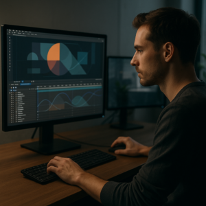
Motion design for creators is no longer optional. If you edit in After Effects for YouTube, shorts, TikTok, brand content, or client work, animation is part of your toolkit. This guide focuses on practical workflows, content creator animation tips, and template-based strategies you can apply immediately in your projects.Explore motion template plans
📋 Table of Contents
What Motion Design for Creators Really Means
Motion design for creators is the craft of using animation, typography, shapes, and video to communicate ideas in a clear, engaging way. For editors and content creators working in After Effects, it is the bridge between static assets and dynamic stories that feel alive on any platform.
Instead of focusing only on complex visual effects, creator-focused motion design prioritizes clarity, speed, and audience retention. You are not just animating for the sake of style; you are guiding the viewer through information, emotions, and actions in very few seconds.
Why it matters for creators
- Stronger hooks: Animated titles, callouts, counters, and UI elements help you grab attention in the first three seconds.
- Clear storytelling: Motion is a visual highlighter. It can direct the eye toward what matters most in your frame.
- Brand consistency: Reusable animation systems keep your channel, series, or client assets consistent across dozens of videos.
- Platform expectations: Audiences on short-form platforms are used to kinetic type, subtle camera moves, and UI-style overlays. Static content often feels unfinished.
Who motion design for creators is for
- YouTube creators: Channel intros, lower thirds, subscribe reminders, data visualizations, and lyric-style edits.
- Short-form editors: Reels, TikToks, and Shorts that rely on bold typography, fast transitions, and punchy overlays.
- Brand and agency editors: Social ads, product explainers, and UI-based animations supporting campaigns.
- Music and lyric video artists: Beat-synced text, stylized backgrounds, and visualizers.
Whether you are handling one channel or multiple clients, motion design provides a set of repeatable systems you can build into templates, presets, and reusable compositions so your work becomes faster, more consistent, and easier to scale.
Content Creator Animation Tips and Useful Template Types
Content creator animation tips become most useful when they are tied to specific video formats. Instead of learning random tricks, connect every animation decision to the platform, duration, and viewer intent you are targeting.
Core animation types creators use daily
- Text and title animations: Openers, lower thirds, and captions that introduce topics, speakers, or chapters.
- UI and widget overlays: Phone-style interfaces, social media windows, notifications, and dashboards that help tell product or story details.
- Product and feature highlights: Animations that frame screenshots, app flows, or real products in a dynamic way.
- Lyric and music-driven motion: Beat-synced type and graphic pulses that match the soundtrack.
Template styles that match creator needs
- Minimal UI widgets: Perfect for tutorials, fintech explainers, and tech reviews. For example, a project like the modern finance UI animation style can inspire overlays for dashboards and transactions.
- Social and streaming widgets: Subscriber counters, chat overlays, and video preview frames. A setup similar to the YouTube-inspired widget animation is ideal for creators showcasing channel stats or playlists.
- Map and location animations: Great for travel content and logistics breakdowns. A pack inspired by a map-based widget animation can quickly communicate routes, hotspots, or delivery areas.
- Stylized lyric and music edits: If you create music videos or visualizers, projects like the lyric-based animation sequence show how kinetic typography, gradients, and beats can sync smoothly.
Matching animation style to platform intent
- YouTube long-form: Focus on legible titles, clear lower thirds, and light motion accents that do not distract from narrative.
- Short-form content: Use bold, fast, and simplified elements; big type, chunky shapes, and quick transitions read better on phones.
- Brand and product explainers: Lean into polished UI, controlled easing, and subtle camera movement, similar to app or finance widget animations.
By thinking in terms of reusable motion categories instead of one-off tricks, you create a library mindset. Every new overlay, lyric system, or widget can become part of a growing toolkit you reuse across projects instead of rebuilding from scratch.
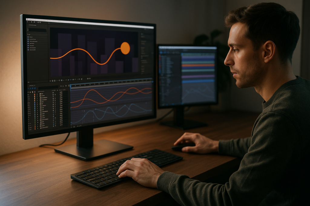
Common Motion Design Mistakes Creators Make in After Effects
Once you start building more motion-heavy edits, certain After Effects habits can slow you down or make your animations feel off. Understanding these pain points early saves you hours in revisions and broken renders.
Frequent technical and creative pitfalls
- Messy compositions: Dozens of unnamed layers, no color labels, and no precomps make projects impossible to revise. You spend more time searching than animating.
- Ignoring timing and rhythm: Keyframes that do not respect the beat or speech cadence lead to motion that feels random, even if the design is good.
- Overusing heavy plugins: Stacking effects and third-party plugins on many layers can kill playback. Your preview becomes a slideshow instead of a real-time experience.
- Poor easing and graph editor use: Default linear keyframes or chaotic Bezier curves result in stiff or inconsistent movement.
- Too much motion blur or glow: Over-cranked blur or glow can muddy text and details, especially on mobile screens.
- No master comp structure: Building everything at the same level instead of nesting assets into logical precomps makes global changes risky.
Checklist to avoid beginner headaches
- Name every layer with purpose: BG Gradient, Main Title, Phone UI Wrapper, etc.
- Use color labels to group roles: text, controls, footage, background, utility layers.
- Build a clear precomp structure: main edit, section comps, reused elements, and control comps.
- Use motion blur sparingly and always test on phone-sized previews.
- Practice consistent easing: adopt a small set of curve shapes you repeat across the project.
- Limit heavy effects to essential hero layers; pre-render or use proxies for complex sequences.
Workflow consequences if you ignore these
- Last-minute changes become risky and time-consuming.
- Clients or collaborators struggle to understand your project layout.
- Renders fail or take far longer than necessary.
- Animations feel inconsistent from clip to clip, hurting brand or channel identity.
As your edits become more ambitious, these workflow fundamentals matter more than any single design trick. Clean projects let you focus on storytelling, not troubleshooting.
Choosing the Right Motion Design Approach for Each Edit
Not every video needs the same intensity or style of motion design. A key part of motion design for creators is learning to dial animation up or down based on format, audience, and message.
Match style to content type
- Social reels and TikToks: Use bold titles, quick reveals, and looping backgrounds. Keep animation beats aligned tightly with cuts or music. Avoid small details that will not read on a phone.
- YouTube education and commentary: Prioritize legibility. Lower thirds, callout boxes, and simple transitions are enough to support clarity. Use motion mainly to emphasize key ideas.
- Ads and product promos: Aim for polished, brand-aligned design. UI widgets, animated screenshots, and clean typography should feel intentional and minimal rather than hyperactive.
- Cinematic edits or music pieces: Lean into smooth camera moves, light leaks, lyric motion, and stylized backgrounds, but keep typography aligned with mood and pacing.
- Corporate explainers: Use restrained movement, clear infographics, and consistent icon animation. Reliability and clarity matter more than experimental style.
Using templates as creative starting points
Templates are most powerful when treated as modular building blocks, not rigid final products. You can combine a UI widget pack with a music-visualizer style background or pair minimal titles with more experimental lyric sections, just as you might with a stylized project like the music-inspired animation sequence.
Balancing originality and speed
- Choose a core visual language (colors, fonts, motion curves) and stick to it across all sections.
- Adapt template layouts to your framing: resize for vertical, square, or horizontal output before heavy animation work.
- Use animations to clarify message hierarchy: primary info moves first, secondary info follows, background elements stay subtle.
Learning from creator platforms
Study how leading channels and educators use motion design. Platforms like YouTube Creators often feature examples of intros, explainers, and branded motion systems that keep things consistent across dozens of videos.
Once you understand how motion supports different formats, it becomes easier to decide when to keep it minimal and when to push for more expressive, complex animation in your edits.Get faster with ready-made motion
Template-Driven Motion Design Workflow in After Effects
Building a reliable motion workflow around templates is one of the most effective ways to scale as a creator. Instead of starting from a blank comp, you begin from a proven structure and customize it to your story, brand, or client.
Check your After Effects version and project settings
- Confirm your After Effects version matches or exceeds the template requirement.
- Set your frame rate to match delivery (often 23.976, 24, 25, or 30 fps). Changing fps mid-project can break timing.
- Decide on resolution and aspect ratio early: 1920×1080 for horizontal, 1080×1920 for vertical, or 1080×1080 for square.
- Use a master comp for each format and nest content inside, so you can adapt a design to multiple outputs.
Organize keyframes, precomps, and naming conventions
- Name main comps with roles: YOUTUBE_MAIN_EDIT, REEL_VERSION, INTRO_PACK, etc.
- Create control comps for colors, typography, and global timing. Use simple shape layers and expressions-sliders if provided by the template.
- Keep controllers at the top of the timeline for fast access and color-label them consistently.
- Use precomps to separate backgrounds, text, UI overlays, and effects. This makes it easier to reuse components across projects.
Performance tips for smoother previews
- Lower preview resolution to Half or Quarter when blocking animation.
- Enable only necessary layers and solo critical elements when fine-tuning motion.
- Use proxies or pre-render heavy parts of the animation, particularly sequences with many effects or 3D layers.
- Keep your disk cache healthy: purge periodically if playback becomes unstable.
Plugin dependencies and safer alternatives
- Before committing to a template, check if it requires paid plugins. If so, ensure you own them or there is a fallback setup.
- Prefer templates that rely on native After Effects tools or provide alternative versions without heavy plugins.
- If a specific effect is not critical, you can often replace it with a simpler built-in effect or subtle gradient and blur.
Customization workflow for creators
Think of each template as a set of lanes: colors, typography, motion, and content. Move through them systematically rather than making random tweaks.
- Colors: Change global color controls first so every element updates at once. Match brand palettes or channel identity.
- Typography: Swap fonts and set a hierarchy: large title, medium subtitle, small detail. Test legibility on small screens early.
- Transitions: Use consistent transition types across the edit: wipes, slides, or quick cuts. Avoid mixing too many transition families.
- Timing: Adjust in/out points and keyframes to match voiceover, music beats, or talking head emphasis.
- Content blocks: Replace placeholder footage, screenshots, or icons with your actual assets, ensuring resolution and aspect ratios fit the design.
Use cases across your content mix
- Reels and Shorts: Rapid-fire subtitles, bold widgets, and minimal background animation. A playful setup inspired by a widget-style project like the colorful app widget animation can work well here.
- Ads and product promos: Use clean UI templates and feature callouts. Review motion pacing against your script to avoid overwhelming viewers.
- Educational series: Build a repeatable intro, lower third, and transition system. This can come from a single master project that you duplicate for each episode.
- Music or lyric edits: Use layered type and background motion similar to lyric-focused sequences like beat-synced text animations, adjusting timing to your track.
Practical checklist before export
- Verify fonts are licensed and embedded correctly.
- Check all color controls and ensure no placeholder brand colors remain.
- Preview the entire sequence at normal speed at least once in Full resolution.
- Test audio sync at the start, middle, and end of the piece.
- Render a short test section for phone review, especially for vertical content.
A consistent, template-first mindset keeps your animations on-brief, easy to revise, and adaptable across the mix of formats most creators handle every week.
Advanced Motion Design Systems and Long Term Workflow
Once your basic workflow is solid, motion design for creators becomes about building systems. Instead of one-off animations, you maintain reusable sets of comps, transitions, and effects that carry across content, channels, and clients.
Build styleframes and reusable systems
- Create a small library of styleframes that define your look: background textures, type layouts, overlay positions, and color grading.
- Turn frequently used elements into master comps you can import into any new project.
- Use simple expression controls on master comps so you can adjust color, stroke width, or animation speed from a single place.
Modular transitions and overlays
- Design transitions as short, standalone comps that can be dropped between any two scenes.
- Group overlays (titles, counters, widgets) into a single folder structure in your project panel to make reuse fast.
- Consider building variations of the same transition (fast, medium, slow) to match different pacing needs.
Quality control for large edit batches
- Set up checklists for color, fonts, safe margins, and motion intensity before final export.
- Review several episodes or videos side by side to confirm consistent styles.
- When working on ongoing content, periodically refine your systems; remove outdated elements, update fonts, and adjust motion curves.
Export considerations and render queue basics
- Use lossless or visually lossless mezzanine codecs when sending files to other apps or editors.
- Organize multiple output modules for different platforms (e.g., one for YouTube, another for social cutdowns).
- Batch render overnight when possible so preview performance stays smooth during working hours.
Dynamic link and project weight
- Use dynamic link with editing apps only when necessary; for heavier motion work, pre-render final segments to keep timelines responsive.
- Periodically consolidate and reduce project size by removing unused footage or pre-renders.
- Archive stable versions of large motion systems so you can revert if a new experiment breaks your layout.
Scaling motion design across a content slate
When your systems are ready, you can apply them across different styles, from subtle UI-based explainer work to more stylized sequences similar to the fluid abstract animation look. The key is to keep a consistent motion language while adapting details to each project.
A well-structured, system-based approach lets you deliver more videos with less friction and more consistent visual quality.
Long Tail Motion Design and After Effects Questions Creators Ask
Editors and creators who lean into motion design quickly encounter more specific questions. Addressing these long tail topics helps you refine your process without getting lost in endless technical rabbit holes.
Common search-style questions
- How much motion is too much for short videos? If the text becomes hard to read or the main subject gets overshadowed, you have gone too far. Use motion to support the story, not compete with it.
- Should I design for horizontal or vertical first? Design for the format that will generate the most watch time. If you split evenly, design horizontally, then adapt to vertical with safe margins and adjusted typography.
- What is the best fps for social motion graphics? 24 or 25 fps works for most cinematic content; 30 fps can feel slightly crisper for UI and gameplay overlays. Keep it consistent across your workflow.
- How do I keep my motion design on-brand? Define a fixed set of colors, fonts, and easing curves. Save them as presets or control comps so they stay the same every time you start a project.
- Can I reuse the same animations across series? Yes, and you should. Reusing a signature intro, lower third, or widget system makes your channel or client work more recognizable and faster to deliver.
- How do I make lyric-style edits without overcomplicating? Start with one text style and a simple background animation. Only after timing is solid should you add secondary flourishes like background particles or secondary type.
Using motion design across niches
- Gaming creators: UI widgets, damage counters, and score callouts similar to compact HUD systems, like those seen in stylized game widgets or overlays.
- Finance and crypto: Clean widgets for charts, balances, and transactions, echoing the structure of modern UI dashboards or token price panels.
- Productivity and tools channels: Screen replacements, app walkthroughs, and widget-style summaries that highlight key steps or tips.
When you treat these questions as prompts to refine your system instead of distractions, you build a workflow that feels tailored to your audience, niche, and content schedule.
From Motion Concepts to a Sustainable Creator Workflow
Motion design for creators becomes truly valuable when it slots cleanly into your editing routine. The goal is not to spend endless hours tweaking keyframes but to deliver clear, engaging videos on a predictable schedule.
Across this guide, you have seen how fundamentals, smart template use, and system-based thinking can keep your projects tidy while giving you room to experiment. Combine strong timing, consistent easing, and organized comps with a reusable library of animations, and your content gains a recognizable style that is easy to maintain.
Applied well, motion design means faster turnarounds, cleaner edits, and more focus on story and strategy instead of low-level technical fixes. Whether you are handling a single channel or client roster worldwide, a structured motion workflow is one of the best investments you can make in your creative process.
Take a moment to review your current projects, identify one area to systemize this week, and build from there. Small workflow improvements compound quickly when you are shipping content regularly.
Start building your motion system
Conclusions
Motion design for creators is less about flashy tricks and more about clear, consistent systems. With solid fundamentals, clean projects, and smart template use, you can animate faster, maintain quality across formats, and support your stories with motion that feels intentional and professional.
FAQ
What is motion design for creators in simple terms?
It is using animation, text, and graphics in tools like After Effects to support your story, clarify information, and keep viewers engaged on any platform.
Do I need advanced After Effects skills to use motion templates?
No. Most templates are built for beginners and intermediates. If you can replace text, swap footage, and adjust basic keyframes, you can use them effectively.
How can I keep my motion design consistent across many videos?
Create a small system of reusable comps for intros, lower thirds, and transitions, and control colors and fonts from a central settings or control comp.
What frame rate should creators use for motion graphics?
24 or 25 fps feels cinematic and is common for YouTube and narrative pieces, while 30 fps can work well for crisp UI, tutorials, and fast social content.
How do I avoid overcomplicating my motion graphics?
Limit yourself to a small set of colors, fonts, and easing curves. Keep backgrounds simple and use motion only to highlight the most important on-screen elements.
Are motion graphics important for short form vertical content?
Yes. Clean titles, captions, and overlays help viewers understand your message quickly and can significantly improve watch time on reels, Shorts, and TikToks.