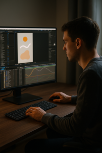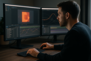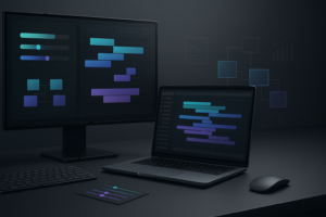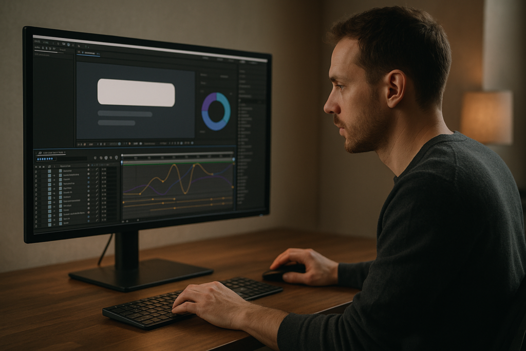
Widget animation sits right between UI design and motion graphics, and After Effects is the perfect place where both meet. Whether you edit for clients, your own apps, or YouTube breakdowns, mastering app widget animation gives your work clarity, polish, and consistency across an entire project.Explore widget-ready templates
📋 Table of Contents
Understanding Widget Animation in After Effects
What is widget animation
When we talk about how to animate widgets in After Effects, we mean giving life to interface components such as cards, mini dashboards, music players, map previews, or notification panels. These elements often live inside apps, mobile UIs, or HUD-style overlays in edits.
Why widget motion matters
For editors and motion designers, well-animated widgets:
- Make complex information readable in a few seconds.
- Guide the viewer’s eye to what matters most.
- Add perceived production value to even simple edits.
- Create a consistent “visual language” across your whole video.
Who this is for
This guide is aimed at:
- Editors who need fast, repeatable widget looks for reels, shorts, and ads.
- Motion designers building UI-based explainer animations.
- Creators who showcase apps, dashboards, or social widgets in YouTube content.
Core principles of widget motion
Before going deep into app widget animation, keep three principles in mind:
- Clarity over flair: The viewer must read and understand the information first, then enjoy the animation.
- Structure: Build widgets in layers and groups that are easy to edit later (icons, labels, backgrounds, charts).
- Consistency: Reuse easing, timing, and transitions so every widget feels like it belongs to the same system.
Once you understand these basics, you can start exploring different widget types and motion strategies without breaking your edit’s visual logic.
Types of App Widget Animation and When to Use Them
Common widget types
In real projects you will usually animate a handful of recurring widget families:
- Status widgets: battery, signal, progress, or loading blocks.
- Media widgets: music players, mini video previews, streaming overlays.
- Utility widgets: maps, booking cards, finance tiles, delivery status.
- Social and content widgets: post previews, comments, likes, subscribers.
Studying existing examples can speed up your learning. For instance, animating a battery status block is similar to a mini progress bar; you can see this logic in a dedicated project like battery widget layouts.
Layer-based motion vs. layout-based motion
App widget animation usually falls into two categories:
- Layer-based motion: Icons, text, and buttons move subtly while the widget frame stays mostly static. Ideal for overlays in music videos or lyric edits such as stylized cards similar in structure to a lyrics widget style.
- Layout-based motion: The entire widget slides, scales, stacks, or flips in 3D space. Perfect for UI explainers and product walk-throughs.
Choosing animation styles by use case
- Explainer or product videos: Use clear in/out transitions, small parallax, and hover-like micro-interactions.
- Music videos and edits: Go for rhythmic cuts, opacity flickers, and synced moves like in interfaces similar to a dynamic video platform widget card.
- App promos and tech ads: Combine both widget-level micro motion and screen-level layout animation so the viewer understands the app quickly.
Comparing hand-built vs. template-based widgets
You can build every widget from scratch, but templates help when:
- You are on tight deadlines and need multiple variations fast.
- You edit content weekly and want a consistent style.
- You are still learning how to time UI motion and want solid reference projects.
The rest of this guide will help whether you start in a blank comp or adapt an existing widget preset.
Common Widget Animation Mistakes and How to Avoid Them
Timing issues
Many editors keyframe everything at the same time: icons, background, text, and accents all pop in on a single frame. This makes widgets feel rigid and cheap.
- Stagger keyframes by 2–4 frames between elements.
- Use different durations for main vs. secondary elements (e.g., background 10 frames, text 8 frames, icon 6 frames).
- Follow a “lead” element (usually the card/background) and let other parts react.
Poor easing and Graph Editor misuse
Dropped-in Easy Ease without refinement often produces generic, floaty motion.
- Avoid extreme speed curves that cause elements to snap in unnaturally.
- Use the Graph Editor to create a quick start and gentle stop for functional UI, and more aggressive curves for stylized music edits.
- Keep easing presets documented so all widgets feel related.
Messy compositions
Widget setups can easily become unmanageable:
- Layers named “Shape Layer 32” bury key elements.
- Icons and labels spread across the main timeline make revisions painful.
To avoid this:
- Name layers clearly: wdg-bg, wdg-icon, wdg-label, wdg-chart.
- Precomp complex groups like charts or lists.
- Color-label related layers so you can visually parse the stack quickly.
Overusing blur and glow
Excessive motion blur or glow destroys widget legibility.
- Use motion blur only on larger movements; keep micro interactions sharp.
- Check readability at 25% zoom or on a phone screen.
- Avoid stacking glow on text; it reduces clarity.
Heavy plugins and slow previews
Throwing plugins on every element can kill performance.
- Limit complex effects to precomps and apply them once.
- Cache previews, and use lower preview resolutions when blocking out timing.
- Reserve stylistic effects for final passes rather than during layout exploration.
Lack of hierarchy
When all elements move equally, viewers do not know where to look.
- Assign roles: primary (title, main number), secondary (labels, icons), background (card, decor).
- Animate primary elements first and with the clearest motion; keep others subtle.
Fixing these problems early leads to cleaner, more professional widget animation and easier revisions later.
Choosing the Right Widget Animation Approach for Each Project
Start from the edit’s purpose
Before animating, define why the widget exists in your video:
- Social reels and shorts: Quick impact, bold moves, minimal detail.
- Performance ads: Clear benefits, feature highlights, short attention spans.
- YouTube explainers: Slower pacing, layered info, multiple states of the widget.
- Corporate or product demos: Clean, conservative motion and easy-to-read text.
Choosing motion language per format
- Vertical content: Stack widgets, use vertical slide-ins, and design for thumb-zone visibility.
- Horizontal content: Use side-by-side widgets and parallax between foreground UI and background footage.
- Mixed platforms: Build master widgets in 4K or 1080p, then precomp and reframe for vertical or square exports.
Using inspiration boards and references
Maintaining a reference folder of UI animations or app previews helps maintain consistency. Browse design communities like Dribbble for layout and motion ideas, then adapt them to your own timing and ease curves.
When templates make sense
Templates are especially useful when:
- You need many widget variations with a shared style.
- You handle ongoing content for a product or channel.
- You want to focus more on storytelling and less on rebuilding UI from scratch.
Subscribing to an Unlimited After Effects Templates Subscription gives you a library of ready-built widget systems you can customize, rather than recreating the same structure for every project.
Examples by niche
For a map or logistics-related sequence, a structure similar to a map-style widget animation can be adapted to show routes, delivery status, or pickup points. For more tech or finance content, a card-based widget that tracks values over time can keep your visuals neat and on-brand.
By matching animation style, pacing, and complexity to each edit’s purpose, you avoid over-designing simple videos and under-delivering on critical product demos.Choose your widget toolkit
Practical Workflow for Animating Widgets with Templates
Planning and setup
Before dropping anything onto the timeline, answer:
- What data does the widget show? (song title, price, user name, route time)
- Where will it live? (corner overlay, full-screen, split-screen)
- How long is it visible? (quick flash vs. full sequence)
Lock these decisions, then create a dedicated composition for the widget. Keep it separate from the main edit until the animation is ready.
Check After Effects version and project settings
When working with digital templates:
- Confirm the template’s minimum After Effects version.
- Match frame rate to your edit: 24, 25, 30, or 60 fps. Changing fps later can break carefully tuned easing.
- Set resolution based on output: 1920×1080, 4K, or vertical 1080×1920. For flexible use, design at 4K and scale down.
Organizing layers, precomps, and naming
A clean structure saves hours:
- Create separate precomps: wdg_background, wdg_content, wdg_icons, wdg_overlay.
- Use naming like title_main, subtitle_info, icon_play, icon_like.
- Color-label each group consistently (e.g., all typography blue, icons yellow).
Adapting a ready-made project, such as a mini music player or UI block similar in philosophy to a music widget-style animation, will show you how professional precomp structures are set up.
Performance tips for smoother widget work
- Use Draft 3D and lower preview resolution while blocking timing.
- Solo one widget at a time if your timeline has multiple overlays.
- Disable heavy effects until final polish.
- Use region of interest when tweaking micro-interactions.
Managing plugin dependencies
Templates may rely on plugins for effects or transitions:
- Always check included documentation for required plugins.
- If a plugin is missing, replace it with built-in effects: glow with basic blur + add, complex transitions with opacity + blur + position.
- Avoid stacking multiple third-party effects on each layer; precomp and apply once where possible.
Customizing colors and typography
Most widget templates expose global controls:
- Use control layers (often named CONTROLS or COLOR) to change brand colors.
- Limit yourself to 1–2 main colors plus 1 accent color to keep UI clean.
- Swap fonts for your brand typeface and adjust leading/tracking to maintain readability.
Tuning transitions and timing
Think in states:
- State 1: Widget off-screen or minimized.
- State 2: Entry animation and main display.
- State 3: Micro-interactions while on-screen (hover, tap, progress change).
- State 4: Exit or handoff to the next shot.
Use short, snappy transitions for social edits and slightly longer for explainers. Small offsets between elements (2–3 frames) help the widget feel responsive instead of robotic.
Use cases and layout variations
- Reels and shorts: Single card widgets, big type, fast in/out. Great for call-to-action cards or music overlays.
- Ads and promos: Multi-step widgets showing a process: search, select, confirm (e.g., booking or delivery flows).
- Product demos: Multiple states of the same widget crossfaded or cut together to show different features in one shot.
- Cinematic edits: Subtle, almost HUD-like overlays with restrained easing and minimal color, complementing the footage.
Practical checklist before dropping into the main edit
- Are all layers named clearly?
- Are keyframes organized and aligned to beats or edit cuts?
- Are global controls set for consistent color and type?
- Are heavy effects precomped and minimized?
- Is timing tested at final fps and resolution?
Once this checklist is green, nest the widget comp into your main sequence, then adjust its scale and position to fit the shot.
Advanced Widget Systems and Long-Term Workflow Optimization
Designing reusable widget systems
Instead of building one-off animations, think in systems:
- Create a “master widget” comp with neutral text and generic icons.
- Duplicate it for variations: stats, media, navigation, notifications.
- Link colors and spacing with expression controls to update many widgets at once.
Watching how a full widget family behaves in a project, such as multiple utility cards akin to a multi-state widget pack concept, can inspire how you design your own system.
Maintaining consistency across an entire edit
- Write down timing rules: default in/out duration, standard delays, and easing style.
- Stick to one or two entry patterns (e.g., slide + fade, scale + fade).
- Use the same corner radius, shadow softness, and spacing grid across all widgets.
Styleframes and approvals
Before animating dozens of instances:
- Create static styleframes showing each widget type.
- Get approval on layout, color, and label density.
- Only then invest time in detailed animation and micro-interactions.
Keeping projects lightweight
Large widget-heavy timelines can get slow:
- Keep each widget in its own precomp; avoid building entire app screens in one comp.
- Use proxies for background footage when previewing UI overlays.
- Archive old versions in a separate folder to keep the active project lean.
Export and render considerations
Widget motion often contains fine lines and small text. To protect quality:
- Render at a slightly higher bitrate than footage-only projects.
- Avoid excessive downscaling in your NLE; keep 1:1 or clean scale factors.
- Check sharpness on an actual phone and desktop screen, not just the AE viewport.
Dynamic Link and round-tripping tips
If you send widget comps to your editing software via dynamic link:
- Lock widget versions before heavy grading; UI can shift badly with extreme color corrections.
- When possible, grade footage first, then overlay neutral widgets.
- If things get unstable, render critical widget sequences as lossless or mezzanine files.
Quality control before delivery
- Scrub through the timeline and watch each widget in isolation, then in context.
- Check motion at 0.5x speed to catch unwanted bounces or pops.
- Confirm no text gets cut off or overlaps when localized or changed late.
- Keep a final checklist so every export meets the same standard.
Building organized systems, not one-off widgets, keeps your workload manageable even as projects scale up and timelines fill with UI overlays.
Widget Animation Questions Editors Often Search For
Key search intents around widget animation
- “How do I animate a Spotify-style widget in After Effects?”
Build a rounded card with album art, text, and controls in shape layers. Animate background scale and opacity first, then slide in text and icons with short offsets. Sync micro movements to the beat. - “Best way to animate map or location widgets?”
Design the map as a simplified vector or pre-rendered image. Animate pins, routes, and zoom using position and scale on precomps. Keep motion subtle to avoid distracting from the main footage. - “How can I loop app widget animation for reels?”
Use seamless loops: for example, a progress bar that fills and empties or a carousel that cycles cards. Align the first and last frames so there is no visible cut when looping. - “How do I sync widget animation to music?”
Mark beats on the timeline with layer markers. Anchor major widget moves (entry, state changes, exit) to those markers; then add smaller micro-interactions on subdivisions between beats. - “What is the easiest way to keep multiple widgets on-brand?”
Centralize brand colors, typography, and easing curves. Use control layers or master comps so changing one setting updates all instances. - “How do I make widget animation look more cinematic and less like a screen recording?”
Use depth: parallax between widget and background, subtle camera moves, and gentle bloom or softening on background only. Keep widget motion minimal and precise.
Focusing your workflow on these typical questions helps you build a repeatable process that answers client and viewer expectations before they even ask.
Bringing It All Together for Better Widget Animations
Key takeaways
Effective widget animation in After Effects comes from clear structure, consistent timing, and a system mindset. You start by understanding what the widget must communicate, then build organized comps with clean naming, reusable easing, and flexible controls. From there, you refine micro-interactions and adapt pacing to each platform and format.
Why this matters for your workflow
When your widgets are built as a coherent system instead of one-off layers, you:
- Edit faster under tight deadlines.
- Keep branding locked in across dozens of shots.
- Spend more time telling stories and less time fixing messy comps.
Next steps
Test-drive these principles on a small sequence first: design one master widget, animate its main states, and drop it into three different edits (reel, YouTube, and ad). Once your system feels solid, scale it across your full projects and gradually expand your library of reusable UI blocks.
If you want to speed up that process, an Unlimited After Effects Templates Subscription can give you a ready-made base of widget comps to customize instead of starting from a blank timeline every time.Start animating smarter
Conclusions
Clean, purposeful widget animation can quietly carry an entire edit. By focusing on structure, consistency, and reusable systems in After Effects, you deliver UI overlays that look polished, are simple to manage, and adapt to any platform or client brief.
FAQ
What is the best way to start animating widgets in After Effects?
Begin with a simple card widget: design a background, title, subtitle, and icon. Animate the background first, then stagger text and icons with basic position and opacity keyframes before refining easing.
How many keyframes should I use for a simple app widget animation?
For a basic entry, you usually need 2–4 keyframes per property. Focus on position and opacity first, then add scale or rotation if needed. Fewer, well-tuned keyframes are better than many messy ones.
How do I keep widget animations consistent across multiple videos?
Create a master widget composition and define rules for timing, easing, colors, and typography. Reuse this master in new projects, and update global controls instead of rebuilding from scratch.
Do I need plugins for professional widget animations?
No. Most professional widget motion uses native shape layers, masks, and text. Plugins can add style, but your core layout, timing, and easing should work with built-in tools first.
What frame rate is best for UI and widget animation?
24 or 25 fps works well for cinematic edits, while 30 fps is common for web and social content. Choose the frame rate of your final delivery and design all easing and timing around that choice.
How can I make small widget text stay readable in exports?
Keep font sizes generous, avoid heavy glows, and use strong contrast between text and background. Render at a solid bitrate, then test the final file on a phone and desktop to check legibility.