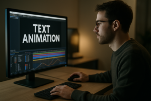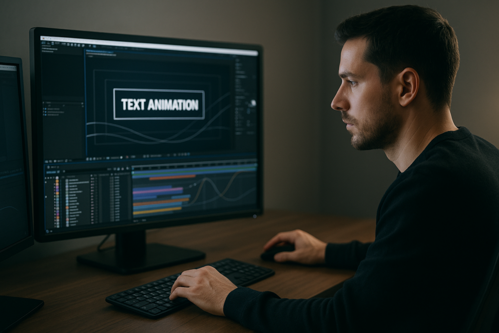
Professional text animation examples are one of the fastest ways to upgrade any edit, from YouTube explainers to high-end campaigns. By studying polished type motion, you can build a repeatable workflow in After Effects that feels intentional instead of random keyframing.Browse AE text presets
📋 Table of Contents
What Professional Text Animation Really Means
Professional text animation examples are more than flashy presets. They are deliberate motion choices that guide attention, support the message, and feel unified with the edit’s pacing, sound, and design.
When editors and motion designers talk about “professional” text animation, they usually mean three things:
- Clarity – the text is easy to read on any device and at any speed.
- Purpose – the animation supports the story instead of distracting from it.
- Consistency – titles, lower thirds, and captions share the same motion logic.
In After Effects, this often shows up as clean easing, subtle overshoot, and animations that respect the frame’s hierarchy. For example, a main title might have a slightly slower, more weighted entrance than a small label or UI tag, but both follow the same core motion rules.
These examples matter for:
- Video editors who want titles that feel better than stock NLE presets.
- Motion designers building modular systems for recurring content.
- Content creators trying to make text-led content (lyrics, educational, UI demos) feel premium.
Even basic moves like fades, slides, and scales become professional when timing, spacing, and typography are handled with intention. The best text motion often looks simple, but it survives frame-by-frame scrutiny.
Finding Text Motion Inspiration That Matches Your Edit
Text motion inspiration is everywhere, but what matters is finding references that match your project’s format, brand, and pacing. Randomly copying a kinetic typography piece onto a quiet corporate video rarely works.
Useful inspiration sources include:
- UI-style widgets – sleek, minimal motion like map pins, payments, and social stats. Collections similar to a location widget animation are great for utility labels and overlays.
- Music-driven edits – lyric and visualizer projects such as a dynamic rap lyrics layout show how text can lock to beats and rhythms.
- Product and finance overlays – think payment, banking, or trading UI. Motion like a clean payment card widget can inspire how you animate prices, CTAs, and stats.
When collecting professional text animation examples, organize them by use case rather than style:
- Hero titles and openers
- Lower thirds and identifiers
- Captions and karaoke-style lyrics
- Stats, numbers, and UI labels
- Notifications, toasts, and tooltips
For template-based workflows, it also helps to study complete packs, not just single shots. Browsing collections of video templates, such as those categorized at motion design video libraries, shows how one motion language scales across many screens and formats.
Tag your favorite examples with notes like “fast bounce for TikTok,” “soft ease for corporate,” or “elastic tags for gaming overlays.” These notes speed up style matching when a new brief lands.
Common Text Animation Mistakes in After Effects
Even strong designers fall into habits that make text animation feel cheap or unfinished. Knowing the common traps lets you avoid them before rendering.
Checklist of frequent issues
- Messy timing – text pops on and off with no anticipation or overlap; everything starts and ends at the exact same frame.
- No easing or bad easing – linear keyframes, or extreme influence values that create awkward pauses and snaps.
- Overusing scale – constant pop-in scaling from 0 to 100% that feels like a slideshow, not motion design.
- Inconsistent directions – one lower third slides from the left, the next from the right, without narrative reason.
- Ignoring motion blur – either forgotten entirely or cranked so high that small text becomes smeared and unreadable.
- Dirty comps – unlabeled layers, missing precomps for reusable elements, random anchor points.
- Heavy plugins – stacking multiple stylization plugins for every text element, causing lag and preview frustration.
Consequences in real workflows
- Clients sense something feels “off” even if they cannot name it.
- Changes become painful because you are hunting for keyframes across many layers.
- Renders slow down, especially for text-heavy edits like lyric videos or UI explainers.
- Scaling a look across 20+ deliverables becomes nearly impossible.
How to avoid them
- Use the Graph Editor to normalize your easing curve and reuse it across shots.
- Limit your main entrance types to a few families: slide, fade, mask reveal, and subtle scale.
- Precomp repeating elements like name bars or tags, and drive variation via text source only.
- Test legibility at 50% scale in the viewport to simulate mobile views.
- Keep plugins for finishing touches, not core motion. If a look dies without plugins, the base animation needs work.
Spot these problems in your current projects, fix them once, and your next set of professional text animation examples will already look cleaner.
Choosing the Right Text Animation Style for Each Edit
Different edits call for different motion languages. A single “cool” animation will not work for every format. Choosing well up front saves hours of rework later.
Social reels and shorts
- Use snappy, high-contrast moves that survive small screens.
- Favor bold typography with quick reveals synced to beats or cuts.
- Think about meme captions, big numbers, and punchy hooks.
YouTube explainers and tutorials
- Keep motion helpful and unobtrusive: labels, step numbers, and chapter titles.
- Match lower thirds and highlight boxes to your on-screen UI, similar to how a clean channel widget animation guides attention without noise.
- Prioritize readability over complex transitions.
Paid ads and product promos
- Lead with benefit-based headlines that animate confidently but not aggressively.
- Use simple slide or mask reveals for key lines and reserve more complex motion for hero shots.
- Ensure branding, colors, and fonts stay consistent across aspect ratios.
Corporate, fintech, and utility content
- Favor minimal, precise motion with micro easing and subtle overshoot.
- Study UI-heavy pieces like a refined finance dashboard animation to see how clean type motion can still feel dynamic.
- Avoid gimmicks like huge bounces or elastic text unless they have a clear narrative purpose.
Where templates and subscriptions fit
When deadlines are tight or content volume is high, pre-built text systems or an Unlimited After Effects Templates Subscription can give you a cohesive starting point: you select a style that fits the project type, then customize colors, fonts, and pacing instead of building from scratch.
Many designers also keep curated external moodboards for motion language. Platforms like Behance are useful for spotting how top studios approach text across campaigns, not just in one-off shots.
Whichever path you choose—manual builds or template-driven—commit to one motion language per project, adjust it to each format, and document your choices for the team.See motion-ready text systems
Building a Template-Driven Text Animation Workflow
Professional text animation examples become most valuable when you turn them into repeatable systems. Templates are not shortcuts for beginners only; they are frameworks you can refine and scale across campaigns.
Template basics and compatibility
- Check the minimum After Effects version and whether the project uses the Classic 3D or newer rendering engines.
- Confirm default settings: resolution (1080p, 4K, vertical, square), frame rate (23.976, 25, 30), and color space.
- If you work across regions, standardize one base fps and adjust imports/exports to avoid timing drift.
Project structure, precomps, and naming
- Keep a master comp naming pattern like TX_MainTitle_01, TX_LowerThird_Name01, etc.
- Precompose recurring systems: name bar, title block, subtitles, button labels.
- Group controllers (colors, fonts, timing sliders) in a clearly named control layer or separate adjustment comp.
Keyframe organization and timing logic
- Store your favorite ease curves and animation presets; reuse them across titles, not just once.
- Align text entrances to beats, cuts, or VO phrases; avoid random timing that ignores audio.
- Use staggered layer offsets for multi-line text instead of separate, hand-timed curves on each line.
Performance and preview tips
- Work in half or third resolution while blocking motion, only switching to full for final checks.
- Lower preview fps temporarily to judge easing without waiting for full RAM previews.
- Use proxies for heavy footage so the focus stays on evaluating motion, not render times.
Plugin dependencies and safe alternatives
- Check which effects require third-party plugins and which are native to After Effects.
- Prefer native tools for core reveals (masks, track mattes, simple blurs) and reserve plugins for finishing.
- If a template uses a plugin you do not have, see whether simple adjustments with native tools can approximate the look.
Customization workflow
Start every imported text template by standardizing its voice to your project:
- Set global color controls to match your brand palette.
- Update fonts and tracking to your typography guidelines.
- Adjust in/out timing so each screen has enough reading time for your audience.
Think of a lyric or hook-based project—something in the spirit of a music-led animation like high-energy track visuals. You can repurpose that pacing logic for bold, text-heavy hooks in social ads by:
- Reducing visual clutter around the type.
- Shortening individual word animations for snappier reads.
- Aligning key impacts with bass hits or edit points.
Use cases and checklists
For reels and shorts:
- One hero style for hooks, one for subtitles, and one for callouts.
- Vertical-safe margins so text never touches screen edges.
- High-contrast color choices tested against busy footage.
For ads and promos:
- Consistent headline motion across storyboards.
- Reused lower thirds for product names and benefits.
- Quick variants of the same template for different lengths (6s, 15s, 30s).
For cinematic and narrative edits:
- Slower, more subtle moves with generous easing.
- Titles that interact with footage depth using simple masks and parallax.
- Limited palette of motion so credits and chapter cards all feel related.
Over time, your library of text templates—plus your tweaks—becomes a personal system. You can swap styling, adapt pacing, and still keep the underlying motion language stable across projects, whether you work solo or with a team.
Advanced Systems for Consistent Text Motion
Once the basics are set, the next step is making your text animation scale across full edits, seasons, or channels without constant manual fixes.
Reusable animation systems
- Create master comps that store your primary text motions: hero title, lower third, caption, stat callout.
- Expose only meaningful controls to editors: color, font size, line spacing, and timing offsets.
- Use expressions where helpful (e.g., staggered delays) but keep them documented directly on the layer.
Styleframes and motion references
- Design a few static frames that show key type styles in context: normal, hovered, and selected states.
- Pair each styleframe with a short animated example so collaborators understand motion expectations.
- Keep both in a single reference comp so they travel with the project.
Modular transitions between text states
- Build short transition modules: between title and subtitle, between two stats, between chapter cards.
- Reuse the same transition modules for consistency; only change content.
- Consider subtle camera moves, opacity fades, and directional blur instead of complex morphs.
Quality control passes
- Do a silent pass to check pacing alone; then a sound-on pass to evaluate sync.
- Check for widows/orphans in multiline text and adjust tracking or line breaks as needed.
- Make sure motion blur is consistent across all text comps and matches your shutter settings.
Export and delivery considerations
- Render short test segments from the render queue before committing to a full-length export.
- Choose codecs that preserve sharp type (e.g., high-bitrate H.264 or ProRes family) depending on delivery.
- When using dynamic link to an NLE, avoid stacking heavy effects in the same comp as text; consider pre-rendered overlays.
Keeping projects lightweight
- Archive unused comps and layers into a separate folder so the main structure stays lean.
- Use simple solids and shapes for backgrounds rather than imported high-res graphics when possible.
- Periodically purge unused cache and consolidate footage to maintain predictable performance.
These advanced habits help you maintain that “studio-level” feel across entire campaigns. Your professional text animation examples stay sharp from first draft to final master, even when timelines shrink or feedback rounds grow.
Search-Driven Ideas Around Professional Text Animation
Editors and motion designers often search for very specific solutions. Turning those recurring questions into quick strategies gives you a library of ready answers.
- “Professional text animation examples for lyrics” – focus on per-word or per-line reveals, beat-synced highlights, and clear contrast for fast reading.
- “Clean corporate lower third animation” – look for subtle slide or mask reveals, restrained easing, and safe margins to avoid covering logos or faces.
- “Kinetic typography for social ads” – test bold, punchy title systems that can be adapted to many products, similar in spirit to UI-based promos like an app-style content card.
- “Text motion inspiration for gaming overlays” – explore HUD-style labels, kill feeds, and badge animations with slightly exaggerated transitions but clean legibility.
- “After Effects text animation without plugins” – prioritize native tools: position, scale, rotation, opacity, masks, and motion blur, plus the Graph Editor for nuance.
- “Subtitles that do not look boring” – use micro-animations: slight fade and upward drift, color accents on key phrases, and minimal bounce only for emphasis.
- “Matching text to music beats” – map main hits on a duplicate audio layer, then align keyframes or markers to those peaks.
- “Text animation for mobile-first content” – test on a phone; ensure font sizes are large, lines are short, and animations are clear even at 1.25x speed.
As you collect these search-driven prompts, keep a comp library with named examples. Over time, this becomes your personal “answer bank” for recurring client questions and briefs.
Bringing It All Together for Better Text Motion
Professional text animation examples are really about decisions: which motion language, how consistent, and how fast you can apply it across real projects. When you combine good references, clean templates, and solid organization, your titles, lower thirds, and captions start to feel intentional instead of improvised.
Focus first on clarity and pacing, then refine easing, micro-details, and system-wide consistency. Whether you are delivering lyric visuals, corporate explainers, or social campaigns worldwide, the same principles apply: simple, well-structured motion beats complex but inconsistent tricks every time.
If you want a head start, keep building a library of reusable text systems and examples you trust. That way, each new brief becomes a matter of choosing and adapting, not rebuilding from zero.Get consistent text motion
Conclusions
Professional text animation comes from clear intent, not just complex keyframes. By studying strong examples, organizing your templates, and standardizing motion systems, you can ship cleaner edits faster and keep your type motion sharp across every project.
FAQ
What makes a text animation look professional in After Effects?
Professional text animation has clear readability, consistent easing, purposeful timing, and a motion style that supports the story instead of distracting from it.
How can I find good text motion inspiration?
Study title sequences, UI animations, lyric videos, and curated template libraries. Save examples by use case, like hooks, lower thirds, and captions, not just by style.
Do I need plugins for high-quality text animation?
No. Most professional looks come from careful timing, easing, and masks. Plugins are useful for finishing touches but should not replace solid base animation.
How long should text stay on screen in my videos?
Aim for at least 1.5 to 2.5 seconds per short phrase, longer for complex sentences. Always test at typical viewing speeds on a phone or laptop screen.
How do I keep text animation consistent across a whole series?
Build a small system of master text comps with shared easing, typography, and color controls, then reuse and adapt them instead of starting from scratch each time.
Can I adapt one text template to different brands?
Yes. Use the same core motion but swap fonts, colors, and small timing tweaks. Center your system around neutral motion so it works with multiple visual identities.