Viral text animations are no longer just a design flex, they are how music videos, creators and brands grab attention in under three seconds. This guide shows editors and motion designers how to build scroll-stopping typography in After Effects with repeatable workflows, smart presets and template-ready setups that fit real production deadlines.Explore text templates
📋 Table of Contents
What Viral Text Animations Really Are
Defining viral text animation
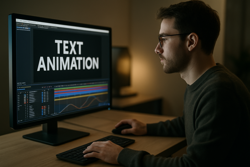
When people talk about “how to create viral text animations”, they usually mean bold, rhythmic typography that instantly communicates a message and feels native to TikTok, Reels, Shorts or lyric videos. It is text that syncs tightly with sound, cuts, and viewer expectations on social platforms.
Key ingredients of viral motion type
- Clarity first: The message stays readable on a small phone screen.
- Rhythm-driven: Text moves with the beat, voiceover or camera cuts.
- Platform-native: The style fits the culture of the app where it is posted.
- Loopable: Animations feel seamless when replayed.
- Template-ready: Easy to reuse for new episodes, tracks or campaigns.
Who this style is for
Viral text animation is useful for:
- Editors cutting short-form video who need fast, polished titles and captions.
- Motion designers building full lyric videos, kinetic typography pieces, or ad packages.
- Creators who want a recognizable text style they can reuse across content.
- Brands and agencies needing a consistent animated type system for campaigns.
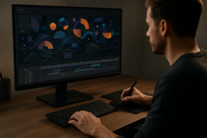
Why it matters in After Effects
After Effects is ideal for viral typography because it gives you fine control over timing, easing, text animators, and expressions. You can build reusable systems instead of keyframing every letter manually, and you can package those systems as templates teams can use worldwide.
Core principles you will reuse
Throughout this guide, almost every technique will circle back to a few fundamentals:
- Designing type for micro-attention (the first one to three seconds).
- Syncing motion to audio peaks and edit points.
- Keeping animations modular so they can be reused and customized.
- Planning for different aspect ratios and resolutions from the start.
Once these principles are clear, you can layer in trends, styles and templates without losing control of the message.
Understanding Viral Typography Trends
What drives viral typography trends
Viral typography trends are shaped by music videos, UI-heavy edits, and creator-led formats. Editors borrow interfaces, lyrics and notification looks, then remix them into kinetic type that feels new but still familiar to viewers.
Common trend families
- Lyrics and caption-heavy videos: Text follows every word of the track or hook, common in music edits similar to the energy of lyrics-focused motion widgets.
- UI and app-inspired type: Typography mimics map pins, chat bubbles or widgets, like layouts inspired by map-style overlays.
- Widget and dashboard aesthetics: Floating cards, stats and sliders that move with the beat, similar to product or finance widgets such as crypto dashboard animations.
- TV and screen-off reveals: Text that appears as if a screen powers on or off, comparable to concepts like TV-inspired lyric transitions.
- Minimal clean tech type: Smooth, glassy titles with subtle distortion and blur, echoing looks you might see in glossy interface-style pieces such as liquid glass motion designs.
Platform-specific expectations
- TikTok and Reels: Bold, fast, meme-aware, often with quick pop-in type and heavy beat sync.
- YouTube Shorts: Slightly more room for storytelling and subtitles; can be cleaner and more legible.
- Long-form YouTube: Section titles, call-outs and lower thirds stay on-screen longer and animate more subtly.
- Ads: Text must be instantly legible, on-brand and optimized for brand recall.
Matching trend to content
Different projects call for different trends:
- Energetic music edits: Fast kinetic type, bouncy easing, bold fonts.
- Tech or fintech content: Card-based UI type, sliders and data-style movements.
- Maps and mobility stories: Geo pins, route labels and pop-up labels, similar to animated pins like those in map widgets.
- Entertainment recaps and playlists: Cover-inspired titles and lower thirds, like compact social players similar to music-themed widgets.
Trends vs. timeless structure
Chasing every new style can break consistency. Instead:
- Lock a core system (font pairing, basic in/out animation, color palette).
- Add trend layers on top (glow, grain, extra bounce, UI chrome) that you can easily swap or remove.
- Package these as reusable presets or templates so you can quickly test which trend performs best without rebuilding from scratch.
By understanding viral typography trends as a set of modular options, you gain speed and creative freedom while keeping your overall look cohesive.
Common After Effects Mistakes That Kill Viral Potential
Rushing timing and ignoring rhythm
One of the biggest issues with how to create viral text animations is timing that feels off. If your text hits slightly before or after the beat or voiceover emphasis, the whole edit feels amateur.
- Use audio waveforms and markers for beats and key words.
- Scrub in small sections and nudge keyframes by a few frames until impact feels right.
- Check timing on both desktop and phone screens, because perception changes with size.
Flat easing and robotic motion
Default linear keyframes create stiff motion. Viral typography usually has punchy overshoot or quick settles.
- Replace linear keys with Easy Ease as a baseline.
- Use the Graph Editor to exaggerate speed in and speed out.
- Keep the motion arc simple and intentional; you do not need complex paths for text.
Overcomplicating text animators
Text animators are powerful but easy to overuse.
- Avoid stacking too many range selectors on one layer.
- Keep separate text layers for different behaviors (scale-in, blur-on, tracking, etc.).
- Precomp complex sequences instead of nesting animators endlessly.
Messy comps and naming
Chaos in the timeline leads to mistakes when revisions hit.
- Name layers like TXT_MAIN_TITLE, TXT_LYRICS_LINE_01, etc.
- Color-label text, controllers and backgrounds differently.
- Group related text into precomps so you can move scenes like building blocks.
Ignoring motion blur and shutter settings
Too much motion blur can make small text unreadable, while none can make animation look cheap.
- Enable motion blur only on fast-moving layers that benefit from it.
- Test different shutter angles for readability.
- Preview on an actual device, not just your monitor.
Heavy plugins and slow previews
Overloading a project with many third-party effects can kill creativity because previews become painful.
- Build a version of your style that uses only native effects when possible.
- Use adjustment layers for overall look instead of repeating effects on each text layer.
- Turn off heavy layers (like glows or particles) during layout and timing passes.
Forgetting aspect ratios and safe zones
Text that looks great in 16:9 might be cropped on vertical feeds.
- Design with safe margins around key text elements.
- Test layouts in vertical, square and landscape comps early.
- Use guides to mark where platform UI might cover your text.
By avoiding these issues, you keep your project lighter, your text clearer, and your animations much easier to adapt into a repeatable style that can actually go viral.
Choosing the Right Approach for Each Edit
Match style to content type
Different deliverables demand different text animation strategies. Instead of forcing one style everywhere, pick an approach that supports the story and platform.
Social reels and TikToks
- Prioritize fast legibility and big type.
- Use punchy entrances (scale pop, quick slide) with very short durations.
- Keep palettes bold and limited for small screens.
YouTube videos and shorts
- Use text to signpost structure: chapters, hooks, key tips.
- Prefer clean slides, fades and minimal bounces that feel professional.
- Consider reusable title systems, like episode widgets or channel tags similar in spirit to modular overlays such as YouTube-style video widgets.
Ads and branded spots
- Anchor your typography to brand guidelines (fonts, colors, motion rules).
- Ensure call-to-action text stays on-screen long enough to read twice.
- Use animation to reinforce hierarchy: headline first, supporting copy second.
Cinematic or music-driven edits
- Lean into beat-based reveals and rhythmic cuts.
- Experiment with stylized looks: grain, chromatic aberration, subtle glitches.
- Keep key lyrics or titles perfectly aligned with audio peaks.
When to build vs. when to use templates
Editors and motion designers rarely have time to custom-animate every word. A flexible template or preset-based system can be the difference between hitting a daily upload schedule and burning out.
- Build from scratch when defining a new hero style for a campaign or artist.
- Use templates for recurring formats: weekly videos, lyric breakdowns, shorts, recap series.
- Customize templates with your fonts, brand colors and pacing to avoid a cookie-cutter feel.
Studying what already works
Before you lock a style, audit what performs. Tools and articles from social-focused platforms such as Later blog resources can help you understand how viewers interact with text-heavy content on different apps, so you can design motion that supports real viewing habits.
Decision checklist before animating
- What is the primary goal of the text? Hook, clarify, or brand?
- Which platform is most important for this piece?
- What duration do I realistically have for each text element?
- Will this style be reused across episodes or videos?
- Do I have an existing template or preset that gets me 80 percent there?
Answering these questions before you open After Effects ensures every design choice serves the edit and lets you decide whether to animate from scratch or start from a flexible, prebuilt typography system.Get faster typography setups
Practical Workflow for Template-Based Viral Text
Start with project and compatibility basics
Before animating, lock down technical settings so your template or project behaves consistently.
- Confirm After Effects version you need to support (often one or two versions back for collaborators).
- Set frame rate to match your edit (23.976, 24, 25 or 30). Do not mix fps across comps without a reason.
- Decide on base resolution (1080×1920 for vertical, 1920×1080 for horizontal, or 1080×1080 for square).
- Create main comps for each aspect ratio you plan to deliver so your typography system can adapt.
Build a clean template structure
Think like you are designing for future-you or for another editor.
- Make a main folder structure: 01_MAIN_COMPS, 02_PRECOMPS, 03_TXT, 04_CONTROLLERS, 05_RENDERS.
- Keep a dedicated STYLE comp containing color controls, global effects and guide layers.
- Use essential controls (sliders, color pickers, checkboxes) on a single control layer for easy customization.
Keyframe organization and naming
Your future self will thank you if the timing decisions are easy to read.
- Label layers with their function (HOOK_TITLE_IN, HOOK_TITLE_OUT, LYRICS_WORD_01).
- Use layer markers to indicate beats, cut points and word changes.
- Keep main in/out motion on two to three keyframes max, then duplicate that pattern across scenes.
Precomps as animation modules
Precompositions are your building blocks for viral typography.
- Group each major scene or line into its own precomp.
- Inside, keep one text layer and one effects/controls layer when possible.
- Use these precomps like clips; duplicate and swap text to build episodes or full lyric videos quickly.
Performance and preview tips
Viral text edits can have many layers; keep them responsive.
- Preview at quarter or half resolution while designing motion; switch to full only for final QC.
- Limit motion blur and heavy effects during layout passes.
- Use region of interest around your text area to speed up previews.
- If working with a lot of footage, consider proxies or pre-rendered backgrounds so typography comps stay light.
Plugin dependencies and safe alternatives
If a template relies on a niche plugin, it becomes harder to use on different machines or in fast client workflows.
- Favor native After Effects tools for core text motion (text animators, built-in blur, distort).
- Reserve third-party plugins for optional glow or stylization layers that you can toggle off.
- Document any required plugins in a READ_ME text layer or guide inside the template.
Customization workflow checklist
When using or building templates, follow the same steps each time.
- Step 1: Set global style – Update brand colors, fonts and main background once via control layers.
- Step 2: Replace text – Fill in hook titles, subtitles and lyrics in designated text layers or comps.
- Step 3: Adjust timing – Slide precomps and markers to sync with audio; tweak only key in/out keyframes.
- Step 4: Refine motion – Use the Graph Editor for key scenes to add extra punch without changing the structure.
- Step 5: Add finishing layers – Grain, vignette, subtle chromatic edges or glow on adjustment layers.
- Step 6: Test in vertical and horizontal – Duplicate your sequence into other aspect ratio comps and adjust scale/position.
Template ideas by use case
- Reels and Shorts hooks: Big, kinetic title templates that pop in and out within one second.
- Full lyric videos: Line-by-line or word-by-word templates that follow the track, similar to extended systems in music-focused projects like stylized lyric animations.
- Ads and promos: Clean lower thirds, product name callouts and feature lists with subtle easing.
- Product demos: UI-style captions and widgets, similar to dashboard or app-style overlays like modern payment widgets.
- Cinematic edits: Minimal, slow-building type with filmic texture and restrained movement.
Quality control pass
Before you export or hand off the project:
- Check every text layer for spelling and line breaks.
- Review at 100 percent zoom to ensure small text stays readable.
- Playback with audio on and no skipping; note any timing that feels late or early.
- Render a short test export and preview on a phone, not just your timeline.
A disciplined template workflow lets you move from concept to finished viral-ready typography much faster while keeping your project light enough for real production timelines.
Advanced Techniques and Long-Term Optimization
Build a reusable typography system
Instead of designing every project from zero, think in terms of systems that can last months.
- Create a master styleframe with your core fonts, sizes, and color combinations.
- Lock a few animation archetypes: punchy pop-in, smooth slide, subtle fade.
- Turn each archetype into a preset or template you can drag onto new text layers.
Maintain consistency across series
Viewers recognize your content by how your text feels as much as what it says.
- Repeat the same entry style for all main titles in a series.
- Use color coding for segments: tips, quotes, lyrics, hooks.
- Keep transitions between text scenes modular so they chain well in any order.
Modular transitions and bridges
Design small transition precomps that can sit between text moments.
- Simple wipes with a bold block of color and a word or icon.
- Quick scale-up then cut to next scene.
- Card flip or slide that reveals the next title beneath.
Export and render considerations
Viral text animations often live on social platforms, so file weight and clarity matter.
- Export masters in high-quality codecs (ProRes, DNxHR) for archival and re-editing.
- Create platform-ready H.264 or HEVC copies from those masters.
- Check how compression affects small text and fine lines and adjust stroke/size if needed.
Dynamic Link and project handoff
Many editors cut in Premiere Pro while motion is built in After Effects.
- Use Dynamic Link sparingly; it can slow large projects.
- Consider pre-rendering final text animations with alpha channels for speed.
- Document where editable text lives so anyone can revise it without digging.
Keeping projects lightweight
Long-running series can accumulate a lot of assets and versions.
- Archive old assets and unused precomps into a separate folder.
- Use the collect files feature regularly to keep project folders clean.
- Replace heavy video backgrounds with compressed, pre-rendered loops.
Long-term iteration loop
To stay aligned with viral typography trends without constant redesign:
- Review performance data: watch-through rate, shares, saves, comments about readability.
- Plan small experiments: new entry timing, slightly different font weight, updated color accents.
- Update your core system quarterly rather than reinventing it every week.
Over time, this approach builds a recognizable animated type identity that feels current but stable, and it keeps your After Effects projects efficient enough to run reliably across campaigns.
Search-Driven Ideas for Viral Text Motion
Leveraging common search intents
Editors and motion designers search for very specific answers when building viral text animations. Turning those into quick wins can guide your experiments.
- “Best font for viral captions” – Test bold, high x-height sans-serifs; prioritize readability over personality for small screens.
- “How to sync text to beat in After Effects” – Use audio markers on drum hits or emphasized syllables; snap keyframes to those markers.
- “Vertical lyric video workflow” – Build one master 9:16 comp and keep all lyrics in a single precomp, shifting the view with camera or position.
- “How to animate subtitles fast” – Stagger opacity and position of duplicated text layers; use one animation preset and paste across lines.
- “Trendy kinetic typography ideas” – Try whipping words on and off screen, variable letter spacing pulses, or subtle rotations on key hooks.
- “Making text animations for music promo” – Emphasize song title, artist and release date in separate, rhythm-driven text scenes.
- “Looping text animations” – Design the end frame to match the start frame; use continuous scrolling text with seamless offset.
- “Combining UI widgets and text” – Pair captions with simple interface frames, similar to notification cards or mini dashboards that spotlight the message.
Turning questions into experiments
Use these search phrases as prompts for your next batch of tests:
- Build three variations of the same hook title using different entrance styles.
- Design a looping word carousel that cycles through three or four key phrases.
- Create a subtitle template that you can drop into any edit and customize in under five minutes.
By treating search-driven questions as design briefs, you steadily expand your toolkit and keep your text animations aligned with what editors and creators worldwide are actually trying to achieve.
Bringing It All Together for Viral-Ready Typography
Summarizing the core approach
Learning how to create viral text animations is less about one magic effect and more about a repeatable workflow. You define a clear system for fonts, motion, timing and structure; you align it with viral typography trends that fit your content; then you refine it across multiple edits instead of reinventing it every time.
What you should focus on next
- Dial in a small set of text animations that cover hooks, subtitles and transitions.
- Organize your projects so timing adjustments and content swaps stay fast.
- Test styles on the platforms you care about most and iterate based on real viewer behavior.
Benefits for your daily workflow
With a solid typography system, you can cut more confidently, deliver faster, and keep a consistent visual identity across music edits, social clips, ads and long-form videos. Clean, well-structured After Effects templates reduce technical friction so you can focus on what actually moves the needle: message clarity, rhythm, and style.
As you keep refining your system across projects, your animations will feel more intentional, your renders more reliable, and your results more repeatable—even under tight deadlines and heavy content schedules.
Conclusions
A solid viral text workflow in After Effects blends clear messaging, smart timing and reusable systems. As you refine your typography style across projects, your edits become faster, more consistent and easier to adapt to new trends and platforms without starting from scratch every time.
FAQ
What is the fastest way to create viral text animations in After Effects?
Set up a reusable typography system with a few core presets for hooks, subtitles and transitions, then build new edits by swapping text and adjusting timing rather than designing from scratch.
Which After Effects settings matter most for viral typography?
Frame rate, resolution and safe margins are key. Match fps to your edit, design at the final aspect ratio, and leave room so platform UI does not cover important text.
How do I keep text readable on small phone screens?
Use bold fonts, strong contrast, minimal effects on small type and test at 100 percent zoom on a phone. Avoid thin weights, overly tight tracking and heavy motion blur.
Do I need plugins to follow viral typography trends?
No. Most viral text styles can be achieved with native text animators, blur and distort. Plugins are best reserved for optional stylization, not for core motion.
How can I sync text animations to music beats?
Display the audio waveform, add markers on beats or important words, and align your keyframes or layer in points to those markers. Fine-tune by nudging a few frames until the impact feels right.
What is the best way to manage many lyric lines in one project?
Keep lyrics inside structured precomps, use consistent naming like LYRICS_LINE_01, and rely on markers to track timing. This makes revisions and reflows much easier.