
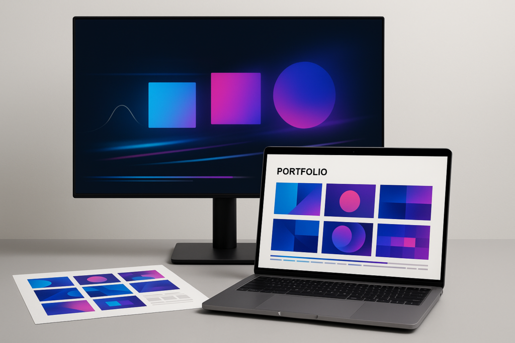
To present motion design work in a portfolio, curate a small set of your strongest pieces, package them in the right formats (a tight reel plus deeper case studies), and add clear context-what the goal was, what you did, and why your choices worked-while keeping playback smooth and the viewing experience frictionless. In other words: make it easy to watch, easy to understand, and hard to forget.
Motion design is time-based and attention-based. Your portfolio should respect both. That means editing like a filmmaker, explaining like a designer, and building like a product person-because the best work can still lose if it loads slowly, hides behind confusing navigation, or arrives with no story attached. The good news: you don’t need a huge body of work or a fancy platform. You need intention, clarity, and a little ruthless taste.
📋 Table of Contents
What is motion design and why showcase it in a portfolio?
Motion design sits at the crossroads of graphic design, animation, and communication. It’s what happens when typography starts breathing, icons start behaving, and brand systems start moving through time. It can be flashy, sure-but at its best it’s functional: it clarifies a message, guides attention, and makes information feel inevitable.
Because motion design is experiential, it’s hard to judge from a résumé or a list of software skills. A portfolio is where your instincts become visible: your timing, your taste, your restraint, your ability to solve a brief, and your ability to finish. It’s also where you demonstrate that you can think beyond “cool animation” and into outcomes-product clarity, brand consistency, audience understanding, and technical reliability.
Why a portfolio matters for motion designers
Motion designers are often hired for trust as much as talent. Clients and employers want to know: will you interpret a brand correctly, meet deadlines, handle feedback, and deliver files that work in the real world? A portfolio is the quickest way to answer those questions without saying a word.
It also protects you from the dreaded “Can you do this style?” conversation. When your portfolio is curated and intentional, it quietly steers people toward the kind of work you want more of. Think of it as a magnet: it doesn’t attract everything-only the right things.
Finally, a portfolio is your insurance policy against broken links and vanished posts. Anyone who has ever clicked a shared URL and landed on a dead end knows the pain. Many education and community sites (motion design schools included) have pages that move, get renamed, or simply return a blunt 404-“Oh no! This page does not exist.” That’s not a moral failing; it’s the internet. Your portfolio should be resilient: easy to navigate, easy to update, and not dependent on one fragile path.
How to select and organize projects in your motion design portfolio?
Selection is the real design work. Most motion designers don’t suffer from a lack of projects; they suffer from a lack of editing. A portfolio is not a storage unit. It’s a gallery-curated, paced, and lit to make the work look inevitable.
Organizing your projects is equally important. Motion work is consumed in time, and time is a budget your viewer is stingy with. The structure of your portfolio should feel like a confident handshake: direct, clear, and not overly complicated.
What criteria help pick the best work to showcase?
Pick work that demonstrates range with intention, not randomness. Range is helpful when it shows different problem types-brand launch, product UI motion, explainer, social campaign, title sequence-rather than ten variations of the same trick.
Use these criteria to choose:
- Outcome: Did the piece solve a communication problem? Did it increase clarity, elevate a brand, or support a product experience?
- Craft: Are timing, easing, typography, compositing, and sound (if used) clean and deliberate?
- Authorship: Can you clearly state what you did? If it’s a team project, can you show your contribution without awkward vagueness?
- Relevance: Does it match the work you want next? Your portfolio is a forecast.
- Freshness: If something is old but iconic, keep it. If it’s old and merely “fine,” retire it.
A practical rule: if you wouldn’t be excited to talk about a project in an interview, it doesn’t belong on the front line of your portfolio. (You can always keep it in a private folder for “in case they ask.”)
Also, avoid the temptation to include work just to prove you know a tool. “Made in After Effects” is not a story. “Made onboarding 30% clearer by animating state changes and hierarchy” is a story.
How to order projects for maximum impact?
Order is persuasion. Viewers don’t watch everything. They sample. Your job is to make the sample irresistible.
Common ordering strategies that work:
- Best-first, best-second: Lead with a banger, then another. Don’t “warm up.” Nobody asked for a warm-up.
- Problem-type grouping: Cluster by categories (Brand, Product/UI, Explainers, 3D, Titles) so viewers can jump to what they need.
- Intentional pacing: Alternate high-energy pieces with calmer, design-forward pieces. Give the eye a breath without losing momentum.
If you use a reel, your ordering matters twice: once in the reel itself, and again in what appears immediately below it on your site. A smart approach is to feature 3-6 “hero” projects under the reel, then provide a separate archive link for everything else.
And remember: the first project is not just your best-it’s your most representative. If you lead with experimental glitch art but want product motion roles, you’ll attract the wrong conversations. (You may still attract cool people. Just not the hiring manager you were aiming at.)
Should you include personal projects or client work?
Include both-strategically. Client work proves you can collaborate, interpret constraints, and ship. Personal work proves you have taste, curiosity, and the ability to initiate.
Personal projects are especially valuable when:
- You’re pivoting into a new niche (e.g., from social content to UI motion).
- Your client work is under NDA or visually bland despite being strategically important.
- You want to demonstrate a style you’re not being hired for yet.
Client work is especially valuable when:
- It shows recognizable brand constraints handled elegantly.
- It demonstrates real deliverables (multiple aspect ratios, localization, handoff files).
- It includes measurable context (launch timelines, performance metrics, user outcomes).
If a project is under NDA, you still have options: show a cropped version, blur sensitive data, create a “style-adjacent” personal remake, or offer a password-protected case study. The goal is to respect confidentiality while still showing your thinking.
What are effective formats for presenting motion design work?
Format is not decoration; it’s accessibility. The right format ensures your work plays quickly, looks sharp, and communicates clearly on a recruiter’s laptop, a client’s phone, or an art director’s ultrawide monitor.
Most strong motion portfolios use a two-layer approach: a short reel for fast scanning, plus individual project pages for deeper evaluation. That combination satisfies both kinds of viewers: the skimmers and the skeptics.
Video reels vs individual project presentations
A reel is your trailer. It’s designed to earn the next click. Individual project pages are your feature film: they prove you can handle a brief from start to finish.
Reels work best when:
- They’re short (30-75 seconds is a common sweet spot).
- They open strong within the first 3 seconds.
- They show variety without feeling like a random playlist.
- They include your role and a way to contact you (lightly, not like a billboard).
Individual projects work best when:
- They show the full context: problem, process, constraints, final deliverables.
- They separate your contribution from the team’s.
- They include stills, breakdowns, and alternate cuts (social ratios, UI states, etc.).
If you only have energy for one format, choose individual projects. A reel without context can feel like a magic trick-impressive, but mysterious in the wrong way. A well-built project page can still be skimmed quickly, and it ages better over time.
That said, a reel is often the fastest door-opener for agencies. Many creative teams use reels as a first-pass filter. Give them what they need-then reward the deeper viewer with case studies.
Watch motion design reel examples
Embedding animations in web portfolios
Embedding is where many portfolios quietly fail. Motion work can look perfect on your machine and fall apart elsewhere-stuttering playback, crushed blacks, blown-out highlights, or a video player that hides controls until the viewer performs a small ritual.
Best practices for embedding:
- Host smartly: Use reliable video hosting (Vimeo, YouTube, or self-hosted with a CDN) depending on your needs for quality, privacy, and branding.
- Provide multiple resolutions: Let viewers choose 1080p or 4K when available, but default to a reasonable stream.
- Use poster frames: A strong thumbnail is your silent pitch.
- Consider looping previews: Short, silent loops (3-8 seconds) can make a grid of projects feel alive without forcing a click.
When embedding UI motion or small details, consider adding a zoomed-in crop or a slowed-down segment. Recruiters often watch on small screens; your micro-interactions can disappear if you don’t help them.
Also: always test your portfolio like a stranger. Open it on your phone using cellular data. Open it in an incognito window. Send it to a friend and ask them to find your contact info. If they get lost, your future client will too.
Using case studies to provide context
Case studies are where you stop being “someone who animates” and become “someone who designs motion.” They show decision-making: why this pacing, why this transition, why this hierarchy, why this visual metaphor.
A strong motion case study typically includes:
- The brief: What was the goal? Who was the audience? What platform(s) did it live on?
- Constraints: Brand guidelines, accessibility requirements, tight deadlines, localization, file-size limits.
- Your role: Motion design, art direction, storyboards, animation, compositing, sound, delivery.
- Process artifacts: Style frames, animatics, timing tests, explorations, rejected directions (tastefully shown).
- Final deliverables: The finished piece plus variants (9:16, 1:1, 16:9; dark mode; different languages).
- Impact: What changed because this shipped? Even qualitative notes help.
Case studies also protect you from the “pretty but pointless” trap. When you explain the why, your work feels grounded-like it belongs in the world, not just in a render queue.
How to write descriptions and context for motion design pieces?
Writing is the stealth skill of motion portfolios. The viewer is already watching; your text should quietly guide what they notice and how they interpret it. Think of descriptions as subtitles for your intent.
Good portfolio writing is not long. It’s specific. It turns “I made this animation” into “I solved this communication problem using motion.” That shift changes how people price you, hire you, and trust you.
What key information should descriptions include?
Every project description should answer a few basic questions quickly, ideally in the first 2-4 lines:
- What is it? (Brand film, product launch, UI animation system, explainer, title sequence.)
- Why did it exist? (Launch, onboarding, campaign, education, rebrand.)
- What did you do? (Your role and scope.)
- Where did it live? (Web, app, social, broadcast, in-store screens.)
Then, if the viewer keeps reading, add a second paragraph with the interesting parts: constraints, decisions, and results. Constraints are surprisingly persuasive because they make your solutions look smarter. “We had 48 hours” is a constraint. “The brand palette couldn’t change” is a constraint. “The video had to be under 6MB” is a constraint. Constraints are where craft becomes strategy.
If you worked on a team, be explicit without being awkward. A simple line like this works: “I led motion design and animation; illustrations by X; sound design by Y; creative direction by Z.” Clarity reads as professionalism.
How storytelling can enhance project presentations
Storytelling doesn’t mean turning your portfolio into a memoir. It means giving your viewer a narrative arc: problem → exploration → decision → result. That arc creates momentum, and momentum keeps people scrolling.
Try structuring longer case studies with micro-headings inside your paragraphs (or with short bold phrases) to keep the reader oriented:
- The challenge: What was confusing, missing, or at risk?
- The idea: What concept or metaphor guided the motion?
- The system: How did you keep it consistent across assets?
- The polish: What details made it feel premium (timing, texture, type, sound)?
Storytelling is also where you can show taste. For example, instead of saying “I used overshoot,” you can say: “We kept the motion snappy but not bouncy-more ‘confident product’ than ‘playful toy.’” That sentence signals maturity, and it helps the viewer imagine you making decisions in their brand world.
If you want to add personality, do it lightly. A portfolio can be human without becoming a stand-up set. One well-placed line about a tricky constraint or a surprising iteration can make you memorable in a sea of identical layouts.
Should technical details be highlighted?
Yes-selectively. Technical details matter when they demonstrate competence, not when they read like a software shopping list.
Highlight technical details when they:
- Explain a challenge you solved (e.g., Lottie constraints, real-time rendering, file-size limits).
- Show production readiness (e.g., handoff specs, naming conventions, versioning, localization workflow).
- Demonstrate cross-functional collaboration (e.g., working with developers, using Figma prototypes, delivering JSON animation files).
Keep technical details minimal when they:
- Don’t change the viewer’s understanding of the work.
- Sound like buzzwords without context.
- Distract from the design decisions.
A useful compromise is a short “Details” block near the end of a project page:
- Tools: After Effects, Cinema 4D, Houdini, Blender, Figma, etc.
- Deliverables: ProRes masters, H.264 exports, Lottie JSON, sprite sheets, etc.
- Specs: 9:16, 1:1, 16:9; 24/30/60fps; safe areas; captions.
This keeps the main story clean while still giving technical reviewers what they want.
What design principles improve portfolio presentation?
Your portfolio is itself a design project-arguably the most important one, because it frames all the others. The principles that make motion design good (clarity, hierarchy, pacing) also make portfolios good. Apply them to your layout, navigation, and typography.
And because motion designers are judged on polish, small details matter: consistent margins, readable type, thoughtful thumbnails, and pages that don’t feel like they were assembled in a hurry five minutes before an application deadline.
How to create a cohesive visual style across your portfolio
Cohesion doesn’t mean everything looks identical. It means the portfolio feels like one place, not a patchwork of different templates and moods. Your work can vary wildly in style; your presentation should remain calm and consistent.
Ways to build cohesion:
- Consistent typography: Choose 1-2 typefaces and stick to a clear hierarchy (H1, H2, body, captions).
- Consistent color usage: Use a neutral UI so your work is the star. Let your projects bring the color.
- Consistent thumbnail logic: Similar framing, similar contrast, similar labeling (if any).
- Consistent page templates: Projects should share a structure so viewers learn how to read them quickly.
One underrated trick: treat your portfolio like a brand system. Define a few “rules” (spacing, button style, link behavior, caption style) and follow them. Even if the viewer can’t articulate why it feels professional, they’ll feel it.
If you want to include a bit of motion in the portfolio UI (hover states, transitions), keep it subtle and functional. The irony of a motion designer’s site that animates everything-menus, headings, page loads-until it becomes annoying is… well, it’s a classic. Let your projects do the heavy lifting.
What role does user experience play in motion design portfolios?
UX is not optional. Many people viewing your portfolio are busy, tired, and on their fifth tab of the hour. If your site makes them work, they will leave. Not because your work is bad, but because attention is finite.
Key UX principles:
- Immediate access to work: Your projects should be visible within one scroll, ideally sooner.
- Clear navigation: Simple menu labels like Work, About, Contact. Avoid clever names that hide meaning.
- Fast contact: Email should be easy to find and copy. Consider a dedicated Contact section.
- Mobile friendliness: Touch targets, readable text, and videos that play nicely on phones.
Also consider the “panic scenario”: a recruiter has 30 seconds before a meeting. Can they find your reel, open a project, and understand your role without hunting? If yes, you’re winning.
And because the internet is full of dead ends, make sure your internal links are reliable. A navigation that leads to missing pages is the fastest way to lose trust. Everyone has seen sites where a click leads to a blunt message like “Oh no! This page does not exist.” Your portfolio should feel sturdier than that-checked, maintained, and considerate.
How to optimize loading speed and playback quality
Speed is part of presentation. A beautiful animation that takes 12 seconds to load is no longer beautiful; it’s a test of patience. Optimize like your career depends on it-because sometimes it does.
Practical optimization steps:
- Export smart: Use high-quality H.264 or H.265 for web, with appropriate bitrates (often 8-20 Mbps for 1080p depending on content).
- Keep masters separate: Store ProRes masters offline; don’t upload gigantic files as your only source.
- Use a CDN or reputable host: Video hosting platforms handle adaptive streaming better than most DIY setups.
- Compress thumbnails: A grid of huge PNGs can slow a site more than the videos.
- Limit autoplay: Autoplaying multiple videos on one page can tank performance, especially on mobile.
Playback quality isn’t just resolution. It’s color and motion fidelity. Watch out for banding in gradients, crushed shadows, and jitter introduced by frame blending or incorrect frame rates. If your work relies on subtle gradients (many modern brand systems do), test your compression settings until it holds up.
Include captions or burned-in text alternatives when the message depends on audio. Many viewers watch muted by default, especially on social or in office environments.
How to tailor your portfolio for different audiences?
One portfolio can serve multiple audiences, but it shouldn’t treat them all the same. Employers, clients, and agencies evaluate differently. Employers may want process and collaboration. Clients want reassurance and outcomes. Agencies want taste, speed, and versatility.
Tailoring doesn’t necessarily mean building three separate websites (unless you enjoy suffering). It often means creating multiple entry points: a general homepage, a curated “selected work” view, and a few audience-specific collections or PDFs.
Should you customize for employers, clients, or agencies?
Yes-at least a little. The easiest way is to maintain a core portfolio and create curated sets:
- For employers: Emphasize your role, collaboration, systems thinking, and repeatable process. Include product/UI motion if relevant.
- For clients: Emphasize outcomes, reliability, deliverables, timelines, and clarity. Show before/after or problem/solution when possible.
- For agencies: Emphasize taste, range, and the ability to match brand voices. A strong reel matters here.
Consider adding a short “Services” or “What I do” paragraph for client-facing versions. Keep it grounded: title sequences, brand motion systems, social campaign assets, UI motion, explainers. Avoid vague claims like “I bring stories to life.” Your work already does that; your text should be useful.
If you offer downloadable materials (like a PDF portfolio), keep it updated and lightweight. Nothing says “out of date” like a PDF that still lists software you haven’t touched since 2021.
What are key considerations for online vs in-person presentations?
Online portfolios must be self-explanatory. In-person presentations can be guided and conversational. That difference changes how you prepare.
For online viewing:
- Assume muted audio and small screens.
- Make navigation obvious and contact immediate.
- Use concise descriptions and scannable layouts.
- Provide context that doesn’t require you to be present.
For in-person (or live video) presentations:
- Build a short deck with 3-5 projects and a clear narrative.
- Include process frames you can talk through (style frames, animatics, iteration).
- Prepare to pause and zoom-especially for UI motion and details.
- Have offline backups (downloaded videos) in case streaming fails.
In-person is also where you can show “how you think” more explicitly. Talk about trade-offs: why you simplified a transition, why you removed a flourish, why you chose readability over spectacle. Those moments signal seniority.
What tools and platforms support motion design portfolio presentation?
Your platform should serve your work, not the other way around. The best portfolio platform is the one you can maintain without dread. A gorgeous custom site that never gets updated is less useful than a simple site that stays alive.
Platforms also shape discoverability. A personal site is your home base, but social platforms are your billboards. Used together, they create a loop: social posts attract attention; your portfolio converts it into opportunities.
Popular portfolio websites for motion designers
Motion designers commonly use a mix of:
- Personal websites (custom, Webflow, Framer, Squarespace, Wix): best for control, branding, and case study structure.
- Behance: strong for discoverability and project-based storytelling; good for art directors browsing.
- Dribbble: great for short loops and UI motion teasers; can be less ideal for long-form case studies.
Many motion communities and education platforms also link out to these networks. It’s common to see “Follow us” sections pointing to Instagram, Facebook, Behance, Dribbble, Twitter, and YouTube-because that’s where motion work travels well. You can use the same idea: make it easy for viewers to find you in the places they already browse.
Whichever platform you choose, prioritize:
- Video presentation quality (no ugly compression surprises).
- Ease of updating (you’ll thank yourself later).
- Link stability (avoid broken pages and abandoned templates).
How to use social media for portfolio exposure
Social media is not your portfolio, but it’s an excellent distribution engine. The trick is to treat it like a funnel, not a diary.
Practical tactics:
- Post native formats: Vertical crops for Reels/TikTok/Shorts; square for feeds; keep text readable on phones.
- Use short loops: A 4-8 second loop can outperform a full 45-second cut in social contexts.
- Link back to case studies: Let social be the teaser; your site is the proof.
- Write useful captions: One sentence of context plus your role and tools is often enough.
Consider maintaining a simple “Link in bio” page that points to your reel, 2-3 hero projects, and your contact email. If you run a newsletter or community (many motion education sites do), that can also be a way to keep your work in people’s orbit-just be mindful of privacy and permissions.
If you do collect emails, be transparent. A clean subscription note-“By subscribing, you agree to the Terms of Use & Privacy Policy”-isn’t just legal hygiene; it signals professionalism. The same goes for having clear policy links if you sell products or templates.
What software aids in motion design presentation?
Presentation isn’t only about creating animations-it’s about packaging them. Useful tools include:
- Editing: Premiere Pro, DaVinci Resolve, Final Cut Pro for reels and cuts.
- Compression: HandBrake or Adobe Media Encoder for web-friendly exports.
- Frame grabs & layout: Photoshop, Figma, Affinity tools for thumbnails and case study layouts.
- Prototyping: Figma, ProtoPie, After Effects + Lottie previews for UI motion demonstrations.
- Hosting & embeds: Vimeo/YouTube, or self-hosted players with adaptive streaming.
Also consider tools for organization: a simple spreadsheet tracking project name, year, role, deliverables, link, and NDA status can save you from chaos. Chaos is charming in art; it’s expensive in portfolios.
What common pitfalls to avoid when presenting motion design work?
Most portfolio mistakes aren’t about talent. They’re about friction. The viewer can’t find the work, can’t play the work, can’t understand the work, or can’t tell what you did. Remove those obstacles and your portfolio becomes dramatically more persuasive-without changing a single keyframe.
Below are the most common pitfalls motion designers stumble into, plus the fixes that keep your work looking as strong online as it does in your timeline.
Avoiding overloading with too many projects
More is not more. More is often just… more. A portfolio with 30 projects signals indecision unless every single one is excellent and clearly categorized.
Symptoms of overload:
- Viewers can’t tell what your “best” is.
- Your site feels endless, like scrolling through an attic.
- Weak work sits next to strong work and quietly lowers the average.
Fix it with a tiered approach:
- Homepage: 3-6 hero projects.
- Selected work: 8-12 strong projects total.
- Archive: Optional, for completeness, clearly labeled.
This lets you keep history without forcing every viewer to wade through it. Curate like an editor, not a hoarder.
Preventing low-quality video and playback issues
Low-quality playback is the silent killer. It makes great work look amateur and makes subtle craft invisible. If your gradients band, your type flickers, or your motion stutters, the viewer won’t blame compression-they’ll blame you.
Common causes:
- Uploading one massive file and letting a platform compress it aggressively.
- Incorrect frame rate conversions.
- Over-sharpening or exporting with crushed color levels.
- Autoplaying too many embeds on one page.
Prevention checklist:
- Export a web-optimized version intentionally (don’t rely on platform defaults).
- Watch your upload on multiple devices and browsers.
- Provide a direct download link for high-quality viewing when appropriate.
- Keep an eye on audio levels if sound matters-nothing should blast.
And please, for the love of your own craft, don’t hide your work behind a broken link. If a viewer clicks and lands on a 404-style dead end-“Oh no! This page does not exist”-they won’t investigate further. They’ll move on. Link hygiene is part of presentation.
Why skipping context and descriptions harms impact
When you skip context, you force the viewer to guess. Guessing is work. Work is friction. Friction is abandonment.
Without context, viewers can’t tell:
- What the goal was (so they can’t judge success).
- What constraints existed (so they can’t appreciate problem-solving).
- What you did (so they can’t hire you confidently).
Even minimal context helps. A two-sentence caption can change everything: “Launch animation for a fintech app rebrand. I designed the motion system and animated a suite of 12 assets across 16:9, 1:1, and 9:16.” That’s enough to anchor the viewer’s interpretation.
If you’re worried text will make the page feel heavy, keep it scannable: short paragraphs, bullet points, and clear role labels. The goal is not to write a novel. The goal is to make your work legible as professional practice.
What are best practices for updating and maintaining your motion design portfolio?
A portfolio is not a one-time build; it’s a living system. The longer it sits untouched, the more likely it is to develop tiny failures: outdated contact info, broken embeds, missing pages, or projects that no longer represent your skill level. Maintenance isn’t glamorous, but it’s one of the highest-leverage habits you can build.
Think of your portfolio like a studio space. If it’s clean, organized, and ready, you can invite people in without panic. If it’s cluttered and half-finished, you’ll hesitate-and hesitation costs opportunities.
How often to refresh portfolio content
Refresh frequency depends on how fast your work evolves, but a practical schedule looks like this:
- Monthly (15 minutes): Check links, video playback, and contact info. Confirm nothing leads to missing pages.
- Quarterly (1-2 hours): Swap in a new project if you have one, update thumbnails, refine descriptions.
- Twice a year (half-day): Re-cut your reel, reassess your “selected work,” and remove anything that no longer represents you.
If you’re actively job hunting, tighten the loop: update as soon as you complete a strong piece, and tailor your homepage to the roles you’re applying for that month.
Also, keep an eye on platform changes. Social networks change formats; video hosts change embed behavior; portfolio builders update templates. A small update can accidentally break your layout. Your monthly check catches that before a recruiter does.
Tracking portfolio performance and user feedback
You don’t need to become an analytics zealot, but basic feedback loops are incredibly useful-especially when you’re improving conversion (getting inquiries, interviews, freelance leads).
Simple things to track:
- Which projects get clicked most (are your thumbnails doing their job?).
- Where viewers drop off (is your reel too long? are pages too heavy?).
- Device breakdown (if most viewers are on mobile, prioritize mobile playback and captions).
- Inbound sources (Instagram, Behance, Dribbble, YouTube, direct links).
For qualitative feedback, ask people who hire or collaborate with motion designers-creative directors, producers, senior designers-to do a quick “portfolio walk.” Give them a task: “Find my best UI motion project and tell me what you think my role was.” If they can’t answer confidently, your presentation needs clearer labeling.
If you run a community presence-maybe you share tutorials, scripts, or resources-consider adding a lightweight subscription option. Many motion-focused sites do this to keep in touch with their audience, sending free tutorials, updates, and discounts. If you choose to do something similar, keep it respectful: clear opt-in, clear privacy language, and no spammy cadence. A portfolio should feel like an invitation, not a trap.
Conclusion: Once your portfolio is solid, treat it as a platform for relationships, not just a display shelf. Add a short “Now” section with what you’re exploring (a new tool, a motion system study, a niche like sports graphics or SaaS onboarding). Consider publishing occasional breakdown posts-one paragraph plus a GIF-so your site stays alive and searchable. And if you ever sell assets, templates, or scripts, borrow a page from professional course platforms: make it easy to browse, make policies visible, and keep support contact clear (an email address is often enough). A portfolio that feels maintained, reachable, and human doesn’t just show your motion design-it shows how it will feel to work with you.
Browse motion design portfolio-ready videos
See a UI motion case-study style example