Motion design in Adobe After Effects is no longer just a niche skill. Editors, content creators, and designers need clean, consistent animation that delivers on tight deadlines. This practical guide shares expert motion design tips to improve your timing, workflow, and visual quality while staying efficient in real-world projects.Browse AE template plans
Understanding Motion Design Basics in After Effects
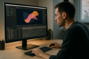
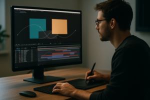
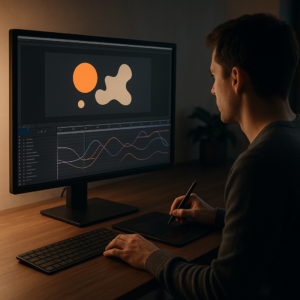
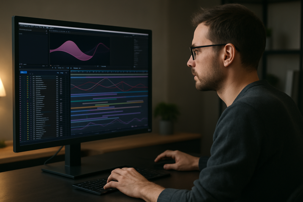
Motion design is the craft of bringing graphics, text, and visual elements to life through animation. In Adobe After Effects, that usually means animating layers, keyframes, and effects to communicate ideas clearly and with style.
At its core, motion design combines three pillars: design, timing, and storytelling. Good design makes the frame readable, timing controls the emotional impact, and storytelling ensures every movement has a purpose instead of just adding noise.
Motion design matters because almost every digital experience now has animation: social content, UI demos, product explainers, lyric videos, and branded openers. Editors and creators are expected to know more than just cuts and fades; they need to control typography, icons, overlays, and transitions with intention.
For beginners, the essential motion design tips are simple:
- Keep layouts clean before you animate. Design first, animation second.
- Use as few keyframes as possible. Simplicity is easier to control.
- Think in phases: intro, main content, and outro, each with its own timing.
- Always ask why something moves, not only how.
Motion design in After Effects is for a wide range of people: video editors adding animated titles, social media creators building reels and shorts, designers turning static styleframes into live pieces, and marketers who need product visuals that feel premium without full 3D pipelines.
Whether you work solo or in a team, understanding the basics of easing, spacing, and layer organization sets the stage for the more professional motion design tips you will apply in more complex projects.
Professional Motion Design Tips and Use Cases
Professional motion design tips go beyond simply adding keyframes. They help you choose the right animation style for the format, the message, and the platform. A vertical TikTok ad, a YouTube lyric video, and a UI widget animation each need a different approach, even if you build them in the same project.
One useful way to think about professional motion design is to categorize your work by purpose:
- Explainers and tutorials – Clear, readable text, slow pacing, minimal distractions.
- Ads and promos – Faster cuts, bold motion, strong callouts and product focus.
- Brand and title sequences – Consistent typography, on-brand color, rhythmic transitions.
- Music and lyric videos – Precise beat sync, expressive motion, more stylized visuals.
- UI widgets and mockups – Subtle micro-interactions, smooth easing, realistic timing.
Templates can accelerate each of these. For example, when you need a modern lyric layout, a project like the Lush Life lyric template can provide a ready-made timing and layout logic that you can adapt instead of starting layout and beat-mapping from scratch.
For product or fintech-style animations, a prebuilt project similar to a payment widget animation or digital card motion piece helps you focus on brand content while the base motion language is already solved.
Even for everyday content, small, focused widgets save time. Think of status visuals like the battery indicator animation or a map location widget when you explain app features or on-screen locations. Instead of building every UI detail manually, you can reuse and adapt them.
Finally, for creator-first content, such as lyric snippets or music edits, having presets similar to animated text sequences or pop references like music-focused visualizers helps you maintain stylistic variety while working quickly.
Professional motion design is not about reinventing the wheel on every project. It is about knowing the main formats you work with, picking the motion vocabulary that fits, and using smart starting points—templates, presets, or previous projects—to move faster while still tailoring the final look to the brief.
Common Motion Design Mistakes in After Effects
Once you move beyond basics, the biggest problems in motion design usually come from workflow, not from a lack of creativity. Avoiding a few common traps will save you hours and keep your projects clean.
1. Inconsistent timing and easing
- Random default linear keyframes with no easing.
- Different easing curves for similar elements in the same scene.
- Keyframes too close together, creating stutters.
Solution: Use the Graph Editor to set a few standard ease curves (for example, soft ease-out for entrances, overshoot for bounces). Apply them consistently with copy–paste or presets.
2. Overusing motion blur and heavy effects
- Enabling motion blur on every layer, even static backgrounds.
- Stacking glows, blurs, and distortions without considering render cost.
Solution: Reserve motion blur for foreground elements that actually move. Precomp heavy treatments and consider lower-quality blurs during previews.
3. Messy comps and hierarchy
- All layers in a single composition, no structure.
- Unnamed layers and precomps that make revisions painful.
Solution: Break projects into logical sections: main comp, text precomps, background precomps, and adjustment layers. Name layers with purpose (e.g., “Title_Main”, “BG_Noise”).
4. Poor use of precomps
- Precomposing too late, making it hard to reuse systems.
- Precomposing too early, locking you out of layer-level controls.
Solution: Precomp when an element is conceptually a unit: a lower-third, a card, a widget. Keep versions you know you will reuse in other projects.
5. Ignoring performance
- Working at 4K with complex effects for social content that will be viewed on phones.
- Never using proxies or region-of-interest.
Solution: Match comp resolution and frame rate to deliverables, and lower preview resolution while animating. Render heavy layers once and reuse them.
6. Lack of visual hierarchy
- Text, icons, and background elements fighting for attention.
- No clear primary focus in the frame.
Solution: Use size, contrast, and motion intensity to guide the eye. Only one or two elements should have strong motion at any given moment.
When you address these issues early, you get cleaner projects that are easier to update, hand off, and base future work on. That is the foundation professional motion designers rely on for repeatable quality.
Choosing the Right Motion Approach and When to Use Templates
Every edit has a different purpose, and the smartest motion design tips are about choosing the right approach for each project type instead of forcing one style on everything.
Social reels and shorts
For vertical clips, attention is won in the first seconds. You want quick, legible motion: bold titles, punchy transitions, simple background animation. Keep typography large and avoid tiny UI details that will not be seen on a phone.
Performance tip: Work in vertical compositions from the start (e.g., 1080×1920, 30 fps). Avoid extremely small text, and preview with safe areas in mind.
YouTube content and lyric videos
For long-form content, pacing matters more than sheer intensity. Intro and lower-thirds should feel consistent across episodes. Lyric videos need precise beat-sync and clear reading lines. A project similar to a ready-made lyric layout can give you a structured starting point for timing and reveals.
Ads, promos, and product demos
Here, every movement should highlight a benefit or feature. Use UI-style animations, elegant overlays, and mockups to keep the product centered. Hybrid UI projects like a social video widget or an OTT-style interface animation help quickly explain digital products while feeling familiar and polished.
Cinematic and brand films
For cinematic work, animation is often slower and more considered: subtle text builds, gentle camera moves, and minimalistic overlays. Use fewer, more meaningful moves instead of constant motion. Think in terms of sequences and beats, not just individual comps.
Corporate explainers and UI walkthroughs
Clarity is crucial. UI widgets, map pointers, and callouts must be clear and easy to understand. A realistic UI mockup like a video call interface or learning app widget can make feature explanations feel grounded in real product use.
When templates make sense
- Tight deadlines where design exploration time is limited.
- Series content that must stay visually consistent across dozens of videos.
- Clients with limited budgets who still expect a high-end motion feel.
- Explorations where you need quick variations before committing.
Browsing inspiration on platforms like Dribbble can help you identify motion patterns you want to emulate. Instead of reproducing each frame from scratch, you can adapt a smart base project and layer your brand on top, letting you focus on narrative and messaging rather than rebuilding every transition from zero.
For many creators, an Unlimited After Effects Templates Subscription becomes a practical way to maintain variety and speed. You have a library of starting points for widgets, lyric layouts, and branded sequences, and your main creative work shifts to curation and customization instead of basic construction.Compare subscription options
Template-Driven Workflow in After Effects Step by Step
Using templates does not mean sacrificing originality. When handled with an editor mindset, they become a fast, reliable base for your own style. This chapter outlines a practical workflow you can apply across projects.
Project setup and compatibility
Before importing any template, check its requirements:
- After Effects version: Make sure the template supports the version you use (e.g., CC 2021 or later). Opening newer projects in older AE can break expressions or effects.
- Frame rate and resolution: Align compositions with your deliverables (e.g., 1080p 25 fps for broadcast, 1080×1920 30 fps for vertical social). If a template is 4K and you only need 1080p, downscale early for faster previews.
- Color space: Match color management settings with your overall workflow so renders do not look washed out or too contrasty.
Organizing the imported project
Once you open a template project, resist the urge to dive straight into animation. First, understand the structure:
- Look for folders like “Main Comps”, “Edit Here”, or “Controls”.
- Identify global control layers for colors, typography, and effects.
- Open the main sequence comp and scrub the timeline to see the full animation.
If the structure is clean, it should feel similar to a modular pack such as the animated widget collections where each section is reusable and clearly labeled.
Keyframe organization and naming
Professional motion design tips always return to one thing: clarity. Rename compositions and layers to match your project:
- Replace generic names like “Comp 3” with “Intro_LowerThird”.
- Use consistent prefixes like “TXT_”, “BG_”, “ICON_” for quick searching.
- Color-label important layers (controls, main titles) for faster navigation.
On the timeline, keep keyframes grouped logically. If a layer has many properties animated (position, scale, opacity), consider using null objects or parent links to separate concerns and keep individual timelines readable.
Performance-conscious workflow
Templates with many layers and effects can be demanding. To keep your workflow responsive:
- Work at half or quarter resolution while blocking animation.
- Use the region of interest for focused previews.
- Solo only the layers you are actively adjusting.
- Cache long sections, or pre-render them to footage if they do not need further changes.
For complex, atmospheric pieces like a liquid-style motion project, pre-rendering background loops will save a lot of preview time.
Handling plugins and dependencies
Many templates rely on third-party effects. Before committing, check:
- Which plugins are required (e.g., particle systems, glows, or 3D tools).
- Whether there is a fallback version using only native effects.
- If you can replace heavy plugins with simpler alternatives without breaking the look.
When sending projects to collaborators or clients, document which plugins are critical and which are optional, so they can open and adjust the project safely.
Customization: colors, typography, and timing
Approach template customization in clear passes:
- Pass 1 – Content: Replace placeholder text and media with your own (titles, photos, product shots).
- Pass 2 – Brand look: Update colors, fonts, and logos according to your brand guide. Use global control layers where available.
- Pass 3 – Timing: Adjust layer in/out points and keyframes to match music, voiceover, or screen pacing.
- Pass 4 – Polish: Fine-tune easing, secondary animations (wiggles, parallax), and subtle overshoots.
Use cases by format
Think of your template library as a toolbox of reusable systems:
- Reels and shorts: Fast-paced card animations, bold text, and quick transitions. A UI-card pack similar to game or app widgets is perfect for this.
- Ads and product promos: Clean product frames, benefit callouts, and smooth camera moves around mockups.
- YouTube intros and outros: Consistent intro sequences you reuse across episodes, updated only with new titles.
- Cinematic edits: Minimalist type, gentle movement, and a lot of attention to spacing and negative space.
Practical checklist before final render
- Are all placeholder texts, images, and logos replaced?
- Do colors and fonts match your brand or brief?
- Is the timing synced to music or voiceover?
- Are there any hidden or disabled layers that should be off?
- Is motion blur used selectively, not globally?
- Is your output resolution and codec correct for the platform?
By treating templates as structured systems rather than rigid designs, you preserve flexibility while dramatically shortening build time. This is exactly where an Unlimited After Effects Templates Subscription becomes most valuable: you always have a suitable base to adapt, no matter the format or client.
Advanced Motion Design Tips and Long-Term Workflow
Once you are comfortable working with templates and custom animations, the next step is building a long-term motion design system that keeps your work consistent across dozens or hundreds of videos.
Building reusable animation systems
Instead of designing from scratch each time, create master comps for:
- Primary and secondary titles.
- Lower-thirds and info bars.
- Transitions between major sections.
- Overlay elements such as icons or callouts.
Use expressions and control layers to centralize common settings like brand colors, font sizes, and motion strength. This turns your projects into modular systems rather than single-use timelines.
Styleframes and previsualization
Before animating, build a set of still frames showing key moments: intro, main information screen, transition, outro. This will help align stakeholders on layout and color before you invest time animating. You can even pull stills from template-based projects, adjust them, and only then move to animation passes.
Maintaining consistency across episodes
For series work (YouTube channels, learning platforms, ongoing ads), create a master project that contains your key motion assets. When starting a new video, duplicate the master and replace content instead of importing random elements into new projects every time.
Export and render considerations
Many motion designers lose time and quality at export. A few habits help:
- Render final master files from the Render Queue or a dedicated encoder using visually lossless settings.
- Create separate presets for social media, broadcast, and archive masters.
- Test short 3–5 second segments before committing to long renders, especially on heavy compositions like stylized seasonal intros similar to a holiday animation.
Dynamic link and project weight
Linking between apps can be useful but adds complexity. Keep your After Effects projects as self-contained as possible:
- Avoid excessive nesting of dynamic links from editing software if you can render intermediate files instead.
- Periodically remove unused footage, solids, and precomps to keep project size manageable.
- Archive versions at key milestones, but avoid keeping every test comp forever.
Quality control and review
Professional motion design tips are not just about making things look good; they are about making them reliable. Before delivering:
- Watch the full piece at 100 percent scale and full speed at least twice.
- Check text for typos, alignment, and readability on small screens.
- Look for popping keyframes, abrupt easing, or inconsistent motion blur.
- Export stills to verify color and contrast against reference images or brand guidelines.
By developing these long-term habits, you reduce revision cycles, keep clients confident, and build a library of reusable assets that pay off on every future project.
Motion Design SEO Questions and Quick Answers
People searching for motion design tips often have similar questions. Addressing them quickly helps you plan better projects and find the right workflows.
- What are the most important motion design tips for beginners?
Focus on clean layout, simple easing, consistent timing, and organizing your layers. Start small with text and shape layers before tackling complex effects. - How do I make my After Effects animations look more professional?
Use the Graph Editor for custom easing, limit the number of fonts and colors, keep transitions consistent, and avoid unnecessary movement. Professional work often looks simple but intentional. - Should I always use templates for motion design?
No. Templates are ideal for saving time on repetitive structures or formats you use frequently. Combine them with your own design decisions so projects still feel tailored. - What frame rate is best for motion design?
Match your platform and region: 24 or 25 fps for film and broadcast styles, 30 fps for online and social by default. Only use higher frame rates if you have a clear reason. - How do I choose music and sync motion?
Start by marking beats or key transitions on the timeline. Align major moves (cuts, big title entries) with these markers, and use smaller accents for secondary beats. - Is an Unlimited After Effects Templates Subscription worth it for freelancers?
If you deliver motion-heavy content regularly—intros, reels, promos, explainers—having a large, consistent template library can drastically reduce build time and make pricing and scheduling more predictable, especially when working with clients worldwide.
Bringing It All Together for Faster, Cleaner Motion Design
Effective motion design in After Effects is not about knowing every effect; it is about structured decisions. You now have a roadmap: understand fundamentals, apply professional motion design tips by format, avoid common workflow traps, and use templates as smart building blocks instead of shortcuts.
When you combine clear timing, organized projects, and a reliable library of reusable systems, you get cleaner motion, faster turnaround, and more consistent results across your edits, no matter the platform or client. For many editors and creators, that is exactly where an Unlimited After Effects Templates Subscription becomes an everyday production tool rather than a one-off purchase.
If you are ready to upgrade your workflow with a structured, template-friendly approach while still keeping creative control, explore how curated template access can fit into your process.Explore motion template access
Conclusions
Strong motion design relies on purposeful timing, clean structure, and smart reuse of systems. By combining disciplined After Effects workflows with flexible templates, you can work faster, reduce revisions, and deliver consistent, high-quality animation across any format.
FAQ
What software do I need to apply these motion design tips?
All tips here are tailored to Adobe After Effects, but many principles, like timing, easing, and layout, also apply to other motion tools.
Can I use these motion design tips if I am mainly a video editor?
Yes. Focus on titles, lower-thirds, and transitions first. Even small, consistent animations will noticeably improve your edits.
How much design skill do I need before doing motion design?
Basic understanding of typography, spacing, and color is enough. You can rely on well-designed templates while you develop deeper design skills.
How do I avoid my animations feeling cluttered?
Limit the number of moving elements at any one time, use clear hierarchy, and keep color and font choices constrained to a simple, intentional palette.
Is it okay to mix multiple templates in one project?
Yes, but unify them with consistent fonts, colors, and easing. Adjust timing and details so the final piece feels like a single, coherent design.