Lower thirds are one of the most used graphics in any edit, from YouTube interviews to branded content. This tutorial walks you through designing, animating, and managing lower thirds in After Effects so they are clean, flexible, and fast to reuse across projects.Browse template plans
Understanding lower thirds in After Effects
What are lower thirds
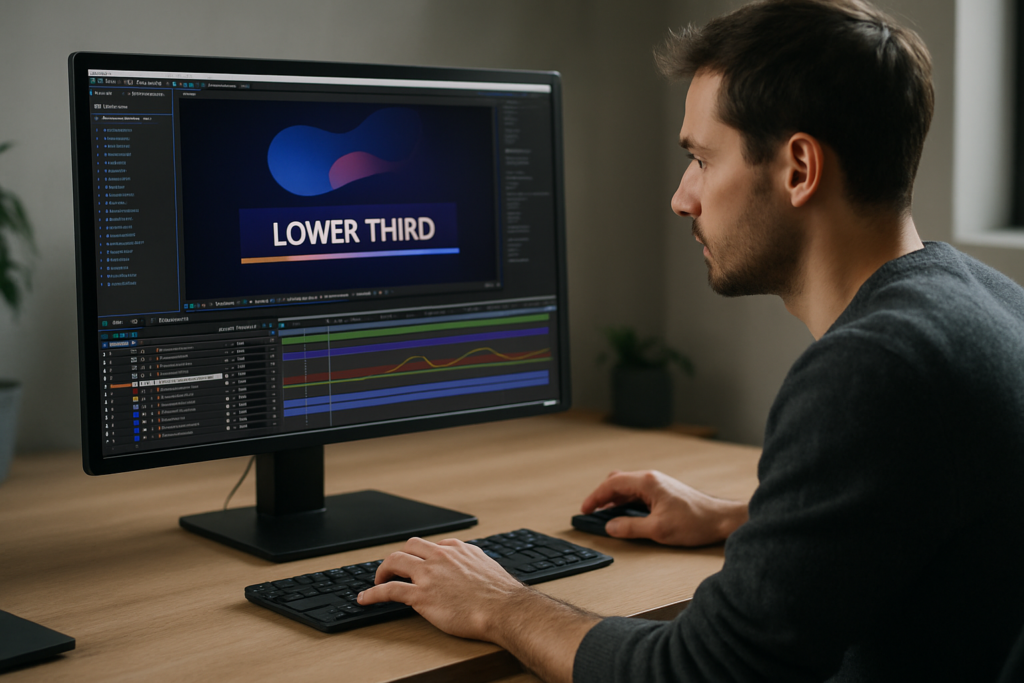
Lower thirds are text and graphic bars that appear in the lower area of the frame to show names, titles, locations, or short info. In an after effects lower thirds tutorial, they are usually the first motion graphics element you learn because they mix typography, layout, and animation in a compact format.
Why lower thirds matter
Lower thirds:
- Clarify who is speaking and why they are relevant
- Add a professional layer of branding and hierarchy
- Support storytelling without distracting from the footage
- Help viewers navigate interviews, explainers, and tutorials
Who this is for
This guide is designed for:
- Editors who want reliable, reusable graphics inside a tight timeline
- Motion designers building a lower thirds system for a series or client
- Creators moving from basic NLE titles into more flexible After Effects workflows
What you will learn
By the end, you will know how to:
- Design clean, readable lower thirds in After Effects
- Animate them with solid timing and easing
- Organize precomps and controls so changes stay simple
- Decide when to build from scratch and when to use templates
Planning effective lower thirds design in AE
What lower thirds design AE really covers
When you hear lower thirds design AE, it includes more than fonts and colors. It covers:
- Type hierarchy (name vs role vs extra info)
- Bar shapes, blocks, and accents
- Entry and exit animation styles
- How graphics adapt to different lengths of text
Key styles of lower thirds
- Minimal bars – simple rectangles and clean type, ideal for interviews and corporate content.
- Segmented layouts – multiple blocks for name, title, handle, or location.
- Widget-style UI elements – graphics designed to look like apps or interfaces, similar to what you see in a map-style widget graphic.
- Decorative / lyric-inspired – stylized lower third bands similar to modern music lyric layouts.
Matching design to content
Match style to format:
- Interviews and documentaries – keep it minimal, prioritize legibility.
- Tech or finance explainers – use subtle UI-style panels, data lines, or icons.
- Music or culture content – more expressive shapes and colors are acceptable.
- Gaming or reaction videos – bolder colors, larger type, and dynamic movement.
When to use prebuilt layouts
If your project has multiple recurring speakers, recurring series, or many language versions, starting from a template pack or a reusable project file saves setup time while keeping design consistent across all videos.
Common lower thirds mistakes and how to avoid them
Design mistakes
- Low contrast – Light text on light footage is hard to read. Solution: add a subtle background bar, gradient, or shadow, and test against busy footage.
- Too many fonts – Mixing more than two typefaces makes graphics feel inconsistent. Use one family with weight variations instead.
- Crowded layouts – Cramming name, title, website, and hashtags into one small bar overwhelms viewers. Prioritize one or two key lines.
Animation mistakes
- Overly long animations – If the lower third takes 1.5 seconds to appear but is only on screen for 3 seconds, it feels sluggish. Aim for 6–12 frames for fast content, 12–18 for slower edits.
- Inconsistent easing – Mixing sharp linear motion with overly smooth curves looks unpolished. Use similar ease curves across all related elements.
- No motion blur when needed – Fast moves without blur feel fake; slow moves with heavy blur look muddy. Turn on motion blur only for elements with noticeable speed.
Workflow and organization mistakes
- Messy comps – Randomly named layers and comps make revisions painful. Use a simple scheme like LT_Name_Main, LT_Name_BG, LT_Controls.
- No master controls – Editing every instance manually for color or font changes wastes time. Use a control comp with expression-linked colors and global text settings.
- Ignoring safe margins – Placing lower thirds too close to the frame edge may cause cropping on some displays. Turn on title/action safe to check.
Performance pitfalls
- Unnecessary effects – Heavy blurs, glow stacks, and many drop shadows slow previews. Use adjustment layers and precomps to keep things efficient.
- Too many layers – Hundreds of tiny layers for each graphic element can be combined into shape layers or precomps to keep the timeline manageable.
Quick self-check before delivery
- Is the name readable at 25–30% scale preview?
- Does the animation feel synced with the speaker or beat?
- Do instances look consistent across the whole edit?
- Are lower thirds easy to update if client copy changes?
Choosing the right lower thirds approach for each project
Clarify where your lower thirds will live
Different platforms call for slightly different decisions:
- YouTube channels and creators – Lower thirds need to be legible on mobile and desktop and match the channel brand. Checking best practices from resources like YouTube Creators helps align your visuals with platform expectations.
- Short-form social (Reels, Shorts, TikTok) – Vertical formats push text higher in the frame to avoid UI overlays. Test your comps with a safe zone for captions and buttons.
- Corporate or broadcast – Consistency and clarity beat flashy animation. Stick to stricter grids and fonts.
- Cinematic or documentary – Slower, more subtle moves, often with soft fades and less graphic weight.
Build from scratch vs use templates
- Build from scratch when you need a completely unique style, want to push custom animation, or are building a new long-term brand package.
- Use templates when deadlines are tight, the project scope is repetitive (series, seasons, recurring guests), or you want a solid structural base you can customize.
Using templates as a system, not a shortcut
A good lower thirds template should:
- Be easily retimed for different edit rhythms
- Include color and typography controls in one place
- Support multiple text lengths gracefully
- Render quickly enough for ongoing content output
Matching animation to the edit type
Think about context:
- Fast social edits – Snappy, 6–10 frame slides or pops on the beat.
- Brand ads – Slightly longer, smoother easing with clear brand color usage.
- Educational tutorials – Lower thirds should not compete with on-screen text or callouts; keep them subtle.
- Music or lyric content – You can sync entry/exit to specific beats or phrases, similar to how you might handle a lyric panel such as a stylized track title.
Future-proofing across episodes and seasons
For channels publishing weekly, using a structured project or a template-based system helps maintain visual identity over time while making it easy to update roles, languages, or minor brand tweaks without starting over.Compare subscription options
Step by step lower thirds workflow with templates and custom setups
Start with project setup
Before doing any design, lock in technical settings:
- Frame rate – Match your edit (23.976, 24, 25, 29.97, etc.) so timing lines up and animations feel natural.
- Resolution and aspect – For 16:9, 1920×1080 or 3840×2160; for vertical, 1080×1920. Decide early so layouts do not break later.
- Color management – Work in the same color space as your main project for consistent contrast and saturation.
Building a base lower third
1. Create a new comp named LT_Base.
2. Add a shape layer for the background bar (or multiple blocks).
3. Add text layers for name, role, or handle.
4. Turn on rulers and guides to align text to a consistent baseline.
5. Keep your anchor points centered or aligned logically for easier animation.
Organizing with precomps
Use precomps such as:
- LT_Design – All graphic and text layers.
- LT_Controls – Color, position, and timing controls using nulls and expression controls.
- LT_Render – Final comp that you drop into edits.
Good organization makes it easier to reuse your lower thirds across different videos, similar to reusing a widget animation such as an embedded channel UI graphic in multiple edits.
Animation and timing checklist
When animating:
- Use position, opacity, and scale together in a simple combination.
- Place keyframes so the motion completes slightly before the spoken name finishes.
- Use the graph editor to smooth in and out; avoid abrupt linear moves unless stylistically needed.
- Keep exit animations shorter than entry to keep pacing tight.
Performance and preview tips
To keep previews responsive:
- Solo only the lower thirds comp when working on it.
- Use region of interest or set your preview resolution to Half or Quarter.
- Turn off heavy effects until the design is final.
- Use disk cache and clean old cache occasionally.
Handling plugin dependencies
Be cautious with effects that require third-party plugins:
- If collaborating with other editors, document any non-native plugins your lower thirds use.
- Where possible, recreate simple looks with built-in effects so files open smoothly on more machines.
- If you must rely on a plugin, consider pre-rendering some elements with alpha to avoid broken looks.
Template customization workflow
Whether you build your own or use a downloaded project, follow this order:
- Open a dedicated controls comp or layer and adjust brand colors first.
- Set fonts and size for main and secondary text.
- Test with short and long names to see how the layout responds.
- Adjust timing globally using markers and time remapping if the template supports it.
Use cases and variations
- Reels and Shorts – Create a slightly higher placement version and a vertical layout variant. Keep bars thinner to avoid covering the subject.
- Product promos – Add a subtle accent element, like a thin progress line or icon, inspired by clean UI animations similar in spirit to a payment widget graphic.
- Cinematic edits – Use softer transitions, low-saturation color palettes, and smaller type.
- Series and channels – Build a master comp with multiple name/title pairs that you can turn on or off for different guests.
Final quality check
Before rendering, scrub through the entire edit focusing only on your lower thirds. Confirm they never clash with subtitles, key visuals, or other on-screen graphics and that every name is spelled correctly.
Advanced systems and long term lower thirds workflow
Designing a reusable system
For ongoing series or channels, think of lower thirds as a system, not isolated shots:
- Create a styleframe set: one for main speakers, one for guests, one for special segments.
- Document font sizes, weights, and colors in a simple text layer or external style guide.
- Store all lower thirds comps in a dedicated folder with clear subfolders.
Modular animation setup
Build pieces that can be reused:
- Design a base slide-in animation and reuse it for different layouts.
- Keep accents like underlines, icons, or small flares in separate precomps so you can swap styles without rebuilding.
- Use markers on the timeline to define entry and exit points, helping editors retime quickly.
Consistency across a whole edit
To keep everything aligned:
- Use the same baseline and margins for every lower third.
- Limit yourself to one or two timing profiles (for example, fast and standard).
- Establish rules for when lower thirds should appear (first speaking moment, first on-screen appearance, etc.).
Export and render considerations
When exporting:
- Render with alpha if your lower thirds will be overlaid by another editor in a separate application.
- Use standard mezzanine codecs that support transparency and do not introduce banding.
- If using Dynamic Link, keep your lower thirds comps lean; complex nested comps can slow down the NLE.
Keeping projects lightweight
Over time, big shows or channels accumulate many variations:
- Archive old versions as separate project files to keep active projects small.
- Remove unused precomps and assets periodically.
- If a design is no longer in use, move it into an Archive folder so it is not accidentally reused.
Quality control habits
Add a quick review pass before delivery:
- Play back on a smaller screen or scaled preview to check readability.
- Review audio and picture together to confirm lower thirds support, not distract from, the story.
- Check for any spelling errors, misaligned anchors, or inconsistent animation curves.
With a disciplined system, you can maintain high quality even when producing graphics at scale for clients or channels publishing worldwide.
Search based lower thirds questions editors are asking
Common search intents around lower thirds
Editors and motion designers often search for targeted solutions. Here are frequent queries and concise answers:
- “How do I animate lower thirds quickly in After Effects” – Build one well-tuned animation with clean easing and then reuse it via precomps, Essential Graphics, or a template across your timeline.
- “Best settings for lower thirds render” – Use a format with alpha support when handing off to another editor, and standard H.264 exports for direct delivery videos.
- “How to keep lower thirds consistent in a series” – Centralize all designs in one AE project, lock color and type in a controls comp, and never change those values inside individual instances.
- “Can I use the same lower thirds for horizontal and vertical” – Yes, but create separate comps: one for 16:9 and one for 9:16, adjusting margins and safe zones so text does not collide with UI overlays.
- “What is the ideal duration for a lower third” – As a rule of thumb, keep them long enough to read twice. For names, 3–5 seconds; for more info, 5–7 seconds.
- “How do I avoid choppy motion” – Match project frame rate to your edit, enable motion blur for fast moves, and refine curves in the graph editor instead of stacking more keyframes.
When to look for specialized templates
Searches like news lower thirds After Effects, gaming lower thirds AE, or minimal interview bar template often indicate you need a well-structured file you can adapt rather than designing from scratch every time.
Bringing it all together for faster, cleaner lower thirds
Key takeaways
Lower thirds become much easier when you treat them as a repeatable system: clear typography, thoughtful animation, organized precomps, and a predictable workflow. You now know how to plan styles, avoid common mistakes, customize templates, and maintain consistency across edits of any scale.
Focus on clarity and efficiency
Whether you work on interviews, branded series, or social content, prioritizing readability and structured organization will make your graphics easier to manage, update, and hand off to other editors or clients.
Next steps
Apply these techniques to one current project, save your best version as a reusable master file, and refine it as you learn what works across different formats and audiences.
Start building faster graphics
Conclusions
Lower thirds are small graphics that carry a lot of responsibility in any edit. With clear design rules, solid animation timing, and organized templates, you can support your story without slowing your workflow. Use this guide as a reference the next time you set up titles for a series or new client.
FAQ
How long should a lower third stay on screen in After Effects projects?
For most edits, keep lower thirds visible for 3–5 seconds for simple names and 5–7 seconds for extra info, adjusting for speech pace and reading speed.
What font size is best for lower thirds on YouTube videos?
Design at 1080p and keep the main name between roughly 50–70 px depending on the typeface, then test playback at 25–30 percent scale to ensure readability.
Should I enable motion blur for all lower thirds animations?
Use motion blur for fast or snappy moves. For slow, subtle animation, it often adds unnecessary softness and longer render times without visible benefit.
How do I keep lower thirds consistent across multiple episodes?
Store all lower thirds in one master AE project, use shared control layers for color and type, and avoid changing design inside individual episode comps.
Can I reuse one lower third design for vertical and horizontal formats?
Yes. Create separate comps for each aspect ratio and adjust margins and safe zones so text does not clash with platform UI or captions in vertical layouts.
What is the easiest way to update lower thirds text across many comps?
Use precomps or Essential Graphics controls where one text source drives multiple instances, so updating the original automatically updates all linked versions.