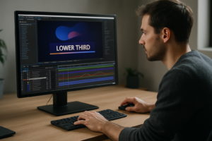
Text is often the hero of modern video: titles, lower thirds, captions, hooks. When you know how to animate text like a pro in After Effects, every edit looks sharper and more intentional. This guide walks through practical, repeatable workflows you can plug directly into client work, content series, and campaigns, even on tight deadlines.Browse text animation plans
Core principles of pro text animation in After Effects
What text animation really is
Text animation in After Effects is the controlled movement and transformation of letters, words, and lines over time. It goes beyond simply fading text in and out; you are choreographing type using position, scale, rotation, opacity, and more, all driven by keyframes, easing, and timing.
Why text animation matters
Most viewers skim. Strong text motion helps them instantly catch the message, whether it is a hook in a reel, a callout in a tutorial, or a headline in an ad. Clean, confident type animation:
- Makes content feel more premium and intentional
- Guides the eye through your story or message
- Improves retention for educational or data-heavy content
- Supports brand identity through motion, not just color and logos
Who this is for
If you are an editor, motion designer, or creator working in After Effects, learning how to animate text like a pro in After Effects gives you a reusable skill set. It is useful whether you mainly cut footage and only touch AE for titles, or you build full kinetic typography sequences for campaigns.
How After Effects handles text
After Effects treats text as its own layer type with powerful built-in animation controls. Using the Text tool, you can create a layer, then add Animators for properties like Position, Scale, Rotation, Opacity, Tracking, and more. These animators use Ranges to target specific characters, words, or lines, which is key for pro-level control.
From basic to professional
A basic text animation might be a simple fade and slide. A professional one balances:
- Timing: when each word lands relative to voiceover or beats
- Easing: how motion speeds up and slows down
- Hierarchy: which words get emphasis and which stay subtle
- Consistency: recurring motion rules across a whole edit
This foundation sets you up for kinetic typography, where text is not just supporting the story, but actively performing it on screen.
Understanding kinetic typography AE styles and use cases
What kinetic typography AE means
Kinetic typography AE refers to sequences where text movement is the main visual element. Instead of text just sitting over footage, the entire frame is driven by animated type: words entering on beats, bouncing, morphing, or reacting to voiceover.
Main styles of kinetic typography
- Lyric or dialogue sync: Each word or phrase appears and animates in sync with audio, great for social clips and music visuals.
- Bold typographic promos: Big, punchy words filling the screen for product launches or brand statements.
- Caption-heavy explainers: Fast-paced titles, subheads, and callouts that support educational content.
- Minimal lower thirds and labels: Subtle but precise motion for names, roles, or product details.
Where kinetic typography fits in your work
You will see kinetic typography in:
- Shorts, Reels, and TikTok edits that rely on on-screen text
- YouTube openers, mid-roll callouts, and end cards
- Brand pieces and product teasers
- Event titles and conference openers
Matching style to platform
Consider how your kinetic typography AE choices change by format:
- Vertical social videos: Bold, centered, big type, short phrases, super clear legibility.
- YouTube content: More room for detail in titles and callouts, supporting visuals and b-roll.
- Corporate or product explainers: Clean, structured type systems that match brand guidelines.
Exploring existing motion systems
Watching and dissecting finished pieces helps. Look at dynamic opener styles similar to a polished automotive promo title sequence and study how the type enters, holds, and exits. Notice repetition: the same kind of slide or scale often repeats with small variations.
Templates as style references
Premade kinetic typography projects are great study material. Open a structured sequence, solo the text layers, and inspect:
- How many keyframes were needed
- How the Graph Editor easing looks
- Where precomps separate scenes or beats
- How titles, subtitles, and labels share the same motion logic
The goal is not just copying a look, but understanding how professional kinetic typography AE projects are built so you can adapt the same principles to your own edits.
Common mistakes when animating text in After Effects
Overcomplicating the animation
Beginners often stack too many effects at once: position, scale, rotation, blur, glow, all on the same word. The result feels noisy and unintentional. Start with one or two properties and get the timing and easing perfect before adding complexity.
Poor timing and rhythm
Even good-looking moves fall apart if they land off-beat or off-voiceover. Common timing issues include:
- Text arriving too late to read comfortably
- Words leaving the frame before viewers finish reading
- All phrases appearing at the same speed with no accents
Fix this by blocking your sequence: scrub through the audio, set markers for key words, then align keyframes to those markers.
Ignoring the Graph Editor
Default linear keyframes make text feel robotic. Many users avoid the Graph Editor because it seems complex, but even simple ease-in/out or classic “speed up then settle” curves add a lot of polish. A common mistake is:
- Using Easy Ease but never adjusting the curve
- Creating extreme curves that cause unnatural overshoots
Solution: focus on clean, S-shaped curves that accelerate quickly then gently ease into the final position.
Messy compositions and layer chaos
As soon as you work on longer sequences, disorganized comps become a serious problem:
- Unnamed text layers: “Layer 34” tells you nothing later
- No precomps: everything lives in one huge timeline
- Keyframes scattered without structure
Consequences include broken edits, hard-to-revision projects, and frustration when clients ask for changes. Establish a simple structure: one comp per scene or beat, precomp complex text rigs, and label layers by function.
Ignoring performance and preview settings
Heavy motion blur, layer styles, and high-res backgrounds can make previews painful. Common pitfalls:
- Full-resolution previews on 4K comps while animating type
- Motion blur enabled globally from the start
- Many text layers with per-character 3D turned on
Work smart by animating at half or quarter resolution, temporarily disabling blur, and reducing preview duration when refining small sections.
Font and readability issues
Beautiful animation cannot fix unreadable typography. Pitfalls include:
- Too-thin fonts on bright or busy footage
- Poor contrast with the background
- Overly condensed fonts with tight tracking that become illegible on mobile
Keep mobile-first viewing in mind, especially for vertical clips.
Forgetting about consistency
Applying a different style to every caption and title in one video creates a chaotic look. Reuse the same base animation system: for example, all main titles slide up with a slight scale, while all subtitles fade in with tracking.
Choosing the right text animation approach for each project
Start from the goal and platform
Before setting a single keyframe, decide what the text must do. Is it stopping the scroll, quickly educating, or emphasizing a punchline? Your approach changes depending on the context.
For social reels and shorts
On vertical platforms, attention is short and screens are small. Priorities:
- Big, bold titles that appear fast and clearly
- One animation idea per clip (e.g., pop-in scale with bounce)
- Strong hierarchy: hook line, then supporting captions
Use snappy moves: fast-in, short hold, clean exit. Text should lead the viewer through the audio.
For ads and product promos
Here, kinetic typography supports a message hierarchy:
- Hero benefit: bold, engaging motion
- Details: more subtle moves
- Call-to-action: clear, readable, usually more stable
Maintain a consistent motion language across variations so a campaign feels cohesive. Study sequences similar to dynamic layouts seen in a modern product demo like snappy split-screen promo edits and notice how type motion reinforces the pace.
For YouTube titles and callouts
YouTube viewers often watch longer, so you can be slightly more detailed. Use:
- Structured intro titles that define the video style
- Reusable lower thirds for guest names or topics
- On-beat callouts during key moments
Kinetic typography AE elements should support pacing, not overwhelm the content.
For cinematic and brand films
Here, text should feel integrated with the mood:
- Slower, smoother animations that match music
- Subtle parallax or depth rather than cartoony bounces
- Cohesive typography reflecting the brand identity
When to build from scratch vs use templates
Building custom text rigs is ideal when:
- You are defining a fresh motion language for a brand
- A campaign requires unique, one-off visuals
- You are exploring and learning new techniques
Template-based workflows are efficient when:
- You need consistent text systems across many videos
- Deadlines are tight but quality must stay high
- Teams and clients expect quick iterations and language variations
Using professionally designed text and kinetic typography projects as a starting point lets you focus on story, timing, and messaging instead of building every rig from zero. You can still customize fonts, colors, and pacing to match each brand.
Choosing fonts and building a type system
Font choice is foundational for text animation. Consider using resources like a high-quality free font library to test pairs and find families with multiple weights. Choose fonts that:
- Stay legible at small sizes on mobile
- Have clear differences between weights for hierarchy
- Support the character sets you need for worldwide audiences
Once you pick a family, define rules: which weight is for main titles, which for subtitles and labels, and how they move differently. These rules keep your motion cohesive from video to video.
Template based kinetic typography workflow and checklist
Think like an editor first
Approach kinetic typography AE like structuring an edit: rough timing first, details later. Templates help here because they give you prebuilt motion systems; your job becomes choosing the right scenes, syncing with audio, and customizing design.
Check After Effects compatibility
Before opening any text animation or kinetic typography project file, confirm:
- After Effects version: Make sure the template is compatible with your AE version (e.g., CC 2020+). Opening older templates is usually safe, but newer features may not work on older versions.
- Frame rate: Match the template fps to your edit (23.976, 25, 29.97). If you must change fps, do it early and check for timing shifts.
- Resolution: Know if it is built for 1080p, 4K, or vertical formats. If you adapt a 16:9 project for vertical, plan on repositioning text and adjusting safe margins.
Organize your project structure
When you import a template into your master project, keep it tidy:
- Use a clear folder structure: 01_Main Comps, 02_Text Scenes, 03_Assets, etc.
- Duplicate master comps before editing so you always have a clean reference.
- Precomp complex text rigs if you plan to reuse them in multiple edits.
Study how structured projects (like those used in polished social tools such as a modular YouTube overlay system) group scenes, controls, and assets. Mirror that discipline in your own files.
Keyframe organization and naming
Even with templates, you will tweak timing and easing. Good habits:
- Rename text layers descriptively: Title_Main_Hook, LowerThird_Name, not “Text 12”.
- Use layer colors to group roles: e.g., all main titles in blue, accents in green.
- Add markers at key beats so you can align type to audio quickly.
For longer sequences, stagger animation layers visually in the timeline; avoid overlapping keyframes randomly. This makes revising much easier.
Performance tips while working with templates
Text-heavy templates can get slow if you are not careful. To keep them responsive:
- Preview at 1/2 or 1/4 resolution while blocking motion.
- Toggle off motion blur and heavy effects during layout and only enable them for final previews.
- Limit the work area to the section you are adjusting.
- Use proxies for large image or video backgrounds so text previews stay fast.
If you run many comps with complex rigs (like per-character 3D or expressions), purge cache occasionally to avoid glitches.
Understand plugin dependencies
Many kinetic typography AE templates are built to be plugin-free; others may rely on specific tools. Always check:
- Does the template require third-party plugins, or is it native AE?
- If plugins are optional, do you have fallback versions of the scenes without them?
- Are effects like glows or blurs created with built-in tools so they render reliably on different machines?
Whenever possible, favor templates that use native After Effects features so your projects remain portable and easier to share with collaborators.
Smart customization workflow
Most well-built kinetic typography AE templates revolve around control layers. Use them:
- Look for a Controls or Global Settings comp with color, font size, and spacing options.
- Change global colors first to match your brand palette.
- Adjust text sizes, leading, and tracking to ensure readability on small screens.
Then customize at the scene level:
- Replace placeholder text with your actual script.
- Trim or extend title comps to sync with the voiceover or music.
- Fine-tune easing in the Graph Editor to line up with beats.
Typography and color decisions
Use the template as a motion system, not a fixed design. Swap fonts to suit your client or channel style, and test a few variations before committing. Keep contrast strong: if your background is complex, add subtle boxes, backgrounds, or blurs so type remains readable.
Use cases and scene planning
Plan your kinetic typography AE scenes according to the edit type:
- Reels and shorts: Pick 1–3 high-impact scenes for hooks, then simpler captions.
- Ads and promos: Use a structured sequence: opener, benefit, proof, CTA, each with a consistent text style.
- Product highlights: Pair feature callouts with simple overlays, similar to how structured informational overlays work in tools like a location-based video widget layout.
- Cinematic edits: Choose slower, more elegant scenes, with longer holds and softer easing.
Practical checklist for every text animation project
- Confirm AE version, fps, and resolution before customizing.
- Define your type system: fonts, weights, colors, and hierarchy.
- Set markers on your audio for key words or beats.
- Block in rough timing with simple fades or slides first.
- Refine easing in the Graph Editor scene by scene.
- Enable motion blur only after timing is locked.
- Preview on a phone or small monitor to check readability.
- Render short test segments to inspect artifacting or flicker on text.
Over time, you can build your own library of go-to text animations inside After Effects, mixing trusted templates, custom rigs, and reusable comps that travel easily between projects.
Advanced tips for consistent, professional text animation
Build reusable animation systems
Instead of reinventing your text animation for every video, create reusable systems:
- Design one “hero title” animation and use it across a series with small variations.
- Turn common moves into presets for position, scale, and opacity animations.
- Save modular text comps you can drop into any new project.
This approach is especially useful when producing recurring content, like a weekly series or ongoing brand campaigns, because it keeps your kinetic typography AE style consistent while saving significant setup time.
Create styleframes and motion references
Before diving deep into keyframes, build a few stills showing how text will look: font pairings, spacing, color blocks, and graphic elements. Then rough out one or two short motion tests. These styleframes and tests become your reference for the entire sequence.
Maintain consistency across long edits
For longer videos with many titles and callouts:
- Use a shared “Text Master” comp that defines global rules like color, safe margins, and grids.
- Repeat the same enter/exit logic for titles, subtitles, and labels.
- Vary only timing and position, not the core animation language.
Keep a small guide layer or overlay in your comps showing margins and alignment guides so every text element lands in consistent zones.
Quality control for typography
Professional text animation pays attention to details:
- Check line breaks so important words stay together.
- Avoid orphan words isolated on a new line.
- Balance word length visually to keep blocks pleasing.
- Test animations on dark and light backgrounds if your content varies.
Before final delivery, scrub through slowly and specifically watch for small jumps or jitter when text settles.
Export considerations and render settings
Text is sensitive to compression. To keep it crisp:
- Avoid unnecessary scaling in your NLE; render from AE at the final resolution when possible.
- Use high-bitrate exports for master files; compress later for platforms as needed.
- Watch for banding or artifacts around text glows or gradients.
Use the AE Render Queue or Media Encoder and keep a naming convention for versions so clients and collaborators know exactly which export they are reviewing.
Dynamic link and handoff tips
If you are sending kinetic typography between After Effects and your editing software:
- Be mindful that dynamic link can slow down playback in the NLE; consider pre-rendering heavy sequences with alpha.
- For text that might change, keep a few comps dynamically linked and pre-render stable elements.
- Communicate clearly with editors about which sections are locked and which are still “live” text.
Keep projects lightweight
Large text-heavy projects can become hard to manage. To keep things lean:
- Periodically remove unused comps and layers.
- Consolidate and reduce project when a job is finalised.
- Use simple effects instead of heavy plugins whenever possible.
Study modular systems such as concise sequence layouts akin to those used in structured screen-based videos like a meeting overlay project to see how professionals structure comps and keep them manageable.
Document your motion rules
As you refine your style, write down rules for speed, easing, spacing, and type sizes. This informal style guide helps teammates match your work, and helps you stay consistent on long-running series across worldwide campaigns.
Long tail questions around pro text animation in AE
How long should text stay on screen
A practical rule is: viewers need time to read the line twice. For short hooks, 1–2 seconds can work; for longer phrases, 3–4 seconds is safer, especially on mobile.
Is it better to animate each word or the whole line
For fast-paced kinetic typography AE, word-by-word or phrase-based animation feels more dynamic. For cleaner, corporate work, animating whole lines or blocks often looks more professional.
Do I need 3D text for pro results
No. Most professional text animation uses 2D or 2.5D motion. Depth, parallax, and layering often deliver more value than heavy 3D text, which can slow down rendering and complicate your workflow.
How do I sync text animation to music beats
Tap markers to the beat by pressing * on the numeric keypad while playing the audio. Then align your text keyframes to those markers. Make some words land exactly on beats and others slightly before or after for a natural rhythm.
What frame rate is best for kinetic typography
Most editors work at 23.976, 25, or 29.97 fps. The key is consistency with your final output and source footage. Once chosen, keep that frame rate across your AE comps and NLE timeline to avoid motion mismatches.
How much motion blur should I use
Use enough blur so fast moves feel natural, but not so much that text becomes smeared or unreadable. Often, per-layer motion blur with a moderate shutter angle (e.g., 180°) is a good starting point. Always review fast moves frame by frame.
Can I reuse the same text animation across multiple brands
Yes, if you separate motion from styling. Keep your core animation as a system, then swap fonts, colors, and spacing to fit each brand. This is particularly efficient when working on multiple clients or content channels.
What is the best way to test readability
Export a short section, send it to your phone, and watch it at arm’s length with sound off. If you can comfortably read the text without pausing, your timing, size, and contrast are likely in a good place.
How do I handle multiple language versions
Design text boxes and motion to allow for longer or shorter phrases. Use flexible layouts and avoid extremely tight timing so language changes do not break your animation. Consider keeping master comps with neutral timing and duplicating them per language.
Bringing it all together for pro level text motion
Recap the essentials
To animate text like a pro in After Effects, you need more than flashy moves. You need a clear type system, confident timing, clean easing, and organized comps. Kinetic typography AE becomes powerful when every choice supports the message and platform, whether it is a short hook, product promo, or long-form explainers.
Turn techniques into habits
Build small, repeatable workflows: create markers for beats, keep a few go-to animation presets, use control layers for global settings, and maintain strict naming and color labeling. These habits keep projects fast, editable, and client-friendly.
Focus on clarity and consistency
As you refine your style, prioritize readability, pace, and cohesion across each entire video and across multiple videos in a series. Professional text animation feels deliberate, not random, even when it is bold and expressive.
Keep learning from finished projects
Open reference projects, study how scenes are built, and practice rebuilding small parts from scratch. Over time, you will recognize patterns in professional motion design: how titles are staged, how easing is structured, and how scenes connect.
Next steps
Pick a short piece of audio, write a simple script, and build a 15–30 second kinetic typography sequence using the principles above. Save your best scenes as reusable comps and keep iterating. As your library grows, you will be able to deliver polished, consistent text animation for clients and channels worldwide, even on tight deadlines.Start building faster text edits
Podsumowanie
Mastering text animation in After Effects is about control, clarity, and repeatable systems. With solid timing, clean easing, and organized templates, you can deliver sharper titles, captions, and kinetic typography for any platform, scaling your motion design output without sacrificing quality.
FAQ
How do I start animating text like a pro in After Effects?
Begin with simple position and opacity animations, learn the Graph Editor for easing, then build small reusable presets and comps for titles and lower thirds.
What is kinetic typography in After Effects used for?
Kinetic typography in After Effects is used to synchronize text with music or voiceover, creating engaging titles, lyrics videos, ads, explainers, and on-screen captions.
Do I need plugins for professional text animation in AE?
No. Most pro-level text animation is possible with native AE tools. Plugins can help with effects or automation but are not required for clean, polished motion.
How can I make my text animation smoother?
Use Easy Ease, refine curves in the Graph Editor, and avoid abrupt stops. Add moderate motion blur and give elements enough time to settle on screen.
What are best practices for organizing text comps?
Name layers clearly, color label by function, precomp complex rigs, group scenes into folders, and add markers for beats and key lines to simplify revisions.
How do I keep text readable on mobile screens?
Use bold fonts, strong contrast, minimal wording, and large point sizes. Test exports on a phone and ensure viewers can read lines without pausing playback.