
To color grade motion graphics in After Effects, you build a controlled color pipeline (working space, bit depth, and monitoring), then apply a deliberate “look” using tools like Lumetri Color, Curves, Levels, and adjustment layers, refining selectively with masks and tracking, and finally exporting with settings that preserve your intended color. The trick is that motion graphics aren’t just “footage with effects”-they’re often clean vectors, gradients, glows, and UI elements that can fall apart if you grade them like live-action. So the workflow needs to be both artistic and technical: push mood and style, while protecting brand colors, readability, and smooth gradients.
In this guide (current as of 2026-08-20), you’ll learn a practical, repeatable grading workflow tailored specifically to motion design: how to prep a project so colors behave predictably, which After Effects tools matter most, how to apply grading techniques without banding or muddy text, and how to export so your grade survives the trip to the real world (YouTube, broadcast, social, or a client’s laptop with the brightness cranked to the sun).
Watch motion design color workflows
📋 Table of Contents
What is Color Grading in Motion Graphics?
Color grading in motion graphics is the process of shaping the overall color “feel” of your animation-contrast, saturation, hue relationships, and tonal balance-so it communicates a specific mood, brand identity, or cinematic style. It’s not merely making things “look correct.” It’s making them feel intentional. A grade can make a slick product explainer feel premium and metallic, a title sequence feel ominous and nocturnal, or a UI animation feel bright, friendly, and accessible.
Because motion graphics frequently combine multiple asset types-vector layers, shape layers, precomps, imported illustrations, 3D renders, stock footage, and text-grading becomes the glue. A good grade makes disparate elements look like they belong in the same universe, under the same “light,” with the same visual rules.
Difference Between Color Grading and Color Correction
Color correction is about accuracy and consistency. You correct exposure, fix white balance, neutralize unwanted color casts, and ensure blacks are black (or at least intentionally not black). In motion graphics, correction often means ensuring brand colors match the style guide, gradients don’t clip, and imported assets don’t look like they came from three different planets.
Color grading is about taste and storytelling. You intentionally bend reality: warm the highlights, cool the shadows, compress contrast for a soft pastel vibe, or increase separation for a punchy, high-end look. In other words: correction gets you to “clean,” grading gets you to “beautiful” (or “weird,” if that’s the assignment).
In practice, the two overlap. You might correct first (so everything is stable), then grade (so everything is expressive). Or, for purely graphic scenes, you might do minimal correction and focus on a look. The key is to know which hat you’re wearing at any moment-technician or stylist-because it changes how you judge the image.
Benefits of Color Grading Motion Graphics
Color grading pays off in motion design in a few surprisingly concrete ways:
- Visual cohesion: A grade can unify mixed sources-flat vectors, 3D, and footage-so they feel like one piece.
- Hierarchy and readability: By controlling contrast and saturation, you can guide the eye to the headline, the CTA, or the product.
- Brand alignment: Grading can gently steer a palette toward brand-approved hues without repainting every asset.
- Emotional tone: Warmth, coolness, and contrast shape the viewer’s feeling before they’ve processed a single word.
- Production efficiency: A smart grade on an adjustment layer can replace dozens of micro-adjustments across comps.
There’s also a less glamorous benefit: client-proofing. When your work has a cohesive, polished look, feedback tends to shift from “something feels off” to more actionable notes. A good grade reduces vague discomfort.
How to Prepare Motion Graphics for Color Grading in After Effects
Preparation is where most grading problems are either prevented-or quietly guaranteed. Banding, crushed shadows, weird gamma shifts, and “why does it look different on my phone?” often start before you touch a single curve.
Think of prep as building a stable stage: consistent color management, sensible layer structure, and enough bit depth so your gradients don’t turn into a staircase.
Organizing and Prepping Your Project
Motion graphics projects can sprawl fast. Before grading, set yourself up so you can make global changes without playing whack-a-mole.
Practical organization moves that help grading:
- Precompose by scene or module: Keep each “shot” or section in its own precomp. This makes it easier to apply per-scene grades while still having a master grade above everything.
- Separate UI/text from background when possible: Text and UI elements often need protection from heavy contrast or saturation changes. A clean separation lets you grade background mood while keeping typography crisp.
- Name layers and comps like you mean it: When you’re hunting down the one layer causing a color mismatch, “Shape Layer 47” is not your friend.
- Use guide layers for reference: Drop in brand color swatches, reference frames, or a style frame as a guide layer. It’s like having a compass while you grade.
Also: decide early whether you’ll grade inside scene precomps, on top of them, or both. A common, flexible structure is:
- Scene-level correction (fix issues unique to that scene).
- Sequence-level grade (the overall look across scenes).
- Output trim (final small tweaks for delivery platform).
This layered approach mirrors how professionals work: fix locally, stylize globally, then adapt for output.
Setting Up Color Profiles and Workspaces
After Effects can be color-managed, but it won’t force you to be consistent. You have to choose consistency-on purpose.
Start with these core settings:
- Project bit depth: Use 16 bpc as a practical minimum for gradients and glows; use 32 bpc if you’re doing heavy compositing, HDR-ish highlights, or lots of exposure-style pushes. Higher bit depth reduces banding and keeps subtle transitions smoother.
- Working space: Set an appropriate working color space in Project Settings. For many motion graphics deliveries, a Rec.709-like space is common; for modern web pipelines, some teams prefer wider-gamut workflows but still deliver Rec.709/SDR. The “right” choice depends on your delivery requirements-what matters is that you choose one and stick to it.
- Linearize (with caution): Linear workflows can improve compositing realism (glows, blends), but can also change how colors and gradients feel. If your pipeline expects linear, commit early. If you’re unsure, test before building an entire project around it.
Monitor reality check: If you grade on an uncalibrated display, you’re basically grading on vibes. You can still do good work, but your confidence interval gets wider. If you can, use a calibrated monitor or at least a consistent viewing environment (dim room, stable brightness). Even better: compare on a second device (phone) to catch crushed shadows or oversaturated neons.
Import settings matter, too: Illustrator files, PNGs, and renders may carry profiles (or not). If one asset is interpreted differently, it can shift hues subtly. When something looks “mysteriously wrong,” check the interpretation and profiles before you start bending curves to compensate.
Which After Effects Tools to Use for Color Grading Motion Graphics
After Effects offers multiple ways to grade. The best tool is the one that gives you control without turning your comp into a fragile Jenga tower. In motion design, simplicity is power: fewer effects, clearer order, easier revisions.
Below are the tools that matter most, plus when to use each.
Using Lumetri Color Panel
Lumetri Color is often the fastest route to a polished look because it bundles common grading controls into a familiar panel: basic correction, curves, color wheels, and creative adjustments. It’s especially useful when you want a “cinematic-ish” grade on mixed content (footage + graphics) or when you’re iterating quickly with a client.
Where Lumetri shines for motion graphics:
- Speed: You can get to a strong look quickly with contrast, saturation, and curves.
- Unified controls: Instead of stacking five effects, you can keep many adjustments in one place.
- LUT workflow: Applying and mixing LUTs is straightforward.
Where to be careful: Lumetri can be heavy on performance, and its all-in-one nature can tempt you into over-processing. Motion graphics often contain clean flat colors; aggressive film-style grading can introduce unwanted shifts, especially in brand palettes. Use Lumetri deliberately, and consider isolating brand elements from the grade if needed.
A good approach is to use Lumetri on an adjustment layer above your scene, then refine problem areas with targeted corrections underneath.
Applying Color Correction Effects
After Effects’ classic color effects still matter. They’re often lighter, more modular, and easier to reason about when you need one specific change.
Useful effects for motion graphics grading:
- Hue/Saturation: Great for global saturation trims or shifting a limited hue range (carefully).
- Tint / Tritone: Simple stylization-excellent for graphic looks, duotones, and poster-like palettes.
- Photo Filter: Subtle warming/cooling without a complicated setup.
- Channel Mixer: Powerful for creative remapping, but easy to overdo.
- Exposure (in 32 bpc workflows): Feels more “photographic” for brightness changes, especially with glows and highlights.
Modular effects are also great for troubleshooting. If a client asks, “Can we just reduce the reds a touch?” it’s easier to tweak a dedicated control than to untangle a mega-grade.
Using Adjustment Layers for Grading
If there’s one motion-graphics-friendly grading habit to adopt, it’s this: grade on adjustment layers. Adjustment layers let you apply effects across everything beneath them, which is perfect for global looks and consistent sequences.
Common adjustment layer patterns:
- Master Grade: One adjustment layer at the top of the comp for the overall look.
- Scene Grade: One adjustment layer inside each scene precomp to normalize and fine-tune.
- Protected UI/Text: Place UI/text above the master grade (or use blending/track mattes) so it stays crisp.
- Selective Grade: Adjustment layer with a mask to affect only a region (like a background vignette).
The advantage isn’t just convenience-it’s reversibility. When the inevitable revision arrives (“Can we make it less moody and more cheerful?”), you can adjust a few controls instead of reworking dozens of layers.
Utilizing Curves, Levels, and Color Balance
These are the workhorses: simple, powerful, and precise.
Curves is your best friend for shaping contrast without wrecking midtones. A gentle S-curve can add punch; a lifted toe can create a soft, modern “matte” look. Curves also allow per-channel adjustments, which is how you create subtle warm highlights and cool shadows without turning everything into a color cast.
Levels is excellent for setting black and white points-especially useful when you need to ensure your background isn’t hovering above true black (unless you want it to). For motion graphics, Levels can also help keep flat designs from looking washed out after other effects.
Color Balance (or similar tools) is a fast way to steer shadows/midtones/highlights toward a palette. It’s a classic approach: cool shadows + warm highlights = instant depth. Just keep an eye on neutrals (grays and whites), which can drift and make UI elements look “dirty.”
A practical tip: when you’re grading graphic elements, small moves go a long way. A 5-10% shift can feel like a complete redesign; a 50% shift can feel like an accident.
How to Apply Color Grading Techniques in After Effects
Tools are only half the story. Technique is what turns sliders into style. Motion graphics grading is about controlling attention and preserving design intent-especially where there are flat colors, gradients, and text.
Below are techniques that consistently produce professional results without sacrificing legibility or brand integrity.
Using Masks and Tracking for Selective Color Grading
Selective grading is where motion graphics really benefit from After Effects’ compositing strengths. Instead of globally shifting everything, you can shape the grade around the story: brighten the product, darken the edges, isolate the background, or keep skin tones natural in a mixed media piece.
Common selective grading use cases:
- Vignette that doesn’t crush UI: Mask an adjustment layer so the vignette avoids text areas.
- Spotlight on a logo/product: Subtle exposure lift and saturation boost inside a tracked mask.
- Background separation: Cool down and desaturate the background while keeping foreground elements lively.
Workflow approach:
- Create an adjustment layer above the layers you want to affect.
- Draw a mask on the adjustment layer and feather it generously for natural transitions.
- If the subject moves, use mask tracking (or track a null and link the mask path via expressions if needed).
- Apply your grade effects (Curves, Lumetri, Levels) to that adjustment layer.
Two practical cautions:
- Watch edge artifacts: High-contrast adjustments can reveal mask edges, especially over gradients. Increase feather, reduce contrast, or add a tiny blur.
- Don’t “grade the noise”: If your background includes texture/noise, selective pushes can make it crawl. Consider precomposing and managing noise separately.
Selective grading is also a polite way to handle brand colors. If the brand blue must remain exact, isolate it (or keep those layers above the grade) while still giving the rest of the scene a cinematic treatment.
Working with Color LUTs in After Effects
LUTs (Look-Up Tables) are essentially pre-packaged color transformations. They can be a fast way to establish a vibe-film emulation, teal-orange contrast, pastel flattening, you name it.
How to use LUTs effectively for motion graphics:
- Use LUTs as a starting point, not a final answer: Apply a LUT, then refine with Curves/Levels to fit your specific palette.
- Reduce intensity: If the LUT feels too strong, mix it by lowering effect intensity (or blend via opacity if applied on an adjustment layer, depending on your setup).
- Choose LUTs that respect clean colors: Some LUTs are designed for noisy, organic footage and can make flat designs look dirty or uneven.
A practical LUT workflow:
- Normalize your scene first (basic correction: ensure whites/neutral grays are neutral, avoid clipping).
- Apply the LUT on a master adjustment layer.
- Use Curves to restore contrast where needed and protect highlights.
- Use Hue/Saturation (or Lumetri HSL tools if available) to rein in any brand colors that drift.
Also, keep an eye on gradients. LUTs can increase contrast in subtle tonal regions, which may reveal banding. If you see banding, consider switching to 16/32 bpc, adding a tiny amount of dithering/noise, or smoothing gradients before the LUT.
Color Grading Animated Elements vs Static Elements
Static design principles still apply in motion, but animation introduces a new variable: time. A grade that looks perfect on one frame can feel too strong once the element moves, scales, or passes through different backgrounds.
Animated elements (like moving shapes, kinetic type, and transitions) need:
- Temporal stability: Avoid grades that cause flicker when elements cross gradients or vignettes.
- Edge cleanliness: Strong sharpening or contrast can create halos on moving vector edges.
- Consistent perceived brightness: A bright element moving into a darker region may feel like it changes color, even if it doesn’t. Consider background grading that preserves consistent luminance where important elements travel.
Static elements (like a background illustration) can handle:
- More texture and mood: You can push contrast and color separation further if readability isn’t at risk.
- Local stylization: Duotones, tritones, and vignette shaping often work beautifully on static backplates.
One strong technique is to grade in layers: apply a gentle master grade to everything, then apply a second grade specifically to backgrounds (often darker, less saturated), while keeping text/UI either ungraded or lightly corrected. This creates depth without sacrificing clarity.
Another technique: grade transitions. If you have a bright, playful scene cutting to a moody one, don’t rely on a hard cut alone. Animate the grade itself (subtly) across a few frames so the viewer’s eye adjusts smoothly. In After Effects, that can be as simple as keyframing the intensity of a Lumetri effect or the opacity of a graded adjustment layer.
Adjusting Contrast, Saturation, and Hue for Motion Graphics
These three controls-contrast, saturation, and hue-are the holy trinity of “look.” But motion graphics respond differently than footage because many areas are flat, clean, and mathematically perfect. That perfection is both a gift and a trap.
Contrast: Increasing contrast can make motion graphics feel premium and punchy, but it can also crush subtle gradients and reduce readability in dark UI. A more controlled approach is to shape contrast with Curves: deepen shadows slightly, protect midtones where text lives, and avoid clipping highlights on glossy elements.
Saturation: Saturation is emotional volume. Too little and your piece feels lifeless; too much and it feels cheap (or like a sports drink commercial, which may be exactly what you want). For motion graphics, consider selective saturation: keep accent colors vivid while reducing saturation in backgrounds. This creates hierarchy without turning everything neon.
Hue shifts: Hue is powerful but dangerous. Small hue shifts can wreck brand colors and skin tones. If you need to shift hue, do it in a controlled way:
- Shift shadows and highlights in opposite directions for depth (cool shadows, warm highlights).
- Avoid global hue rotation unless the entire piece is abstract and brand-free.
- Use HSL-based tools to target only the problematic color family.
A motion-graphics-friendly grading recipe (adapt as needed):
- Set black/white points with Levels (avoid clipping).
- Add gentle contrast with Curves (small S-curve).
- Steer mood with subtle shadow/highlight color balance.
- Trim saturation globally, then boost accents selectively.
- Add a tiny vignette or edge roll-off if it supports focus.
The goal isn’t to use every step-it’s to have a reliable order of operations so your grade remains predictable and editable.
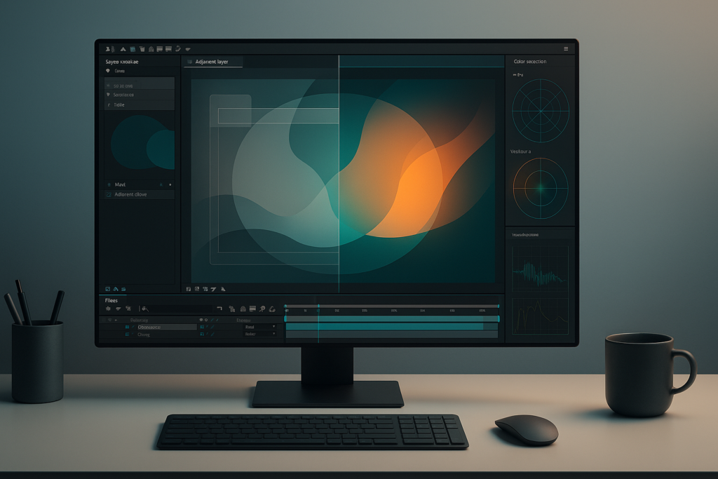
See a polished “look” in a UI-style animation
What are Best Practices and Tips for Color Grading Motion Graphics in After Effects
Great grades aren’t just “pretty.” They’re consistent, technically sane, and resilient to change. Motion graphics often go through multiple revisions, versioning for different aspect ratios, and last-minute logo swaps. Your grading workflow should survive all of that without collapsing into chaos.
Maintaining Consistency Across Scenes or Sequences
Consistency is what separates a polished sequence from a collection of nice shots. In motion design, consistency means:
- Stable neutrals: Grays should remain gray (unless you intentionally tint them).
- Repeated colors match: The same brand blue shouldn’t look different from scene to scene.
- Contrast logic stays coherent: If Scene 1 is soft and airy, Scene 2 shouldn’t suddenly be crunchy unless it’s a story beat.
Methods to keep consistency:
- Use a master adjustment layer in a “Main” comp: Put all scenes into a master comp and apply the overall grade there. Scene-level corrections happen inside each scene precomp.
- Build a reference frame set: Export stills of key scenes and keep them visible while grading. If you can’t see scenes side-by-side, your eyes will lie to you.
- Save grade presets: If you’re using Lumetri or Curves setups repeatedly, save presets so you can apply the same base look quickly.
- Lock brand colors: Keep brand-critical elements above the grade, or isolate them from heavy adjustments.
Consistency also includes motion: if you animate grade intensity (for transitions), do it with restraint and a consistent easing style. A grade that “pops” mid-shot can feel like a bug even if it’s technically smooth.
Avoiding Common Color Grading Mistakes
Most grading mistakes in motion graphics aren’t dramatic-they’re subtle, cumulative, and easy to miss until the render is on a different screen.
Common pitfalls (and how to avoid them):
- Banding in gradients: Work in 16/32 bpc, avoid extreme curve bends, and consider adding subtle dithering/noise to smooth transitions.
- Crushed blacks that hide design detail: Check shadow areas for lost texture or shapes. Motion graphics often rely on subtle separation.
- Oversaturated accents: Bright colors can clip and bloom on some displays. Pull saturation back slightly and rely on contrast/hierarchy instead.
- Unintended color shifts in whites/grays: Watch neutrals. If your “white” UI turns pinkish or greenish, it looks unprofessional fast.
- Grading text like it’s footage: Heavy contrast and sharpening can make text harsh or fringed. Protect it.
- Stacking too many effects: Ten small adjustments can be harder to manage than one well-considered curve and a simple balance pass.
A useful habit: periodically toggle your grade off and on. If the “off” version looks cleaner and more readable, your grade may be doing too much. If the “on” version feels more intentional without losing clarity, you’re on the right track.
How to Use Scopes and Waveforms to Monitor Color
Your eyes are excellent, but they’re also easily influenced by surrounding colors, room lighting, and the fact that you’ve been staring at the same comp for two hours. Scopes are the antidote to self-deception.
Scopes help you:
- See if you’re clipping highlights or crushing shadows.
- Check whether neutrals are truly neutral.
- Monitor saturation and avoid illegal broadcast levels (if relevant).
What to look for (conceptually):
- Waveform (luma): Shows brightness distribution. Great for ensuring your text/UI sits in a readable luminance range.
- RGB parade: Shows channel balance. If your “gray” background has uneven RGB levels, you’ve introduced a tint.
- Vectorscope: Shows saturation and hue direction. Helpful for keeping brand colors consistent and avoiding oversaturation.
In motion graphics, scopes are especially helpful when you’re working with flat colors. A tiny shift that’s hard to perceive can be obvious on an RGB parade. Use scopes to confirm what you intend is what you’re actually doing.
One more tip: check multiple frames. Animation can cause values to spike briefly (a flash, a glow peak, a transition). A single frame can clip even if the rest is fine, and that one frame may be the one the client screenshares.
Balancing Artistic Intent with Technical Accuracy
Color grading is where art meets engineering. Motion graphics makes that intersection even sharper because you often have non-negotiables: brand colors, accessibility/readability, and platform constraints.
A practical way to balance both sides:
- Define “must not change” elements: Logos, product colors, UI states, compliance colors. Protect them.
- Define “free to stylize” elements: Backgrounds, textures, atmosphere, shadows, lighting accents.
- Grade for the message: If the message is clarity (tutorial UI), keep contrast clean and colors stable. If the message is mood (title sequence), you can push stylization harder.
Also consider accessibility. High style shouldn’t come at the cost of legibility. If your grade lowers contrast between text and background, you may be making the design objectively harder to read. Sometimes the most professional choice is a grade that’s slightly less dramatic but significantly more usable.
Finally, remember that motion graphics often live on compressed platforms. Subtle shadow detail can vanish in streaming compression. Technical accuracy includes planning for that reality-sometimes you need slightly stronger separation than you’d prefer in a pristine master file.
How to Export and Preserve Color Grading from After Effects
The final heartbreak is when your render doesn’t match your comp viewer. Export is not an afterthought-it’s the last step of your color pipeline. A perfect grade that shifts on export is still a failed delivery (at least emotionally).
To preserve your grade, you need to align export settings with your working space, delivery platform, and codec behavior.
Choosing the Right Export Settings
The “right” settings depend on where the video will live. A social ad, a broadcast deliverable, and a conference screen loop are three different beasts. Still, there are reliable principles.
General export guidance for graded motion graphics:
- Choose a codec appropriate for the job: For high-quality masters, use a robust intermediate codec (commonly ProRes or similar) if your pipeline supports it. For direct-to-web, H.264/H.265 may be required, but consider making a master first.
- Match frame rate and resolution: Avoid unnecessary resampling that can introduce artifacts around edges and gradients.
- Mind bit depth and alpha needs: If you need transparency (for overlays), choose a format that supports alpha and preserves your color pipeline.
Master-then-deliver workflow: Export a high-quality master file that preserves your grade, then create platform-specific encodes from that master. This reduces the chance you’ll re-render from After Effects for every tiny delivery change and accidentally introduce inconsistencies.
If your project includes subtle gradients, glows, or vignette roll-offs, give your export extra care. Highly compressed codecs can posterize gradients. If you see banding in the final encode, try:
- Adding subtle dithering/noise before export (tiny amounts).
- Increasing bitrate for the web encode.
- Exporting a higher-quality master and encoding with a better tool/preset.
Ensuring Color Accuracy in Final Render
Color accuracy is less about superstition and more about verifying each link in the chain.
Steps to reduce surprises:
- Check your comp viewer settings: Make sure you’re previewing in a way that reflects your working space and intended output.
- Do short test renders: Export 5-10 seconds with your heaviest gradients, glows, and darkest shadows. Review before committing to the full render.
- Compare in multiple players/devices: Watch the test render on your primary display, a phone, and a different desktop player. You’re looking for big shifts: crushed blacks, neon clipping, or gamma differences.
- Keep an eye on UI whites and skin tones: These are the first places viewers notice “something is off.”
Also, be mindful of where the video will be embedded. Some platforms apply their own processing. If you’re delivering to a client who will upload to social, consider providing guidance: recommended upload settings, and a note that platform compression may slightly alter gradients.
When possible, include a small “reference” still or a short reference clip approved by the client. It’s not just helpful-it’s protective. It establishes what “correct” looks like.
Conclusion: Once you’ve built a dependable grading workflow in After Effects, you can start treating color like a reusable design system rather than a one-off finishing step. Create a small library of looks-subtle contrast curves for corporate explainers, bold duotones for event promos, soft pastel grades for lifestyle UI-and keep them as presets or template comps. Over time, you’ll develop a personal “color handwriting,” the same way animators develop timing instincts. And if you want to level up even further, try building a few style frames first (single still compositions) and grading those before animating: it’s much easier to make smart color decisions when the timeline isn’t demanding your attention. Color grading, in the end, is less about chasing perfection and more about building confidence-so every piece you ship looks like it belongs to you.