
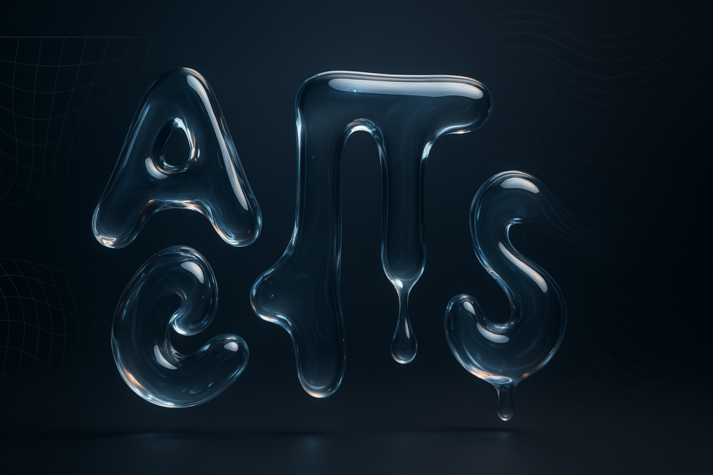
To create a liquid text animation in After Effects, you combine text preparation (often converting type into shapes), controlled deformation (Puppet Pins, Mesh Warp, or Warp effects), and organic motion (Turbulent Displace and displacement maps), then polish it with timing, keyframes, and styling so the letters feel like they’re made of fluid instead of rubber. That’s the core recipe. The rest of this guide expands that recipe into a practical, repeatable workflow-one you can customize for anything from glossy “gel” typography to inky, blobby drips.
We’ll build the effect in a way that stays editable and readable, because liquid text is only fun if viewers can still tell what it says. Along the way, you’ll see why shape layers and masks matter, how turbulence adds natural motion, how displacement maps create believable distortion, and why previewing frequently is the difference between “mesmerizing fluid type” and “my font is melting for no reason.”
Watch a liquid-glass After Effects breakdown
📋 Table of Contents
What is Liquid Text Animation in After Effects?
Liquid text animation is a motion design style where typography behaves like a fluid-stretching, wobbling, sloshing, dripping, or gently undulating as if it’s made from water, paint, gel, mercury, or syrup. In After Effects, you don’t simulate true fluid dynamics (not natively, anyway). Instead, you fake it using deformations, procedural noise, and smart timing-because motion design is basically professional illusion-making.
The goal isn’t random distortion; it’s viscous believability. Liquids have inertia. They overshoot, settle, and keep moving in small residual waves. A convincing liquid text animation respects that: it feels continuous, smooth, and slightly unpredictable, but still controlled enough to remain legible.
Characteristics of Liquid Text Animation
Liquid text typically has a few recognizable traits. First, edges rarely stay perfectly crisp-there’s subtle waviness, bulging, and soft deformation, especially during motion. Second, the movement is often secondary: the text might slide or scale, but the liquid behavior follows behind, like the letters are catching up with themselves.
Another hallmark is volume conservation (even if it’s an illusion). When one part of a letter stretches thinner, another part often bulges slightly, suggesting the same “amount” of material is being redistributed. In After Effects, you can hint at this by combining a broad warp with localized pin deformations, then layering a gentle turbulence pass on top.
- Viscosity cues: slow, heavy wobble for syrup; snappy ripples for water.
- Edge behavior: blobby, rounded corners read more “liquid” than sharp serifs.
- Residual motion: small settling waves after the main action sells realism.
Benefits of Using Liquid Text Animation
Liquid text is a fast way to inject personality into a title card. Even simple words feel alive when they gently breathe and shimmer. It also bridges the gap between graphic design and character animation: your typography becomes the performer.
From a practical standpoint, liquid motion is forgiving. Tiny imperfections can look intentional-organic, handmade, tactile. And because the effect often relies on procedural tools like turbulence and displacement, you can generate lots of variation quickly without hand-animating every frame.
Finally, it’s a strong storytelling cue. Liquid implies mood: playful (goo), premium (molten metal), dreamy (ink in water), or even unsettling (slow melt). That’s a lot of emotional range for a few effects and keyframes.
Common Uses for Liquid Text Animation
You’ll see liquid typography in music visuals, product promos (especially beverages, cosmetics, and candy), social ads, lyric videos, and playful brand idents. It’s also common in explainer videos when you want a moment of visual delight between information-heavy sections.
On the web, liquid text often appears as short loops-GIFs or MP4 snippets-because the motion is hypnotic and reads well even without sound. For video, it’s frequently used as an opener or chapter marker: a quick, satisfying “splash” of type that sets tone.
What Are the Tools and Features Needed in After Effects?
After Effects includes everything you need to create convincing liquid text-no plugins required-though plugins can speed things up later. The key is knowing which tools do what: which ones reshape geometry, which ones generate organic motion, and which ones help you control timing.
Think of your toolkit in three layers: structure (shape layers, masks), motion (Puppet, Mesh Warp, Warp), and texture (Turbulent Displace, displacement maps, blur/glow). Then you tie it all together with keyframes and the Graph Editor.
Essential After Effects Panels and Effects
At minimum, you’ll want to be comfortable with:
- Timeline & Keyframes: where the motion lives.
- Effects & Presets: to apply Warp, Turbulent Displace, Displacement Map, Blur, Glow, etc.
- Character & Paragraph panels: for clean typography setup before you start deforming.
- Align panel: because liquid text still needs good layout.
Effect-wise, these are the workhorses:
- Turbulent Displace: procedural wobble and ripples (a staple for natural movement).
- Displacement Map: distort using a texture/noise layer-great for “liquid surface” behavior.
- Warp / Bulge / Bezier Warp: broad, art-directable deformation.
- Mesh Warp: smooth deformations with controllable grid points.
- Roughen Edges (optional): for blobby, organic outlines when used subtly.
Using the Puppet Tool for Liquid Effects
The Puppet Tool is often associated with character rigs, but it’s also perfect for liquid text because it lets you create localized deformation. You place pins on parts of letters and animate them to create stretches, squashes, and drips-like pulling taffy.
The trick is restraint. Too many pins can make the mesh look crunchy or over-constrained. Too few, and the motion looks like a stiff sticker sliding around. A good starting point is placing pins at key structural points: corners, terminals, and mid-strokes-then adding a couple of “drip” pins where you want gravity-like pulls.
Also: Puppet works best when your text has enough resolution and clean edges. That’s why many artists convert text to shapes before puppet work-more on that soon.
Role of Shape Layers and Masks
Shape layers are your best friend for liquid text because they’re inherently vector-based and respond well to deformations and effects. When you convert text to shapes, each letter becomes a set of paths you can animate, merge, offset, and stylize.
Masks matter because liquid often involves reveals: the text fills up like a glass, wipes on like paint, or emerges from behind a blobby matte. Masks let you art-direct these reveals with precision. Combine masks with feathering and animated mask paths, and you can create the illusion of fluid “filling” the letters.
A common professional approach is to use a separate matte layer-a noisy, animated blob-then use it as an Alpha Matte for your text. This is where displacement maps and turbulence become especially useful: they make the matte feel alive.
Importance of Keyframes and Graph Editor
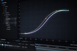
Liquid motion lives and dies on timing. If your keyframes are linear, the text looks mechanical. Real fluid eases in, overshoots, and settles. That’s why keyframes-and specifically the Graph Editor-are non-negotiable.
Use the Graph Editor to shape speed changes: quick push, slow settle; or slow build, fast snap, then tiny aftershakes. Even if you rely on procedural effects for wobble, you still need to animate the influence of those effects over time (Amount, Size, Evolution, etc.).
One more practical note: the context of this workflow matters. A step-by-step approach works best when you preview frequently-short RAM previews of just the section you’re tweaking-so you can judge the fluidity of motion as it plays, not as you imagine it.
How to Prepare Text for Liquid Animation in After Effects
Preparation is where you quietly win. If you set up your text cleanly-good font choice, sensible spacing, and a composition that matches delivery specs-you’ll spend your time designing motion instead of fighting weird artifacts.
In liquid animation, the text layer is not just a label; it’s a piece of geometry you’re going to bend. So choose type that bends gracefully.
Selecting and Formatting Text Layers
Start by creating a new composition and typing your title. Pick a font with thicker strokes and simpler shapes. Ultra-thin fonts can look elegant, but they fall apart when displaced: a small ripple can erase a stroke entirely. Rounded sans-serifs, bold serifs with generous stems, and display fonts with soft terminals are great candidates.
Then format with intention:
- Increase tracking slightly if letters are close-liquid bulges can cause collisions.
- Avoid extreme kerning pairs (like “AV”) unless you plan for merging shapes.
- Consider all caps for punchy, stable silhouettes, or lowercase for a more playful, drippy feel.
Before converting anything, decide whether you need the text to remain editable. If this is a client job with late copy changes, keep an editable text layer as a backup and duplicate it for conversion. Name layers clearly (e.g., TEXT_EDITABLE, TEXT_SHAPES) so you don’t accidentally animate the wrong one at 2 a.m.
Converting Text to Shapes for Advanced Control
To convert: select the text layer, then choose Create > Create Shapes from Text. After Effects generates a shape layer with paths for each character. This unlocks a lot: you can use Merge Paths, animate Offset Paths, adjust Fill and Stroke per letter, and apply effects in a more predictable way.
There are trade-offs. Shape layers can get heavy if the text is long or the font is complex. Also, once converted, you can’t edit the text content directly. That’s why keeping an editable copy is a best practice.
After converting, inspect the shape layer’s contents. You’ll often see groups for each letter. If you plan to animate letters differently (like a wave traveling across the word), this structure is helpful. If you want the entire word to behave like one blob, you may need to unify shapes using Merge Paths and careful grouping.
Setting Up Composition Settings
Set composition specs based on where the animation will live. For social, 1080×1080 or 1080×1920 is common. For video, 1920×1080 is the default. Use a frame rate that matches the delivery: 24 or 30 fps for most video, 60 fps if you want ultra-smooth, syrupy motion.
Two settings matter a lot for liquid text:
- Duration: give yourself time for the liquid to “settle.” A 2-second comp can feel rushed; 4-6 seconds is often nicer for loops.
- Background: choose a contrasting color early so you can judge readability while you animate.
Finally, decide if you’re building a loop. Liquid loops are popular because they feel endless and calming. If looping is the goal, plan for it now: use cyclical animation (Evolution with cycle options, or seamless keyframe matching) so you don’t end up trying to force a loop at the end.
How to Create Liquid Text Animation Step-by-Step
This section gives you a practical build. There are many ways to achieve liquid text, but a reliable approach is to combine: (1) a broad deformation to establish “soft material,” (2) localized animation to create pushes/pulls, (3) procedural turbulence for organic motion, and (4) displacement mapping for surface complexity.
We’ll assume you have a shape layer version of your text (recommended), but most steps also work on a precomped text layer. If you’re working with an editable text layer, consider precomposing it first so effects apply cleanly: Layer > Pre-compose, move all attributes, name it TEXT_PRECOMP.
Browse more After Effects animation breakdowns
Applying Distort and Warp Effects
Start with a controlled, art-directable warp. Apply Effect > Distort > Warp (or Bezier Warp if you want corner control). Choose a subtle style like Arc or Bulge depending on your look. The goal is not to visibly bend the word into a rainbow-unless that’s your vibe-but to make the letterforms feel less rigid.
Animate the warp values slowly. For example, keyframe Bend from 0 to a small value (like 5-12) and back. Add easy ease, then tweak the speed curve so the motion accelerates and decelerates like a soft mass moving through space.
If you want a “sloshing” feel, combine Warp with a gentle rotation or position move of the whole layer. Liquids respond to movement; even a small nudge can motivate the wobble. The important part is that the deformation appears to be a reaction, not a random filter.
Tip: apply Warp early in the effect stack, then add finer detail later. Broad-to-fine is a good mental model: first shape the blob, then add ripples on the surface.
Using the Puppet Pin Tool to Animate Text
Now add localized motion. Select your text shape layer (or precomp), choose the Puppet Position Pin Tool, and place pins on key points. For a short word, 6-12 pins is often enough. Put pins at the ends of strokes, inside bowls (like “O”), and at junctions where you want stretch.
Animate a few pins to create a liquid pull. For instance:
- At frame 0, set pins at rest (they auto-keyframe when you move them with animation enabled).
- At ~12 frames, pull a bottom pin slightly downward to suggest a drip starting.
- At ~24 frames, let it overshoot a touch further, then ease back up slightly.
- Add a tiny side-to-side sway on the same pin to avoid perfectly vertical motion.
Then animate a second pin on a nearby stroke in the opposite direction, subtly. This creates the illusion of internal flow: one area stretches while another compensates. That’s a big part of “liquid logic.”
Open the Puppet settings and adjust Mesh Expansion if edges clip or deform awkwardly. Also consider adding Puppet Starch pins to keep some areas more rigid-like the center of a letter-so everything doesn’t turn into spaghetti.
Adding Fluid Motion with Turbulent Displace
This is where the animation starts to feel alive. Apply Effect > Distort > Turbulent Displace. Set a low Amount to start (e.g., 10-25) and adjust Size depending on your font scale. Larger Size gives slow, broad undulations; smaller Size gives busy ripples.
Animate Evolution to create continuous motion. A simple expression like time*50 works, or you can keyframe it manually. The context behind this approach is straightforward: turbulence effects add natural, dynamic movement to the liquid text, and they do it with very little manual effort.
To avoid the “boiling edges” problem, don’t crank Amount too high. Instead, layer two Turbulent Displace effects:
- Pass 1 (macro): Amount 10-20, Size 80-200 (slow wobble).
- Pass 2 (micro): Amount 2-8, Size 15-60 (surface shimmer).
Then animate the Amount so it peaks during action and calms during rest. That’s more realistic: liquids get energetic when disturbed and settle when left alone.
Preview often. Turbulence can look great frame-by-frame and weird in motion, or the reverse. Short RAM previews are your truth serum.
Animating with Mesh Warp for Smooth Deformations
If Puppet feels too “pinned” or you want smoother, more continuous deformation, use Effect > Distort > Mesh Warp. Increase the grid to something like 4×4 or 5×5 for a start. Then animate a few points to create a slow wave traveling across the word.
Mesh Warp shines when you want the entire word to behave like a cohesive mass-like jelly. You can push one corner up and watch the middle follow. It’s also easier to keep legibility because you’re moving larger regions rather than tugging tiny points.
A good technique is to animate Mesh Warp points with offset timing:
- Left-side points move first.
- Center points follow a few frames later.
- Right-side points finish the wave.
This creates a traveling “sloshing” motion. Then, layer Turbulent Displace afterward for fine detail. Broad mesh movement + subtle turbulence is a reliable combo.
If you need the deformation to feel more physical, add a slight position move to the whole layer at the start of the wave. Motion motivates motion.
Refining Animation with Keyframe Interpolation
Once the deformation is working, polish the timing. Select your keyframes and apply Easy Ease, then open the Graph Editor. For liquid motion, you often want:
- Fast out, slow in when the liquid is settling.
- Overshoot (a little) for a bouncy gel feel.
- Secondary drift after the main move-tiny motion that fades.
Don’t be afraid to add extra keyframes for nuance. A single ease-in/ease-out can feel like a UI animation. Liquids tend to have at least two phases: the main push and the after-wobble.
Also refine the relationship between effects. For example, when Puppet pins pull down, increase Turbulent Displace Amount slightly. When the pins return, reduce it. That coordination makes the whole stack feel like one material reacting, not multiple unrelated effects happening to the same layer.
Finally, consider adding a displacement map stage for that extra “fluid surface” believability-because displacement maps are a classic way to distort text into a liquid-like appearance.
Quick displacement map setup:
- Create a new solid called DISPLACE_MAP.
- Apply Fractal Noise (or Turbulent Noise), animate Evolution.
- Blur it slightly (Fast Box Blur) for smoother distortion.
- On your text layer, apply Effect > Distort > Displacement Map.
- Set the map layer to DISPLACE_MAP, use Luminance, and keep Max values modest (5-20).
This adds a surface-like distortion that feels different from Turbulent Displace-more like the text is refracting through moving liquid.
How to Enhance Liquid Text Animation with Color and Style
Motion sells the physics; styling sells the material. The same wobble can read as water, slime, chrome, or neon gel depending on color, highlights, and glow. This is where you decide what kind of liquid you’re actually animating.
As the context notes, customizing colors and textures is part of the fun-and it’s also how you make the effect feel less “default After Effects filter” and more like a designed piece.
Applying Gradient and Fill Effects
For shape layers, you can use built-in Fill and Gradient Fill inside the shape contents. Gradients are especially effective for liquid because they imply curvature and translucency.
Try these approaches:
- Vertical gradient: darker at bottom, lighter at top for a “lit from above” look.
- Diagonal gradient: suggests directional lighting and motion.
- Animated gradient start/end points: subtle movement that feels like light sliding over a wet surface.
If you’re working with a precomped text layer, you can use Gradient Ramp or 4-Color Gradient. Keep it tasteful: liquid looks better with smooth transitions than harsh bands.
For translucent liquids (water, glassy gel), consider lowering opacity slightly and adding a faint background distortion behind the text (advanced, but powerful). Even a small refractive hint can make the text feel embedded in space.
Adding Shadows and Highlights for Depth
Depth is what turns “wobbly flat text” into “goo you could poke.” Highlights are especially important: liquids reflect light with soft, curved speculars.
Easy highlight recipe:
- Duplicate the text layer (or shape layer).
- On the top copy, make it a lighter color (near-white or a lighter tint).
- Apply Gaussian Blur and set blending mode to Screen or Add.
- Mask it so the highlight sits on the top edges of letters.
For shadows, use Drop Shadow carefully. Real liquid often has a soft contact shadow and a subtle ambient shadow. Too strong and it looks like a sticker. A small distance, large softness, and low opacity usually works.
If you want a more dimensional “gel sticker” style, add an Inner Shadow (Layer Styles) or fake it with a blurred duplicate set to Multiply, masked to the interior. That inner shading suggests thickness.
Using Glow and Blur Effects for Realism
Glow is not only for neon-it’s also a cheat for bloom and softness. For bright liquids (neon slime, luminous ink), apply Glow and tune the threshold so only the highlights bloom. If everything glows equally, you lose detail and readability.
Blur can also simulate depth-of-field or motion softness. A tiny Fast Box Blur (1-3 pixels) can reduce harsh edges created by displacement, making the liquid feel smoother. If you’re exporting for web, be careful: heavy blur can create banding in compressed formats.
For extra realism, animate glow intensity subtly in sync with motion peaks-when the liquid stretches or ripples, the highlight bloom can increase slightly, as if the surface angle changes relative to the light.
What Are Common Challenges and Solutions in Liquid Text Animation?
Liquid text is delightful right up until it isn’t. Most problems fall into three buckets: deformation looks wrong, the text becomes unreadable, or your machine starts sounding like it’s rendering the sun. The good news is that these issues are common-and fixable.
Also, keep the workflow habit emphasized in many practical tutorials: preview frequently. Most liquid issues are motion issues, and motion can’t be judged from a single frame.
Fixing Unnatural Distortions
If your text looks like it’s made of rubber rather than liquid, the deformation may be too uniform or too high-frequency. Liquids usually deform smoothly and continuously. Here are fixes:
- Lower Turbulent Displace Amount and increase Size for smoother waves.
- Blur your displacement map more so the distortion is less crunchy.
- Reduce pin count in Puppet; too many pins can create sharp creases.
- Add Starch pins to preserve structure in key areas.
If you see edge tearing or strange clipping, check layer order and precomps. Sometimes applying effects directly to a shape layer with many groups can behave differently than applying effects to a precomp. Precomposing the shape layer (moving all attributes) can stabilize the effect stack.
Another common culprit is mixing coordinate spaces: for example, a displacement map layer that’s scaled or transformed differently than the text. Keep the map layer the same comp size, and avoid non-uniform scaling unless you want directional distortion.
Maintaining Text Readability
Readability is the price of admission. If viewers can’t read it quickly, the effect becomes decorative noise. To keep clarity:
- Use bold type and avoid ultra-thin strokes.
- Limit maximum distortion during key reading moments (first 1-2 seconds).
- Stabilize counters (holes in letters like O, P, R) with Starch pins or gentler warps.
- Increase contrast between text and background; add subtle shadow if needed.
A practical approach is to choreograph your animation: let the word appear cleanly first, then introduce heavier liquid behavior after the viewer has read it. This is especially useful in ads and title sequences where comprehension matters.
If you want a dramatic drip, consider doing it as an accent on one letter rather than the whole word. One juicy drip can sell the concept without sacrificing the message.
Improving Render Times
Liquid text stacks can get heavy: multiple distortions, noise layers, blurs, glows, and displacement maps add up. To speed things up:
- Pre-render heavy noise maps (like Fractal Noise) and reuse them.
- Use adjustment layers strategically, but don’t stack unnecessary effects globally.
- Lower preview resolution (Half/Quarter) while animating.
- Turn off Motion Blur until final polish.
- Use Fast Box Blur instead of Gaussian Blur when acceptable.
If you’re using multiple Turbulent Displace effects, consider whether both are necessary at all times. You can keyframe effect opacity (or Amount) so the micro-ripple pass only activates during moments of action.
And when you’re iterating, isolate. Solo the text, preview a work area of 1-2 seconds, and only expand once the motion feels right. This aligns with the practical advice you’ll see in most workflows: frequent, targeted previews help you reach the desired effect faster.
How to Export and Optimize Liquid Text Animation
Export is where your beautiful liquid motion meets the real world: codecs, file sizes, platform constraints, and the eternal mystery of why something looks different after compression. The key is to decide your destination first-web, social, or video-and export accordingly.
As many step-by-step guides note, the final step often involves exporting the animation as a video or GIF. GIFs are common for loops, but they’re not always the best choice for quality. MP4 or WebM often looks better at a smaller size.
Choosing the Right Export Settings
For most uses, export a master file first, then create platform versions from it.
- Master: ProRes 422 (or ProRes 4444 if you need alpha), or an image sequence for maximum quality.
- Delivery (video): H.264 MP4 for broad compatibility.
- Delivery (web modern): WebM can be smaller and cleaner for loops, depending on your pipeline.
If you need transparency (for overlaying liquid text on other footage), export with alpha using ProRes 4444 (or an equivalent) and then convert to a web-friendly format that supports alpha if needed (workflow varies by platform).
Make sure your color management is consistent. Glows and gradients can shift if you export with mismatched color profiles. Do a short test export early-especially if your design relies on subtle highlight detail.
Optimizing File Size and Quality
Liquid text often contains smooth gradients and soft motion-two things compression loves to destroy. To keep quality while shrinking size:
- Avoid excessive blur that creates large areas of subtle gradient (hard for H.264).
- Add a tiny bit of noise (very subtle) to reduce banding in gradients.
- Use a reasonable bitrate: too low will smear the ripples; too high may be unnecessary.
- Limit resolution to what you actually need (don’t ship 4K for a small web embed).
If exporting a GIF, be prepared to compromise. GIF has limited colors and can turn smooth liquid gradients into crunchy steps. A common approach is to export MP4 for most platforms and reserve GIF for places that truly require it. If you must use GIF, reduce frame rate (15-20 fps), simplify gradients, and consider a dither setting during conversion.
Preparing Animation for Web or Video Use
For web loops, seamlessness matters more than dramatic arcs. Keep motion subtle, cyclical, and avoid big directional moves that reveal the loop point. Animating Turbulent Displace Evolution with a cycle-friendly setup can help, as can matching the first and last keyframes on your Puppet/Mesh Warp.
For video titles, readability and pacing matter. Give the viewer a clean read, then let the liquid behavior add charm. Also consider safe margins if the text will appear on broadcast or across varied devices.
Finally, test on the target platform. A liquid effect that looks silky in After Effects can look overly sharp after social media compression. If that happens, you may need slightly stronger shapes (bolder type, thicker highlights) and less fine micro-detail that gets lost in encoding.
Where to Find Inspiration and Resources for Liquid Text Animation
Liquid text is one of those styles where inspiration matters because the “physics” is subjective. Is your liquid thick like honey or light like water? Does it shimmer like chrome or glow like neon? Watching a variety of references helps you build a mental library of motion cues and surface treatments.
And because After Effects is deep, the fastest way to level up is to learn how others stack effects, manage timing, and keep things readable while still going delightfully gooey.
Tutorials and Courses for After Effects
Look for tutorials that focus on deformation workflows (Puppet, Mesh Warp, displacement maps) rather than just “apply this preset.” The best lessons explain why a technique works-like how turbulence adds natural, dynamic movement, or how displacement maps create liquid-like distortion-so you can adapt it to your own typography and brand style.
When evaluating a tutorial, check whether it covers:
- Text prep (font choice, converting to shapes, precomps)
- Timing (keyframes, Graph Editor, easing strategies)
- Styling (highlights, gradients, glow, depth cues)
- Export (web vs video, GIF vs MP4)
Courses that include critique or project-based assignments are especially useful. Liquid motion is subtle; feedback helps you spot when something feels “off” even if you can’t immediately name why.
Plugins that Simplify Liquid Effects
You can do everything in this guide with native tools, but plugins can accelerate certain looks-especially if you need advanced blobby merges, metaballs, or more complex organic motion. If you explore plugins, look for ones that:
- Create blobby/morphing shapes with controllable viscosity
- Offer better noise/displacement options or faster previews
- Help with stylized shading (gel, glass, chrome) without manual layer stacks
Even with plugins, the fundamentals remain the same: good typography, motivated motion, and careful timing. A plugin can generate goo, but it can’t decide whether your goo is saying something readable.
Community and Forums for Feedback and Tips
Motion design communities are where you learn the small, practical tricks: how to keep counters from collapsing, how to avoid edge chatter, how to make a loop seamless, and how to export without banding. Post short clips and ask specific questions like “Does this wobble feel watery or gelatinous?” You’ll get more actionable feedback than a general “Thoughts?”
When you share, include details: frame rate, effects used (Turbulent Displace settings, displacement map values), and what you’re aiming for. People can then suggest targeted changes-like lowering Amount, increasing Size, or shifting keyframe influence in the Graph Editor.
And keep a habit of saving iterations. Liquid text is exploratory; sometimes version 3 is better than version 12, and you won’t know until you compare them side by side.
Conclusion
Once you’ve built your first liquid text animation, the most interesting next step is to start designing a “material library” for yourself: a few reusable setups that represent different fluids-water, ink, gel, slime, molten metal-each with its own timing profile, highlight style, and distortion behavior. You’ll notice that the motion language changes with the material: ink tends to bloom and spread, gel tends to wobble and settle, molten metal tends to move slowly but gleam sharply.
It also helps to study real-world references the way animators do. Watch slow-motion footage of droplets, paint pours, or even latte art. Pay attention to how motion propagates through the liquid, how edges round off, and how the surface catches light. Then bring that back into After Effects not by trying to simulate physics perfectly, but by making smarter artistic choices: where to place deformation, when to let motion rest, and how to use color and texture to imply thickness.
Finally, treat your liquid text as typography first and effect second. A beautifully chosen font, thoughtful spacing, and confident composition make the liquid behavior feel intentional-like the type was always meant to be fluid. When that happens, the animation doesn’t just wobble; it communicates.