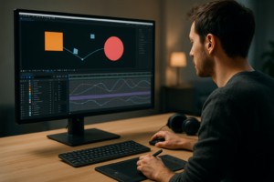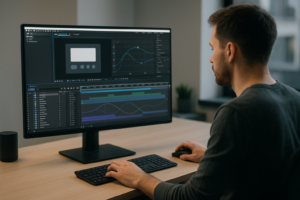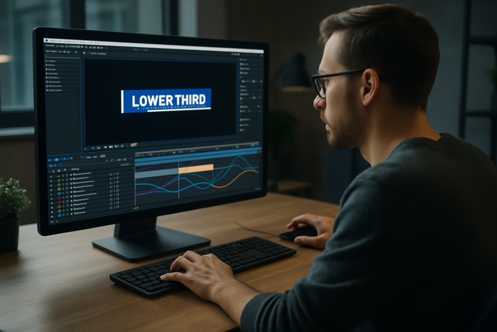
Animated lower thirds are one of the most visible details in any professional edit. Whether you cut YouTube videos, corporate explainers, or social ads, clean lower thirds instantly raise your production value. This guide walks through practical After Effects workflows for designing, animating, and reusing them efficiently in real projects.Browse lower thirds now
Understanding what animated lower thirds actually do
What are animated lower thirds
Animated lower thirds are small title graphics that appear in the lower area of the frame, usually to introduce a person, place, or key information. In After Effects, they are typically a combination of text layers, shape layers, and simple animations that slide, fade, or scale into view without distracting from the main footage.
Why lower thirds matter in your edit
Lower thirds solve a communication problem: they provide context fast. Viewers should instantly know who is speaking, what topic is on screen, or what section of the video they are in. Well-designed lower thirds:
- Make videos feel more professional and trustworthy
- Help audiences follow complex content (tutorials, interviews, panels)
- Reinforce branding through colors, typography, and motion style
- Keep key information readable without pausing the video
Who needs animated lower thirds
If you work in After Effects as an editor, motion designer, or content creator, you will use lower thirds often:
- YouTube creators who introduce guests, segments, or chapters
- Agencies and freelancers producing branded corporate videos
- Social media teams making reels, shorts, and vertical explainers
- Education and course creators labeling topics, modules, or speakers
How After Effects fits into the process
Most editors assemble a rough cut in Premiere Pro, DaVinci Resolve, or similar, then turn to After Effects when they need more control over motion, easing, and animation details. Lower thirds are perfect for After Effects because:
- You can build reusable systems with precomps and expressions
- You have fine control over easing, overshoot, and motion blur
- You can create scalable templates that adapt to different names and titles
Key building blocks of animated lower thirds
To understand how to create animated lower thirds, it helps to break them down into basic components:
- Text layers for names, roles, descriptions, and keywords
- Shape layers for bars, boxes, underlines, and accents
- Animation with position, scale, opacity, and sometimes rotation
- Timing to sync the appearance with the speaker or beat
- Branding using consistent fonts, colors, and alignment
From simple to advanced lower thirds
You can start with very simple designs: a single bar sliding in with a name on top. As your skills grow, you can add secondary lines, icons, animated backgrounds, and subtle details like track mattes and blur reveals. The fundamentals remain the same: clarity first, style second.
Exploring lower thirds After Effects templates and styles
Why use a lower thirds After Effects template
Building every graphic from scratch can slow down your workflow, especially when you are editing multiple videos per week. A good lower thirds After Effects template gives you:
- Prebuilt compositions with layered animations
- Easy customization of text, colors, and timing
- A consistent style across multiple videos and clients
- A time-saving starting point that you can adapt
Common types of lower thirds templates
Templates vary a lot, but most fall into a few functional styles:
- Minimal bars – clean rectangles or lines that slide in with name and title
- Boxed IDs – solid or semi-transparent boxes with more room for text
- Callout-style – pointers, arrows, or connectors tying text to a part of the frame
- Segment labels – topic or chapter titles that work as lower thirds or headers
- Dynamic social/stream overlays – animated handles, live labels, and status bars
Matching templates to content type
The right template depends on what you are editing:
- For music or lyric projects, you might combine lower thirds with animated text similar to lyric-style layouts.
- For overlays in tech or finance content, widget-based designs like animated finance widgets can inspire clean, data-driven lower thirds.
- For map-based or location-heavy videos, try ideas from location widgets to highlight places or venues in your lower thirds.
Template formats and how they are organized
Most lower thirds templates ship as:
- An After Effects project file (.aep)
- Separate precomps for each style variation
- A master controls comp with color and timing adjustments
You will often see precomps named by type or use case, such as “Speaker Lower Third 01” or “Topic Label 03”. A well-made template lets you drop into a Controls comp, adjust a few sliders, and reuse the same look across your entire edit.
Choosing between multiple styles in a pack
When you download a pack or browse a library, look for:
- Readable typography at your target resolution (1080p, 4K, vertical)
- Multiple length options (one-line, two-line, social handle)
- Adjustable safe margins for broadcast and subtitles
- Variants for different backgrounds (light, dark, busy footage)
Once you understand the structure of a typical template, building your own lower thirds from scratch becomes much easier. You can copy the best organizational habits and adapt them to your own style.
Common lower thirds mistakes and how to avoid them
Overcomplicating the design
One of the most frequent issues when people learn how to create animated lower thirds is trying to show off every technique at once. Excessive gradients, glows, and complex shapes quickly become distracting.
- Prioritize clarity over style
- Limit yourself to 1–2 fonts and a small color palette
- Keep shapes simple and functional
Poor timing and easing
Even a beautiful design can look amateur if the animation timing is off.
- Too fast: viewers cannot read the name in time
- Too slow: the lower third feels heavy and drags the pacing down
- No easing: linear keyframes make motion feel robotic
Use easy ease and adjust curves in the Graph Editor so movement starts and stops smoothly. Aim for:
- Entrance around 6–10 frames of acceleration
- Hold on screen long enough to read twice
- Exit that feels lighter than the entrance
Ignoring safe margins
Designing too close to frame edges can cause issues on certain displays or when cropped for different aspect ratios. Keep text and crucial elements within a safe area, especially if your work might be broadcast or reframed for social platforms.
Messy compositions and naming
Inconsistent naming becomes a headache as projects grow. When you return weeks later, it is difficult to understand what each layer does.
- Rename layers (e.g., “Name Text”, “Role Text”, “Main Bar”)
- Use color labels to group text, shapes, and controls
- Precomp complex sections and name them clearly (e.g., “LT_01_Main”)
Heavy plugins and unnecessary effects
Stacking effects like blurs, glows, and third-party plugins on every layer slows previews and renders. Many projects do not need them.
- Start with native effects and simple masks
- Use blur or glow sparingly as accents
- Reserve plugins for specific looks you truly need
Inconsistent styles across an edit
Another common mistake is using different lower thirds for each video or segment, creating a fragmented viewing experience.
- Define a basic style guide (font, size, colors, motion style)
- Stick to one or two layouts across the entire series
- Save a “master” lower third comp you can reuse in future projects
Not testing against real footage
Lower thirds that look great on a solid background may be unreadable over live footage.
- Test against both light and dark shots
- Add subtle background shapes or boxes where necessary
- Use contrast and color to separate text from the image
By recognizing these mistakes upfront, you set a strong foundation before diving into more advanced workflows or template-based systems.
Choosing the right lower thirds workflow for your project
Start with your distribution platform
Before you design anything, decide where the content will live. The best workflow for animated lower thirds in After Effects depends heavily on format.
- YouTube and long-form content: prioritize legibility on desktops and TVs, design for 16:9, and expect recurring speakers.
- Shorts, reels, and vertical: keep lower thirds tighter, avoid covering critical center content, and use bold typography.
- Ads and promos: make branding stronger, include logos or icons when needed, and test multiple background types.
- Corporate and internal videos: keep the style sober, clean, and on-brand with official guidelines.
If you work with YouTube creators, check platform resources such as YouTube Creators to understand typical layouts and safe zones so your lower thirds support thumbnails, end screens, and overlays.
Scratch design vs template-based workflow
You have two main options for building lower thirds in After Effects:
- Design from scratch when you need a unique, brand-specific look or want to refine your motion design skills.
- Use templates when speed, consistency, and volume matter more than inventing a completely new style.
For recurring content like weekly videos or multi-episode series, templates often win: you can standardize design once, then focus on content rather than rebuilding graphics.
Adapting to different video types
Choose your animation style based on how dynamic the edit is:
- Cinematic or documentary: prefer subtle, slower animations with fades and gentle slides.
- Tech, gaming, and energetic content: sharper moves, stronger easing, maybe slight overshoot.
- Educational and tutorial: minimal motion, high contrast, and stable positions so viewers can read comfortably.
You can also match your lower thirds style to other on-screen elements. For example, if you use animated widgets similar to a YouTube-style widget graphic, echo its line weight, colors, and corners in your lower thirds for a consistent visual language.
When a template library makes sense
If you edit for multiple clients or channels, switching designs constantly becomes a time sink. A broader template library with an Unlimited After Effects Templates Subscription can help you:
- Quickly match a style to each brand without starting from zero
- Maintain consistency across different series from the same client
- Experiment with new looks while keeping your timeline moving
Balancing speed and customization
The ideal workflow is often hybrid: start from a solid template, then customize key details (colors, typography, timing) to match your brand or project. Over time, you will build a personal library of variations that you can drop into new edits, tweak, and export quickly.Compare template plans
Step by step workflow to build and customize lower thirds
Plan your layout and information hierarchy
Before you touch After Effects, decide what your lower third needs to show. Typical fields include:
- Primary line: name or main label
- Secondary line: role, title, or short description
- Optional: social handle, location, episode or section name
Sketch a few layouts or screenshot reference frames that you like. Pay attention to where the speaker usually stands and how much screen real estate you can use without blocking important content.
Set up your After Effects project correctly
Consistency starts with project settings:
- Resolution: match your edit (1080p, 4K, or vertical like 1080×1920)
- Frame rate: use the same fps as your main sequence (23.976, 25, 30, etc.)
- Color space: keep it consistent with your delivery pipeline
Create a main composition for your lower third, e.g., LT_Master_1080p, and a separate comp for testing it on reference footage.
Organize layers and precomps
Good organization is what makes a lower third reusable:
- Group related elements into precomps: e.g., “Name_Block”, “Title_Block”
- Separate text and background shapes so you can swap copy without touching animation
- Create a dedicated controls comp where you can centralize key color controls and timing markers
Use consistent prefixes like LT_ for all related comps so they are easy to locate later.
Design the background shapes
Use shape layers for bars, boxes, and accents:
- Enable the title/action-safe overlay to keep everything inside a clean area
- Start with simple rectangles and subtle rounded corners
- Use fills and strokes with clear contrast against both light and dark footage
You can reference other overlay-heavy designs, such as those seen in a video conferencing overlay widget, to inspire clean alignment and padding.
Add and style your text
Create separate text layers for each line. Keep these principles in mind:
- Use a clear, legible font at small sizes
- Balance font weights: bold for names, medium or regular for titles
- Align text inside your shapes with consistent padding
Set paragraph alignment according to your layout: left-aligned text is usually easier to read quickly than centered text in lower thirds.
Animate entrances and exits
Now bring the design to life with simple but refined motion:
- Animate background shapes first (position and opacity)
- Add text animations with slightly delayed timing for a layered feel
- Use easy ease and refine curves in the Graph Editor for polished motion
Consider short overshoots or secondary animations (like a subtle scale bounce) but avoid anything that distracts from the speaker.
Build a timing system
For reusability, set up a consistent timing system:
- Place markers for In, Hold, and Out positions
- Use precomps or expressions so you can easily extend the hold without redoing animation
- Test different durations to find the sweet spot for your typical content
Optimize performance
Lower thirds should preview quickly. To keep things fast:
- Limit heavy blur and glow effects
- Use motion blur only where it actually adds value
- Set preview resolution to half or third if needed
- Turn on disk cache and clear it if performance drops
If you are working inside a bigger graphics-heavy project with widgets and overlays similar to those in animated UI-style comps, consider rendering your lower thirds as pre-rendered alpha video files (ProRes with alpha) for smoother editing in your NLE.
Check plugin dependencies and safe alternatives
If you plan to share your lower thirds with collaborators or clients, minimize third-party plugin use. When you must use plugins, document them clearly and offer a fallback version using native effects where possible.
Customize for multiple use cases
Once the main design and animation are solid, duplicate the comp for different scenarios:
- Standard name lower third – one or two lines, bottom-left or bottom-right
- Topic or chapter bar – stretches wider, may sit near the bottom or top
- Social handle tag – more compact, can appear near the speaker or central frame
Test your lower thirds in different formats: traditional 16:9, vertical 9:16, and maybe square crops if you repurpose content.
Practical checklist before exporting
Run through a quick checklist to ensure your lower thirds are production-ready:
- All text layers spelled correctly and aligned
- Safe margins respected at all sizes
- Animation smooth with no unwanted stutters
- Colors match branding guidelines
- Comps named cleanly and grouped in folders
- Any placeholder text clearly marked for editors
If you prefer starting from professionally organized projects rather than setting up everything yourself, you can study or adapt project structures from curated motion resources such as those found in the video template collection to sharpen your own organizational habits.
Advanced tips for consistent, reusable lower thirds systems
Create a reusable style system
Instead of thinking of each lower third as a one-off comp, treat it as part of a system. Define:
- Primary and secondary font styles
- Allowed color combinations and accent colors
- Standard padding, margins, and minimum sizes
- Preferred animation curves and durations
Document these choices in a reference comp or a simple PDF. This anchors your visual language across projects.
Use expression controls for flexibility
Expression controls can make your lower thirds more adaptable:
- Add color controls to shape layers so you can recolor the entire set from one panel
- Expose key timing values (delay, hold time) as sliders
- Use checkboxes to enable or disable secondary lines or icons
This approach lets editors or other motion designers quickly adjust the look without digging into keyframes.
Keep projects lightweight
To avoid slowdowns when you scale to multiple episodes or deliverables:
- Clean up unused layers, solids, and comps
- Consolidate and reduce project if you have many unused assets
- Use simple gradients or flat colors instead of heavy textured backgrounds
When a look calls for extra visual interest, consider external media like subtle bokeh or noise overlays rendered once and reused across comps.
Plan for whole-series consistency
Think beyond a single video. If you are building graphics for a show, podcast, or recurring series:
- Create a master lower thirds project just for graphics
- Version it sensibly (v1, v2) when you make bigger style changes
- Keep a change log so collaborators know what is new
Align your lower thirds with other motion elements, such as intro titles or animated widgets. For instance, if you use a clean overlay system similar to the ones seen in a map-based HUD-style comp, maintain similar rounded corners, stroke thickness, and motion patterns throughout.
Export and rendering considerations
How you export your lower thirds matters:
- As pre-rendered assets: render with alpha channel (e.g., ProRes 4444) and overlay in your NLE for maximum performance during editing.
- Via Dynamic Link or similar: offers real-time updates from After Effects but can be heavier on system resources.
For large projects, pre-rendered lower thirds often give the best balance of flexibility and reliability. Keep your rendered files organized with clear naming (show name, version, resolution).
Quality control before delivery
Before handing graphics to a client or publishing:
- Check color accuracy on different displays
- Test readability on small screens and at a distance
- Verify that animations do not clash with cuts or key narrative moments
- Scrub through the entire piece to ensure no lower third lingers too long or exits abruptly
When you fine-tune these details, your lower thirds stop feeling like overlays and start feeling like an intentional part of the storytelling.
Answering common questions about animated lower thirds
How long should a lower third stay on screen
There is no single rule, but a good starting point is long enough for viewers to read the content twice. For short names, this may be 3–4 seconds. For longer titles or multi-line descriptions, 5–7 seconds is safer. Always adjust based on pacing: faster edits may need slightly shorter durations to avoid feeling heavy.
Where should I position my lower thirds
Most editors keep lower thirds in the bottom-left or bottom-right area, away from faces and key action. Use safe margins and avoid placing them directly over subtitles or important UI elements. For vertical content, consider moving them slightly higher than usual so they do not compete with platform UI overlays.
Can I reuse the same lower thirds across multiple brands
Structurally, yes. You can reuse the same animation and layout system, then switch out colors, fonts, and small style details. Save a neutral base version of your lower thirds that you can adapt quickly to new brand guidelines without rebuilding animation each time.
How many lower thirds variations do I really need
For most channels or shows, three to five well-designed variations are enough:
- Standard speaker name and role
- Two-line detailed identifier
- Topic or chapter label
- Social handle or call-to-action tag
- Occasional special event or feature highlight
Too many variations can fragment your visual identity and slow down your editing decisions.
Should I always use motion blur
Motion blur can add realism and smoothness, but it is not mandatory. For fast, snappy animations, subtle motion blur often helps. For very minimal, UI-like movement, you might keep it off to maintain sharpness. Test both options and choose based on the overall style of the project.
Is it better to build my own or rely on templates
Both have a place in a professional workflow. Building from scratch helps you understand motion design fundamentals and create unique branding. Templates save time and allow you to handle higher output. Many motion designers mix both approaches: they start from a solid template, then customize heavily until it feels tailored.
Bringing it all together for faster, cleaner lower thirds
Animated lower thirds work best when they are clear, consistent, and fast to deploy. You have seen how to approach them from fundamentals through templates, common pitfalls, advanced organization, and real-world workflows. The goal is always the same: support the story with motion that feels intentional, never distracting.
Once you understand how to create animated lower thirds, you can treat each new project as a variation on a well-tested system instead of starting over. Whether you design from scratch or begin from a template, keep refining your organization, timing, and style so you can focus more on content and less on rebuilding graphics every time.
If you want to scale this mindset across multiple series and clients, a broad library like an Unlimited After Effects Templates Subscription can give you more starting points while you keep control over the final look and animation. With the right setup, your lower thirds become a reliable part of your toolkit, ready for any brief, format, or platform.
Conclusions
Animated lower thirds are small details that carry big communication weight. When you design them with clear hierarchy, clean motion, and a reusable structure, they speed up your edits and make every video feel intentional. Keep refining your system, and your lower thirds will quietly support any story you need to tell.
FAQ
What is the easiest way to create animated lower thirds in After Effects?
Start from a clean template with organized precomps and controls, then customize text, colors, and timing to match your brand and sequence pacing.
Which After Effects version do I need for most lower thirds templates?
Most modern templates support CC 2019 or newer. Always check the template requirements and match your composition frame rate and resolution.
How can I keep my lower thirds consistent across a full series?
Use a dedicated project with master comps, shared color and text styles, and a simple style guide so every editor uses the same versions.
Are animated lower thirds suitable for vertical content like reels and shorts?
Yes, just adapt layout and size for 9:16, push graphics slightly higher, and test against UI overlays and typical hand-held framing.
How do I avoid performance issues with lower thirds in After Effects?
Limit heavy effects, organize precomps, use lower preview resolutions, and pre-render frequently used lower thirds with alpha for editing.