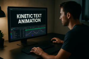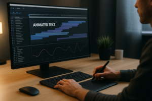
Animating UI widgets in After Effects is one of the fastest ways to make apps, dashboards, and product videos feel polished and modern. This guide walks through clear, repeatable workflows you can adapt to any project, from social edits to UI case studies, using practical steps you can reuse on every timeline. Browse UI animation plans
📋 Table of Contents
UI widget animation basics in After Effects
UI widgets are small interactive pieces of an interface: buttons, cards, tabs, sliders, input fields, notifications, and mini dashboards. Learning how to animate UI widgets in After Effects means giving these static elements believable motion so they feel clickable, responsive, and part of a real product.
For editors and motion designers, UI widget animation sits between product design and motion graphics. You are not just decorating screens; you are communicating hierarchy, feedback, and state changes. A subtle button press, a card sliding into view, or a search bar expanding can say more about a product than paragraphs of copy.
UI widget animation in AE usually focuses on four core behaviors:
- Entrance and exit – how elements appear or disappear (fade, slide, scale, mask reveals).
- State changes – hover, pressed, loading, success, error.
- Navigation and hierarchy – tabs switching, drawers opening, modals animating.
- Feedback and micro-interactions – notifications, toasts, confirmation ticks, and progress indicators.
Why it matters: clean UI motion instantly raises production value for SaaS explainers, fintech promos, dashboards, and social content. If you do client work worldwide or for YouTube channels, this skill helps you turn simple screenshots into dynamic story elements.
Who it is for: editors who want to enhance screen-recorded footage, UX/UI designers building motion specs, and motion designers who need reusable systems. AE gives you full control: easing, expressions, precomps, and resolution-agnostic workflows you can port between projects.
Understanding UI widget animation AE variations
The term ui widget animation ae covers a wide range of styles and use cases. Thinking in categories helps you choose the right approach and the right template or preset for the job.
Common UI widget animation types
- Static mockup with motion overlays – You animate cursors, highlights, and small widgets on top of static UI screenshots. Great for quick app promos and explainers.
- Component-based widgets – Each button, card, or chip is layered and rigged in AE, so you can show different states and sequences.
- Data-heavy widgets – Charts, notifications, and cards animating in sync with voiceover or music, similar to dashboard-style scenes in fintech UI showcases.
- Embedded UI inside devices – Phone or laptop frames with animated widgets, often used for product demos and promo videos.
Comparing UI widget workflows in AE
- Manual build per project – You design and animate from scratch. Maximum flexibility, higher time cost.
- Reusable template systems – Libraries of prebuilt widget comps you can duplicate and restyle, similar to how you would reuse a precomped YouTube layout like the one shown in the YouTube-style UI widget example.
- Screen replacement and compositing – Real footage combined with UI mockups tracked into devices or environments, like dashboards inside cars similar to a car interface-inspired widget animation.
Matching animation style to platform
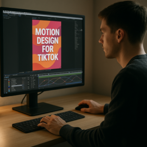
- Social reels and shorts – Fast pacing, punchy transitions, bold scaling, and snappier easing.
- Product explainers – Slower, more readable timing with clear focus shifts and minimal distractions.
- Case-study breakdowns – Clean, functional animation that matches UX design systems, often with cursor and pointer movement.
Exploring different widget styles across categories or playlists, such as the general motion examples on this collection of video projects, can help you recognize which patterns fit your own brand and edit style.
Common mistakes animating UI widgets in AE
Once you start animating UI widgets in After Effects, a few recurring issues tend to appear. Fixing these early keeps your work clean and client-ready.
1. Messy comps and naming
- Randomly named layers like Shape Layer 45 make revisions painful.
- Widgets spread across multiple comps with no structure.
- No color labels or layer grouping.
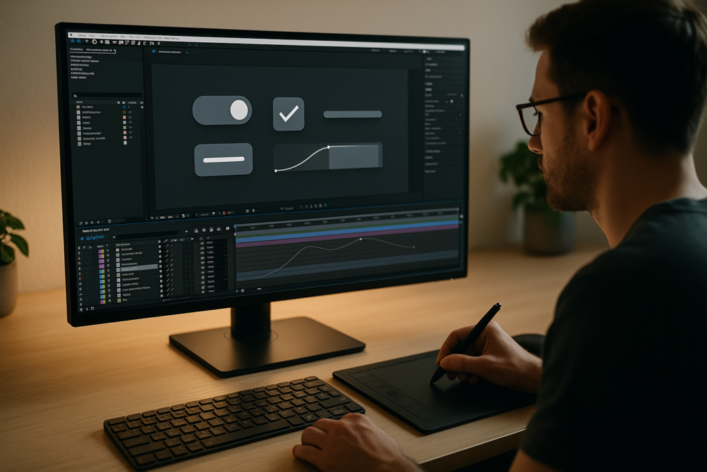
How to fix: use precomps for each widget (Button_Main, Card_Stats, Nav_TabGroup) and clear layer names (Icon_User, BG_Card, Text_Label). Color-label related layers and keep one widget per comp where possible.
2. Poor timing and easing
- Linear keyframes create robotic moves.
- All widgets animating at the same speed, regardless of size or importance.
- Overshoots applied randomly.
How to fix: use the Graph Editor to add subtle ease-out on entrances and ease-in on exits. Larger elements can move slightly slower; finer details like toggles and checkmarks can be snappier. Avoid big overshoots for UI unless the style is very playful.
3. Overusing motion blur and effects
- Motion blur on small movements makes UI look fuzzy.
- Glow and depth-of-field effects make text less readable.
- Heavy effects push render times too high.
How to fix: enable motion blur only on bigger transitions or sliding panels. Keep UI crisp and text ultra-readable. Test at 100 percent scale to see what the viewer will see.
4. Ignoring real product behavior
- Widgets animating in ways that are impossible in real apps.
- Hover states shown on mobile screens.
- Unclear tap or click cause and effect.
How to fix: base your motion on actual interface behavior. If the product is live, screen-record it. Keep platform conventions: taps for mobile, hovers and clicks for desktop, realistic load times.
5. Heavy projects and slow previews
- Huge comps at 4K for simple UI overlays.
- Unnecessary 3D layers and lights.
- No pre-rendering for repeated animations.
How to fix: scale comp sizes to the final output, pre-render looping widgets, and keep widgets mostly 2D unless depth genuinely adds clarity.
Quick checklist before delivery
- Are widget states (default, hover, active, loading, success) clearly distinguishable?
- Is text readable at final delivery size and platform?
- Are transitions consistent in duration and easing?
- Is the project clean enough for another editor to open and quickly understand?
Choosing the right UI animation approach for each edit
Different edit types call for different UI widget strategies. Instead of trying to force one style everywhere, match animation decisions to the context.
Social reels and shorts
- Use bold motion: fast slides, quick scales, and punchy cursor moves.
- Focus on a single action per shot: one button tap, one card swipe, one notification.
- Cut tightly to the beat; UI widgets become rhythm elements, not just interface.
YouTube videos and content series
- Prioritize clarity and repeatability across episodes.
- Design widget systems that can be reused: subscribe panels, lower-third-style app cards, and recurring callouts, similar to consistent layouts seen in long-running series like the multi-scene edit shown in this multi-shot motion project.
- Keep transitions smooth and less aggressive than reels; viewers watch for longer.
Product promos, SaaS, and dashboards
- Stay close to the brand’s design system: colors, corner radius, spacing.
- Emphasize hierarchy: where should the viewer look first in the widget?
- Use data widgets (cards, charts, pill filters) to tell a story: before vs after, old vs new, problem vs solution.
Corporate explainers and training
- Use restrained motion and conservative easing.
- Focus on process: step-by-step widget interactions, guided highlights, and clear labelled areas.
- Ensure everything is legible in compressed screen recordings or live presentation software.
Where templates and inspiration fit
UI-focused templates or libraries help when you need consistency across many edits. They provide pre-rigged widgets (charts, meeting cards, chat bubbles) you can restyle faster than building from scratch. For visual inspiration and to study motion trends, browsing UI motion shots on Dribbble is useful; translate those ideas into AE-friendly systems instead of copying them frame by frame.
As your workload grows, especially with recurring content or product updates, keeping a shared library of widgets becomes crucial. That is where an Unlimited After Effects Templates Subscription can support a stable, predictable workflow: you reuse a proven motion language while staying free to customize for each client or campaign. Compare template options
Practical workflow for UI widget templates in After Effects
Once you understand the basics, the real efficiency comes from building or using reusable widget templates. Think of these as small, self-contained systems that can drop into any project and quickly adjust to the new brand or story.
Project setup and compatibility
Before you drag in any widget template, align your project settings:
- After Effects version – Check that the template matches or is older than your AE version to avoid compatibility issues.
- Frame rate – Set fps to match the delivery (23.976, 25, or 30). If the template was built at 30 fps but you work at 25, check timing-sensitive animations.
- Resolution – Choose comp sizes based on output: 1920×1080 for landscape, 1080×1920 for vertical reels, 1920×1920 for square.
Organizing keyframes, precomps, and names
For each widget, use one master comp (Widget_Card_Main) and nested precomps for states or repeated parts (Card_Hover, Icon_Set, BG_Shapes). Inside those:
- Group animation keyframes on as few layers as possible (Position, Opacity, Scale).
- Use labeled layers like Text_Title, Text_Subtitle, Icon_Left, BG_Pill.
- Align the anchor point logically (center for buttons, left for text, edge for drawers).
Look at complex UI scenes such as the layered meeting widget in this video call style widget animation for ideas on structuring multiple states inside one timeline.
Performance tips for smooth previews
- Use Half or Quarter resolution while designing.
- Solo the active widget comp when fine-tuning motion.
- Disable heavy effects until final checks.
- Use region of interest around your widget to limit preview area.
For repeating widgets across a longer edit (like multiple notifications, map cards, or lyrics popups similar to the dynamic text timing in this lyric-style motion piece), consider pre-rendering them with alpha and reusing the renders.
Plugin dependencies and safe alternatives
- Check the template documentation for third-party plugins.
- If a plugin is missing, replace complex effects with native AE tools (CC Radial Fast Blur, Drop Shadow, Shape Layer strokes).
- Expressions like wiggle or overshoot can often replace physics-based plugins for subtle micro-interactions.
Customization workflow step by step
Use this repeatable checklist when adapting a UI widget template:
- 1. Colors – Link fills and strokes to a small set of Color Controls. Update brand palette once instead of changing individual layers.
- 2. Typography – Replace fonts with the brand typeface. Adjust leading and tracking to avoid text wrapping in narrow widgets.
- 3. Content – Update labels, button copy, metrics, and icons. Keep text short for mobile-style widgets.
- 4. Timing – Adjust keyframe distances to sync with music, VO, or screen recordings.
- 5. Transitions – Ensure entrance and exit animations feel consistent with the rest of the edit.
Use cases: from reels to cinematic edits
- Reels and shorts – Quick call-to-action widgets, tap-to-reveal sections, or chat bubbles flying in and out.
- Ads and product promos – Dashboard cards, account summaries, and transaction lists reminiscent of polished fintech UI like the sequences seen in the financial app motion example.
- Cinematic or narrative edits – Diegetic UI: widgets as part of screens in cars, devices, or environments, similar in spirit to the stylized overlays from map-based UI motion.
Once this workflow becomes routine, you spend less time wrestling with setup and more time art-directing motion and story beats.
Advanced systems for consistent UI motion in AE
As your UI widget library grows, the challenge shifts from making single shots look good to keeping an entire video or series consistent. That is where systems thinking comes in.
Building reusable animation systems
- Create a master timing chart: short, medium, and long durations you reuse (for example, 8, 12, 20 frames).
- Lock in default easing curves in your Graph Editor and copy/paste them across widgets.
- Use expressions to link durations and offsets so that related elements move together.
Styleframes and motion references
Before animating every widget, design a few key frames showing states and transitions: default, hover, active, and loading. These styleframes become your reference across the project and help clients approve look and feel early.
Modular transitions between widgets
- Use shared wipe, slide, or fade systems so the viewer understands visual language across screens.
- Keep transitions short and predictable; UI should feel responsive, not theatrical.
- Consider sequencing: first focus widget animates, then supporting context moves in.
Quality control and review passes
- Do a text pass: spelling, alignment, and responsive behavior.
- Do a motion pass: easing consistency, overshoot amount, and stagger offsets.
- Do a brand pass: colors, typography, and spacing matching brand guidelines.
Export and render considerations
- Use lossless or high-quality mezzanine formats (like visually lossless intermediate codecs) for handoff to editors.
- Keep alpha where needed so editors can composite widgets over other footage.
- If you use dynamic link from AE to your NLE, test performance on longer timelines; heavy comps can slow down playback.
Keeping projects lightweight
- Archive unused precomps and layers.
- Remove hidden assets not used in any widget.
- Pre-render complex sequences (for example, busy dashboards or stacked notifications) as clips with alpha and replace them in your master comp.
Developing these systems means that when a new project arrives—a UI demo, a virtual meeting interface like the one suggested by the layout in this call-style widget animation, or a recurring YouTube UI segment—you can respond quickly with structured, predictable motion rather than starting over every time.
UI widget search intents and quick answers
Editors and motion designers searching for guidance on how to animate ui widgets in after effects tend to ask similar practical questions. Here are concise responses you can apply immediately.
- How do I make a button click feel real? – Combine a small scale-down (about 95 percent) with a quick ease-out and a subtle shadow change. Sync it with a cursor or tap gesture.
- What is the best way to animate tab changes? – Fade or slide out the previous content area while the active tab underline or pill slides to the new tab, then fade or slide in the new content with a slight delay.
- Can I reuse the same widget animation across different brands? – Yes. Keep layout and motion identical, but swap colors, fonts, icons, and copy. Save brand variations as separate precomps.
- How do I sync widgets to voiceover? – Mark key phrases on the VO track, then align widget state changes (tap, expand, confirm) to those markers. Keep at least half a second for the viewer to read.
- Should I animate every element of the UI? – No. Choose focus. Animate only what supports the story or message; leave supporting UI static to avoid noise.
- How do I combine live footage and UI widgets? – Track or corner-pin your UI into screens, then add subtle camera-matching motion and interactive widget states. Keep motion slightly slower than handheld camera movement for readability.
Using these answers as starting templates saves time and reduces guesswork whenever a new UI-heavy brief lands in your inbox.
Bringing it all together for faster, cleaner UI motion
Animating UI widgets in After Effects is most effective when your process is structured: clear comps, consistent timing, and reusable systems. Start with simple interactions—buttons, cards, navigation—and gradually build a library of widgets you can drop into any edit.
Focus on believable behavior, clean easing, and on-brand customization. Over time, your timelines become faster to build, easier to revise, and more consistent across campaigns, whether you are crafting quick social edits or detailed product demos.
When you pair a solid workflow with access to a reliable library of UI-focused projects through an Unlimited After Effects Templates Subscription, you gain both speed and creative flexibility without sacrificing quality. Get UI widget templates now
Conclusions
UI widget animation in After Effects is a craft you can systemize: define timing rules, use clean precomps, and build reusable components. With practice, you will animate buttons, cards, and dashboards that feel intuitive and on-brand while keeping your AE projects light, flexible, and ready for any client brief.
FAQ
How do I start animating UI widgets in After Effects as a beginner?
Begin with simple widgets like buttons and cards. Use basic position, opacity, and scale keyframes, then refine with the Graph Editor for smooth easing.
What frame rate should I use for UI widget animation AE projects?
Most UI animation works well at 25 or 30 fps. Match the delivery platform or the main footage you are editing to avoid timing and motion issues.
Do I need plugins to animate UI widgets in AE?
No. Most UI interactions can be done with native shape layers, text, masks, and expressions. Plugins help with speed or specific effects but are not mandatory.
How can I keep my UI widget templates easy to edit for clients?
Use clear naming, color controls, and precomps for each widget. Group editable text and colors in one place so clients or editors can make quick changes.
What is the best way to keep UI animations consistent across a series?
Define standard durations, easing curves, and transition styles. Save widgets as reusable precomps and build a small internal style guide for motion.
Can I use the same UI widget animations for vertical and horizontal videos?
Yes, but design with flexible layouts. Use parented groups so you can reposition widgets between 16:9 and 9:16 comps without rebuilding animations.