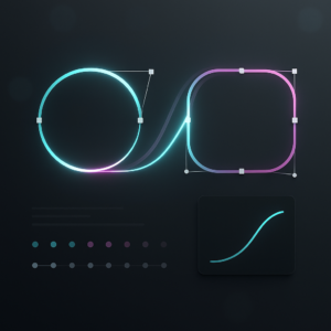
Expensive-looking brand animation is less about budget and more about decisions: timing, restraint, detail, and workflow. This guide shows you how to think and work like a high-end motion studio in After Effects, so your luxury brand motion graphics feel premium across every frame, format, and platform.Explore premium templates
📋 Table of Contents
What Expensive Brand Animations Really Are
What does “expensive” really mean
When people say an animation looks expensive, they are usually reacting to clarity, focus, and control. The motion feels intentional. The design is minimal but detailed. Every frame seems like it could be a still from a campaign.
Core elements of expensive brand animation
- Precision – timing, easing, and spacing feel human and crafted, not default keyframes.
- Restraint – minimal effects, no clutter, very few fonts and colors.
- Hierarchy – the eye knows exactly where to look first, second, and last.
- Consistency – motion rules stay the same across logo, titles, and product shots.
- Finishing – subtle motion blur, grain, glows, and compositing polish.
Why this matters for brands
Luxury and premium brands live on perception. Motion is often the first touchpoint: a logo sting before a video, a product reveal in a paid ad, or an onboarding animation. If those animations feel cheap, the entire brand perception slips.
Who this guide is for
This guide is for editors, motion designers, and content teams working in After Effects who need to ship work that looks agency-grade: in-house teams building brand systems, freelancers pitching high-end clients, and creators upgrading from basic YouTube graphics to luxury-feeling motion systems.
What you will actually improve
Rather than chasing random “cool” effects, you will learn to:
- Build a repeatable motion language instead of one-off tricks.
- Use After Effects in a structured, studio-style way.
- Evaluate whether an animation feels premium or not and know how to fix it.
Understanding Luxury Brand Motion Graphics
Luxury as a motion language
Luxury brand motion graphics are not defined by gold gradients and lens flares. They are defined by how calmly and confidently visuals move. Think slow, deliberate reveals, subtle parallax, and refined typography that eases in and out with care.
Common styles of luxury motion
- Minimal logo stings – sparse backgrounds, micro-animations on logomarks, smooth type reveals.
- Product hero sequences – controlled camera moves, reflections, and clean overlays similar to high-end smart TV-inspired widgets.
- Editorial layouts – grid-based typography, masked transitions, and asymmetrical layouts that feel like fashion magazines.
- Data and fintech luxury – crisp charts, cards, and widgets with subtle motion, like a refined digital banking animation.
Comparing intent: hype vs luxury
Hype motion aims for energy and spectacle. Luxury motion aims for trust and aura. When deciding how to create expensive brand animations, ask whether each move supports clarity and desirability or simply adds noise.
Template-based luxury motion
Luxury looks can absolutely start from templates; the value lies in how you customize them. For example, a widget-style overlay pack used for a video channel interface can also be repurposed for minimalist UI-style brand frames just by adapting type, colors, and timing.
Where luxury motion shows up
- Hero sections and case studies on portfolio sites and award platforms like Awwwards.
- Launch teasers, product promos, and app walkthroughs.
- Brand films, investor decks, and high-value ad buys.
Understanding these formats helps you design animations that can live across campaigns, not just as isolated shots.
Common Mistakes That Make Animations Look Cheap
The usual After Effects problems
Even good designers end up with animations that feel cheap because of workflow and detail issues, not concept. Most of those issues are fixable once you know what to look for.
Checklist of visual mistakes
- Default easing – leaving keyframes on linear or “Easy Ease” only, without sculpting the motion curve.
- Inconsistent motion blur – some layers with blur, others without, or using extreme shutter angles that look smeary.
- Overused effects – unnecessary glows, excessive depth of field, random particles, or aggressive camera shake.
- Messy typography – too many fonts, inconsistent tracking and leading, no alignment grid.
- Overly busy transitions – wipes, spins, and clone effects that pull attention away from the brand.
Workflow issues that kill premium feel
- Unorganized comps – no precomps, no naming conventions, everything in one timeline, leading to random changes and mistakes.
- Bad timing decisions – every element moving at once instead of in staggered, layered phases.
- Ignoring reference – designing in a vacuum instead of comparing to high-end references or previous brand work.
- Heavy plugins without reason – relying on complex effects when simple transforms and masks would look cleaner and render faster.
Consequences in real projects
These mistakes cause brand animations to look generic, dated, or “template-y” in the worst way. Clients notice when layouts shift randomly, animations snap instead of glide, or elements feel unconnected.
How to start avoiding them
- Audit your last project and list where motion blur, fonts, colors, and easing changed without a rule.
- Limit yourself to one or two primary motion styles per sequence (for example, sliding + opacity fade).
- Use a dedicated test composition where you push timing extremes before applying them across the edit.
By spotting these issues early, you build a foundation where every decision supports a luxury-level outcome.
Choosing The Right Approach For Each Brand Piece
Case-by-case thinking
Not every expensive brand animation looks the same. The right approach depends on context: social, paid ads, case studies, or in-product motion. Each format suggests different pacing, density, and detail.
Social posts and reels
- Focus on bold type and simple reveals that read instantly.
- Design for vertical framing: keep key action in the central safe zone.
- Use quick but smooth animations, avoiding chaotic transitions.
Performance ads and promos
- Lead with the product or benefit; brand polish comes through refined timing.
- Use overlays and widgets to show status, numbers, or features, similar to elegant battery-style UI widgets.
- Structure animations in modular scenes so they can be easily A/B tested.
YouTube and long-form content
For channels built around premium storytelling or tech reviews, think in systems:
- Design a reusable lower-third, chapter opener, and end card system.
- Keep motion consistent across every segment so the whole episode feels curated.
- Use subtle HUD- or card-like elements inspired by interfaces such as a refined maps-style widget.
Cinematic or brand films
Here, camera motion and compositing do the heavy lifting:
- Plan transitions based on visual metaphors, not just wipes.
- Use depth (blur, parallax, scale) more than loud effects.
- Allow longer beats of stillness; silence in motion often reads as luxury.
Templates as a strategic choice
When timelines are tight, building everything from scratch undercuts quality. High-end templates and an Unlimited After Effects Templates Subscription can give you:
- A consistent design language across multiple deliverables.
- Pre-built animation logic that you only need to refine, not reinvent.
- Faster iteration for client approvals while keeping an upscale look.
Using reference intelligently
Study case studies and motion on curated sites such as Awwwards to align with contemporary luxury standards, then adapt those ideas thoughtfully to your brand’s constraints, platforms, and audience rather than copying one-off tricks.
Building A Luxury Template And Workflow System
Start with technical alignment
Before animation, lock in project specs. Expensive brand animations fall apart when footage and graphics do not match technically.
After Effects version and project settings
- Confirm the minimum After Effects version clients or collaborators use.
- Set a master frame rate (often 23.976, 24, or 25 fps) and stick to it across comps.
- Define main resolutions: 16:9 (1920×1080 or 4K), 9:16 for vertical, and square if needed.
- Create master composition templates for each aspect ratio so every sequence starts in a consistent environment.
Naming conventions and precomps
Treat your project like a shared studio file:
- Name comps with prefixes like 01_Intro_Main, 02_Product_Reveal, etc.
- Precomp by function: LOGO_pre, BG_pre, Type_pre, FX_pre.
- Keep typography in separate precomps so you can swap languages or copy variations quickly.
- Group overlays and widgets into dedicated precomps, similar to a modular payment card widget layout.
Keyframe organization and motion rules
Luxury motion thrives on repeatable rules:
- Pick 1–2 primary easing curves and reuse them everywhere (for example, gentle ease-out for entrances, subtle ease-in for exits).
- Align keyframe timing to even frame numbers where possible for predictability.
- Stagger animations by a consistent offset (e.g., 3–6 frames) for cascading reveals.
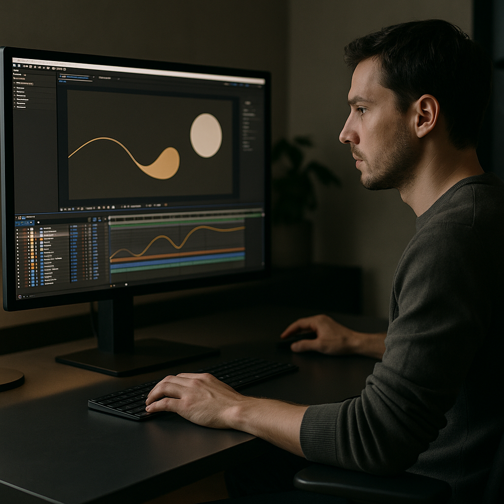
- Use the graph editor to sculpt curves; avoid leaving default Easy Ease untouched.
Performance and preview workflow
Heavy projects kill creative decision making. To keep them responsive:
- Use lower preview resolution (Half or Quarter) when blocking motion, switching to Full only for final checks.
- Turn off heavy effects (shadows, blurs, glows) via layer switches until late in the process.
- Work with proxies or compressed working files for 4K or 8K footage.
- Use short test comps with a few layers to refine motion principles before applying them to complex scenes.
Plugin dependencies and safe alternatives
If you are planning reusable systems or client hand-offs:
- Avoid niche plugins unless they add critical value; prefer built-in effects.
- If a plugin is required, document it clearly and keep a no-plugin fallback version.
- Use shape layers, masks, and basic 3D for many effects that people often overcomplicate with third-party tools.
Customization workflow for templates
Approach luxury templates like a color and type system, not a fixed look.
- Create global color controls via master adjustment layers or Essential Graphics controls.
- Limit the palette to 1–2 brand colors plus neutrals; keep gradients subtle and controlled.
- Define 2–3 type styles: headline, subhead, and body, and apply them consistently.
- Expose key timing controls (animation in/out duration) to sliders where possible.
Designing transitions with intent
Instead of random wipes, design a family of transitions:
- Directional wipes that mimic brand shapes or grid lines.
- Opacity and blur-based cuts that create softness without distraction.
- Modular blocks that can work as both transitions and section dividers.
Use case mindset
For each animation, decide where it will live:
- Reels and shorts – prioritize quick legibility, bold type, and clear CTA moments.
- Ads and product promos – focus on product clarity, straightforward UI overlays, and minimal text.
- Cinematic edits – rely on camera moves, parallax, and light, with graphic elements supporting, not leading.
Practical build sequence
When creating a reusable luxury brand system in AE:
- Step 1 – Lock specs and create master comps.
- Step 2 – Build basic layouts without animation.
- Step 3 – Define easing curves and timing rules in one test comp.
- Step 4 – Animate logo, titles, and primary blocks using those rules.
- Step 5 – Add subtle secondary motion: parallax, masks, micro-rotations.
- Step 6 – Apply finishing: motion blur, grain, gentle glow, color management.
- Step 7 – Package as a mini-system with clear labels so you can reuse it on the next job.
This approach lets you scale luxury-level animations across brand campaigns rather than reinventing from scratch each time.
Advanced Techniques And Long Term Workflow
Building a motion language, not single shots
High-end studios think in systems. Each brand gets its own physics: how fast elements move, how far they travel, what kind of easing they use. Once that language is defined, every deliverable speaks it.
Styleframes and motion tests
Before animating complete sequences, create static styleframes to nail layout, type, and color. Then:
- Build a short motion test: logo + a few UI elements.
- Test different timing variations while keeping design fixed.
- Save winning versions as presets or template comps.
Reusable animation systems
Turn frequently-used actions into systems:
- Logo intro comp that can handle multiple logo variations.
- Title lower-thirds based on a single master precomp.
- Modular overlays inspired by widgets, like a clean video call-style overlay that can be reused for any brand.
Keeping projects lightweight
- Pre-render heavy sequences as ProRes or similar high-quality intermediates.
- Avoid unnecessarily deep precomp nesting that makes navigation confusing.
- Delete unused layers and hidden comps that will never be used.
- Use adjustment layers sparingly and only where they truly unify the frame.
Export and render considerations
Luxury brand motion must hold up on big screens and small devices.
- Render an uncompressed or lightly compressed master first; create platform versions from that.
- Use consistent color management so blacks and highlights match across edits.
- Test key shots on multiple devices (phone, laptop, TV) to ensure type remains legible.
Dynamic Link and handoff
If you are moving between After Effects and editing apps via dynamic link:
- Keep AE comps modular and named clearly for editors.
- Avoid stacking too many AE comps in one edit; instead pre-render main sections.
- Provide editors with a simple guide to which comps control which parts of the graphics system.
Quality control routines
Build a checklist you run before every delivery:
- Check that motion blur is consistent across layers and scenes.
- Ensure easing curves match your chosen motion language.
- Review type for alignment, tracking, and consistency of styles.
- Scrub frame-by-frame across transitions to catch popping or glitches.
By treating your luxury brand motion graphics as an evolving system, you gain speed and confidence on every new project while preserving a premium look.
SEO Driven Questions About Luxury Motion
Addressing common search-intent topics
Editors and designers searching how to create expensive brand animations often have specific workflow concerns. Here are concise answers to frequent queries.
- How do I make logo animations look luxury instead of flashy? Keep motion small and precise, emphasize fades and subtle scale or mask reveals, and use one or two animation directions consistently.
- What frame rate is best for luxury brand motion graphics? 23.976, 24, or 25 fps usually look cinematic. More important than the exact number is using one frame rate across all comps and exports.
- Are templates acceptable for high end clients? Yes, if they are customized thoughtfully and integrated into a coherent system. Treat templates as building blocks, not final products.
- How do I choose colors for premium looking animations? Start with mostly neutrals and one accent brand color. Avoid extreme saturation and keep gradients subtle.
- How much motion blur should I use? Use moderate blur with consistent settings across all scenes. Overly strong blur looks messy and video-like rather than cinematic.
- What is the best way to animate UI and widgets? Use gentle, responsive movements that mirror real interfaces. Keep animations short, with slight delays and micro-easing for a realistic feel, similar to refined UI-style overlays showcased in collections like education app widgets.
- How do I keep my project from lagging? Pre-render heavy parts, lower preview resolution, disable unnecessary effects while animating, and keep your comp structure minimal.
- What kind of references should I look at? Study premium brand films, curated portfolios, and case studies, focusing on timing, spacing, and type rather than just effects.
Using these answers as a checklist will keep your creative decisions aligned with what people actually look for when they want a high-end After Effects workflow.
Putting It All Together For Premium Brand Motion
From scattered tricks to cohesive systems
Expensive-looking brand animation is not about a single effect; it is the accumulation of disciplined choices. You set consistent project settings, design with restraint, define motion rules, and maintain those rules across every deliverable.
Key takeaways for your workflow
- Decide on a motion language first: pacing, easing, and movement style.
- Use organized comps, naming conventions, and precomps so changes are fast and safe.
- Rely on simple, well-timed transforms over complex, noisy effects.
- Check every scene against your quality checklist before export.
- Recycle successful layouts and transitions as your own personal template library.
Scaling luxury motion across projects
Once you have a solid system, you can apply it across product launches, social campaigns, case studies, and hero films. An Unlimited After Effects Templates Subscription can give you an evolving foundation of professionally structured projects to adapt, mix, and refine, while you focus on the brand-specific details that make the work truly premium.
The more you work this way, the more each project feeds the next: better references, tighter systems, and cleaner results that consistently feel high-end to clients and audiences worldwide.
Conclusions
Premium brand motion is built, not guessed: clear specs, clean layouts, and disciplined timing. Treat After Effects as a system builder, refine a few strong ideas, and reuse them intelligently. With a structured motion language and reliable templates as your base, every new project can look and feel agency-level, even on tight deadlines and budgets.
FAQ
How do I start creating expensive brand animations if I am a beginner in After Effects?
Begin with simple layouts and basic transforms, then focus on easing and timing. Study high-end references, copy their pacing, and build small reusable comps before full sequences.
What makes luxury brand motion graphics different from regular motion graphics?
Luxury motion uses restraint, clarity, and consistency. It favors clean typography, controlled camera moves, and subtle details over loud transitions and heavy effects.
Can I use templates for luxury brand clients without it looking generic?
Yes, if you customize type, color, timing, and composition. Use templates as structure, then refine motion and design so the result matches the brand rather than the default look.
Which effects should I avoid to keep animations looking premium?
Avoid excessive glow, extreme camera shake, oversaturated color effects, and complex particle systems unless there is a clear concept. Clean transforms and subtle blur usually look more expensive.
How important is the graph editor for high end animations?
Very important. Sculpting curves in the graph editor gives you precise acceleration and deceleration, which is crucial for smooth, intentional, and luxurious-feeling motion.
Should I animate at 24fps or 60fps for luxury brand work?
Most premium brand and cinematic projects use 23.976, 24, or 25fps. Higher frame rates can feel like live video. Choose one and keep it consistent across the project.