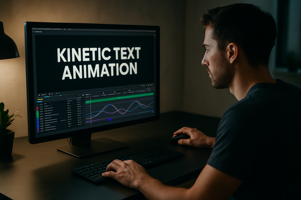
Kinetic text is one of the fastest ways to give your edit rhythm, personality, and clarity. Whether you are editing lyrics, UI widgets, or social ads, clean typography motion is essential. This tutorial walks through practical After Effects workflows you can reuse on every project, from basic setups to advanced systems.Explore template access
📋 Table of Contents
Understanding kinetic text animation basics
What is kinetic text animation
Kinetic text animation is simply type that moves with intent. In After Effects, that means timing words, letters, and phrases so they support the story, beat, or UI action on screen. Instead of static captions, your typography reacts to music, voiceover, camera moves, and design beats.
Why kinetic text matters for editors
For editors and motion designers, kinetic text:
- Clarifies messaging when viewers watch with sound off.
- Adds rhythm and energy that cuts can ride on.
- Connects visuals with brand voice through typography and motion style.
- Lets you reuse the same animation system across multiple videos for consistency.
Who this tutorial is for
This kinetic text animation tutorial is made for:
- Editors who mainly cut in Premiere but jump into After Effects for graphics.
- Motion designers building repeatable systems for lyrics, widgets, or UI-style overlays.
- Creators making reels, shorts, and promos who need reliable, quick text setups.
What you will learn
Across the next chapters you will:
- Understand the core principles behind dynamic typography AE setups.
- Fix common timing and graph issues that make text feel off.
- Build a reusable text rig that scales from social clips to full campaigns.
- Optimize for speed so changes are painless even under client pressure.
By the end, you will have a practical workflow for clean, controlled text animation that fits into real production timelines, not just tutorials.
Exploring dynamic typography styles in After Effects
What dynamic typography means in AE
Dynamic typography AE workflows are less about flashy presets and more about building relationships between text, timing, and layout. The goal is to create typography that:
- Responds to beats or words in the audio.
- Adapts easily to different line lengths and languages.
- Maintains hierarchy so key words feel more important.
Common kinetic text styles
You will see a few recurring styles in professional projects:
- Lyric and quote sequences – Full-screen phrases that hit on beats. Examples include animated lyrics similar in vibe to a lyrics widget project.
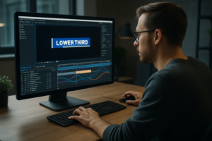
- UI-inspired widgets – Text inside panels, lower thirds, and cards that slide, scale, and reveal, like modern product or app promos.
- Brand-driven titles – Big, bold kinetic words that carry brand personality in trailers, intros, or explainers.
Matching style to content
Different edits need different dynamic typography AE strategies:
- Music or lyric edits benefit from punchy on-beat reveals, per-word or per-syllable animations, and bold color accents.
- Product and app demos prefer subtle, UI-like motions that feel like a clean interface, similar to an animated feature or pricing widget.
- Corporate or case study videos lean on restrained moves and clear hierarchy: headline, subline, callout.
Thinking in systems, not shots
Instead of building one-off animations, treat your kinetic text like a small design system:
- One main headline style (entry and exit).
- One supporting style for subcopy or captions.
- Optional accent style (tags, labels, metrics).
Each style should share core traits: similar easing, consistent motion directions, and aligned color usage. This way, whether you are building edit overlays similar to an animated interface panel or a music-driven card sequence reminiscent of a track-inspired animation, you keep everything coherent without reinventing the wheel on every shot.
Common kinetic text mistakes and how to avoid them
Timing problems
Most kinetic text issues come from timing more than design. Watch for:
- Late entrances – Text appears after the viewer needs it, so they miss context.
- Early exits – Copy leaves before the final word is spoken or beat lands.
- One-speed animation – Every move has the same easing and length, making the sequence feel flat.
Checklist to fix timing
- Align key moments to sound peaks or syllables, not random frames.
- Use Hold keyframes for quick snaps when the music is tight and percussive.
- Reserve slower 10–16 frame moves for calmer, explanatory segments.
Graph Editor and easing issues
Unrefined curves make even good layouts feel amateur.
- Beginners often rely on default Easy Ease without adjusting influence.
- Overshoots that are too strong make text look rubbery or cartoony.
Quick Graph Editor fix
- Use consistent influence values (e.g., 60–70) across all text moves.
- Keep overshoots subtle: position overshoot 5–10 pixels instead of 40–60.
Messy comps and precomps
Rushing layout organization leads to:
- Dozens of unnamed text layers.
- Hard-to-edit lyric lines all in one comp.
- Duplicated effects that slow previews.
Structure to avoid chaos
- Precomp per section (verse, chorus, scene) instead of entire timelines.
- Adopt a naming system: TXT_Headline_01, TXT_Sub_01, BG_Shape_01.
- Keep all shared controls (colors, fonts, main animations) in one master control comp.
Overusing heavy plugins
Relying on particle systems or complex blur plugins for simple text reveals makes renders slow and handoffs risky. Many kinetic text looks can be done with native tools: masks, track mattes, simple blur, and shape layers.
Ignoring readability
Stylish motion means nothing if viewers cannot read the words.
- Check contrast between text and background.
- Avoid excessive rotation or skew on longer phrases.
- Keep line length and tracking comfortable, especially on mobile-safe compositions.
Choosing the right kinetic text approach for each project
Start from the edit goal
Your kinetic text choices should follow the video’s purpose and platform, not the other way around. Ask:
- Is the goal to inform, hype, or clarify?
- Where will this live: reels, YouTube, web, in-app?
- How much time will viewers actually spend on each screen?
Approach for short social reels
For 9:16 reels and shorts:
- Use big, centered phrases with quick punch-in motion.
- Favor one- or two-word headlines per beat.
- Keep transitions fast: 4–8 frames for quick wipes or slides.
Approach for YouTube and longer content
For YouTube explainers or commentary videos:
- Use lower thirds and sidebars that can stay on screen longer.
- Let text ease in and settle instead of bouncing constantly.
- Build a few reusable layouts that you can swap per chapter.
Approach for ads and product spots
Paid ads demand clarity and speed:
- Use bold statement headlines with short body lines.
- Guide the eye: first headline, then subcopy, then CTA.
- Animates less but more intentionally. Every move should say something.
Fonts and brand consistency
Good kinetic text starts with good type. If your client does not provide a font, you can build a strong base using widely available families from resources like Google Fonts. Select:
- One display or bold face for headlines.
- One clean sans or serif for body text and captions.
When to use templates and systems
When you are working across multiple videos or building recurring content, custom-building every lower third or title from scratch becomes slow. A reusable kinetic text system or template lets you:
- Maintain consistent motion rules across entire campaigns.
- Swap copy and colors quickly without breaking animation.
- Onboard other editors easily, as they see a clear structure and naming scheme.
Instead of one-off animations, think in terms of a small library of layouts and moves that can cover intros, lower thirds, lyric moments, and UI-style overlays. That way each new project starts with a reliable base instead of a blank comp.See subscription options
Building a reusable kinetic text template workflow
Set up your project correctly
The best dynamic typography AE templates start with solid project settings.
- Frame rate – Match your main edit (commonly 23.976, 24, or 25 fps). Changing later breaks timing.
- Resolution – Build at the primary output size (1080×1920 for vertical, 1920×1080 for horizontal). You can then scale intelligently.
- Safe areas – Leave margins for mobile UI overlays and platform cropping.
Version and compatibility
Decide your minimum After Effects version. If you collaborate with other editors, stay with a stable, widely supported release and avoid features that break backward compatibility unless everyone is updated.
Organize compositions and naming
Clean structure keeps your kinetic text template usable for months.
- Create folders like 01_MAIN, 02_PRECOMPS, 03_ASSETS, 04_CONTROLS.
- Use consistent comp names: MAIN_Vertical_01, TXT_System_Master, TXT_Section_Intro.
- For lyric-style sequences, break verses or segments into separate comps, similar to how multi-part sequences are structured in complex motion pieces like an animated dashboard or UI sequence.
Build a master control layer
Create a “Controls” comp with:
- Color controls (Fill or Tint effects linked with expressions).
- Font size and tracking controllers where possible.
- Master timing offsets for in/out animations (using sliders connected to keyframes or markers).
This lets you adapt the template to new brands quickly without diving into every layer.
Keyframe strategy for kinetic text
For a simple but powerful setup:
- Use 2–3 keyframes per property (start, settle, maybe overshoot).
- Keep entry animations shorter than exits so pacing never drags.
- Use consistent keyframe distances (e.g., 8–12 frames for pop-in, 4–6 frames for accent moves).
Precomps for flexibility
Precomp text layers when:
- You need complex masks or multiple effects on the same phrase.
- You are animating whole lines as one object (scale, rotation, position).
- You want to reuse the same animated line across different layouts.
Label precomps clearly, and avoid nesting too deeply unless absolutely necessary.
Performance and preview tips
To keep the template responsive, especially on laptops:
- Use region of interest when adjusting small parts of the screen.
- Lower preview resolution to half or quarter when checking timing.
- Cache key sections by playing them through once before fine-tuning curves.
- Avoid stacking unnecessary blur or glow; use pre-rendered elements if needed.
Keep plugin dependencies minimal
If you use third-party plugins, document them inside a small “Read Me” text layer in a dedicated info comp. Whenever possible, recreate looks with native tools so collaborators who do not own specific plugins can still open, preview, and tweak the file.
Customizing colors and typography fast
Build your system so changing one layer updates many elements:
- Use expression-linked color controls on adjustment layers or text fills.
- Style text via character styles and keep variations minimal (e.g., bold vs regular).
- Use shape layers for underlines, boxes, and highlights instead of raster assets, so they scale cleanly.
Timing and transitions checklist
- Align main text hits to meaningful beats or word cues.
- Stagger secondary words or accents by 2–4 frames for a ripple effect.
- Use track mattes and simple wipes for reveals instead of complex transitions that distract from the copy.
Use cases for your template
Once the base system is built, it can cover multiple deliverables:
- Reels and shorts – Big center-justified titles, fast in and out.
- Ads and product promos – Split-screen layouts with text on one side and product or screen capture on the other.
- Cinematic edits – Slower, more minimal moves with subtle blur or fade, using the same core easing rules.
- UI and data-driven overlays – Smaller panels and badges for information, similar to complex card-based widgets or dashboard-style overlays.
Design your system so all of these use the same core motion language. That way you maintain a consistent feel even when layouts change.
Advanced kinetic text techniques and workflow optimization
Build reusable animation systems
Instead of animating every phrase manually, create a few reusable rigs:
- Pre-animated text layers where you only edit the source text.
- Animation presets for in/out moves that share easing and durations.
- Marker-based systems that drive where text appears in a scene.
Maintain consistency across a full edit
On multi-minute videos, text style can drift unless you standardize:
- Define a motion style sheet: directions (up, right), easing style, typical durations.
- Set a small palette of entry types (fade/slide/scale) and stick to them.
- Re-use lower-third and title structures instead of building new ones mid-project.
Use styleframes and references
Before animating, lock 3–5 key frames that show your main text layouts: hero title, lower third, data callout, lyric quote, and end card. This gives clients a clear preview and helps prevent layout changes late in animation.
Quality control before export
Create a final review checklist:
- Spell-check all copy and confirm against client docs.
- Check readability on a smaller window or phone screen.
- Look for orphan words (one word wrapping to the next line awkwardly).
- Ensure text does not intersect with essential visuals or faces.
Export and render considerations
For most kinetic text sequences:
- Use visually lossless intermediate codecs if you bring graphics into an NLE.
- Keep alpha channel when lower thirds or overlays sit on top of footage.
- Use the Render Queue or an encoder workflow that you trust for time-critical deliveries.
Dynamic link and project size
Dynamic linking between your NLE and After Effects is convenient, but heavy kinetic text comps can bog timelines down.
- Only dynamically link sequences that you expect to revise often.
- For stable sections, render out and replace with flattened clips.
- Archive a clean project version with reduced assets for long-term storage.
Keeping projects lightweight over time
As projects grow with more text scenes:
- Remove unused precomps and solid layers.
- Consolidate duplicate assets and fonts.
- Set up clear folders so future you (or another editor) can understand the build quickly.
These habits let you handle increasingly complex kinetic text timelines while keeping performance and editability under control.
Search-focused tips for kinetic text and dynamic typography
Long-tail questions editors ask
Here are common search intents related to kinetic text animation tutorial topics and dynamic typography AE workflows, answered briefly:
- How do I sync kinetic text to music in After Effects – Mark beats on the timeline with layer markers, then snap your main keyframes to those markers. Use short 4–8 frame animations per beat for punchy results.
- What is the easiest way to animate lyrics – Split lyrics into separate text layers (line by line), precomp per section, and reuse a single in/out animation preset. Then only adjust timing per line.
- How do I keep text readable on busy footage – Add a subtle background plate: semi-transparent bar, gradient, or blur behind text. Use high-contrast colors and avoid very thin fonts.
- What After Effects settings are best for Instagram reels text – Use 1080×1920, 30 fps, safe margins for top and bottom UI, and test vertical framing to ensure no key words are under platform overlays.
- How can I speed up revising kinetic titles for clients – Centralize text in one control comp or use a master text rig. Organize with clear labels and use expressions or templates so changes propagate automatically.
- Do I need plugins for professional kinetic text – No. Most professional motion can be done with native position, scale, rotation, opacity, masks, and track mattes. Plugins are nice-to-have for specific looks, not a requirement.
- How do I match kinetic typography to a brand – Use their fonts, colors, and typical layout structure. Mirror the brand’s tone: minimal and slow for premium, fast and snappy for youth or tech-focused brands.
Keeping these search intents in mind helps you design kinetic text systems that answer real-world needs and fit into everyday editing workflows.
Bringing it all together into a reliable kinetic text system
Recap the core principles
Effective kinetic text relies on a few key ideas:
- Clear timing tied to audio and narrative beats.
- Simple, consistent easing and motion directions.
- Readable type with strong hierarchy and contrast.
- Clean project structure that makes changes safe and fast.
From single shots to full campaigns
Start small: build one polished text scene that works perfectly. Then generalize it into a reusable system with shared controls, naming conventions, and layout variations. That system will support reels, long-form edits, lyric videos, data callouts, and more without starting from scratch each time.
Focus on future you
Every smart decision you make now—consistent naming, precomps that make sense, centralized controls—saves hours on the next round of feedback or on the next project that needs a similar look.
Next steps
Pick a short piece of audio or an existing edit and rebuild one section using the ideas from this kinetic text animation tutorial. Treat it as your base template. Once it feels solid, reuse it on another project and refine it again. Over a few iterations, you will have a dependable, professional-grade dynamic typography AE system that speeds up your workflow and keeps your motion clean and consistent.
Conclusions
Kinetic text becomes powerful when it is structured, readable, and easy to update. By focusing on timing, hierarchy, and clean project organization, you can reuse the same dynamic typography system across platforms and clients. Build once, refine over a few projects, and your After Effects workflow will stay fast, predictable, and consistently on-brand.
FAQ
What is kinetic text animation in After Effects
It is animated typography that moves with intent, supporting story and rhythm through timed position, scale, opacity, and layout changes.
Do I need plugins for dynamic typography AE projects
No. Most kinetic text can be built using native tools like masks, track mattes, blur, and standard keyframing with the Graph Editor.
How long should text stay on screen
Aim for enough time to read the line twice. For short headlines, 1.5–2 seconds can work; for longer sentences, give 3–4 seconds or more.
What frame rate should I use for kinetic text
Match the frame rate of your main edit, often 23.976, 24, 25, or 30 fps. Changing it later can misalign keyframes with audio beats.
How can I keep my kinetic text projects organized
Use clear folder structures, consistent layer and comp naming, precomps per section, and a dedicated controls comp for global settings.
What fonts work best for kinetic text
Clean sans or simple serif families with multiple weights work best. Avoid overly decorative fonts for longer copy or fast-paced sequences.