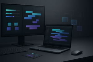
Motion design for YouTube is no longer a nice bonus; it is how channels stand out, communicate clearly and keep watch time high. This tutorial walks through practical After Effects workflows, from foundations to template-driven systems, so you can design motion that fits your channel and deadlines.Browse motion templates
📋 Table of Contents
What Motion Design for YouTube Really Means
Motion design for YouTube is the practice of using animated graphics, typography and visual effects to support the story of a video. It touches nearly every part of a channel: intros, lower thirds, transitions, explainer sequences, lyric lines, end screens and even subtle UI callouts.
For editors and creators working in After Effects, motion design for YouTube is about building visual systems, not just one-off cool shots. A typical video might reuse the same text styles, transitions and logo stings across episodes so the channel feels familiar and professional.
Why it matters
Well-designed motion directly affects performance metrics:
- Audience retention: Clean titles, section bumpers and animated pointers help viewers follow the story without confusion.
- Brand recognition: Consistent motion style makes thumbnails, intros and end screens instantly recognizable.
- Perceived quality: Even simple animations, when timed well, make a video feel planned and crafted rather than improvised.
Who it is for
Motion design for YouTube is relevant to:
- Solo creators who edit their own videos and want repeatable, easy-to-update graphics.
- Editors working for YouTubers or agencies who need fast, reliable setups for weekly or even daily content.
- Motion designers building templates and custom packages for YouTube shows, podcasts and lyric videos.
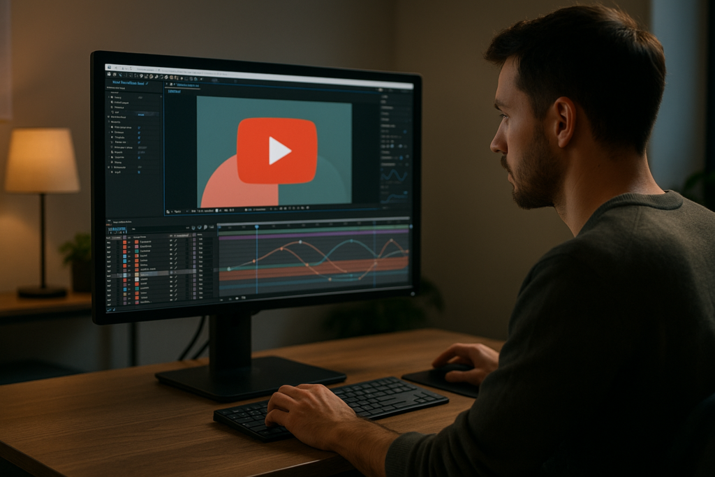
After Effects is the core tool for most of this work because it handles keyframes, compositing and typography in a way editors can control precisely. The goal of this guide is to help you use it in a way that fits the real-world publishing rhythm of YouTube, not just portfolio pieces.
Understanding the YouTube Motion Graphics Workflow
The phrase youtube motion graphics workflow covers all steps from planning and designing your motion system to exporting graphic assets that editors can drop into timelines quickly. Getting this workflow right matters more than any single animation trick.
Core stages of a YouTube motion graphics workflow
- Planning: Decide what repeating graphics you need: intro, lower thirds, chapter cards, subscribe prompts, lyric lines, UI overlays, credits.
- Design and build: Create those elements in After Effects with clear naming, controls and modular structure.
- Integration: Export as video with alpha, or connect via Dynamic Link, and test in your editing environment.
- Iteration: Adjust colors, fonts, pacing and animation curves based on watch time and feedback.
Different motion types for YouTube
- UI-style widgets: Perfect for tech channels, app overviews and finance topics. Think of animated cards similar to a YouTube-style widget or map cards for location stories.
- Lyric and music visuals: Karaoke-style text and beat-synced elements, comparable to projects like dynamic lyric animations or other track-based visuals.
- Brand or sponsor blocks: Short, punchy segments that highlight products or services, similar in structure to sleek UI animations such as a payment widget style animation.
- Atmospheric loops and overlays: Elements like animated glass, particles or subtle transitions, comparable in role to a liquid glass effect that adds depth behind footage.
Matching your workflow to your publishing style
Daily or weekly uploaders need a workflow that favors speed and reuse: prebuilt templates, universal controllers and simple text replacement. Slow, cinematic channels can afford more per-video customization, but still benefit from having a base system for titles and transitions.
Think of your workflow as a pipeline: the fewer decisions you make while you are on deadline, the more consistent and polished your channel will look.
Common After Effects Mistakes in YouTube Motion
Even experienced editors fall into patterns that make motion design for YouTube slower and messier than it needs to be. Recognizing these issues early keeps your projects light and easy to update.
Typical structural mistakes
- Messy precomps: Everything lives in one giant comp with no hierarchy. When the channel rebrands, updating colors or fonts becomes painful.
- Unnamed layers: “Shape Layer 37” or “Text 12” everywhere makes it hard to hand off projects or revisit them months later.
- No master controls: Colors, fonts and logo sizes are hard-coded into dozens of layers instead of controlled by a few sliders or adjustment comps.
Timing and animation issues
- Flat easing: Linear keyframes make everything slide like a PowerPoint. Viewers feel the stiffness even if they cannot explain it.
- Overuse of motion blur: Adding blur to every tiny movement muddies the frame and can increase render times unnecessarily.
- Off-beat animations: In music or commentary edits, animations that do not land on beats or phrase changes look random and distracting.
Performance and export problems
- Heavy third‑party plugins for simple tasks: Using complex effects for minor glows, shadows or distortions bloats render times.
- Too large compositions: Designing everything at 4K when the channel publishes mainly 1080p slows previews and export for no benefit.
- No proxy or pre-render strategy: Repeating the same complex intro render for every episode instead of pre-rendering once.
Checklist to avoid common mistakes
- Name every precomp and layer descriptively.
- Create a single “Control” comp for global colors, fonts and stroke widths.
- Use the Graph Editor to add ease on main movements only.
- Turn motion blur on selectively where speed justifies it.
- Pre-render heavy sequences (like complex lyric blocks) with alpha for reuse.
- Design at the resolution and frame rate you actually deliver.
Keeping these pitfalls in mind prepares you for setting up a smarter YouTube motion system in the next steps.
Choosing the Right Motion Approach for Each YouTube Video
Not every YouTube video needs the same motion density. A talking‑head tutorial, a story‑driven cinematic piece and a fast‑paced product review each benefit from different motion strategies. Your decisions here define how complex your After Effects setups should be.
Match motion style to format
- Talking‑head education: Prioritize clear lower thirds, callouts, simple transitions and chapter cards. Keep animations short and functional.
- Reels and Shorts: Emphasize bold text, quick cuts and snappy transitions. Minimal lingering elements; everything supports pacing.
- Product reviews and tech: Use UI‑inspired widgets, spec callouts and overlays that highlight features. This is where widget‑style templates shine.
- Cinematic and storytelling: Use restrained, typography‑driven motion, subtle overlays and filmic transitions so text does not overpower footage.
When templates make the most sense
If you are publishing regularly, building every graphic from scratch is rarely sustainable. A well-structured template or an Unlimited After Effects Templates Subscription lets you standardize intros, titles, lyric blocks and UI overlays, then focus your energy on content and pacing rather than repetitive layout work.
Practical decision guide
- If your channel has recurring segments, lock in a theme package once and keep it updated.
- If you launch new series often, build modular building blocks: intros, transitions and cards that can be remixed.
- If you work as an editor for multiple creators, maintain separate style libraries so each brand remains distinct.
Aligning with YouTube best practices
The platform itself encourages clarity and consistency around branding and content structure. Resources like YouTube Creators emphasize keeping viewer experience front and center. Your motion choices should support that: easy-to-read text, predictable placement for key information and pacing that respects the viewer’s time.
Once you are clear about the style and density of motion you need, you can design a template-based workflow that fits how you and your team actually produce videos, not an idealized version of your schedule.See subscription options
Building a Practical Template-Based Workflow in After Effects
A strong youtube motion graphics workflow is built around reusable systems. Instead of crafting custom animations for every upload, you design flexible templates that can handle new titles, segments and sponsors with minimal changes.
Project setup and compatibility
Start by aligning your template project with your real delivery specs:
- Match composition resolution to your main output (commonly 1920×1080 or 3840×2160).
- Choose a frame rate that fits your edit (24, 25 or 30 fps) and stick with it.
- Confirm your After Effects version and avoid features your collaborators might not have yet.
If you plan to reuse animations across series, keep a clean MASTER_TEMPLATE project file separate from episode-specific edits.
Organizing keyframes, precomps and naming
- Group related elements (intro, lower thirds, lyric lines, widgets) into clearly labeled folders.
- Use descriptive names like “LT_HostName”, “TRANS_SwipeUp” or “LYRIC_SectionA” so editors know where to look.
- Precomp complex elements (for example, a subscriber widget or a chapter card inspired by a UI card like map-based overlays) and expose only the controls you want to change frequently.
Performance tips for real-world deadlines
- Preview at half resolution and lower frame rate while designing timing.
- Use disk cache and purge periodically during long sessions.
- Disable heavy effects until your motion is locked.
- Pre-render recurring elements (like intros or sponsor wipes) as ProRes or PNG sequence with alpha for drag-and-drop reuse.
Handling plugins and dependencies
Third‑party plugins can be powerful, but each one is a dependency risk. Before you rely on them:
- Check which machines in your pipeline actually have the plugin installed.
- See if built‑in effects can achieve 80% of the look with far less friction.
- Where plugins are required, isolate them into a few key precomps so you can pre-render if needed.
Customization workflow: colors, typography and timing
Structure your templates so episode updates feel trivial:
- Create a “STYLE” comp with color swatches, font references and basic logo scale.
- Use expressions or pickwhips so global controls drive colors and text sizes.
- Keep text animations modular: one animation system that any line of text can plug into.
- Adjust timing with marker-based triggers or by sliding precomps, not by re‑keyframing everything.
Use cases mapped to templates
- Reels and Shorts: Design vertical-friendly versions of your lower thirds and overlays with the same core style.
- Ads and product promos: Focus on clear feature callouts and pricing slates that you can quickly duplicate and tweak for new campaigns.
- Music and lyric videos: Build timed lyric lines and background effects once, similar to structured lyric layouts like those seen in dedicated lyric projects, then change only the text and colors per track.
- Story episodes: Create modular chapter cards, location tags and time jumps to keep viewers oriented without overcluttering the frame.
Step-by-step template checklist
- Define your main video formats (long-form, Shorts, trailers).
- List mandatory repeating graphics (logo sting, titles, segments, CTAs).
- Set project resolution, fps and safe margins.
- Build one clean, well-organized template project.
- Add style controls for global colors and fonts.
- Test template in a real edit and refine based on friction points.
When your system is working, you can iterate on style slowly over time while keeping your underlying structure intact, which is how long-running channels stay visually fresh without rebuilding from zero.
Advanced Systems and Long-Term Workflow Optimization
Once your basic template structure is in place, motion design for YouTube becomes about building systems that scale. The goal is consistency across dozens or hundreds of videos without locking yourself into a look you cannot evolve.
Reusable animation systems
Instead of animating every lower third individually, create a handful of reusable animation rigs for text, backgrounds and icons. For example, a single slide-in rig can handle names, topics and social handles simply by swapping text.
Styleframes and look-dev
Before you build full motion, design a few key frames that represent your title card, lower thirds and one complex information screen. This makes it easier to keep a unified look across assets, similar to how you might visualize a whole series using a single conceptual widget like the complex layouts found in an editing-focused widget project.
Modular transitions
Create a small library of 3–5 core transitions: wipe, push, blur, and one or two stylized effects. Make each one easy to recolor and reuse. Mark in and out points clearly so editors know where to cut in timeline.
Quality control systems
- Build a quick review checklist: text legibility, safe margins, spelling, logo usage, and color contrast.
- Use guides and title-safe overlays when designing type-heavy screens.
- Render low-res previews for client or creator feedback before committing to full exports.
Export and render considerations
For recurring elements, use intermediate codecs that balance quality and file size. Standard practice is to render assets with alpha where possible so editors can composite over any background without re‑opening After Effects.
Dynamic Link and pipeline choices
Dynamic Link can be useful but becomes fragile in long projects or across multiple machines. For high‑volume channels, pre-rendering key motion assets that rarely change is often more reliable and faster, while keeping a few live-linked templates for elements that change every episode.
Keeping projects lightweight long-term
- Archive older styles and unused comps in separate project files.
- Periodically clean assets and remove imported items that are not used.
- Store your master templates in versioned folders so you can roll back if a new idea does not test well.
With these systems in place, you can manage multiple shows, playlists or even client channels through a single, organized library of motion assets that evolves with your creative direction and analytics data.
Search-Driven Ideas for YouTube Motion Design Content
As you refine your motion design for YouTube, you will notice recurring questions from clients, viewers and even your own team. Turning those questions into clear answers can guide both your channel content and your template-building priorities.
Common search intents and quick answers
- “How do I make clean lower thirds in After Effects for YouTube?”
Design a single lower-third template with safe margins, a simple slide-in animation and controls for name, role and color. Export it with alpha so editors can reuse quickly. - “What is the best resolution for YouTube motion graphics?”
Most channels work well at 1920×1080, even if footage is occasionally higher; focus on consistency and staying aligned with your main deliverables. - “How do I sync motion graphics with music?”
Add markers on the timeline at key beats or lyric lines, then align in/out points of text and elements to those markers for rhythmic motion. - “How do I speed up my After Effects workflow for YouTube videos?”
Build reusable templates, pre-render heavy elements, use proxies when needed and keep a small set of go‑to transitions to avoid decision fatigue. - “Can I reuse the same intro and transitions across multiple series?”
Yes, but consider color or subtle layout variations per series so viewers can distinguish segments while still recognizing your overall brand. - “How do I create motion for commentary or reaction channels?”
Focus on simple zooms, on-screen highlights, reaction labels and occasional pop-up graphics. Avoid overloading the frame so main content remains readable. - “What templates are most useful for editors working with multiple YouTubers?”
Channel-agnostic assets like lower thirds, simple wipes, social handles and end screens that can be restyled quickly for each brand. - “How do I keep my motion style consistent when I work with other editors?”
Create a visual style guide: colors, fonts, animation speeds, example frames and a shared template project everyone uses.
Using these search-driven prompts as a checklist helps you spot gaps in your own motion system and prioritize which assets or templates to build next.
Putting It All Together for a Sustainable YouTube Motion Practice
By now you have a roadmap: understand your channel format, avoid common After Effects pitfalls, design a clear template structure and gradually build advanced systems to keep everything consistent and fast. Motion design for YouTube is less about flashy effects and more about building a dependable workflow that supports every upload.
When your youtube motion graphics workflow is set up well, you gain three major benefits: cleaner visuals that support the story, faster turnaround for episodes and series, and predictable results even when your team or upload schedule grows. Combining smart project organization with an Unlimited After Effects Templates Subscription gives you a flexible library you can adapt to new concepts without starting over every time.
Focus on small, repeatable wins: one better lower third, one cleaner intro, one more efficient render pipeline. Over dozens of uploads, those choices become a professional, cohesive channel identity that viewers recognize instantly.
Conclusions
A sustainable motion design system for YouTube is built on reusable templates, clear structure and deliberate pacing. When your After Effects projects are organized around real publishing workflows, you can release more videos, maintain consistent branding and still leave room for experimentation on the shots that matter most.
FAQ
What is motion design for YouTube?
It is the use of animated graphics, text and visual effects in YouTube videos to improve clarity, branding and viewer engagement, usually created in After Effects.
Do I need advanced After Effects skills for YouTube motion graphics?
You do not. Solid fundamentals like keyframing, precomps, easing and simple expressions cover most YouTube needs when paired with well-built templates.
How many custom graphics does a YouTube channel really need?
Most channels work well with a logo sting, intro, lower thirds, a few transitions, callouts and an end screen, all reused and lightly customized per episode.
Should I design my motion graphics in 4K for YouTube?
Only if your main content and audience demand 4K. For many channels, 1080p templates render faster and are easier to manage while still looking professional.
How do templates help YouTube editors stay consistent?
Templates lock in style, timing and animation behaviour so editors only change text, colors or logos. This keeps episodes matching even across different editors.
Can I use the same motion style on Shorts and long-form videos?
Yes, but adapt layouts to vertical framing and faster pacing. Keep core colors, fonts and motion characteristics so viewers still recognize your brand.