Clean UI motion design has become a visual language for apps, dashboards, and digital products. For editors and motion designers in After Effects, it is about clarity, hierarchy, and subtlety instead of flashy chaos. This guide gathers inspiration, structure, and workflows so you can build polished, minimal UI animations efficiently in client-ready projects.Explore all UI templates
📋 Table of Contents
Understanding Clean UI Motion Design
What clean UI motion design means
Clean UI motion design describes animations built around clarity, restraint, and usability. Instead of big swooshes and heavy effects, you focus on micro-interactions, subtle transitions, and meaningful movement that supports the interface on screen.
In practical After Effects terms, it is about precise keyframes, smooth easing, and simple shapes that move with intent. Each animation should help the viewer understand state changes, hierarchy, or feedback, not distract from the UI content.
Why it matters for editors and motion designers
Whether you are animating a product demo, a fintech dashboard, or a YouTube breakdown of a favorite app, clean UI motion design makes the edit feel modern and professional. It helps you:
- Highlight key features and flows without overwhelming the viewer.
- Match the aesthetic of contemporary apps and operating systems.
- Create reusable systems for future edits, instead of one-off complex effects.
For editors, it is especially useful when integrating UI overlays into live-action or screen-recorded material. Soft slide-ins, masked reveals, and crisp hover states blend seamlessly into talking-head videos, tutorials, and ads.
Who this style is for
This style suits:
- Product teams showcasing app flows, dashboards, or prototypes.
- YouTube creators and educators who need legible on-screen UI callouts.
- Agencies producing tech, fintech, or SaaS promos where clarity is critical.
- Freelance motion designers building UI kits and reusable interface widgets.
Because clean UI motion design is largely about discipline and consistency rather than complex effects work, it is approachable even if you are relatively new to After Effects. With thoughtful timing, easing, and layout, you can achieve a premium look using basic tools and well-structured templates.
Exploring the UI Minimal Animation Style
Defining a UI minimal animation style
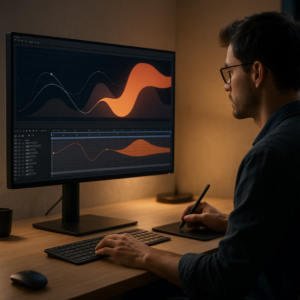
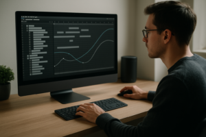
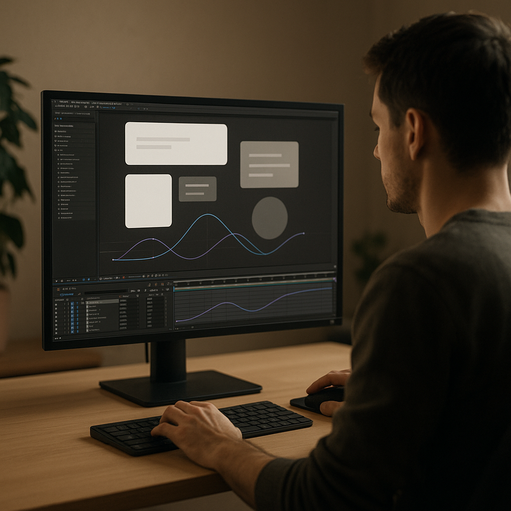
A UI minimal animation style focuses on small, deliberate movements. Elements glide, fade, and scale with gentle easing. Colors are often neutral with one accent, and transitions avoid hard cuts or busy distortions. Think of simple cards sliding up, a single line graph animating in, or a clean toggle switching state.
Instead of treating each element as a separate effect, you design a system: consistent durations, easing types, and distances. This creates a cohesive experience across the entire edit, whether you are animating one widget or a full dashboard.
Common variations of minimal UI motion
- Widget-based dashboards – compact cards for stats, payments, playback, or maps that animate in coordinated sequences. You can find inspiration in small UI modules like currency or balance cards, similar to how a digital card balance animation demonstrates clean motion in a financial context.
- Utility micro-interactions – battery status, notifications, progress bars, and timers that move just enough to be noticeable. For example, a battery status widget animation can show how subtle fills and indicator changes communicate state clearly.
- Service and app tiles – compact cards for streaming, learning, or social apps that rely on polished icon movement, focus states, and hover-like behaviors.
Matching intent to animation style
Once you understand the range of the ui minimal animation style, you can match it to user intent:
- Product explainers – prioritize clarity with gentle slides, opacity fades, and minimal scaling.
- Tech ads – add slightly snappier easing and staggered reveals to feel energetic but still clean.
- Tutorial content – keep movement small and repeatable, so viewers track clicks and states easily.
Finding and organizing inspiration
For structured inspiration, browse collections of UI-focused After Effects projects such as the widgets and interface layouts at curated UI motion videos. Save references into moodboards by type (e.g., cards, charts, navigation, notifications) so you can quickly reuse a visual language in future edits.
Common Clean UI Animation Mistakes in After Effects
Over-animating simple interfaces
One of the biggest mistakes is adding too much motion to a simple UI. Layering rotations, bounces, and glows on a basic card instantly breaks the minimal look. Instead, limit yourself to one or two properties (position + opacity, or scale + opacity) for each element.
Messy timing and inconsistent easing
Clean UI motion design relies on consistent timing. If every card, button, and label animates with different speeds and eases, the interface feels chaotic.
- Set standard durations (for example, 0.25s for micro-interactions, 0.5–0.7s for section transitions).
- Use shared easing presets through the Graph Editor so similar elements behave the same way.
- Check how sequences feel together, not just as isolated layers.
Ignoring the Graph Editor and value curves
Relying only on default Easy Ease tends to create a generic “rubbery” look. For a minimal style, subtle custom curves matter:
- Avoid extreme influence values that cause overshoot or jerky starts.
- Use soft ease-ins for elements entering focus and quicker ease-outs for elements leaving.
- Keep curves similar for related elements (titles, body text, icons).
Heavy effects and unnecessary plugins
Another problem is throwing effects like Glow, Motion Tile, or complex third-party plugins at small UI pieces. This hurts both performance and style:
- Minimal UI rarely needs more than simple shadows, blurs, and track mattes.
- Use shape layers and gradients instead of layered raster assets when possible.
- Test renders early to avoid slowdowns caused by stacked adjustment layers.
Unstructured comps and precomps
Messy compositions make iteration painful. Common issues include:
- All elements in a single comp with no grouping.
- Unnamed layers and precomps, making it hard to adjust one widget.
- Confusing anchor points leading to awkward motion paths.
To prevent this, keep each card or widget in its own labeled precomp and align anchor points logically (e.g., top-left for pinned UI, center for floating tiles).
No hierarchy between primary and secondary elements
In clean UI motion design, not everything should move equally. A key card sliding in with a clear ease can be supported by smaller fades for labels and icons. When all elements share the same amplitude and speed, viewers cannot tell what matters most.
Before animating, decide what is primary, secondary, and tertiary in each layout and reflect that in timing and intensity.
Choosing the Right Clean UI Motion Approach for Each Edit
Start from the context of your video
The same UI minimal animation style can feel completely different depending on where it is used. Before building comps in After Effects, define the context:
- Short social reels or TikToks – viewers scroll quickly, so you need punchy but still clean UI sequences. Use fast slide-ins, quick masks, and concise layout shifts.
- Product ads – balance clarity with rhythm. Use well-timed camera moves or parallax on top of minimal UI motion to keep attention.
- YouTube explainers – prioritize readability. Slower, predictable animations help viewers follow complex flows.
- Corporate demos – aim for restraint, minimal color, and unobtrusive motion that feels reliable and professional.
Deciding between custom builds and templates
For one-off hero sequences, building UI by hand from shape layers can give you full control. For ongoing content, however, you often need to swap logos, stats, and copy quickly across many versions.
This is where a well-organized template library and an Unlimited After Effects Templates Subscription can support your workflow: you stay within a consistent system of timing, easing, and layout while adapting colors and typography to each brand. Instead of rebuilding widgets repeatedly, you just duplicate precomps, replace content, and adjust timing.
Evaluating references and style alignment
When collecting reference boards from clients or your own research (for example on UI animation galleries), look for:
- How far elements travel during transitions.
- Preferred easing (linear, gentle cubic, snappy bounce).
- Use of blur, depth, and opacity to show focus.
Translate those patterns into After Effects presets or expression controls, so you can apply a defined style across multiple compositions without manually adjusting every keyframe.
Planning motion for narrative beats
For narrative content such as lyric-style visuals or story-driven UI, time your clean UI animations to specific beats, phrases, or voiceover lines. Even if the style is minimal, sync makes it feel intentional.
Map key beats on a timeline before animating, then design UI states that reflect those beats: open/close, highlight, swap, or rearrange panels. This keeps the motion tightly integrated with the edit instead of feeling like an overlay added at the end.
Practical Template and Workflow Guide for Clean UI Motion
Clarify project specs before animating
Before importing or building any UI template, lock down three core specs:
- Resolution – 1920×1080 for standard HD, 1080×1920 for vertical reels, or 3840×2160 for 4K. Design UI to fit safely in all text-safe areas.
- Frame rate – 24 fps for cinematic, 25/30 fps for social and broadcast, 60 fps only if you truly need ultra-smooth motion. Clean UI is often fine at 24–30 fps.
- Color space – keep it consistent with your delivery platform and any live-action footage you are compositing over.
Check After Effects compatibility
When working with templates, verify:
- Minimum After Effects version (e.g., CC 2019+).
- Whether expressions are language-dependent.
- If any third-party plugins are required for the UI elements.
If you want a smoother experience, prefer templates that rely mostly on native tools like shape layers, track mattes, and simple blurs. For example, a lightweight widget pack such as a video platform stat widget can show how much is possible with only built-in features.
Organizing precomps and naming conventions
Clean UI motion design relies on structure. Use clear naming such as:
- UI_MAIN_DASHBOARD
- UI_CARD_BALANCE
- UI_CHART_LINE_01
- UI_BUTTON_PRIMARY
Group related elements into precomps: one for the base layout, one for states (hover, active, disabled), and one for transitions (entrance/exit). This way you can swap in new content while preserving the motion system.
Keyframe organization and hierarchy
To keep the ui minimal animation style consistent, limit where you place keyframes:
- Animate parent nulls or controllers instead of individual layers whenever possible.
- Separate position and opacity animations into different layers or controllers for clarity.
- Use staggered timing to establish hierarchy: primary card moves first, secondary labels follow.
Color-code layers (e.g., yellow for controllers, blue for UI tiles, green for text) so you can quickly identify what to tweak later.
Performance tips for smooth previews
Dense UI comps can slow down previews. Keep them responsive by:
- Turning off Motion Blur until final checks.
- Using Region of Interest when adjusting a single card or widget.
- Lowering preview resolution to Half or Third when blocking out timing.
- Pre-rendering heavy background elements and importing as footage.
If you use many overlapping UI layers, precomp static elements and cache them. Animate only what truly needs motion.
Managing plugin dependencies
If a template requires plugins, decide early whether they fit your long-term workflow. Clean UI motion rarely needs heavy FX; simple tools such as Gaussian Blur, Drop Shadow, and Gradient Ramp often suffice.
If you work with collaborators, document which plugins a project uses and offer safe alternatives. For example, instead of a complex 3D plugin for cards, use simple 2.5D layers with rotation and shadow to mimic depth with lower overhead.
Customization workflow for branding
Most clean UI templates are designed for quick rebranding. Set up central controls where possible:
- Use a master control layer with Expression Controls (Color, Slider, Checkbox) for brand colors and corner radius.
- Link typography and icon colors to these controls.
- Store brand palettes in one master comp and reference them across widgets.
When you import a new logo or adjust a palette, the entire system updates automatically, preserving the minimal style.
Timing and transitions
For a cohesive clean UI motion design, define timing rules:
- Card entrances: 8–12 frames for fast content, 12–18 for explanatory content.
- Opacity fades: start a few frames before position animation for smoother perception.
- Section changes: use short crossfades or slide transitions instead of aggressive wipes.
Save these patterns as Animation Presets so you can apply them to new elements with one click.
Use cases across different platforms
Once your base system is built, adapt it:
- Reels and Shorts – focus on vertical layouts, large typography, and strong primary cards. Keep transitions tight and rhythmic.
- Ads and promos – combine UI cards with product shots. Use clean callouts that line up to features or benefits without obscuring visuals.
- Cinematic edits – integrate UI gently into live-action frames with screen replacements or floating HUD-like cards. Subtle parallax and blur keep it grounded.
- Educational videos – design stable lower-third panels and action indicators so viewers always know what is being discussed.
Think of your clean UI system as a kit of parts. Once it is built, you can drop it into many kinds of edits and only adjust timing and content, not the underlying design logic.
Advanced Tips for Consistent and Scalable UI Motion
Designing reusable animation systems
Instead of treating every new UI as a fresh project, build a modular system. Use controllers for spacing, corner radius, and motion intensity, and connect multiple cards to the same rig. This way, scaling from one tile to a grid of widgets is mostly about duplicating and offsetting layers.
Creating styleframes and motion references
Before animating, set up a few still styleframes that show primary states: idle, hover, active, success, and error. Then animate transitions between them using your standard easing and durations. These small tests become a reference for future sequences and help maintain a consistent ui minimal animation style across multiple videos.
Ensuring consistency across long edits
For multi-minute explainers or series, document your rules:
- Standard card size ratios.
- Default in/out animations and durations.
- Preferred easing curves.
- Layer naming and color-coding conventions.
Save this into a template project so every new episode or video starts from the same foundation rather than a blank file.
Export and render considerations
Clean UI motion design can look different once compressed for social platforms. To preserve clarity:
- Avoid ultra-thin lines that can shimmer after compression.
- Keep gradients smooth but not too subtle; mild contrast helps at lower bitrates.
- Test render short segments before delivering long edits.
Use the Render Queue or a dedicated encoder to output visually consistent formats for your distribution channels, and check how overlays appear over your final grade.
Dynamic link and project weight
If you work between editing software and After Effects, keep UI comps modular. Use short, self-contained UI animations rather than linking entire timelines. This keeps projects lighter and reduces relinking issues.
Periodically clean your project: remove unused solids, precomps, and footage, and consolidate files. Minimal, well-labeled UI setups are easier to archive for future reuse.
Quality control and review
Before final delivery, review UI motion with a checklist:
- Are timing and easing consistent across cards and screens?
- Does motion always support hierarchy and readability?
- Are any elements jittering or snapping due to subpixel issues?
- Do colors meet accessibility and contrast expectations?
Consider watching the piece with motion blur toggled on and off to ensure animation reads cleanly in both cases. Minimal UI should remain legible even at reduced preview quality.
Search Intent and Quick Answers for Clean UI Motion Design
Typical questions editors ask
When exploring clean UI motion design, editors and motion designers often search for very specific workflows. Here are common intents with concise answers so you can move faster in After Effects.
- How do I start with clean UI motion if I am a beginner?
Begin with simple cards made from shape layers. Animate position and opacity only, use Easy Ease, then refine curves in the Graph Editor. Limit yourself to one or two colors plus a neutral background. - What is the best duration for UI micro-interactions?
Most micro-interactions fall between 6 and 12 frames at 24–30 fps. Shorter feels snappy and energetic, longer feels more relaxed. Keep a small set of standard durations and apply them consistently. - How can I keep my UI animations organized?
Use one composition per widget type and descriptive naming. Parent related elements to a controller null. Group entire UI scenes into a master comp so you can offset them relative to the edit. - Do I need advanced plugins for minimal UI?
No. Clean UI motion design is primarily about thoughtful layout and timing. Native shape layers, masks, blurs, and gradients are usually enough. Plugins can help with speed but are not required for a polished result. - How do I integrate UI with music or narration?
Mark beats or key phrases on the timeline, then time major UI transitions to those markers. Use more subtle movements between beats so the edit never feels static, but keep big moves aligned to audio events. - How can I quickly prototype multiple UI layout ideas?
Use simple wireframe rectangles and text placeholders first. Animate transitions with your standard easing, then refine shapes and colors. This lets you test pacing and hierarchy before committing to detailed design.
Adapting clean UI motion to different aesthetics
Even within a clean style, you can accommodate various brands by adjusting only a few parameters: border radius, color palette, and motion intensity. The underlying motion logic stays the same, which keeps your workflow efficient and predictable.
Applying minimal UI concepts beyond interfaces
The same principles also work for minimal lyric layouts, data callouts, or simple content widgets like video progress bars. For instance, a compact utility panel similar in spirit to an editor-style widget can borrow from clean UI timing and compositional rules while serving a different narrative goal.
Closing Inspiration and Next Steps for Clean UI Motion
Bringing everything together
Clean UI motion design thrives on discipline: simple shapes, intentional timing, and consistent easing across your entire edit. Once you understand the fundamentals and avoid common pitfalls, you can apply the same toolkit to dashboards, app demos, explainers, and even lyric or story-driven overlays.
Focusing on workflow, not just looks
For editors and motion designers, the real advantage is speed and reliability. By building or adopting a well-structured set of UI templates, you spend less time redrawing widgets and more time refining pacing, storytelling, and client feedback. A repeatable ui minimal animation style keeps your work coherent across campaigns, channels, and formats.
Your next project
Pick a small sequence—a single card reveal, a notification, or a simple stat panel—and rebuild it using the principles above. Lock your frame rate, define timing presets, clean up your Graph Editor curves, and name layers clearly. Then reuse that system in your next three edits, refining with each pass.
With a consistent approach and an Unlimited After Effects Templates Subscription feeding fresh layouts into your toolkit, you can keep experimenting while staying efficient and on-brief for clients or personal projects worldwide.
Conclusions
Clean UI motion design rewards structure and restraint. With clear timing rules, organized templates, and a repeatable minimal UI style, your After Effects projects stay sharp, readable, and efficient to deliver.
FAQ
What is clean UI motion design in After Effects?
It is a restrained animation approach for interfaces using simple shapes, subtle easing, and purposeful timing to highlight hierarchy and usability.
How do I keep a UI minimal animation style consistent?
Define standard durations, easing curves, and layout rules, then reuse them in presets and template projects across all your edits.
Do I need plugins for clean UI animations?
No. Native shape layers, masks, gradients, and basic blur or shadow effects are enough for most clean UI motion design work.
What frame rate works best for UI motion?
Most editors use 24 or 30 fps. Both support smooth, minimal UI motion; choose based on your platform and any live footage you mix in.
How can templates help with UI motion projects?
Templates provide prebuilt layouts, timing, and easing systems so you can swap content quickly and maintain consistent, professional motion.
How do I integrate clean UI motion into live-action footage?
Use screen replacements or floating cards, match camera movement subtly, and keep animations small and timed to key actions or dialogue.