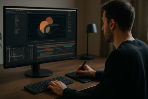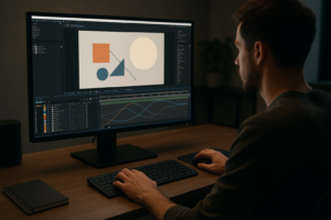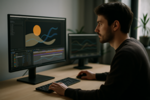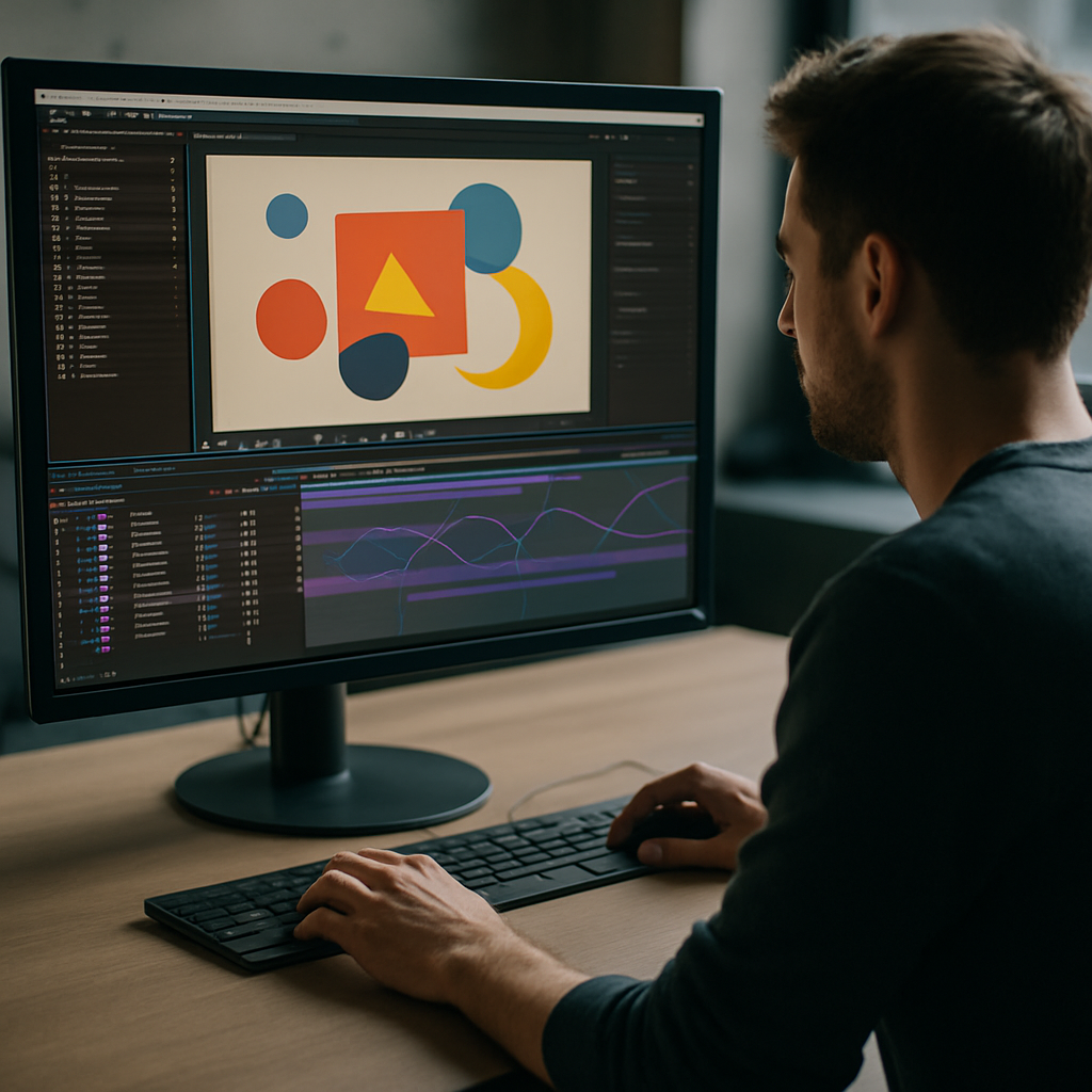
2D motion graphics inspiration is not just about cool shots. For editors and motion designers in After Effects, it is about repeatable ideas, reusable systems and a workflow that stays fast under deadlines. This guide focuses on practical examples, decision-making and templates that keep you shipping polished work consistently.Explore template access
📋 Table of Contents
Understanding 2D motion graphics inspiration
2D motion graphics inspiration is the spark that helps you decide what to animate before you worry about how to keyframe it. For After Effects users, it usually shows up as layouts, timing patterns, transitions, text behaviors, and ways of revealing or hiding information.
It matters because most projects are not starting from a blank slate. You are adapting brand guidelines, working within a script, or cutting to an existing track. Having a bank of 2D ideas keeps you from repeating the same three transitions or default easing curves on every job.
2D motion graphics inspiration is useful for:
- Editors who need quick, on-brand motion accents for YouTube videos, ads, reels, and explainers.
- Motion designers building title sequences, UI animations, or lyric videos with tight deadlines.
- Content creators who want their social posts to look more polished without spending days on a single animation.
Instead of treating inspiration as random scrolling, you can organize it into repeatable systems: text reveals, overlays, widgets, transitions, and loopable elements. That mindset is what the rest of this guide focuses on: practical ways to turn inspiration into reusable building blocks inside After Effects.
Creative 2D animation examples that actually ship
When people search for creative 2D animation examples, they usually want ideas they can plug into real-world projects. It helps to think in categories you can reuse across multiple clients or channels.
1. Text-centric widgets and overlays
These are compact, UI-style animations that sit on top of footage or solid backgrounds. Think of location tags, music info, or social handles.
- Animated lower-thirds that slide or mask in with clean easing.
- Lyrics or captions that pulse to the beat or stagger in lines.
- Minimal widgets for stats, prices, or notifications.
You can study examples like the sleek overlays in the YouTube inspired widget layout or location-style designs similar to a map pin or ride pickup card.
2. Product and service UI-style animations
These work well for SaaS platforms, fintech, or any digital product. They mix simple shapes, icons, and text to mimic app behavior.
- Cards sliding in with easing and blur.
- Buttons pressing, toggles switching, sliders moving.
- Payment or confirmation flows built from rectangles, lines, and simple icons.
Look at motion built around finance or payment flows such as a minimal card UI similar to a payment service style widget for reference on hierarchy and pacing.
3. Lyric and music-driven 2D graphics
Music videos, lyric reels, and visualizers rely heavily on 2D animation. You can build a system of text, shapes, and background pulses that follow the track.
- Type that pops in on snare hits or vowels.
- Shape bursts and outlines that echo the rhythm.
- Background gradients and grain that shift on sections.
Reference beat-synced overlays and kinetic lyric looks like those in stylized music widgets, such as rhythmic layouts similar to lyric focused animations.
4. UI and tech-style sequences for explainers
Explainers and tech promos love clean 2D screens: maps, dashboards, notifications, or call popups.
- Simple, flat vector maps with route lines and pins.
- Inbox-style message bubbles sliding in from off-screen.
- Call or meeting notifications with profile circles and buttons.
You can draw inspiration from layouts reminiscent of ride pickup cards like map and pickup inspired widgets or conference call UIs like video call style overlays.
5. Branded social and promo loops
For social channels, you need short, loopable animations: logo bursts, product cards, and countdowns.
- Loops that start and end on the same frame for seamless repeats.
- Simple logo resolves with textures or light sweeps.
- Product cards that cycle through colorways or features.
For more compact ideas, browse varied After Effects projects on curated motion templates and widgets to see how different motion systems handle timing, depth, and layering.
Common 2D motion mistakes in After Effects
Even strong ideas can fall flat when execution in After Effects gets messy. Knowing where most editors and designers slip up helps you avoid redoing work under deadline.
Timing and spacing issues
- Keyframes spaced randomly without rhythm or reference to audio.
- Everything entering and exiting at the same speed, creating a flat feel.
- Overly long transitions that slow down the edit.
How to avoid
- Block timing with stepped keyframes first, then refine easing.
- Use markers on the timeline for beats, voiceover phrases, or cut points.
- Think in durations: 4–8 frames for accents, 10–16 for more relaxed moves.
Poor use of the Graph Editor
- Linear motion that feels robotic.
- Excessive ease-in and ease-out curves causing rubbery motion.
- Uncontrolled overshoot that looks sloppy.
How to avoid
- Use a few go-to easing presets you trust instead of reinventing curves every time.
- Keep influence values consistent across similar elements.
- Limit overshoot to key moments; zero it out for UI and data-heavy layouts.
Messy comps and precomps
- Hundreds of unlabelled layers in a single timeline.
- No precomps for reusable elements like lower-thirds or widgets.
- Breaking client-approved animations when making layout changes.
How to avoid
- Name layers clearly and use colors for categories (text, shapes, controls).
- Precomp systems: text blocks, icon sets, or background loops.
- Use master control layers for colors, timing, and global effects.
Heavy plugins and slow previews
- Leaning on third-party plugins for basic motion that could be done with native tools.
- Huge comps (4K with effects on everything) that kill real-time previews.
- Unoptimized footage and vector art.
How to avoid
- Reserve heavy plugins for looks you truly cannot get natively.
- Use lower-resolution previews and region of interest while blocking animation.
- Convert large layers into pre-rendered elements if they stay static.
Inconsistent style across the edit
- Different easing, stroke weights, shadows, or type treatments on each scene.
- Random transitions that do not feel related.
- Colors drifting away from brand guidelines.
How to avoid
- Create a simple style guide: color palette, type hierarchy, motion rules.
- Build reusable animation presets or controllers.
- Do quick styleframe checks before animating the whole sequence.
Getting these fundamentals right makes any source of 2D motion graphics inspiration instantly more usable in real projects, because you spend less time fixing problems and more time iterating on design.
Choosing the right 2D motion approach for each project
Different projects call for different 2D motion strategies. The best creative 2D animation examples are tailored to their platform, audience, and pacing, not just the designer’s preferences.
Social reels and shorts
- Goal: grab attention in the first second and stay readable on mobile.
- Approach: bold type, simple shapes, and large widgets or overlays.
- Tips: prioritize punchy transitions, minimal text per frame, and fast cuts synced to the beat.
Ads and performance creatives
- Goal: communicate one key benefit or action quickly.
- Approach: UI-style animations, quick demonstrations, and clear callouts.
- Tips: use 2–3 core layouts, keep motion consistent, and highlight CTAs with subtle but clear motion.
YouTube intros, segments, and lower-thirds
- Goal: build recognizability and rhythm across episodes.
- Approach: reusable title cards, segment bumpers, and channel-branded lower-thirds.
- Tips: design once, then convert into systems you can tweak for each video without rebuilding from scratch.
Cinematic and narrative edits
- Goal: support storytelling without stealing focus.
- Approach: restrained text, subtle overlays, and slower, more natural easing.
- Tips: use 2D motion mainly to clarify time, place, and dialogue (e.g., captions, locations, chapter titles).
Corporate, product, and explainer videos
- Goal: clarity, professionalism, and brand alignment.
- Approach: clean charts, icons, and UI flows; minimal but precise motion.
- Tips: lock brand colors and type early, then build reusable comp templates for charts, stats, and callouts.
Where inspiration fits your workflow
Instead of collecting random references, look for examples that match your project type and reuse them as modular patterns. Platforms like Dribbble are useful for static styleframes; you can then translate those into motion rules: how elements enter, how they overlap, how they loop.
Using templates and systems for decision-making
When deadlines are tight, a library of reusable motion systems can be the difference between “good enough” and “actually proud of it.” Systems let you:
- Pick from a few proven animation styles instead of starting over each time.
- Keep visual language consistent across an entire series or channel.
- Spend more time on story and pacing, less on rebuilding the same widgets.
If you rely on multiple projects and channels, having an Unlimited After Effects Templates Subscription becomes less about novelty and more about speed and consistency: you select a motion system, adapt it to your brand, and move on to the next deadline.Compare subscription options
Template-based workflows and checklists for 2D motion
Once you have 2D motion graphics inspiration and creative 2D animation examples to follow, templates turn those ideas into efficient workflows. Treat templates not as finished pieces, but as motion systems you can adapt.
Check project compatibility first
- After Effects version: confirm the project opens on your installed version. If it was built in a newer version, consider updating or asking for a back-saved file.
- Resolution and aspect ratio: check the main comps (16:9, vertical 9:16, square). Duplicate and adjust comps when you need multiple formats.
- Frame rate: match your edit (23.976, 25, 30, 60). Mismatched fps can cause drift between audio and motion.
Set up naming, precomps, and controls
- Rename the master comp with the project name and delivery format.
- Use precomps for elements you will reuse: lower-thirds, subtitle blocks, product cards, and icons.
- Create a “CONTROLS” comp or layer that holds color controls, text styles, and global timing sliders where possible.
Organize keyframes like an editor
- Keep related keyframes vertically aligned so timing is easy to read.
- Label your in and out points clearly, especially for overlays that must hit beats or VO cues.
- Use markers on the timeline for major events: intro, hook, CTA, section changes.
Performance tuning before you animate everything
- Lower preview resolution to Half or Third for complex scenes.
- Use masks instead of heavy effects when possible for reveals.
- Pre-render static or background-heavy comps if they rarely change.
The more complex the animation system (for example, a layered UI inspired sequence like a clean app promo similar to mobile app style flows), the more you benefit from early performance checks.
Check plugin dependencies and alternatives
- Open the Effects panel and note any third-party plugins used.
- If you lack a plugin, see if its role is essential (glow, distortion, text animator). Often you can swap to native effects.
- When possible, rebuild key parts using standard tools so your project is more portable.
Customization workflow: colors, type, transitions, timing
Approach templates like an editor:
- Colors: lock your palette first. Use control layers or expressions to propagate changes everywhere.
- Typography: set heading and body fonts that match the brand. Adjust tracking, leading, and size for readability on mobile and desktop.
- Transitions: pick 2–3 motion styles (wipe, slide, scale) and apply them consistently. Avoid mixing too many gimmicks.
- Timing: structure the sequence to match your track or VO. Trim or extend precomps rather than offsetting random layers.
Use-case driven template setups
- Reels and shorts: build a vertical master comp. Add prebuilt overlays such as music widgets, engagement prompts, and fast lower-thirds. Use short, punchy animations like those seen in compact card widgets similar to battery style overlays.
- Ads and promos: set up separate precomps for hook, feature highlights, and CTA. Each should be easy to swap or reorder.
- Product-focused edits: create a system of product cards, feature callouts, and price tags. You can draw on clean UI-oriented layouts reminiscent of card-based finance motion when planning information hierarchy.
- Cinematic or music-driven edits: build lyric or subtitle precomps that can be reused across tracks. Study how beat-reactive text and background motion works in stylized lyrics layouts similar to music-driven comps.
Final checklist before you render
- Check spelling and line breaks on all text.
- Toggle solo on major elements to ensure nothing intersects or clips awkwardly.
- Scrub the timeline to spot unexpected holds or jumps.
- Preview with audio from start to finish at least once in real time.
By treating each template as a motion system and following a clear checklist, you turn inspiration into dependable workflows rather than one-off experiments.
Advanced 2D motion systems and long term workflow
Once basics and template workflows feel solid, 2D motion graphics inspiration becomes a way to evolve systems over time instead of starting from zero on every project.
Designing reusable animation systems
- Build a small library of lower-thirds, overlays, and transitions that share the same easing, stroke weight, and shadows.
- Convert frequently used moves into animation presets for position, scale, and opacity.
- Use master controller layers (sliders, checkboxes) for features like on-off glows, secondary color switches, or noise overlays.
Maintaining consistency across whole edits
- Lock your core animation vocabulary: how elements enter, hold, and exit.
- Use the same motion behavior for similar objects (e.g., all buttons pop with the same squash-and-stretch values).
- Create a simple motion spec doc per client or series for future episodes.
Styleframes as decision anchors
- Before animating, design 2–3 key frames for each sequence.
- Use these to align with clients or collaborators on hierarchy and color.
- Once approved, you animate between these frames, not from a blank canvas.
Export, render queue, and delivery basics
- Set consistent output codecs and bitrates for different platforms (e.g., high-quality masters vs. lightweight social exports).
- Use the Render Queue or an external encoder to batch variations (different resolutions, languages, or aspect ratios).
- Name your outputs clearly with project, version, and aspect ratio.
Dynamic link and project weight
- Dynamic link is useful but can become unstable in large projects; use it mainly for shots that truly require live updates.
- When a sequence is locked, consider rendering a master ProRes or similar and cutting that inside your NLE.
- Clean unused assets and old comps periodically to keep files lighter.
Quality control pass for professional polish
- Check edges: no unwanted halos, cropped layers, or leftover guides.
- Ensure motion blur is consistent and supports the style (sometimes you want it off for crisp UI, on for faster moves).
- Confirm all colors look correct on different displays if possible.
For recurring content like recurring widgets or channel overlays, it helps to maintain a core system influenced by one or two strong examples, such as the cohesive UI look seen in notification-based layouts like language app style widgets. Over time, this approach saves hours and keeps your work recognizable across campaigns and clients.
Search driven ideas for 2D motion and After Effects
Editors and motion designers often type the same questions into search engines when looking for 2D motion graphics inspiration or creative 2D animation examples. Turning those questions into quick answers helps guide your next project.
- “Simple 2D motion ideas for beginners” – Start with basic text reveals, minimal overlays, and logo animations using only position, scale, opacity, and masks.
- “How to animate UI in After Effects” – Treat each UI element as a separate layer; use subtle slides, fades, and micro bounces. Keep motion carefully timed so it feels like real software.
- “2D motion for YouTube intros” – Build a 5–10 second sequence with a logo, channel name, and episode title using one or two motion styles. Save it as a reusable project file.
- “Best 2D animation timing for reels” – Keep transitions under half a second and aim for strong accents on beats or scene changes. Overshoot and bounce lightly, not aggressively.
- “2D motion graphics for lyrics” – Use precomps for each line or phrase of the song. Animate them on beats with a consistent entry style and vary only color or background motion.
- “How to keep After Effects projects organized” – Separate folders for comps, assets, renders, and precomps; use clear naming, colors, and control layers for global adjustments.
- “Making 2D motion look more professional” – Focus on spacing and easing, consistent shadows and strokes, on-brand type, and clean transitions that support the story.
- “2D motion graphics inspiration for corporate videos” – Look for subtle UI flows, charts, and stat callouts. Use controlled, understated motion and keep typography very legible.
- “Ideas for looping 2D animations” – Design start and end frames to match, then offset secondary elements like shapes or gradients for visual variety within the loop.
Keep a running document or board where you collect both references and the answers that worked for you. Over time, it becomes a personalized knowledge base of motion solutions you can draw from across worldwide projects and clients.
From inspiration to consistent delivery
2D motion graphics inspiration is most valuable when it leads to a smoother workflow and better output. Once you understand the fundamentals, study creative 2D animation examples, and adopt template-friendly systems, your After Effects projects become more predictable under real deadlines.
The key is to treat every idea as part of a reusable motion language: overlays, widgets, lyric systems, UI flows, and transitions that you can adapt from project to project. Organized comps, clean keyframes, and lightweight setups make that language easy to maintain.
As you refine your process, you spend less time fighting timelines and more time exploring new looks, iterating quickly for clients, and shipping consistent motion across channels and campaigns.
If you want a steady stream of ready-made systems to plug into your workflow, an Unlimited After Effects Templates Subscription can give you a dependable base of projects to adapt rather than rebuild from scratch every time.Get unlimited AE templates
Conclusions
Use 2D motion graphics inspiration as fuel for systems, not one-offs. Organize your After Effects projects, lean on proven motion patterns, and refine timing and style. With structured workflows and adaptable templates, you can deliver cleaner animation, faster turnarounds, and more consistent results on every edit.
FAQ
What is 2D motion graphics inspiration in practical terms?
It is a library of layouts, timing patterns, and motion systems you can reuse in After Effects, like text reveals, overlays, UI flows, and transitions.
How do I find creative 2D animation examples that fit my project?
Search by project type, such as reels, explainers, or UI promos, then focus on examples with similar pacing, aspect ratio, and audience to your own brief.
How can I adapt templates without everything looking the same?
Lock brand colors and type, customize timing and transitions, and combine elements from a few systems instead of relying on a single template for all scenes.
What are the most important settings when opening a new AE template?
Check After Effects version, frame rate, resolution, aspect ratio, and any third party plugin dependencies before committing to the project in your workflow.
How do I keep 2D motion projects running smoothly in After Effects?
Organize precomps, use lighter preview settings, limit heavy effects, and pre render static or complex backgrounds so timelines stay responsive.
How can I make my 2D motion more professional without buying plugins?
Focus on clean easing in the Graph Editor, consistent style choices, good typography, and purposeful timing linked to music or voiceover cues.