Learning how to animate text in After Effects Pro is one of the fastest ways to upgrade your edits, titles, and social content. This guide walks you step by step from clean basics to advanced kinetic text animation workflows so you can work faster, stay organized, and deliver professional motion for any project.Explore text templates
📋 Table of Contents
Understanding Text Animation In After Effects Pro
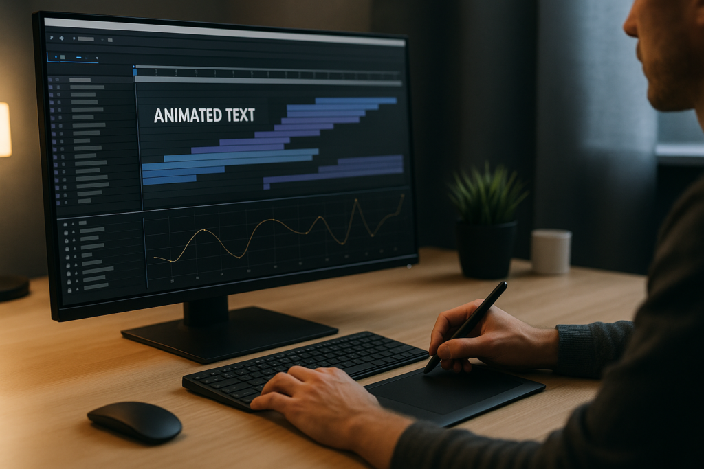
When people search how to animate text in After Effects Pro, they usually want two things: clean motion that looks professional and a workflow that does not slow down their edit. Text animation in After Effects is simply the process of moving, scaling, rotating, and revealing text over time using keyframes, text animators, and effects.
It matters because text carries information and style at the same time. Headlines, lower thirds, captions, and lyrics all rely on motion to guide the viewer’s eye. Good animation makes the message easier to read and remember, while bad animation distracts or feels amateur.
Text animation in After Effects is useful for:
- Video editors who need polished titles and lower thirds fast.
- Motion designers building full-screen typographic layouts and kinetic sequences.
- Content creators making reels, shorts, promos, and lyric videos.
- Agencies and brands that require consistent type styles across many videos.
At a basic level, you animate text by:
- Creating a text layer with the Type tool.
- Setting keyframes for properties like Position, Scale, Opacity, and Rotation.
- Using easing (via the Graph Editor) to smooth out motion.
- Optionally adding text animators to control characters, words, and lines independently.
Once you understand these building blocks, you can move into more stylized kinetic text animation, where the timing, rhythm, and layout of your type follow the beat of the audio or the pacing of the edit.
Kinetic Text Animation Styles And Use Cases
What is kinetic text animation
Kinetic text animation is the art of making words move in sync with sound, rhythm, or narrative. Instead of static captions, every word, line, or phrase is designed to appear, move, and disappear with intention.
Common styles include:
- Lyric videos where each word or phrase lands on a beat or vocal line. For example, a project like the Lush Life lyrics style uses timed reveals and bouncy easing.
- Explainer titles where text slides, pops, or fades to support the script.
- UI-style widgets such as animated stats, notifications, or finance overlays inspired by layouts similar to a digital finance card animation.
- Social graphics where bold, full-frame typography punctuates edits for reels and shorts.
Variations of kinetic text
- Word-by-word reveals for emphasis in tutorials and educational content.
- Line-by-line movement for subtitles and dialogue emphasis.
- Character-based animation where letters wiggle, bounce, or rotate individually for playful brands.
- Grid and split-screen layouts where multiple phrases animate in different areas of the frame.
Matching kinetic text to project type
- Music lyrics: Tight syncing to beats and vocals, often with bold color and expressive motion similar to animated music layouts like performance-style lyric animations.
- Product or app showcases: Clean, minimal moves that complement UI, similar to overlays you might find near a map or location widget animation.
- YouTube intros: Fast, punchy kinetic type with smooth transitions, which can be combined with animated channel widgets like a video platform-style widget.
- Seasonal promos: More playful, decorative motion to match themed visuals, like how animated titles might accompany a stylized piece such as a holiday scene animation.
Why templates matter for kinetic text
Kinetic text requires precise timing and consistent style. Building it from scratch every time is possible but slow. Templates and preset systems let you:
- Reuse proven motion systems across many edits.
- Maintain consistent typography and easing.
- Quickly adapt layouts to new formats like reels, 16:9 videos, or vertical shorts.
As you move forward, you will combine these styles with solid fundamentals like easing, hierarchy, and clean project structure so your kinetic text animation looks polished and is easy to update later.
Common Text Animation Mistakes And How To Avoid Them
Before building complex kinetic text animation, it helps to fix the issues that make text feel amateur or hard to manage. Many editors searching how to animate text in After Effects Pro are actually fighting the same core problems.
1. Sloppy timing and off-beat motion
- Text appears too early or lags behind the audio.
- Every word moves with the same speed, so nothing feels emphasized.
Fix: Use audio markers on the timeline to mark beats or key phrases. Align in and out points of your text layers or keyframes to those markers, then add easing so the motion feels natural, not mechanical.
2. No easing or wrong easing
- Linear keyframes make text feel robotic.
- Overdone easing makes motion rubbery or childish.
Fix: Use Easy Ease as a starting point, then refine in the Graph Editor. Keep curves consistent across related layers so they feel like part of one system.
3. Overusing motion blur and heavy effects
- Full-comp motion blur on many text layers increases render time.
- Stacked glows, drop shadows, and blurs muddy readability.
Fix: Enable motion blur only where it adds value. Use subtle effects and test readability on a smaller preview window or at playback speed.
4. Messy compositions and naming
- Text layers named “Layer 23” make revisions slow and stressful.
- Multiple unrelated text animations live in one giant comp.
Fix: Use clear names like “Title_Main”, “Subtitle_Line1”, or “CTA_Button_Text”. Precomp sequences that belong together and keep one idea per comp when possible.
5. Heavy plugins and unsupported setups
- Using many third-party effects for simple text moves.
- Opening old projects that rely on plugins not installed on the current machine.
Fix: Prefer native text animators and built-in effects whenever possible. If a project uses plugins, document them and keep a list so collaborators know what is required.
6. Ignoring safe areas and readability
- Text sits too close to frame edges, especially in vertical formats.
- Colors blend into the background, especially on fast-moving edits.
Fix: Turn on action/title safe guides. Test your text over the actual footage with different brightness levels. Use solid backgrounds or semi-transparent shapes behind text when needed.
Checklist for clean setups
- Consistent easing curves across all text animations.
- Readable font size on mobile and desktop.
- Logical layer and comp naming.
- Minimal, purposeful effects.
- Timing aligned to audio or edit beats, not random.
Solving these issues first makes every other technique in this guide easier to apply and maintain, especially when deadlines are tight.
Choosing The Right Text Animation Approach For Each Project
Once your basics are solid, the next step is deciding how much time to spend building animations from scratch versus using reusable systems. The right approach depends on where the text will live and how often you need to repeat similar layouts.
Social reels and shorts
- Vertical or square formats with fast pacing.
- Text usually needs to be bold, centered, and readable in under a second.
Approach: Use simple kinetic moves like slide-ups, pop-ins, or type-on effects. Pre-build a small set of reusable animations and apply them across multiple clips for consistency.
YouTube videos and long-form content
- Lower thirds, topic headings, and callouts must be subtle and on-brand.
- Consistency over many episodes is more important than flashy motion.
Approach: Design a modular title and lower third system once. Save animation presets or dedicated comps you can copy into each new project, similar to how a recurring widget layout works in a UI-style pack such as editing dashboard overlays.
Ads and product promos
- Text must highlight key benefits and prices quickly.
- Pacing is tight, and every second needs intentional motion.
Approach: Use bold kinetic text animation that matches the product energy. Mix in animated UI elements or counters inspired by visual ideas similar to a charging or progress indicator animation when you need progress-style text callouts.
Music and lyric videos
- Timing is driven by rhythm and vocal phrasing.
- Style can be more experimental, with expressive type layouts.
Approach: Plan sections around song structure (intro, verse, chorus). Build a few different text animation patterns and reuse them by section so the video feels cohesive but not repetitive. A design-driven example is a performance-oriented lyric layout like stylized music track animations.
When templates and subscriptions help
If you regularly produce kinetic text-heavy content for clients or channels, building everything from scratch becomes expensive in time. Using a high-quality Unlimited After Effects Templates Subscription lets you:
- Start from professional kinetic text bases and customize fonts, colors, and timing.
- Maintain visual identity across multiple deliverables.
- Quickly adapt layouts for new campaigns or content series.
For typography choice, pairing a reliable type system with motion is crucial. Free libraries such as Google Fonts allow you to test font families that stay readable across different screen sizes and resolutions before committing them to your templates and presets.
Step By Step Workflow For Template Based Text Animation
To make your kinetic text animation efficient, treat templates as structured systems instead of one-off compositions. Whether you build your own or start from a library, a clear workflow keeps everything flexible and fast.
Project setup and compatibility
Before importing or opening any template, check:
- After Effects version: Verify that the project matches or is older than your installed version. If you collaborate worldwide, align everyone on a minimum version.
- Frame rate (fps): Match the template’s fps with your edit (e.g., 23.976, 25, 29.97). Changing fps later can break precise kinetic timing.
- Resolution and aspect ratio: Decide if you are working in 1920×1080, 4K, or vertical formats like 1080×1920. Many kinetic text systems are resolution-independent, but framing and safe areas still matter.
Organizing precomps and naming conventions
Think like an editor who might revisit the project months later:
- Name folders logically: “01_MAIN”, “02_TEXT”, “03_ASSETS”, “04_RENDERS”.
- Label text precomps clearly: “TXT_LowerThird”, “TXT_Title_Intro”, etc.
- Group reusable animation systems into master comps so you can duplicate them for new scenes.
Many advanced text projects, such as lyric-style or widget-style layouts like rap-inspired text widgets, rely heavily on nested precomps. Keeping those labeled pays off when updating many lines of text at once.
Performance, previews, and caching
Kinetic text can involve many layers. To keep playback responsive:
- Set Resolution to Half or Quarter while working.
- Use Region of Interest to preview only the area where text is animating.
- Reduce preview duration to short loops that cover entrance and exit animations.
- Turn off unnecessary motion blur until final checks.
For complex scenes, consider using lower-resolution proxies or pre-rendering heavy background elements while keeping your text live.
Plugin dependencies and safe alternatives
Before committing to a template-heavy workflow:
- Check the Effects & Presets panel for any missing plugins.
- Replace non-essential plugin-based glows, blurs, or glitches with native equivalents when performance matters.
- Document any must-have third-party tools so team members know what they need installed.
Customization workflow for colors, typography, and timing
Approach templates as design systems:
- Global controls: Use master controls or adjustment layers to set brand colors and global fonts once.
- Typography: Choose 1–2 primary fonts and keep hierarchy clear: Title, subtitle, body. Adjust tracking and leading so text remains readable even with motion.
- Timing: Drag in and out points of text precomps on the main timeline to sync with beats. Fine-tune inside precomps with keyframe offsets and ease curves.
When adapting to new platforms, duplicate your master comp and adjust only what is necessary: framing, text length, and maybe speed. This is especially helpful for recurring sequences like UI-themed shots, similar to how a reusable layout might be created once for a design like payment widget style animations.
Use cases and practical checklist
Apply this workflow to different project types:
- Reels and shorts: Short, punchy captions; minimal colors; heavy focus on beats.
- Ads and promos: Structured message flow (hook, benefit, proof, CTA) with increasing intensity in text motion.
- Product explainers: Calm, clear kinetic text with emphasis on clarity and information hierarchy.
- Cinematic edits: Understated titles and subtitles with slow, elegant easing.
Template setup checklist:
- Confirm version, fps, and resolution.
- Rename and organize all imported comps and layers.
- Identify and centralize color and font controls.
- Test performance on the heaviest kinetic scenes first.
- Render a short test sequence to confirm motion, readability, and timing before committing the whole edit.
With this structure in place, your kinetic text animation becomes faster to build, easier to revise, and more consistent across multiple projects.
Advanced Techniques And Long Term Workflow Optimization
After you are comfortable with template-based workflows, you can push your kinetic text animation by thinking in systems rather than single shots.
Building reusable animation systems
Instead of animating each line independently, create:
- Master text animators that control position, opacity, and scale across multiple lines.
- Animation presets for common moves: slide-ins, pop-ups, bounce, type-on. Save them and reuse across projects.
- Modular comps for intros, lower thirds, and end cards that can be quickly duplicated and relabeled.
Maintaining visual consistency
Across a series of videos, consistency is what makes typography feel professional:
- Use the same easing curves across all primary animations.
- Lock in a small palette of brand colors for text and backgrounds.
- Define rules for when to use uppercase, bold, or italic for emphasis.
If you reference multiple templates, align them visually so they feel like one system rather than disconnected designs.
Styleframes and planning
Before animating entire sequences, build a few static styleframes that show:
- Full-screen title layouts.
- Lower thirds over real footage.
- Caption or lyric layouts with background graphics.
Share these with your team or clients first. Once approved, you animate with confidence, knowing type size, hierarchy, and color are already locked.
Export, render, and delivery considerations
Clean text motion also depends on how you export:
- Use high enough bitrate or quality settings so thin fonts stay sharp.
- Test compressed versions on mobile devices to check legibility.
- Avoid unnecessary resizes or re-encodes that soften text edges.
Inside After Effects, use the Render Queue or Media Encoder for final exports. For heavily kinetic projects like animated promo widgets or lyric-style overlays similar to fluid text and shape animations, pre-rendering complex segments can prevent last-minute slowdowns.
Dynamic link and project weight
If you send your text animations into an editing app via dynamic link:
- Keep your After Effects project lightweight by cleaning unused layers and comps.
- Avoid stacking too many nested compositions; flatten when timing is locked.
- Consider rendering key sections as ProRes or a visually lossless codec to keep editing snappy.
Quality control workflow
Before delivery, build a simple QC pass:
- Scrub through your timeline with the audio muted and check whether the motion pacing still feels clear purely visually.
- Turn on and off guides and safe areas to confirm placement.
- Check a low-res export for typos, timing issues, and color consistency.
Over time, these advanced habits let you scale from individual kinetic shots to full campaigns and series without losing control over style or performance.
Search Driven Tips For Better Kinetic Text Workflows
Editors and motion designers often search similar long-tail questions when learning how to animate text in After Effects Pro and building kinetic text animation systems. Below are common intents with concise, practical answers.
- Best way to sync lyrics to music in After Effects
Use markers on the audio layer for each word or phrase, then snap text in and out points to those markers. Fine-tune keyframes inside precomps for smoother easing. - How to keep text readable on busy footage
Add a subtle solid or gradient behind the text, slightly blur the background, and maintain strong contrast between text and backing shape. - How many fonts should a kinetic text video use
Usually 1–2 main typefaces: one for headings, one for body. Rely on weight, size, and color changes rather than adding more families. - Why does my text animation lag in previews
Lower preview resolution, shorten the work area, and disable motion blur until final checks. Pre-render heavy background animations to focus resources on text. - How to re-use the same lower third in multiple edits
Build a dedicated lower-third comp with expressions or simple controls for name and title. Save it in a master project, then import that comp into each new edit. - How to adapt horizontal text templates for vertical videos
Duplicate your main comp, switch to a vertical resolution, then reposition and scale your text elements while checking title-safe areas on a phone-sized preview. - Can I animate text to match voiceover without music
Yes. Use the waveform display of the voiceover track to find peaks and syllables, place markers for important words, then align text entrances to those cue points. - How to get cinematic titles instead of flashy motion
Use slow, subtle easing, slightly overshoot scale or position, and keep color palette minimal. Add a gentle blur or grain over the final shot for cohesion. - How to avoid redoing all kinetic captions when script changes
Keep text in dedicated source comps. If timing allows, adjust only the text content while leaving main animation keyframes untouched, then nudge layer in/out points on the master timeline.
These search-driven tactics help refine your workflow so you spend more time making strong creative choices and less time fixing structural issues.
Bringing It All Together For Faster Pro Level Text
By now you have a full view of how to animate text in After Effects Pro: from basic keyframes and easing, to structured kinetic text animation, to template-based systems that keep your projects organized and fast.
The most effective editors and motion designers treat text not as a last-minute add-on but as a planned part of the story. They use clean layouts, consistent easing, and well-managed precomps so revisions are painless, even under tight deadlines.
Adopting a structured approach and leveraging an Unlimited After Effects Templates Subscription when needed means you can deliver more videos, at higher quality, with less manual repetition. Start small: define one or two core text systems for your next project, name everything clearly, and reuse those systems on your following edits.
With each project, your library of reliable kinetic text tools grows, and your ability to say yes to bigger, more complex timelines grows with it.
Conclusions
Clean, well-structured text animation in After Effects comes from combining strong fundamentals with efficient systems. When you plan timing, organize comps, and use templates wisely, kinetic text becomes a fast, reliable part of your workflow instead of a time sink. Apply these practices to your next edit and refine them with each new project.
FAQ
What is the fastest way to animate text in After Effects Pro?
Use prebuilt text presets or templates, adjust timing with markers on the audio track, and refine easing in the Graph Editor for smooth, professional motion.
How do I make kinetic text animation match the beat of a song?
Add markers on the audio layer for drums or key lyrics, then align layer in and out points or main keyframes to those markers and tweak easing for rhythm.
Which fonts work best for animated text?
Choose clean, legible sans serif or serif fonts that read well at small sizes and on mobile. Test light and dark backgrounds to confirm contrast and clarity.
How can I keep my After Effects text projects organized?
Use clear folder structures, descriptive comp and layer names, one main idea per comp when possible, and centralized controls for colors and typography.
Do I need third party plugins for professional text animation?
Not necessarily. Most professional text motion can be done with native text animators, keyframes, and effects. Use plugins only when they clearly save time.
How do templates help with client revisions?
Templates separate design and timing from content. You can update wording, colors, or formatting in source comps while keeping the core animations intact.