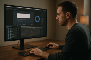
The best motion graphics assets for editors are the ones that drop into your timeline fast, match your project’s visual language, stay editable under deadline pressure, and come with licensing you can actually live with. In practice, that means a balanced toolkit: clean title and lower-third packs, flexible transitions, modular overlays (light leaks, film grain, UI elements), icon and infographic sets, and a handful of polished templates you can re-skin without fighting them. The “best” isn’t one magic pack-it’s a curated system that makes your edits look intentional, not decorated.
Editors today are expected to be part storyteller, part designer, part finishing artist. Motion graphics assets bridge that gap: they let you add clarity, energy, and structure without turning every project into a full-blown After Effects build. Used well, they’re invisible support beams-quietly holding the viewer’s attention and guiding their eyes exactly where you want them to go.
Browse motion graphics assets for editors
📋 Table of Contents
What Are Motion Graphics Assets for Editors?
Motion graphics assets are prebuilt visual components-animated or static-that editors can import, customize, and reuse to elevate video content. Think of them as the “design vocabulary” you can speak fluently once you’ve collected the right words. Some assets are tiny (a single animated arrow), some are big (a complete opener with typography, transitions, and music placeholders), but they all share one promise: faster motion design without starting from a blank composition.
For editors, the value is less about fancy animation for its own sake and more about communication: labeling speakers, introducing chapters, emphasizing key points, visualizing data, and smoothing pacing with transitions that feel deliberate rather than accidental.
Definition and Types of Motion Graphics Assets
At their core, motion graphics assets are reusable building blocks created in tools like After Effects, Premiere Pro, DaVinci Resolve, Final Cut Pro, and Motion (plus 3D apps such as Blender or Cinema 4D). They’re typically distributed as project files, template files, plugins, or rendered clips with alpha channels.
Common categories include:
- Templates (openers, promos, YouTube intros, reels, slideshows)
- Titles and lower thirds (name straps, identifiers, callouts)
- Transitions (whip pans, zooms, film burns, graphic wipes)
- Effects and presets (glitch, chromatic aberration, VHS, speed ramps)
- Overlays (film grain, dust, bokeh, light leaks, HUD/UI)
- Icons and animated elements (arrows, checkmarks, emojis done tastefully, stickers)
- Infographics (charts, maps, counters, progress bars)
- Background loops (abstract gradients, particle fields, subtle texture motion)
Some assets are delivered as MOGRTs (Motion Graphics Templates) for Adobe workflows; others are Resolve Fusion titles, FCPX titles, or rendered ProRes 4444 overlays. The “type” matters less than how smoothly it integrates into your workflow and how easily it bends to your brand.
How Editors Use Motion Graphics Assets in Projects
Editors use motion graphics assets to solve practical problems: “How do I introduce this person without breaking the pace?” “How do I make this tutorial step obvious?” “How do I keep retention high through a talking-head segment?” Assets provide answers with motion, typography, and rhythm.
In a typical edit, assets show up at several moments:
- Structure: openers, chapter cards, segment bumpers, end screens
- Clarity: lower thirds, labels, callouts, on-screen instructions
- Energy: transitions, speed-line elements, punch-in graphics
- Polish: film grain, subtle texture, UI overlays, animated mattes
There’s also a quieter use: continuity. A consistent set of titles, icons, and transitions makes a series feel like a series. That’s not just aesthetics-it’s audience trust. When viewers recognize the visual “rules,” they stop spending attention on the packaging and spend it on the story.
Which Types of Motion Graphics Assets Are Most Useful for Editors?
If you’re building an asset library from scratch, prioritize what gives you the biggest impact per minute. The most useful assets are the ones you’ll use weekly-sometimes daily-without needing to re-learn them each time. They should be modular, fast to customize, and stylistically adaptable across clients.
Below are the categories that tend to earn their keep in real editing rooms (and on real deadlines).
Templates and Presets
Templates are the “big moves”: openers, promos, countdowns, highlight reels, and branded sequences. Presets are the “small moves”: animation curves, text behaviors, color treatments, and effect stacks you can apply in seconds. Together, they’re the difference between “We’ll fix it in post” and “We fixed it in post-by lunch.”
What makes a template editor-friendly?
- Modularity: swap scenes, remove sections, rearrange without breaking
- Smart controls: sliders for timing, color, scale, and easing
- Clean typography: readable defaults, sensible line spacing, safe margins
- Media placeholders: clear drop zones and predictable aspect handling
Presets shine when you’re standardizing a look. For example, a set of text animation presets (fade up, slide in, pop with overshoot) can become your signature style-especially for short-form content where consistency and speed are everything.
One practical approach: keep two template tiers. Tier one is “brand-safe” (minimal, corporate, always usable). Tier two is “flavor” (bold, trendy, experimental). You’ll be surprised how often you need both in the same week.
Transitions and Effects
Transitions are seasoning. The problem is that most people cook like they’re trying to win a salt-eating contest. The best transition assets for editors are the ones that support pacing without screaming, “Hello, I am a transition.”
Useful transition packs usually include:
- Cut enhancers: subtle push/slide, micro zoom, motion blur
- Motivated wipes: shapes, matte wipes, graphic wipes that match on-screen elements
- Camera-style moves: whip pans, swish, handheld shake transitions
- Stylized effects: glitch, RGB split, film burn-used sparingly, like hot sauce
Effects assets matter just as much. A well-built film grain overlay can unify mixed footage. A light leak can soften a harsh cut. A HUD/UI overlay can make a tech video feel “designed” without designing everything.
Editors should look for effects that are parameterized: intensity controls, blend modes, color options, and speed. If an effect is locked to one vibe and one tempo, it’s not an asset-it’s a one-time costume.
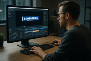
Lower Thirds and Titles
Lower thirds are arguably the highest ROI asset category in editorial motion graphics. They show up everywhere: interviews, documentaries, corporate videos, podcasts, event recaps, and social clips. Titles, meanwhile, do the heavy lifting of navigation-introducing segments, framing themes, and giving viewers a mental table of contents.
The best lower-third packs tend to share a few traits:
- Legibility first: strong contrast, clean fonts, sensible sizes
- Safe-area aware: works across platforms and crops (16:9, 9:16, 1:1)
- Editable alignment: left/right/center versions, adjustable padding
- Multiple styles: minimal, boxed, line-based, accent-bar, callout pointer
Titles should also include hierarchy: H1-style big section cards, smaller subheads, and micro labels. When your title system has hierarchy, you can build rhythm into your edit-like chapters in a book-without resorting to constant transitions.
A pro move is to choose title assets that support variable-length text. Real-world names, job titles, and languages don’t always fit the demo. If your lower third breaks when someone’s title is “Senior Vice President, Strategic Partnerships & Global Operations,” you’ll learn a new kind of pain.
Elements and Overlays
Elements are the small animated bits that make edits feel alive: arrows, circles, scribbles, highlight strokes, pop-up labels, emoji-style reactions (when appropriate), and pointer lines. Overlays are textures and layers: dust, grain, scratches, bokeh, paper textures, gradients, lens flares, and interface glass.
Why are these so useful? Because editors often need to direct attention. A simple animated underline can turn a spoken point into a remembered point. A callout arrow can clarify what the viewer should look at in a screen recording. A subtle texture overlay can prevent a flat digital image from feeling sterile.
When choosing overlays, pay attention to:
- Alpha channel quality: clean edges, no ugly banding
- Looping: seamless loops save you from awkward resets
- Blend flexibility: assets that work in Screen/Overlay/Soft Light modes
- Resolution headroom: 4K+ overlays scale better across projects
Elements should be stylistically coherent. If you mix hand-drawn scribbles with ultra-corporate geometric UI, it can work-but only if the story supports that contrast. Otherwise it looks like your timeline is wearing mismatched socks.
Animated Backgrounds and Icons
Animated backgrounds are your secret weapon for quick polish: they fill negative space behind titles, create transitions between topics, and make “boring” information screens feel designed. Icons, especially animated ones, are the language of modern explainer content-fast, universal, and friendly.
The best animated backgrounds are subtle. They should move enough to feel alive, but not so much that they compete with text. Look for:
- Low-frequency motion: slow gradients, gentle parallax, soft particles
- Color control: easy palette matching for brand consistency
- Clean texture: no compression artifacts, no distracting patterns
For icons, prioritize sets with consistent stroke width, corner radius, and timing. A mixed icon style reads as amateur even if each icon is “nice.” Also, consider platform needs: vertical video often needs chunkier icon design and bigger motion to read on phones.
One more thing: icons are not just decoration. In tutorials and product videos, they can become navigation. A recurring icon for “Tip,” “Warning,” or “Step” trains viewers to understand your structure at a glance.
What Are the Benefits of Using the Best Motion Graphics Assets?
Motion graphics assets are not a shortcut around craft-they’re a shortcut around repetition. When you stop reinventing the same lower third for the 300th time, you get your creative energy back for the parts that actually deserve it: story, pacing, performance, and meaning.
The best assets deliver benefits that are both visible (polish) and invisible (workflow sanity). And yes, those invisible benefits are often the ones that keep you employed.
Improving Video Quality and Engagement
High-quality motion graphics assets improve perceived production value immediately. Viewers may not know what a “MOGRT” is, but they can feel when a video is coherent: consistent typography, smooth motion, and clean composition signal competence. Competence signals trust. Trust buys attention.
Engagement improves when motion graphics help the viewer follow the narrative. Consider common scenarios:
- Talking-head content: kinetic text and callouts can reinforce key phrases
- Documentary/interviews: lower thirds and location cards reduce confusion
- Explainers: icons and infographics turn abstract ideas into visuals
- Social content: captions and animated emphasis improve retention on mute
Good assets also help with pacing. A clean title card can create a breath between segments; a subtle transition can smooth a time jump; a background loop can keep a section from feeling like a dead end.
There’s a psychological angle too: motion attracts the eye. Used responsibly, it guides attention to what matters. Used irresponsibly, it becomes a toddler waving a toy in front of the camera. The best assets are designed to guide, not hijack.
Saving Time and Increasing Workflow Efficiency
Time savings isn’t just “faster.” It’s fewer decisions, fewer technical surprises, and fewer late-night troubleshooting spirals. A dependable asset library turns motion design from a risky variable into a predictable step in your pipeline.
Efficiency gains typically come from:
- Repeatable systems: consistent title packages across episodes or clients
- Fewer round trips: assets that clients can approve quickly because they look familiar and professional
- Less keyframing: presets and rigged controls replace manual animation
- Faster revisions: editable text and color controls prevent rebuilds
In practical terms, a good set of lower thirds can save hours per project. A reliable transition pack can prevent you from “auditioning” 30 options. And a consistent overlay kit can unify footage without you chasing a new grade every time the lighting changes.
There’s also a team benefit: when you standardize assets, assistants and collaborators can jump into the project without decoding your personal system of mystery comps and unnamed layers.
Enhancing Creativity and Professionalism
It sounds paradoxical, but constraints often boost creativity. When you have a small, high-quality set of motion assets, you stop browsing endlessly and start designing with intent. The assets become a framework-like a good set of brushes for a painter.
Professionalism shows up in the details: easing that feels natural, typography that breathes, spacing that respects the frame, and motion that matches the tone. The best assets are built by people who understand those details and bake them in-so you don’t have to fix everything from scratch.
Creatively, assets can also act as prompts. A set of animated icons might inspire a more visual approach to a section that would otherwise be a wall of talking. A stylish opener might suggest a stronger narrative arc. In other words: assets don’t replace ideas, but they can invite better ones.
What Should Editors Consider When Choosing Motion Graphics Assets?
Choosing assets is less like shopping for furniture and more like building a toolkit. A gorgeous asset that doesn’t fit your workflow is just a pretty file sitting on a drive. The right criteria will save you from buying “cool” and ending up with “useless.”
Editors should evaluate assets the way they evaluate footage: technically (will it work?), creatively (does it fit?), and legally (can I use it?). All three matter. Ignore one and you’ll eventually pay for it-usually at the worst time.
Compatibility With Editing Software
Compatibility is the first gate. Assets are often marketed broadly, but the fine print matters: version requirements, plugin dependencies, and whether the template is built for your exact app.
Key compatibility questions:
- Which host? Premiere Pro MOGRT, After Effects project, Resolve Fusion title, FCPX title, etc.
- Which versions? Some templates require newer versions for essential features.
- Any plugins? Third-party plugins can break portability and collaboration.
- Fonts included? If not, are alternatives acceptable and licensed?
If you work across multiple NLEs, consider building a mixed library: editable templates for your primary platform and high-quality rendered overlays (ProRes 4444 with alpha) for universal use. Rendered assets are less flexible, but they’re dependable across systems.
Also consider collaboration: if your assistant editor can’t open the template, you’ve created a bottleneck. The best assets fit not just your software, but your team’s reality.
Customizability and Flexibility
Customizability is what separates “stock-looking” from “branded.” The more you can adjust color, typography, timing, and layout, the easier it is to make an asset feel like it belongs.
Look for templates with:
- Master controls: centralized sliders for color, duration, and scale
- Responsive design: auto-resizing boxes and backgrounds for variable text
- Timing control: extend holds, shorten reveals, adjust ease without breaking
- Layout variants: left/right, stacked, compact, and widescreen versions
Flexibility also means stylistic range. Some packs are locked into a very specific trend (which will date fast). Others are built on timeless principles-clean typography, subtle motion, balanced spacing-and can be pushed toward different moods with color and texture.
As a rule: if you can’t make the asset match at least three different project tones (corporate, documentary, social), it’s probably too narrow to be a “best” pick for an editor’s core library.
Licensing Terms and Usage Rights
Licensing is the part everyone wishes was simpler-and the part that can cause real damage if you ignore it. Motion graphics assets can come with restrictions on client work, broadcast, paid ads, resale, and distribution volume. Some licenses are per-project, some are per-seat, and some are subscription-based with conditions about when you’re allowed to publish.
Before you commit, check:
- Commercial use: is client work allowed without extra fees?
- Distribution limits: any caps on views, impressions, or broadcast regions?
- Team usage: can multiple editors use the asset under one license?
- Client handoff: can you deliver the project file with the template inside?
- Subscription rules: are you covered if you cancel and the video stays live?
When in doubt, keep a simple licensing log: asset name, source, license type, purchase date, and which projects used it. It’s not glamorous, but it’s the kind of professionalism that keeps you calm when a client asks, “Are we covered for this paid campaign?”
File Formats and Resolution Quality
Quality isn’t only about “4K.” It’s about how the asset holds up under real-world conditions: scaling, compression, color grading, and platform delivery. A beautiful overlay can fall apart once you push contrast. A title can look crisp in the preview but shimmer after export due to thin lines and poor anti-aliasing.
Consider these technical factors:
- Resolution: 4K assets provide headroom for reframing and vertical crops.
- Bit depth: higher bit depth reduces banding in gradients and glows.
- Alpha support: ProRes 4444, PNG sequences, or well-built template layers.
- Frame rate: 24/25/30/60 support, or at least motion that retimes cleanly.
- Color space awareness: assets should behave predictably in Rec.709 and modern HDR workflows.
Also watch for “fake 4K” overlays-upscaled, noisy, and compressed. A quick test is to zoom to 200% and look for blocky artifacts or muddy detail. If it’s already breaking at 200%, it will definitely break on a big screen or after a heavy encode.
What Are the Best Sources to Find Quality Motion Graphics Assets?
There are many places to find motion graphics assets, but not all sources are equal. Some platforms excel at breadth (you can find almost anything). Others excel at curation (fewer items, higher average quality). The best source depends on your workflow, budget, and how often you need new material.
A healthy strategy is to mix sources: one reliable subscription for volume, one or two marketplaces for hero assets, and a small stash of free resources for experimentation-carefully vetted for licensing and quality.
Marketplace Platforms for Motion Graphics
Marketplaces are great when you need something specific: a sports opener, a sleek tech UI pack, a documentary title kit, or a particular transition style. They also let you buy once instead of subscribing forever.
What to look for in a marketplace listing:
- Preview honesty: does the demo show customization, or only the best-case render?
- Documentation: clear install steps and control explanations
- Update history: templates that get updates survive software changes better
- Support responsiveness: especially for complex templates
When browsing, pay attention to the “boring” assets too. Minimal lower thirds and clean titles don’t look exciting in thumbnails, but they’re often the ones you’ll use for years.
A practical buying tip: purchase one small pack from a creator before buying their larger bundles. If their layer organization is tidy and their controls make sense, you’ve found someone worth investing in.
Free vs. Paid Asset Libraries
Free assets can be excellent-especially for overlays, simple elements, or learning. But “free” often comes with trade-offs: limited customization, inconsistent quality, unclear licensing, or assets that are so widely used they instantly look generic.
Paid libraries usually win in:
- Consistency: cohesive design systems across packs
- Support: updates, bug fixes, and documentation
- Time savings: better controls, cleaner organization
- Legal clarity: clearer commercial licensing terms
That said, a smart editor uses both. Free assets are great for testing a style direction or filling a niche need. Paid assets are best for your core toolkit-the stuff that must work every time.
If you do use free assets, treat them like ingredients from an unfamiliar market: read the label twice, test before serving, and keep a note of where they came from.
Subscription Services Offering Unlimited Access
Subscriptions are built for editors who produce frequently: agencies, content studios, YouTube teams, and freelancers with recurring clients. The appeal is simple: lots of assets, predictable cost, and fast downloads.
To evaluate a subscription service, consider:
- Library depth: are there enough variations of the assets you actually use?
- Search quality: can you find what you need quickly, or is it a scavenger hunt?
- Licensing model: what happens to published videos if you cancel?
- Format coverage: templates for your NLE, plus overlays and icons for cross-platform work
Subscriptions can also encourage sloppy choices (“It’s unlimited, so why not?”). The best way to avoid that is to curate a personal shortlist: download only what fits your style system, then reuse it with intention. Unlimited access is only valuable if it reduces decision fatigue, not increases it.
One workflow trick: build a “subscription intake” folder where new assets live for a week. If you haven’t used an asset after a week of real work, it probably doesn’t belong in your core library.
Vendor Reputation and Customer Reviews
Reviews matter, but not all reviews are equally useful. Look for comments that mention:
- Ease of customization (not just “looks cool”)
- Performance (does it lag or render slowly?)
- Accuracy of preview (does the product match the demo?)
- Support (did the creator respond when something broke?)
Also, trust your editorial instincts. If a template’s demo is all fast cuts and heavy music, it might be hiding awkward animation or limited controls. Good templates can stand still for a moment and still look good.
Finally, check whether the vendor has a consistent design voice. Creators who understand typography, spacing, and easing tend to produce packs that feel usable across many projects-not just one flashy genre.
How to Integrate Motion Graphics Assets Efficiently in Editing Projects?
Owning great assets is one thing. Integrating them efficiently is where editors actually win. The goal is to make motion graphics feel like part of your editorial language, not a bolt-on accessory you wrestle with at 2 a.m.
Efficient integration comes down to three things: organization, consistency, and performance. If you nail those, you’ll move faster and your work will look more cohesive-without extra effort.
Best Practices for Asset Organization
Asset organization is not a personality trait; it’s a survival strategy. A clean library reduces search time, prevents duplicate purchases, and makes collaboration smoother.
A practical folder system might look like this:
- 01_Titles
- LowerThirds_Minimal
- Titles_ChapterCards
- Callouts_Labels
- 02_Transitions
- Subtle
- Camera
- Stylized
- 03_Overlays
- Grain_Dust
- LightLeaks
- UI_HUD
- 04_Elements
- Arrows_Scribbles
- Icons_Animated
- Infographics
- 05_Templates
- Openers
- EndScreens
- Promos
- 99_Licenses (PDFs, receipts, terms)
Add metadata if your OS supports it, or keep a simple spreadsheet with tags like minimal, doc, sports, tech, vertical. The point is not perfection-it’s speed under pressure.
Also consider building a preview catalog: short exported samples (or screen recordings) of your favorite assets. Humans remember visuals better than filenames like “ModernTitlesPack_v7_FINAL2.”
Tips for Seamless Asset Integration
Seamless integration is about making assets feel native to your footage, audio, and narrative. A template can be beautifully designed and still feel wrong if it doesn’t match the tone or timing of the edit.
Techniques that help:
- Match typography: align fonts with brand guidelines; if you must substitute, match x-height and weight.
- Match motion language: if your edit is calm, avoid aggressive bounces and overshoots.
- Use consistent spacing: keep margins, safe areas, and baseline alignment uniform.
- Motivate transitions: tie wipes to camera movement or on-screen shapes.
- Color grade awareness: overlays should be applied after (or within) the grade thoughtfully, not randomly.
Audio matters too. Even a subtle whoosh can make a transition feel intentional-if it’s mixed properly. Keep a small SFX set that matches your motion assets: soft swipes for minimal titles, punchier hits for bold graphics. The best motion graphics often “sound” right, even when viewers don’t consciously notice it.
Finally, build brand variants. If you have recurring clients, create a dedicated version of your favorite title pack with their colors and fonts preloaded. You’ll save time on every project and reduce the chance of mistakes.
Get a clean UI overlay pack for client projects
Optimizing Performance and Rendering
Some motion graphics assets are lightweight. Others are performance vampires-heavy blurs, multiple 3D layers, particle systems, and high-res precomps stacked like a Jenga tower. Optimizing performance keeps you editing, not waiting.
Ways to keep things fast:
- Pre-render heavy comps: export to ProRes/DNxHR and re-import for smooth playback.
- Use proxies: especially for 4K/6K projects with multiple overlays.
- Disable motion blur strategically: enable for final export, not necessarily during rough cuts.
- Limit effect stacking: one good overlay often beats three mediocre ones.
- Check render settings: ensure alpha exports are correct and consistent.
If you’re working in Adobe workflows, be mindful of Dynamic Link overhead. Sometimes the fastest “professional” move is to render the graphic once you’re happy and treat it like footage. You lose some editability, but you gain stability-particularly in collaborative projects where reliability beats theoretical flexibility.
Also, test assets early. Don’t wait until the last hour to discover that your chosen title template stutters at 60 fps or breaks in vertical format.
What Are Common Mistakes to Avoid When Using Motion Graphics Assets?
Motion graphics assets can elevate your work-or quietly sabotage it. Most mistakes aren’t about taste; they’re about intention. When assets are used as decoration rather than communication, the edit starts to feel like a showroom instead of a story.
Avoiding common pitfalls will keep your work looking original, professional, and legally safe.
Overusing Stock Assets and Losing Originality
The biggest danger of stock motion graphics is the “template smell.” Viewers may not name it, but they sense when a video is built from recognizable parts. Overuse also creates visual fatigue-too many transitions, too many animated elements, too much motion competing for attention.
How to keep originality:
- Choose a limited palette: pick a small set of assets that match and reuse them consistently.
- Customize deeply: change timing, typography, spacing, and color-not just the text.
- Design around the story: use motion only where it adds clarity or emotion.
- Create one bespoke element: even a custom logo sting or unique title style can make the whole package feel original.
A useful rule: if an asset draws attention to itself more than to the message, it’s probably too loud. Let motion graphics be the stage crew, not the actor (unless the concept is literally about the graphics).
Also beware of trend-chasing. Some trends are fun; some are expiration dates. If you’re cutting evergreen content, choose assets with timeless typography and restrained motion, then add trend flavor in small doses.
Ignoring Asset Compatibility
Compatibility issues waste time in the most frustrating way: you’ve already committed to the look, and now the tool refuses to cooperate. Common compatibility problems include missing fonts, deprecated effects, plugin dependencies, and templates built for different frame rates or aspect ratios.
To avoid this:
- Test in a sandbox project before using assets in a client timeline.
- Confirm your version of the software matches the asset requirements.
- Check aspect ratio behavior for 9:16, 1:1, and 16:9 deliverables.
- Inspect font usage and ensure you can legally obtain substitutes if needed.
If you deliver both horizontal and vertical versions, prioritize assets that are built with responsive layout or come with multiple aspect presets. Otherwise, you’ll spend your time nudging boxes and re-centering anchor points-work that feels like progress but is mostly just friction.
Finally, consider long-term compatibility. Templates tied to niche plugins may break after updates. The most future-proof assets rely on core features and clean design rather than fragile technical tricks.
Overlooking Licensing Restrictions
Licensing mistakes can be expensive and embarrassing. They can also damage client relationships-especially if a video is pulled from a platform due to a rights claim or a brand compliance issue.
Common licensing oversights include:
- Using personal licenses for client work
- Assuming “royalty-free” means “no rules”
- Sharing assets across a team without the right seats
- Handing off editable project files when the license forbids redistribution
Build a habit: when you download or purchase an asset, save the license text (PDF or screenshot) alongside it. Future-you will thank you when you’re revisiting a project months later and can’t remember whether the asset was cleared for paid advertising.
If you’re working with agencies or broadcast clients, ask early about their licensing expectations. Some clients require documentation for every third-party asset. It’s much easier to provide that if you’ve organized it from the start.
What Are Emerging Trends in Motion Graphics Assets for Editors?
Motion graphics assets are evolving quickly, shaped by platform shifts (vertical-first, short-form), faster production cycles, and new tools that lower the barrier to sophisticated design. The trend isn’t just “more flashy graphics.” It’s more adaptive graphics-assets that respond to data, formats, and workflows.
As of 2026-06-15, editors are increasingly expected to deliver multi-format packages: a long-form cut, a vertical cut, a square cut, plus teaser clips. Emerging asset trends reflect that reality: responsive templates, modular systems, and automation that reduces repetitive work.
Use of 3D and VR Motion Graphics
3D is no longer reserved for big studios. Asset packs increasingly include 3D elements-product mockups, floating UI panels, 3D typography, and environment-based transitions-that can be dropped into 2D edits. The appeal is depth: 3D motion can make simple content feel premium without requiring a full 3D pipeline.
For editors, the most practical 3D-related assets are:
- 3D-like UI overlays with parallax and depth cues
- Product showcase templates with replaceable screens and labels
- 3D icon sets designed for modern brand aesthetics
- Hybrid 2.5D scenes that fake depth with layered planes
VR and immersive formats are more niche, but the design language is influencing mainstream assets: curved UI elements, spatial typography, and “in-world” labels that track objects. Even if you never deliver a VR video, you may borrow the aesthetic-especially for tech, gaming, and product storytelling.
The practical caution: 3D assets can be heavier to render and harder to customize. The best 3D-forward packs include performance-friendly options (pre-rendered elements, adjustable quality settings, and clear controls).
AI-Generated and Automated Assets
AI is reshaping motion graphics assets in two main ways: generation and automation. Generation includes AI-assisted backgrounds, textures, and style variations. Automation includes templates that adapt based on text length, detected beats, or content structure.
Where AI-driven assets help editors most:
- Auto-caption styling: consistent, brand-aligned animated captions with smart line breaks
- Smart reframing graphics: titles and callouts that reposition for different crops
- Variant generation: quick creation of multiple looks (colorways, texture versions)
- Data-driven infographics: charts that update from CSV/JSON inputs
The best AI-enabled assets are the ones that remain editable. If AI outputs a baked look you can’t control, it’s a novelty. If it gives you a starting point that still respects design fundamentals-typography, spacing, motion curves-it becomes genuinely useful.
Editors should also be mindful of licensing and provenance. AI-generated elements can carry unclear rights depending on the tool and dataset policies. Treat AI assets with the same seriousness you treat music licensing: if the usage rights aren’t clear, don’t gamble with a client’s project.
Interactive and Customizable Templates
Templates are becoming more like mini-apps: interactive control panels, responsive layouts, and modular components you can assemble like LEGO. Instead of buying one “YouTube opener,” you buy a system of parts: typography modules, shape libraries, transition styles, and icon sets that all share the same design DNA.
Trends in interactive templates include:
- Responsive design: auto-resizing boxes, dynamic padding, and safe-area presets
- Multi-format outputs: one template with 16:9, 9:16, and 1:1 variants
- Theme switching: one-click style changes (minimal, bold, dark mode)
- Component-based builds: add/remove modules without breaking animation
This trend is particularly helpful for editors working in series content. You can build a consistent motion identity across episodes while still keeping enough variation to avoid visual boredom.
It also nudges the industry toward better design hygiene: clearer naming, better layer organization, and templates built to survive real-world usage-not just demo reels.
Conclusion
Building a library of the best motion graphics assets for editors is ultimately about building a repeatable visual voice. Not a voice that shouts over your footage, but one that speaks clearly: guiding attention, adding structure, and making your work feel confidently finished. The more your assets behave like a coherent system-shared typography rules, consistent motion curves, predictable spacing-the less your projects depend on last-minute inspiration and the more they depend on craft.
If you want a next-level advantage, treat your asset library like a living product. Schedule a quarterly “asset audit”: remove what you never use, update what’s breaking, and add only what fits your current client mix. Create a tiny internal style guide for yourself (or your team): preferred fonts, title safe margins, standard lower-third timing, and a handful of go-to transitions. That kind of quiet discipline is what makes your edits feel expensive-even when the timeline is chaos and the deadline is doing that thing where it gets closer on purpose.
And when you do splurge on a hero template or a premium pack, consider investing not only in the asset but in its integration: build brand variants, pre-render performance-heavy versions, and document how to use it. The best motion graphics assets aren’t just downloaded-they’re adopted. Once they’re part of your workflow, they stop being “stock” and start being your style.