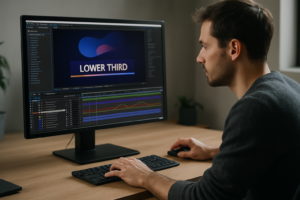

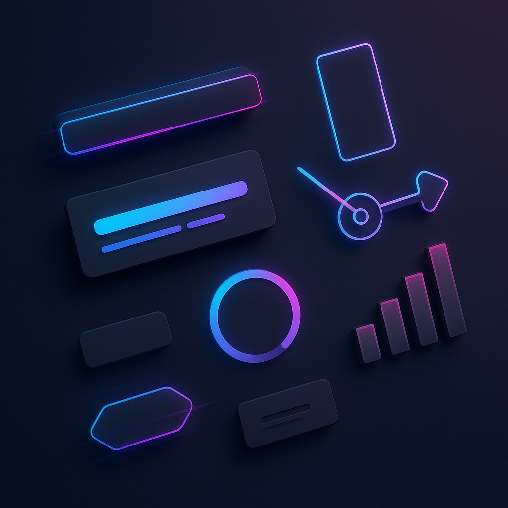
The best After Effects widgets for social media videos are the ones that let you communicate fast-clear titles, punchy lower thirds, thumb-stopping transitions, and on-brand UI elements-without turning your timeline into a fragile house of cards. In practice, that means choosing lightweight, highly customizable motion graphics (often packaged as MOGRTs or AE templates) that render quickly, match platform specs (9:16, 1:1, 16:9), and support repeatable branding across Reels, TikToks, Shorts, Stories, and ads.
But “best” isn’t a single list you copy-paste forever. Social platforms evolve, trends mutate weekly, and your content style might range from documentary-clean to maximalist meme chaos. So this article goes deeper: what counts as a widget, which types move the needle on engagement, how to choose them without wasting money, where to find reliable options, what mistakes quietly ruin performance, and a curated set of highly rated widget categories you can use as a shopping checklist.
📋 Table of Contents
What are After Effects Widgets for Social Media Videos?
Definition and Purpose of After Effects Widgets
In the After Effects world, “widget” isn’t an official Adobe term so much as a creator’s shorthand: a pre-built, reusable motion element you can drop into a project and customize quickly. Think of them as motion design “building blocks”-animated titles, subscribe buttons, lower-thirds, UI callouts, kinetic typography rigs, progress bars, sticker-style overlays, infographic counters, and transitions that behave predictably when you change text, colors, or timing.
Widgets typically arrive in one of a few practical forms:
- AE project templates (.aep) with precomps you duplicate and tweak.
- Motion Graphics Templates (.mogrt) designed to be edited in Premiere Pro (and sometimes in AE) with exposed controls.
- Script-driven rigs (sometimes with Essential Graphics controls) that generate animations via sliders, dropdowns, and color pickers.
- Element packs (folders of precomps) that behave like a modular toolkit.
The purpose is simple: speed and consistency. Social content is high-frequency by nature. You’re rarely making one perfect video; you’re making twenty good ones, on time, with a recognizable voice. Widgets help you keep that pace without sacrificing polish.
There’s also a creative reason widgets exist: they reduce the cognitive load of “reinventing the wheel.” If your channel needs the same three things every week-title card, speaker name tag, and a CTA-then building those once (or buying a solid pack) frees you to spend your energy on the story, the edit, and the hook.
Benefits of Using Widgets in Social Media Videos
The obvious benefit is efficiency, but the real payoff is what efficiency enables: iteration. When widgets handle the “plumbing,” you can test different hooks, different captions, different pacing-without rebuilding motion design from scratch each time.
Here are the most practical benefits you’ll feel immediately:
- Faster production cycles: drag, drop, customize, export. The difference between posting twice a week and five times a week is often “do I have reusable graphics?”
- More consistent branding: repeated color systems, typography, and motion style create familiarity-especially important when viewers see your content in a scroll, not a playlist.
- Clearer communication: social is noisy. Widgets like callouts, highlights, and on-screen labels help viewers follow the point even with sound off.
- Higher perceived quality: clean motion design signals effort and competence, which can influence whether someone trusts your advice, your product, or your story.
- Better accessibility: well-designed text widgets (with safe margins, contrast, and readable timing) support viewers who rely on captions or watch on small screens.
There’s also a subtle advantage: widgets make your workflow more collaborative. If you’re working with a team-editor, designer, social manager-widgets act like a shared visual language. Everyone knows what “the standard lower third” looks like, where it lives, and how to use it without breaking the project.
What Types of After Effects Widgets Improve Social Media Videos?
Animated Text and Titles
If social media had a national anthem, it would be a sentence that starts with “Wait-did you know…?” Animated text and titles are the most important widget category because they directly support the two things platforms reward: stopping power and clarity.
Great title widgets typically include:
- Hook headlines (big, bold, high-contrast) that appear in the first second.
- Kinetic typography that emphasizes key words in sync with narration.
- Caption-style text with speaker tracking or dynamic highlighting for “talking head” edits.
- Text presets with motion rules (overshoot, bounce, wipe, type-on) that feel intentional rather than random.
For social, the best animated text widgets are designed for small screens: thick weights, generous line spacing, minimal ornamentation, and animations that read even when the viewer’s thumb is hovering, ready to flee.
Also: titles are where your brand voice can live. A finance channel might use crisp, restrained motion; a comedy channel might use playful squish-and-stretch. The “best” widget is the one that matches your tone and stays legible at 1080×1920 on a phone held at arm’s length.
Lower Thirds and Callouts
Lower thirds and callouts do two jobs: they identify and they direct attention. In social videos, that often means naming the speaker, labeling a product, pointing to a feature, or highlighting a quote. When done well, they feel like helpful signage. When done badly, they feel like a neon sign screaming over the content.
Lower thirds that work for social tend to be:
- Compact: they don’t cover the mouth, the product, or the “center of meaning.”
- Safe-area aware: they avoid UI overlays (platform buttons, captions, and account name areas).
- Quick in and quick out: 12 seconds of a lower third is a lifetime in a Reel.
Callouts-arrows, circles, pop labels, and tracking boxes-are especially useful for tutorials, app walkthroughs, and product demos. The best callout widgets include tracking-friendly setups (or at least easy parenting), and they offer multiple styles so you can keep variety without losing consistency.
One underrated feature: responsive design. A strong lower-third widget should adapt when you change the name from “Amy” to “Dr. Amelia Rutherford, PhD” without exploding off-screen. Look for widgets that use expressions or responsive layout controls so the background box grows with the text.
Social Media Icons and Buttons
Social icons are the visual equivalent of a tap on the shoulder. They’re small, familiar, and instantly understood. But because they’re so familiar, they’re also easy to cheapen. The best icon and button widgets are clean, properly spaced, and animated with restraint.
Common icon widgets include:
- Like, comment, share UI animations (often stylized rather than literal copies of platform UI).
- Subscribe/follow buttons with subtle pop or swipe reveals.
- Notification bell animations (still popular, still effective in certain niches).
- Platform badges (YouTube, Instagram, TikTok, LinkedIn) for cross-promotion.
Two important notes for 2026-era social content:
- Avoid mimicking platform UI too precisely. Platforms change UI frequently, and overly literal replicas can look dated fast-or raise policy concerns in ad contexts.
- Design for “micro-duration.” Your follow CTA might have 0.8 seconds to land. The best widgets are readable at a glance and don’t require viewers to “watch the animation” to understand the message.
Ideally, icon widgets come with editable colors, stroke widths, and optional sound cue placeholders (even if you add sound later). A crisp “click” sound paired with a subtle icon pop can make the CTA feel satisfying instead of needy.
Transitions and Overlays
Transitions and overlays are the spice rack of social editing. Use them well and the dish sings; dump the whole rack in and nobody can taste the chicken. The best transition widgets help with pacing and scene logic-they signal a change of thought, location, or time without derailing the story.
High-performing transition widget types include:
- Whip pans and swipes tuned for vertical framing.
- Match-cut helpers (zoom, push, spin) that hide jump cuts in talking-head footage.
- Light leaks, film burns, and texture overlays used sparingly to add warmth or grit.
- Shape-based wipes that echo your brand geometry (rounded, sharp, playful).
Overlays-grain, paper texture, bokeh, scribbles, stickers-can make content feel handmade and tactile, which often performs well because it breaks the “corporate smoothness” pattern. But overlays should be adjustable: opacity, blend mode suggestions, and color controls matter. A good overlay widget lets you dial the vibe in, not commit to a fixed look.
Performance matters here more than anywhere. Some transition packs are heavy: 4K textures, multiple blur layers, and glow stacks that turn your render into an overnight event. For social, the best transition widgets are optimized to look great at 1080×1920 with minimal computational drama.
Infographic and Data Widgets
Infographic widgets are the secret weapon of educational social content: they convert abstract information into something the viewer can “get” in two seconds. Think animated bar charts, percentage counters, timeline sliders, map pins, comparison cards, and progress rings.
What makes infographic widgets social-friendly is not complexity-it’s readability. The best ones:
- Animate in a clear sequence (label first, then data, then highlight).
- Use large numerals and avoid tiny axis text.
- Offer color themes that remain legible for color-blind viewers (or at least maintain strong contrast).
- Include “highlight states” so you can call attention to one bar/point without rebuilding the graphic.
Infographic widgets also help with credibility. When you present numbers with clean motion design, viewers perceive the content as more researched-even if the numbers are simple. (You still need accurate sourcing, of course; motion design can’t launder bad data.)
For creators who post frequently, data widgets that accept CSV input or have easy slider controls are worth their weight in gold. The “best” packs often include both: quick sliders for small edits and data-driven options for bigger projects.
How Can After Effects Widgets Enhance Engagement on Social Media?
Increasing Viewer Attention and Retention
Engagement starts with attention, but it’s retention that compounds. After Effects widgets help retention when they act like a guide rope through your video: they show what matters, when it matters, and why the viewer should keep watching.
Here’s how widgets directly support attention and retention:
- Pattern interrupts: a quick text punch-in, a sticker pop, or a subtle transition can reset attention without feeling like filler.
- Information chunking: numbered steps, section headers, and on-screen labels make dense content easier to follow.
- Anticipation cues: progress bars, “Step 2/3,” or “Coming up” tags create a small psychological contract: stay, there’s a payoff.
- Reinforcement: highlighting key phrases on-screen increases comprehension-especially for viewers watching silently.
The trick is timing. Social audiences don’t mind motion; they mind wasted motion. A widget that takes 1.5 seconds to reveal a single word is asking for trouble. The best widgets for retention are snappy, readable, and aligned with your edit rhythm.
Also consider “loop logic,” especially for short-form. Many Reels and TikToks benefit from a loop-friendly ending that visually echoes the beginning. A simple title widget that reappears or a subtle end-card animation that matches the opening can make the loop feel intentional, nudging replays and boosting watch time.
Promoting Brand Identity and Consistency
Brand identity on social is less about logos and more about recognition speed. Viewers should be able to tell it’s you within a second or two-through typography, color, motion style, and the way you present information.
Widgets make brand consistency scalable because they’re reusable and rule-based. Instead of manually recreating your look, you rely on a toolkit that already “knows” your brand decisions: font choices, corner radius, stroke thickness, easing curves, shadow softness, and color palette.
When you build or buy widgets, you’re essentially choosing a motion dialect. Are your animations springy and playful? Smooth and premium? Sharp and editorial? The best widgets for brand building are consistent not only in appearance but in motion behavior. Even if the viewer can’t name it, they feel it.
One practical approach is to maintain a small set of “signature moves”-for example:
- A specific title entrance (slide + slight overshoot).
- A consistent highlight style (rounded rectangle with a soft drop shadow).
- A recurring transition motif (shape wipe in brand colors).
With that, you can vary content topics wildly while keeping the channel cohesive. Over time, cohesion becomes trust, and trust becomes clicks, follows, and conversions.
Encouraging Interaction with Calls to Action
Calls to action (CTAs) are delicate. Too timid and nobody acts; too aggressive and people scroll out of spite. Widgets help because they let you design CTAs that feel like part of the storytelling rather than a sudden sales pitch.
Effective CTA widgets for social typically do at least one of the following:
- Make the action obvious: “Follow for part 2” paired with a simple icon animation.
- Reduce friction: show what to do (“tap the link,” “save this,” “comment ‘guide’”).
- Time the CTA to the viewer’s emotional peak: right after the payoff, not before it.
- Use on-screen prompts as reminders: subtle “Save this” tags during a list-based tutorial.
Widgets also allow for contextual CTAs. Instead of one generic “subscribe,” you can rotate CTA styles: a “Save” sticker for educational posts, a “Comment your pick” poll-style graphic for opinion content, and a “DM me ‘template’” callout for lead-gen. The best widget packs include multiple CTA variations so you can match the action to the content type.
Finally, good CTA widgets respect the platform’s visual ecology. They sit away from native buttons and captions, and they don’t mimic UI so closely that viewers confuse your graphic with an actual tappable element. Clear, honest prompts outperform gimmicks in the long run.
Browse After Effects widget examples for social videos
How to Choose the Best After Effects Widgets for Your Social Media Videos
Compatibility and Ease of Use
Compatibility is where “great-looking” templates go to die. Before you fall in love with a widget pack, check what it expects from your system and workflow.
Key compatibility questions:
- After Effects version: Is it built for the current AE release? Does it require an older version?
- Plugins: Does it rely on third-party plugins (and are those plugins still supported)?
- Fonts: Are the fonts included, free to use, or will you need to license them separately?
- Format support: Does it include 9:16 layouts, or will you be resizing everything manually?
- MOGRT vs AEP: Do you need to edit in Premiere Pro, or are you comfortable living in After Effects?
Ease of use isn’t just about beginner friendliness; it’s about repeatability under deadline. The best widgets have exposed controls that make sense: color pickers, font controls, duration sliders, and toggles for optional elements. If you have to dig through 30 layers to change a hex code, it’s not a widget-it’s a puzzle box.
A quick test: open the widget and try to do three common edits-change text, change color, change timing-within two minutes. If you can’t, your future self will resent you.
Customization Options
Social media rewards novelty, but your brand needs consistency. Customization is how you balance both: you keep the same “system,” but you vary the expression.
Look for customization options such as:
- Color themes (global controllers that change the entire pack).
- Typography flexibility (font swaps without breaking layout).
- Layout variants (left/right, top/bottom, compact/expanded).
- Animation style toggles (smooth vs bouncy, fast vs slow).
- Background and stroke controls for readability across different footage.
Also consider whether the widget supports responsive behavior: auto-resizing boxes, adaptive padding, and safe-area presets for vertical video. Responsive widgets are the difference between “I can use this forever” and “I can use this only when the text is short and the footage is dark.”
If you’re building a content series (say, weekly tips), customization matters even more. You want enough variation to avoid visual fatigue, but not so much variation that each post looks like it came from a different channel.
Performance and Rendering Speed
On social, speed is a feature. Not just for you, but for the algorithmic reality that trends and news cycles have expiration dates. A widget pack that renders beautifully but takes forever is like a sports car that needs three days to start.
To evaluate performance, pay attention to:
- Heavy effects stacks: multiple blurs, glows, and shadows can slow previews and exports.
- 4K textures and footage placeholders: great for cinema, overkill for phone-first posts.
- 3D layers and lights: sometimes worth it, often unnecessary for quick social graphics.
- Expressions: powerful, but poorly written expressions can slow down playback.
A practical approach is to maintain two tiers of widgets:
- Everyday lightweight widgets for high-volume posting (titles, lower thirds, basic transitions).
- Hero widgets for occasional big posts (launch videos, ads, brand films) where heavier rendering is acceptable.
Also, consider your export pipeline. If you frequently deliver multiple aspect ratios, widgets that can be re-framed quickly (or that come in pre-built 9:16/1:1/16:9 comps) will save hours over a month.
Cost and Licensing Considerations
Cost is rarely just the price tag. It’s also the time you spend adapting, troubleshooting, and replacing. A cheap pack that breaks every time After Effects updates can be more expensive than a premium pack that simply works.
Licensing is equally important, especially if you’re doing client work or running ads. Before using a widget commercially, check:
- Commercial use rights: Are you allowed to use it in monetized content?
- Client work terms: Some licenses require a separate license per client or per end product.
- Attribution requirements: Rare for paid packs, more common for free assets.
- Stock elements inside the pack: Music, photos, or footage may have separate licenses.
If you’re building a long-term brand, consider investing in a small number of high-quality widget systems rather than collecting dozens of inconsistent packs. Consistency is a competitive advantage, and licensing clarity reduces risk when a video unexpectedly becomes your biggest hit.
Where to Find Reliable After Effects Widgets for Social Media Videos
Popular Marketplaces and Platforms
Reliable widgets usually come from places where creators have reputations to protect and where updates are common. Some platforms specialize in motion design assets, while others are broader marketplaces with a large selection.
Common places to find After Effects widgets for social media include:
- Motion graphics marketplaces that focus on AE templates and MOGRTs.
- Subscription libraries with curated packs and regular updates.
- Independent creators’ shops (often the best for distinctive, less “template-y” styles).
- Community forums and creator communities where professionals share vetted recommendations.
When evaluating a platform, look at update history and support responsiveness. Social video needs are practical: you want assets that install cleanly, come with documentation, and don’t require detective work.
If you’re a Premiere Pro-heavy editor, prioritize platforms with strong MOGRT offerings. If you’re an After Effects power user, modular AE element packs can offer deeper control and more flexible re-use.
Free vs Paid Widget Sources
Free widgets can be excellent, especially for learning or for filling gaps (a simple arrow pack, a basic title set, a handful of overlays). But free assets come with trade-offs: inconsistent quality, unclear licensing, or outdated build methods.
Here’s a practical way to decide:
- Use free widgets for generic elements you can easily replace (simple shapes, basic transitions, minimal icons).
- Pay for widgets that become part of your brand system (titles, lower thirds, CTA kits, infographic rigs) because you’ll use them constantly.
Paid packs also tend to offer better documentation and cleaner controllers. That matters when you’re posting frequently and can’t afford to troubleshoot a broken expression at 1 a.m.
One more note: “free” often means “you pay with time.” If you’re spending hours fixing a free template, you’ve effectively purchased it with your most limited currency.
User Reviews and Community Recommendations
Reviews are useful, but you need to read them like a producer, not like a tourist. Look for reviews that mention specifics: render speed, version compatibility, whether the controls are intuitive, and how the creator handles updates.
When scanning community recommendations, pay attention to patterns:
- Repeated praise for usability usually signals good controller design.
- Complaints about missing fonts or plugins are red flags for friction.
- Mentions of “works in vertical” are especially relevant for social-first workflows.
Creator communities can also help you find “quietly excellent” widget packs that aren’t overexposed. If you want your content to feel less templated, those recommendations can be gold-because the same handful of viral packs often show up everywhere, and audiences do notice repetition, even if they can’t articulate it.
Finally, don’t underestimate the value of documentation videos. A widget pack with a clear walkthrough saves you time and helps you use the asset as intended, which usually looks better than improvising your way through a complex rig.
Common Mistakes to Avoid When Using After Effects Widgets
Overusing Effects Leading to Distracting Videos
The fastest way to make a social video feel amateur is to treat widgets like confetti: throw them everywhere and hope excitement happens. The result is often visual noise that competes with your message.
Overuse usually shows up as:
- Too many transitions (every cut is a wipe, a zoom, and a glow).
- Too many text animations (every sentence bounces in like it’s auditioning for a children’s show).
- Overlays stacked on overlays (grain + light leak + dust + chromatic aberration).
A better approach is to assign widgets roles. For example:
- Titles for structure (start and section changes).
- Callouts for clarity (when pointing at something specific).
- Transitions for logic (when moving locations or ideas).
If a widget doesn’t serve a role, it’s probably decoration. Decoration isn’t illegal, but in social video it’s expensive: it costs attention.
One simple rule: if the viewer remembers the animation more than the idea, the animation is too loud.
Choosing Incompatible or Low-Quality Widgets
Low-quality widgets tend to look fine in the preview image and fall apart in real use. Common issues include broken expressions, poorly organized comps, missing assets, and controls that don’t map cleanly to the result.
Incompatibility can be subtle too. A widget might technically work, but it’s built for 16:9 broadcast design and doesn’t translate to vertical. Or it uses thin fonts and delicate lines that vanish on a phone screen.
To avoid this, vet widgets with a short checklist:
- Open the project and inspect organization: are comps labeled? are controllers obvious?
- Test in your target aspect ratio: especially 9:16.
- Swap in your brand font: does the layout still hold?
- Render a 10-second sample: check for flicker, aliasing, and unexpected artifacts.
Also watch for widgets that rely on outdated techniques. After Effects evolves; what was clever in 2018 can be fragile now. Reliability is part of quality.
Neglecting Video Optimization for Different Platforms
A widget can be beautifully designed and still fail if it ignores platform realities. Social platforms have different UI overlays, safe zones, caption behaviors, and audience expectations.
Optimization mistakes include:
- Text in the danger zone: placing key titles where platform buttons cover them.
- Unreadable sizing: using thin, small type that looks elegant on a monitor and microscopic on a phone.
- Color/contrast issues: bright text over bright footage without a backing plate or shadow.
- Export mismatches: using the wrong frame rate or compression settings, causing banding or muddy text.
Build platform-aware versions of your widgets: a 9:16 preset with safe margins, a 1:1 preset for feed posts, and a 16:9 preset for YouTube. The best widget systems either include these versions or can be adapted once and saved as your own library.
And remember: many viewers watch without sound. Widgets that reinforce the message visually-titles, captions, key-word highlights-are not just decorative; they’re functional accessibility tools.
Examples of Highly Rated After Effects Widgets for Social Media Videos
Rather than naming a random grab-bag of products that may change availability over time, the most reliable way to choose “highly rated” widgets is to recognize the categories and feature sets that consistently earn praise from editors and creators. Below are examples of widget types that tend to be top-rated-plus what to look for so you can pick the best version of each in whatever marketplace you prefer.
1) Essential Vertical Titles Pack (Hook + Caption + Emphasis)
This is the workhorse set: bold hook titles for the first second, subtitle/caption styles for clarity, and emphasis animations (underline sweeps, highlight bars, word pops) to punctuate narration.
- Look for: safe-area presets for 9:16, thick font weights, background plates, and global color controllers.
- Why it’s highly rated: it improves comprehension instantly and speeds up edits dramatically.
2) Responsive Lower Thirds System (Auto-Resize + Variants)
A premium lower-thirds system includes multiple layouts-left, right, centered, stacked-plus responsive boxes that expand with text length. The best packs also include “tag” styles for quick labels (e.g., “TIP,” “MYTH,” “STEP 1”).
- Look for: responsive design, font swapping without breaks, and quick in/out animation controls.
- Why it’s highly rated: it keeps videos readable and professional without constant manual tweaking.
3) Callout & Tracking Toolkit (Arrows, Circles, Labels)
For tutorials and product demos, callouts are pure value. Highly rated toolkits include arrows with bend controls, animated circles, scribble highlights, and label boxes that can be parented to tracked points.
- Look for: easy parenting, optional motion blur, adjustable stroke widths, and multiple styles (clean vs playful).
- Why it’s highly rated: it makes complex visuals instantly understandable, especially on small screens.
4) CTA Micro-Animations Pack (Follow, Save, Comment)
These are short, tasteful prompts designed to appear without hijacking attention. The best packs include “Save this,” “Follow for more,” “Part 2?,” “Link in bio,” and comment prompts-plus icon variants.
- Look for: fast animation timings (sub-1s), editable text, and styles that don’t mimic platform UI too literally.
- Why it’s highly rated: it boosts interaction without feeling spammy.
5) Clean Transitions for Vertical Editing (Cut Hiders)
Highly rated transition packs for social focus on hiding jump cuts and smoothing pacing: quick zooms, swipes, push transitions, and subtle blur-based cut helpers.
- Look for: lightweight builds, adjustable direction/speed, and versions tuned for 9:16.
- Why it’s highly rated: it improves flow while staying invisible-exactly what a transition should do.
6) Overlay & Texture Widgets (Grain, Paper, Stickers)
These packs add character: film grain for cohesion, paper texture for warmth, doodles and stickers for personality. The best overlays are subtle by default and adjustable when you want more flavor.
- Look for: opacity controls, blend mode recommendations, and color-tint options.
- Why it’s highly rated: it helps content stand out in a feed full of sterile, over-sharpened video.
7) Infographic Widgets (Counters, Bars, Timelines)
Educational creators love these because they turn “trust me” into “look.” A highly rated infographic pack includes number counters, progress rings, comparison cards, and timeline elements that animate clearly and quickly.
- Look for: large numerals, highlight states, theme presets, and simple data input controls.
- Why it’s highly rated: it increases perceived authority and makes information memorable.
8) Brand Kit Widget System (Global Controls)
This is the “grown-up” choice: a unified system where you set brand colors, fonts, and motion style once, and every widget updates accordingly. It’s less flashy than trend packs and more valuable over time.
- Look for: global controllers, consistent easing, and modular components (titles, thirds, transitions, CTAs).
- Why it’s highly rated: it scales across months of content and keeps everything cohesive.
9) Story/Reel End Screens (Loop-Friendly)
End screens for social aren’t like YouTube end cards; they’re often 0.5-1.5 seconds long and designed to either loop cleanly or land a final CTA. Highly rated ones are minimal and readable.
- Look for: versions that work with looping, safe-zone awareness, and optional handles/URLs.
- Why it’s highly rated: it adds polish and can improve replays and follows.
10) Meme/Sticker Reaction Pack (Tasteful, Editable)
Yes, even serious brands occasionally benefit from a wink. Sticker reaction packs-when editable-let you join trends without feeling like you borrowed someone else’s personality.
- Look for: editable text, scalable vector shapes, and animation controls to tone it down.
- Why it’s highly rated: it adds humor and relatability-powerful engagement levers-without heavy production.
To make these examples actionable, here’s a quick comparison table of what “highly rated” usually means in practice:
| Widget Type | Most Important Feature | Common Dealbreaker |
|---|---|---|
| Titles & Captions | Legibility on phone + fast timing | Thin fonts, slow reveals |
| Lower Thirds | Responsive layout | Manual resizing required |
| Callouts | Easy parenting/tracking workflow | Hard-to-edit layer stacks |
| CTAs | Subtle, quick, clear prompt | UI mimicry or overly loud animation |
| Transitions | Lightweight performance | Render-heavy effects |
| Infographics | Clear sequencing + big numbers | Tiny labels/axes |
If you want to build a “best widgets” toolkit without overbuying, start with three packs: (1) a vertical titles/captions system, (2) a responsive lower-thirds/callouts toolkit, and (3) a lightweight transitions set. Add CTAs and infographics next. Overlays and sticker packs are optional flavor-useful, but not foundational.
See a YouTube-style widget for Shorts and Reels
Conclusion
The most effective widget strategy isn’t collecting assets-it’s designing a repeatable motion language that you can deploy at the speed social demands. If you want your videos to feel effortless (the highest compliment in content), treat widgets like a wardrobe: a few well-fitted staples you can mix and match, plus one or two statement pieces for special occasions.
As you refine your toolkit, consider creating a small internal “widget style guide” for yourself or your team: preferred font sizes for 9:16, safe margins, a limited color palette, and a standard set of easing curves. This is the unglamorous part, but it’s what turns motion design into muscle memory. And once motion becomes muscle memory, you’re free to focus on what audiences actually reward-ideas, clarity, and the kind of pacing that makes someone forget they were supposed to keep scrolling.
Finally, keep an eye on the calendar. Social design trends age quickly, but your brand shouldn’t chase every micro-trend. The sweet spot is a stable core (titles, thirds, callouts) with a small “trend layer” you can swap seasonally-new sticker styles, fresh transitions, updated CTA phrasing. That way, your content stays current without losing its identity, which is still the rarest-and most valuable-effect you can pull off.