

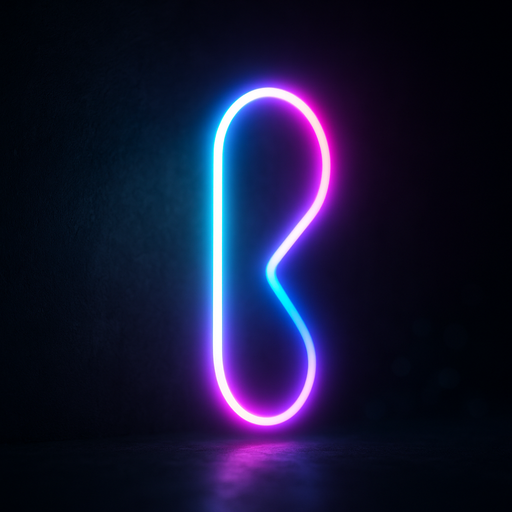
To create a neon glow effect in After Effects, you build a bright “core” (usually text or a shape), then stack one or more Glow passes (often paired with Blur) and tune their thresholds, radii, and colors until the light feels like it’s emitting-not merely outlined. The most convincing neon comes from layering: a crisp inner edge, a hot bloom close to the tube, and a softer halo that spills into the background, plus subtle animation (flicker, hum, or exposure breathing) so it feels alive.
This guide walks you through a clean, repeatable workflow you can use for titles, logos, UI accents, and full-on cyberpunk signage. It’s written for modern After Effects workflows as of 2026-08-12, but the core principles hold across versions: control contrast, shape the light, and keep your glow physically believable.
📋 Table of Contents
What is a Neon Glow Effect in After Effects?
A neon glow effect is a stylized lighting treatment that mimics real neon tubing: a bright, saturated core with a soft, colored bloom that spills onto nearby surfaces. In After Effects, “neon” is less about a single effect and more about how you combine effects-Glow, Blur, blending modes, and color correction-to create the illusion of light emission.
Real neon signs have a few telltale traits: the tube is brighter at the center, edges stay fairly defined, the surrounding glow fades smoothly, and the environment reacts (even subtly) to that light. When your comp captures those cues, viewers don’t think “plugin”-they think “light.”
How Neon Glow Enhances Visual Appeal
Neon glow enhances visual appeal because it leverages the brain’s obsession with contrast and luminance. Bright objects against darker backgrounds read as important, energetic, and modern. Even a simple word can feel like a storefront sign at midnight once it emits light.
There’s also a psychological layer: neon implies nightlife, technology, arcades, sci‑fi, and the kind of optimism that comes with bold color. Used thoughtfully, it can make motion graphics feel more premium-because light looks expensive. Used carelessly, it can look like a highlighter accident. The difference is in restraint, layering, and color discipline.
Common Uses of Neon Glow in Motion Graphics
Neon glow shows up everywhere because it’s versatile: it can be playful, sleek, gritty, or luxurious depending on palette and texture. You’ll commonly see it in:
- Title sequences (opening cards, lower thirds, episodic branding)
- Music visuals (lyric videos, concert backdrops, DJ promos)
- Tech and app promos (UI highlights, callouts, futuristic accents)
- Gaming content (stream overlays, intro stingers, HUD-style elements)
- Logo reveals (neon tube “power on” animations, sign flickers)
- Illustrated scenes (cityscapes, signage, cyberpunk environments)
One underrated use: micro-neon-small glows on buttons, icons, or edges that guide attention without screaming. That’s often more effective than turning the entire frame into a glow festival.
What Are the Basic Tools Needed to Create a Neon Glow in After Effects?
You don’t need a mountain of plugins to make convincing neon. After Effects includes the essentials; the real “tool” is your ability to separate the neon into components: core, bloom, halo, and environmental spill.
That said, plugins can speed up the process, improve realism, or add specialized looks (like true volumetric glow). Think of native effects as your reliable kitchen knife-plugins are the fancy appliances you add when you cook this dish often.
Essential After Effects Effects for Neon Glow
Here are the core built-in effects and features that cover most neon workflows:
- Glow
- The main event. Use it in multiple passes to create layered bloom. Key controls: Threshold, Radius, Intensity, and Colors.
- Fast Box Blur / Gaussian Blur
- Softens edges and helps build a broader halo. Often paired with blending modes or used on duplicated layers.
- Levels / Curves
- Shapes luminance so the glow triggers where you want it. Curves are especially powerful for “hot core, soft rolloff.”
- Tint / Tritone / Hue/Saturation
- Lets you push the glow color without destroying the core readability.
- Fill / Stroke
- For shape layers: Fill gives you the tube color; Stroke can simulate tubing thickness or outlines.
- Add / Screen blending modes
- These make light behave like light-adding brightness rather than muddying it.
- Noise / Grain
- Subtle texture prevents banding and keeps the glow from looking too “digital.”
- Wiggle / Expressions
- For flicker, intensity breathing, and that imperfect electrical life.
If you can comfortably duplicate layers, pre-compose, and use blending modes, you’re already holding the keys to neon city.
Recommended Plugins and Presets
Plugins are optional, but they can add speed and polish. A few categories that help:
- Advanced glow suites: Tools that offer better falloff, color handling, and highlight control than the native Glow.
- Optical effects: Lens blooms, chromatic aberration, and subtle diffusion can make neon feel photographed rather than rendered.
- Stylized neon generators: Presets that build tube looks, animated flicker, and sign textures quickly-useful for rapid iteration.
When choosing plugins, prioritize ones that let you control falloff and color separation. Cheap-looking neon often comes from a glow that spreads evenly like fog. Real neon blooms strongest near the tube and fades with purpose.
Presets can be a great starting point, but treat them like a sketch. If you don’t adjust them to your background, your palette, and your scale, they’ll look like… a preset.
How to Prepare Your Composition for Neon Glow Effects
Preparation is where most neon tutorials quietly fail: they jump straight into Glow, then wonder why everything looks washed out. The truth is neon is a relationship between subject and environment. If the environment doesn’t support it, the glow has nothing to “play against.”
Before you add any effects, decide: Is this neon floating in darkness? Mounted on a wall? Reflected in wet pavement? The answer changes your background, contrast, and spill strategy.
Choosing the Right Background and Layers
Neon loves dark, but it doesn’t have to be pure black. In fact, pure black can feel artificial unless you’re going for a graphic look. Consider backgrounds like:
- Deep charcoal gradients (adds depth and avoids flatness)
- Subtle textured walls (concrete, plaster, brick-great for signage)
- Night city bokeh (stylized, cinematic, and forgiving)
- Fog or haze layers (lets light “catch” in the air)
Build your comp in layers. A simple but effective stack looks like this:
- Background (texture/gradient)
- Environmental elements (haze, dust, subtle vignette)
- Neon core (text/shape)
- Glow passes (duplicated layers or effects)
- Spill/interaction (light wrap, reflections, wall bounce)
- Finishing (grain, color grade)
This separation matters because you’ll want to tweak glow intensity without nuking your background contrast.
Setting Up Text or Shapes for Neon Glow
Neon works best when the “tube” has consistent thickness and clean curves. You can create neon from either:
- Text layers: Great for quick titles. Choose a font with rounded terminals or script-like continuity if you want a tube feel.
- Shape layers: Best for true neon tubing. You can draw paths, control stroke width, and animate trim paths for “power on.”
For text, consider converting to shapes (Create > Create Shapes from Text) when you need stroke control, per-letter animation, or a more tube-like appearance. For shape layers, a common approach is:
- Use a Stroke with Round Cap and Round Join.
- Set stroke width to match your desired tube thickness (start around 6-20 px depending on comp size).
- Duplicate the stroke: one for the bright core, one slightly thicker and softer for bloom support.
Also decide early whether your neon is solid (filled) or tubed (stroked). Tubed neon is typically more believable, while filled neon is more graphic and poster-like.
How to Create a Neon Glow Effect Step-by-Step
The workflow below is a practical, “works in most situations” method. It’s not the only way, but it’s reliable: you’ll build a core, then add layered glow with controlled falloff, then animate and integrate it into the scene.
For clarity, assume a 1920×1080 comp at 24 or 30 fps, with a dark background and a text or shape layer named NEON.
Applying Glow and Blur Effects
Step 1: Create a bright core. The core is what sells the “tube.” If your core isn’t bright enough, the glow will look like mist. If it’s too bright without control, it will clip harshly.
- If using a shape stroke: set the stroke color to a near-white tinted version of your neon color (e.g., pale cyan rather than pure cyan).
- If using text: consider adding a subtle inner highlight by duplicating the text, making the top copy lighter and slightly thinner (via tracking/scale or converting to shapes).
Step 2: Add your first Glow (tight bloom). Apply Effect > Stylize > Glow to the NEON layer.
- Glow Based On: Color Channels (often) or Luminance (if your core is already bright)
- Threshold: higher values keep the glow tight (start around 60-80%)
- Radius: small to medium (start 10-40)
- Intensity: modest (start 0.6-1.2)
This pass is the “hot bloom” right around the tube. Keep it disciplined.
Step 3: Add a second Glow (outer halo). Duplicate the Glow effect (or add another Glow) and set it to be broader and softer:
- Threshold: lower (start 10-40%) so more of the core contributes
- Radius: larger (start 60-200 depending on scale)
- Intensity: lower than you think (start 0.2-0.8)
Step 4: Use Blur strategically. If your outer halo looks too “ringy” or harsh, add a Fast Box Blur after the glow passes (or blur a duplicated layer-more on that soon). Blur should feel like diffusion, not like you forgot your glasses.
A helpful trick: if the glow spills too evenly, add Curves before the Glow to shape what triggers the glow. You’re not just glowing the layer-you’re glowing a carefully prepared luminance map.
Watch After Effects neon-style animations
Adjusting Colors and Intensity for Realistic Neon
Real neon has a bright, almost white-hot core with saturated color surrounding it. If your glow is the same color everywhere, it tends to look flat. The fix is color separation across layers or glow passes.
Core color strategy:
- Set the core to a lighter, less saturated version of your neon hue.
- Let the glow be more saturated than the core.
- Optionally push the outer halo slightly toward a neighboring hue (e.g., cyan core with a blue-violet halo) for a richer look.
Glow color controls: In the Glow effect, experiment with Glow Colors options like A & B Colors or Original Colors. A common approach:
- Tight bloom: closer to white or pale tint
- Outer halo: more saturated neon color
Intensity discipline: If you crank intensity to 5, you’ll get a bright blob, not neon. Instead, build brightness through multiple subtle passes and (if needed) blending modes on duplicates. This keeps edges readable while still feeling luminous.
Mind your bit depth: Neon gradients can band in 8-bit projects. If you see banding in halos, switch your project to 16 bpc or 32 bpc and add a whisper of noise/grain at the end. It’s not glamorous, but it’s the difference between “slick” and “student project.”
Using Multiple Glow Layers for Depth
One of the most controllable neon workflows is the duplicate-and-blend method. Instead of stacking many Glow effects on one layer, you duplicate the layer and treat each duplicate as a different “light component.” This is easier to art-direct because you can toggle, mask, and blend each component independently.
Suggested layer stack:
- NEON_CORE (top): crisp, bright, minimal glow
- NEON_BLOOM: medium glow, slightly blurred
- NEON_HALO: large radius glow, more blur
- NEON_SPILL (optional): blurred copy used to light the environment
How to set it up:
- Duplicate your neon layer 2-3 times.
- On NEON_CORE, keep edges sharp; use a tight Glow only.
- On NEON_BLOOM, increase Glow radius and add a small blur.
- On NEON_HALO, use a very large radius, lower intensity, and more blur.
- Set BLOOM/HALO layer blending modes to Screen or Add (Add is punchier; Screen is gentler).
Depth trick: If you’re working in 3D space, push HALO slightly back in Z-space and add a touch of blur. It mimics light scattering through air and can subtly separate the glow from the core.
Masking for realism: Neon signs often have brighter corners or sections (due to bends, transformers, or design). You can mask the BLOOM layer and raise intensity in specific areas to create that handcrafted imperfection.
Animating the Neon Glow Effect
Static neon can look good, but animated neon looks alive. The goal is subtle motion: the kind you feel rather than notice. Here are a few animation approaches, from clean to gritty.
1) Gentle “electrical breathing”
Animate Glow Intensity slightly over time (e.g., 0.8 to 1.0). For an easy expression on Glow Intensity:
w = wiggle(0.6, 0.15); w
Use low frequency and low amplitude. If it looks like a strobe, it’s too much.
2) Startup flicker (classic sign power-on)
Animate opacity or intensity so the neon flickers, then stabilizes. A simple keyframe pattern works:
- At frame 0: 0%
- At frame 3: 100%
- At frame 5: 20%
- At frame 7: 100%
- At frame 10: 60%
- At frame 14: 100% (settle)
Pair this with a slight shift in glow radius during the flicker-real neon often blooms differently as it stabilizes.
3) Tube draw-on (Trim Paths)
If your neon is a shape layer stroke, add Trim Paths and animate the End value from 0% to 100%. This creates the satisfying effect of neon “filling” along the tube. Combine with a glow that ramps up as the stroke completes.
4) Imperfect sections
For realism, animate one small section to occasionally dim. Duplicate the neon, isolate a segment with a mask, and add a stronger flicker just to that piece. Keep it rare-like a sign that’s seen a few rainy seasons.
Audio-driven option: If you’re syncing to music, you can map glow intensity to audio amplitude. Just remember: neon doesn’t usually pulse like a nightclub light unless that’s your intended style.
What Are Tips to Improve the Neon Glow in After Effects?
Once you can make “a glow,” the next level is making it feel integrated: the sign sits in a space, the light affects the environment, and the color grade makes the glow feel like it belongs to the shot.
These tips are the polish layer-the difference between a neon effect and a neon scene.
Using Color Correction to Enhance Glow
Color correction isn’t just for the final grade; it’s a tool for shaping how glow behaves. A few practical moves:
1) Pre-glow contrast shaping
Apply Curves (or Levels) before Glow to control what blooms. Pull down shadows slightly and push highlights so the glow is driven by the hottest parts of the tube. This keeps the halo clean and prevents the entire layer from fogging up.
2) Post-glow saturation control
After stacking glows, saturation can explode. Use Hue/Saturation to rein it in-or even better, selectively reduce saturation in the brightest highlights so the core feels white-hot while the halo stays colorful.
3) Scene-level grading
Neon looks best when the whole scene supports it. A subtle vignette, cooler shadows, or a gentle contrast curve can make the neon pop without increasing glow intensity. In other words: sometimes the best way to make neon brighter is to make everything else slightly darker and calmer.
4) Match blacks and midtones
If your background has lifted blacks (a “milky” look), your neon may feel weak. If your background is crushed, the glow edge may band or look clipped. Adjust midtones so the glow fades into something that feels like air, not a hard cutoff.
Adding Flicker and Light Leaks for Realism
Realism often comes from tiny imperfections. Neon signs hum, flicker, and bleed light into lenses and surfaces. You can fake these cues elegantly.
Flicker that feels real (not random):
- Use two layers of flicker: a slow, subtle drift + occasional quick dips.
- Keep amplitude small most of the time (5-15%).
- Introduce a rare “bad contact” moment: one quick dim and recovery every 6-12 seconds.
Light leaks (tastefully):
Light leaks can add a cinematic feel, but they’re easy to overdo. If you use them:
- Place leaks behind the neon core but above the background.
- Set blending to Screen or Add, then reduce opacity heavily (often 5-20%).
- Color the leak to complement the neon rather than match it exactly-contrast is richer than sameness.
Environmental spill (the “it’s actually there” trick):
Duplicate your neon, pre-compose it, blur it a lot, then place it on the wall/background with a low opacity and Add blending. Mask it so it falls off naturally and doesn’t brighten the whole frame. This is essentially fake bounce light-and it sells the shot immediately.
See neon-like fire & glow examples in After Effects
Optimizing Render Settings for Quality
Neon is sensitive to compression and bit depth. A glow that looks smooth in the viewer can turn into banded rings after export if you’re not careful.
Work at higher bit depth when possible: 16 bpc is a sweet spot for most projects-good gradients without the heavier 32 bpc workflow unless you truly need it.
Use grain to fight banding: A subtle noise layer (even 1-3%) can break up gradient banding in halos. Apply it at the end of the comp so it affects the whole image consistently.
Preview smart: When tuning glow, preview at full resolution at least occasionally. Half-res previews can hide banding and make you overcompensate with intensity.
Mind motion blur: If your neon elements move quickly, enabling motion blur can look great-but it can also smear bright highlights. Test it. Sometimes a slightly reduced glow intensity during fast motion keeps things clean.
What Are Common Mistakes to Avoid When Creating Neon Glow Effects?
Most neon mistakes are not “wrong buttons.” They’re taste and physics mistakes: too much glow, not enough contrast, and colors that fight each other. Fixing them usually means stepping back and asking: Does this behave like light?
Here are the big pitfalls-and how to dodge them before they bite.
Overusing Glow Effect
The classic mistake is turning Glow Intensity up until the text becomes unreadable and the halo becomes a big soft pancake. Neon should be bright, yes-but it should also have structure. Viewers need a crisp edge to believe there’s a tube inside that light.
How to avoid it:
- Keep a sharp core layer that remains readable no matter what.
- Build brightness with multiple subtle passes instead of one nuclear glow.
- Zoom out to 25-50%: if it reads as a blob, pull it back.
A useful rule: if your glow is doing the job of your design, the design is losing.
Ignoring the Importance of Background Contrast
Neon needs something to shine against. If your background is too bright, too saturated, or too busy, your glow won’t feel luminous-it’ll feel like colored fog sitting on top of an image.
How to avoid it:
- Darken or desaturate the background where the neon sits (subtle vignettes help).
- Add a soft shadow or ambient occlusion-like darkening behind the tube to increase perceived brightness.
- Use haze sparingly: haze can help glow, but too much haze reduces contrast and kills punch.
Think like a lighting artist: you’re not only adding light; you’re shaping darkness to make the light look brighter.
Not Considering Color Harmony
Neon colors are intense. If you pick multiple neon hues without a plan, the result can look like competing laser pointers. Color harmony matters more with neon than with muted palettes because everything is turned up.
How to avoid it:
- Limit your palette: one primary neon hue + one accent is often enough.
- Choose a background grade that supports the neon (cool shadows for cyan/blue, warmer shadows for pink/orange, etc.).
- Watch skin tones if neon is in a live-action shot-neon spill can turn faces sickly fast.
If you’re unsure, start monochrome: one neon color done beautifully beats five neon colors done loudly.
How to Export and Use Neon Glow Effects in Projects
Once your neon looks perfect in After Effects, the next challenge is keeping it perfect when it leaves After Effects. Export choices-codec, bit depth, alpha handling-can make your glow either buttery smooth or painfully banded.
Plan your delivery based on where the neon will live: social platforms, a video edit, a game engine UI, or a web animation pipeline.
Best Export Settings to Preserve Quality
For highest-quality masters (archival / handoff to edit):
- Export a visually lossless master (commonly ProRes or DNxHR depending on your pipeline).
- If you need transparency, use a codec that supports alpha (e.g., ProRes 4444), and confirm your alpha interpretation in the receiving app.
- Keep your project at 16 bpc if gradients are important; it helps reduce banding.
For web/social delivery:
- Export H.264/H.265 from a high-quality master rather than straight from a heavily compressed preview.
- Increase bitrate for neon-heavy scenes-glows are hard to compress cleanly.
- If banding appears after compression, add a touch more grain before export; compression often hides fine noise better than it hides banding.
For looping neon signs:
- Ensure your flicker/noise loops seamlessly (use loop expressions or pre-render a loop segment).
- Keep the loop length practical (3-8 seconds often feels natural for signage).
Importing Neon Glow Compositions into Other Projects
Neon elements are frequently reused: a title package in Premiere Pro, a logo in a larger After Effects scene, or UI elements in another comp. A few best practices make this painless.
Use precomps as “assets.” Package your neon as a clean precomp with:
- Named controls (e.g., Color, Intensity, Flicker Amount) using Expression Controls
- Consistent padding so glows don’t get cropped at the edges
- A transparent background if it needs to overlay footage
Preserve scale quality. If the neon will be resized a lot, consider building it at a higher resolution (or use shape layers where possible) so the core stays crisp and the glow remains smooth.
Beware of color management mismatches. If your neon looks different after import, it’s often a color space/gamma issue. Confirm the working space and how the receiving application interprets the file. Neon is unforgiving: a small gamma shift can make the glow feel dull or overly harsh.
When in doubt, render passes. For complex pipelines, export separate passes:
- Core (sharp)
- Glow (bloom/halo)
- Spill (environment light)
This gives editors and compositors control to rebalance the look without asking you to reopen the project every time someone wants “just 10% less glow.”
Explore a glossy, light-heavy After Effects look
Conclusion
Once you’ve built a solid neon workflow, you can start having fun with the “sign-maker” details that make a piece memorable: tiny mounting brackets, a faint transformer box silhouette, a barely visible cable run, dust motes drifting through the halo, or a soft reflection that wobbles like it’s bouncing off imperfect glass. These aren’t required, but they’re the kind of visual subtext that quietly tells the viewer, this exists in a world.
If you want to push further, explore neon beyond text: animate a hand-drawn path that becomes a glowing illustration, drive color shifts with story beats, or create a whole palette of “neon temperatures” (cool cyan for calm, hot magenta for tension, sickly green for unease). Neon is essentially typography and lighting wearing the same jacket-so when you treat it like both design and illumination, your After Effects work stops looking like an effect and starts looking like a scene.