
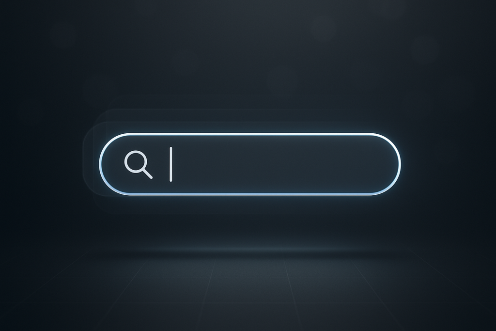
To animate a search bar in After Effects, you typically build it from shape layers (rounded rectangle, icon, cursor), then animate its size/position with keyframes, add text (placeholder and typing), and polish everything with easing, subtle shadows, and (optionally) expressions to keep it flexible. Once you understand that a search bar is just a handful of simple shapes moving with good timing, you can create anything from a minimal “expand-on-click” UI to a fully branded, app-like interaction.
This guide walks you through a practical, production-friendly workflow as of 2026-08-14: how to design the bar cleanly, animate it convincingly, add typing and cursor behavior, and keep the whole thing editable (so you can change the query text, width, colors, and timing without rebuilding the animation).
📋 Table of Contents
What Is Animating a Search Bar in After Effects?
Animating a search bar in After Effects means creating a believable UI interaction: a field appears (or expands), the search icon reacts, a cursor blinks, text is typed, and the bar may confirm the search or collapse back. You’re not simulating a real app engine-After Effects is a motion design tool-so the goal is visual clarity and interaction illusion, not functional input.
In practice, the animation is built from a few core components: a rounded rectangle background, a magnifying glass icon (or a morph into an “X” for clearing), optional divider lines, placeholder text, typed text, and a cursor. With thoughtful spacing, easing, and micro-movements, the viewer’s brain happily fills in the “this is interactive” part.
Benefits of Animating Search Bars for User Interface Design
An animated search bar is a tiny piece of UI, but it carries a lot of storytelling weight. It can signal intent (“we’re searching for something”), focus (“pay attention here”), and progress (“typing is happening; results are coming”). In explainer videos and product promos, it’s often the fastest way to show a user journey without showing a full screen recording.
It also helps you control the brand feel. A search bar that expands with a springy ease and soft shadow reads as friendly and modern; one that snaps open with crisp linear motion feels utilitarian and technical. The same rectangle can communicate very different personality depending on timing, easing, and detail.
Finally, building a search bar is an excellent After Effects exercise: you practice shape layer workflows, anchor point discipline, text animation, and the kind of subtle easing that separates “motion” from “motion design.”
Common Uses of Animated Search Bars in Videos and Applications
Animated search bars show up everywhere because they’re universally understood. Viewers don’t need instructions: they see a cursor blink and immediately know “type here.” That makes search bars a reliable visual shorthand in many contexts.
Common use cases include:
- App and SaaS promos: demonstrating how quickly users can find content or settings.
- Explainer videos: introducing a topic by “searching” for it, then transitioning to results.
- Educational content: showing a query being entered (especially useful for tutorials).
- UI reels: showcasing micro-interactions like expand/collapse, icon morphs, and hover states.
- Broadcast/YouTube overlays: animating a “search for…” prompt to guide viewers.
In motion design, search bars also make great transition devices: the typed query can become the next scene’s title, or the bar can wipe into a new layout. It’s UI that doubles as a storytelling tool.
Which After Effects Tools and Features Are Used for Search Bar Animation?
You can animate a search bar with “basic” After Effects features-no plugins required. The secret is choosing tools that keep the animation editable. A search bar often needs last-minute changes: different query text, different width, different icon style, different brand color. Building with shape layers, smart parenting, and a few expressions makes those changes painless.
Below are the key tools and why they matter.
Using Shape Layers for Creating Search Bar Elements
Shape layers are ideal because they’re vector-based, lightweight, and easy to animate. A typical search bar build uses:
- Rounded Rectangle for the bar background (Fill + optional Stroke).
- Ellipse + Stroke (or path) for the magnifying glass lens.
- Line (a small rectangle or path) for the magnifying glass handle.
- Small rectangle for the cursor (or a text cursor if you prefer).
When you construct these as shape groups inside one shape layer (or a few organized shape layers), you gain control over Roundness, Stroke Width, and Trim Paths for reveals. It also scales cleanly for different resolutions-useful if you’re delivering both 1080p and 4K.
A practical tip: decide early whether the bar will be a single shape layer with multiple groups (tidy but sometimes fiddly) or multiple shape layers (easier to manage and parent). For most beginners and many pros, multiple layers wins for clarity.
Applying Keyframes to Animate Position and Size
The “expand” interaction is usually just a Scale animation (often on X only) or a Size animation if you’re using a Rectangle Path. Both work, but they feel different in workflow:
- Scale: quick, but can distort strokes unless you manage stroke scaling settings carefully.
- Rectangle Path Size: more “UI-authentic,” because the corner radius and stroke can remain consistent.
Most search bar animations combine several keyframed properties:
- Rectangle Path > Size (width expansion)
- Position (sliding into place or aligning to a layout grid)
- Opacity (subtle fade-in for polish)
- Icon Position (nudging as the bar grows)
Keyframes are the skeleton. Easing is the muscle. You can make the same keyframes feel cheap or premium depending on how you shape velocity in the Graph Editor.
Leveraging Masks and Trim Paths for Reveal Effects
Reveal effects are where the animation starts to feel designed rather than merely animated. Two of the most useful approaches:
Masks are great for hiding/revealing text or the interior of the bar. For example, you can keep typed text from “spilling” outside the bar by masking the text layer to the bar’s inner bounds. You can also animate a mask expansion so the bar appears to grow from a point.
Trim Paths is perfect for drawing the magnifying glass icon. Build the lens and handle as strokes, then add Trim Paths and animate End from 0% to 100% for a clean “draw on” moment. It’s simple, readable, and feels very UI-friendly.
Combining both is common: Trim Paths draws the icon, while a mask reveals the bar fill and text. The result looks intentional and modern.
How to Use Expressions to Enhance Animation
Expressions aren’t mandatory, but they’re incredibly useful for making your search bar modular. Instead of manually adjusting multiple layers every time the bar width changes, you can link properties together.
Here are expression ideas that work well for search bars:
- Link icon position to bar width: so the icon stays padded from the left edge.
- Auto-cursor follow typing: cursor X position follows the text’s sourceRectAtTime width.
- Blinking cursor: opacity toggles on/off with a time-based expression.
- Single “Progress” slider: drive multiple animations (bar expand, icon morph, text fade) from one control.
A beginner-friendly blinking cursor expression (on the cursor layer’s Opacity) looks like this:
// Blink 2 times per second
freq = 2;
Math.sin(time * Math.PI * 2 * freq) > 0 ? 100 : 0;
And an extremely handy cursor-follow expression (cursor layer Position) can be built by referencing the typed text layer’s bounding box. You’ll need to adapt names and padding, but the core idea is:
txt = thisComp.layer("Typed Text");
r = txt.sourceRectAtTime(time,false);
// Start position of text layer in comp space
p = txt.toComp([r.left, r.top]);
// Cursor sits at end of text width
x = p[0] + r.width + 8; // padding
// Keep Y where it is
[x, value[1]];
Expressions like these turn your search bar into a reusable component rather than a one-off animation you dread revisiting.
How to Create a Basic Animated Search Bar in After Effects
Let’s build a clean, modern search bar animation that expands, shows an icon, blinks a cursor, and types a query. This workflow prioritizes editability: you can swap colors, text, and timing without rebuilding.
Watch UI animation examples in After Effects
Before you start, create a comp (for example, 1920×1080, 30 fps, 6-10 seconds). Set a neutral background so you can judge contrast-mid-gray is a good “truth serum” for UI elements.
Step-by-Step Guide to Design the Search Bar Layout
1) Create the bar background. Add a Shape Layer and draw a rounded rectangle with the Rounded Rectangle Tool. In the shape layer’s contents, open Rectangle Path and set:
- Size: start with something like 80×56 (collapsed state) or directly at full width if you prefer.
- Roundness: 18-28 for a modern pill shape (depends on height).
- Fill: white or near-white; avoid pure #FFFFFF if you want a softer look.
- Stroke (optional): 2-3 px with low-opacity black/brand color.
Name this layer Bar_BG. Good naming is not bureaucracy-it’s future-you saying thank you.
2) Add subtle depth. UI elements often need separation from the background. Add a Drop Shadow (Effect > Perspective > Drop Shadow) or use a shape layer shadow style if you prefer. Keep it gentle: small distance, soft radius, low opacity. The goal is “floating slightly,” not “sticker slapped on screen.”
3) Create the search icon. You can draw it with shape layers:
- Create a new Shape Layer named Icon_Search.
- Add an Ellipse with Fill: None, Stroke: 3-4 px.
- Add a small rectangle (or a path) rotated ~45° for the handle, same stroke weight.
Place the icon inside the bar on the left, with consistent padding (for example, 18-24 px from the left edge). If you’re aiming for a crisp UI look, align to whole pixels and consider enabling Continuous Rasterization if you’re using vector imports.
4) Add placeholder and typed text layers. Create two text layers:
- Text_Placeholder: “Search” or “Search for anything…” in a lighter color (gray) and maybe slightly smaller.
- Text_Typed: the actual query you’ll animate typing (start empty or invisible).
Use a clean UI font (system-like sans: Inter, SF Pro-like, Roboto-like). Set the text baseline vertically centered in the bar. If you want perfect centering, use guides: the bar height midpoint is your anchor for text alignment.
5) Add a cursor. Make a small vertical rectangle shape layer named Cursor. Height should match the text cap height, not the full bar height. Place it where typing begins-just after the left padding and icon spacing.
6) Organize with parenting. Create a Null called Bar_CTRL. Parent Bar_BG, Icon_Search, both text layers, and Cursor to Bar_CTRL. This gives you a single “move the whole component” handle. If you later animate the bar sliding in, you’ll do it on the null and keep internal animations intact.
Animating the Search Bar Expansion and Collapse
The most common micro-interaction is: collapsed icon-only state → expands into a full input field → later collapses or transitions away.
Option A: Animate Rectangle Path Size (recommended).
- Select Bar_BG and open Contents > Rectangle 1 > Rectangle Path 1 > Size.
- At time 0: set Size to something compact (e.g., 80×56). Add a keyframe.
- At ~0:18-0:24 (about 0.6-0.8 seconds at 30 fps): set Size to full width (e.g., 760×56). Add a keyframe.
Now make it feel good:
- Right-click keyframes > Keyframe Assistant > Easy Ease.
- Open the Graph Editor and shape the speed curve: quick acceleration, then a smooth settle.
Anchor point note: Rectangle Path Size expands from the center by default. If you want it to expand from the left (like many UI bars), you have two clean options:
- Use a group transform: Put the rectangle in its own group and offset the group’s position while animating size.
- Use a “left-anchored” rig: Keep the bar centered but move the whole component so the left edge appears fixed.
A simple left-edge illusion: as the width increases, animate Bar_BG’s Position slightly left by half the width change. Or do it properly with a group transform if you want it mathematically consistent.
Option B: Animate Scale X. If you animate Scale, disable “Scale Strokes & Fills” if needed (depending on how you built the shape). Scale can be faster, but it can also subtly change stroke thickness, which can look wrong for UI.
Collapse animation. Later in the timeline (after typing), reverse the expansion: keyframe Size back to the compact value. Don’t just copy-paste-adjust easing so collapse feels slightly faster than expand. Many interfaces close quicker than they open.
Animating the Search Icon Transformation
The icon can do more than sit there. A small transformation sells the interaction: when the bar expands, the icon can “wake up” (scale up 105% then settle), rotate a few degrees, or draw on via Trim Paths. If you want a “clear” interaction, the magnifying glass can morph into an “X.”
1) Simple icon pop.
- Keyframe Icon_Search > Scale: 100% → 108% → 100% over ~8-12 frames.
- Keyframe Opacity if the icon appears only after expansion begins.
This is subtle, but it reads as responsive.
2) Draw-on with Trim Paths. If your icon is stroke-based, add Trim Paths to the icon’s shape group. Animate End from 0% to 100% during the bar expansion. Stagger the handle slightly after the circle for a pleasing sequence.
3) Morph to an “X” (optional, but impressive). The cleanest method is to build the icon from paths you can animate:
- Create two diagonal strokes for the “X” as separate shape paths.
- Animate their Opacity from 0 to 100 while fading the magnifying glass out.
- Or animate path points if you’re comfortable with path morphing (requires matching path point counts).
For most workflows, a crossfade between icon states is enough and avoids path-morph headaches.
Adding a Cursor or Input Indicator Animation
The cursor is the tiny detail that makes the whole thing feel “real.” Without it, typing can look like text simply appearing. With it, the viewer feels the interaction.
1) Blink behavior. The cursor should blink when waiting, then either blink less (or stop blinking) while typing, depending on the style you want. You can do this with keyframes or an expression. A keyframed approach is straightforward: alternate Opacity 0/100 every 10-15 frames.
2) Cursor timing. Let the cursor appear right after the bar finishes most of its expansion (or slightly before it finishes, if you want snappiness). If it appears too early, it feels like the UI is ahead of itself.
3) Cursor positioning. Place the cursor after the icon and padding. If you’re animating typed text, you can either:
- Manually keyframe cursor X to follow the text (fine for short queries).
- Use an expression tied to the text’s bounding box (best for flexibility).
4) Selection highlight (optional). If you want a more advanced look, add a semi-transparent rectangle behind the text to simulate selection, then animate it wiping across. Keep it subtle and consistent with OS/app conventions.
How to Enhance Search Bar Animation with Text and Effects
A search bar without text is like a stage without an actor. The text is where meaning lives: it tells the viewer what’s being searched, sets tone, and can even act as a narrative beat (typing “best hiking boots” is different from typing “how to fix a leaky faucet”).
Enhancements should support readability first. UI animation is a place where restraint looks expensive.
Adding Animated Placeholder Text
Placeholder text is the “friendly hint” that makes the bar instantly recognizable. In animation, it also gives you something to show before typing begins.
Two common placeholder behaviors:
- Fade out on focus: placeholder fades as the cursor appears.
- Slide and fade: placeholder shifts a few pixels left while fading, implying the field is becoming active.
A clean approach is to animate placeholder Opacity from 100% to 0% over 6-10 frames, slightly after the expansion starts. If you want extra polish, add a tiny blur (Fast Box Blur) that increases as it fades-just a touch, so it feels like the placeholder is receding rather than disappearing.
If your search bar is part of a larger UI, keep placeholder style consistent: same font family as other UI labels, and a placeholder color that meets contrast guidelines (even if you’re not shipping a real app, viewers still “feel” legibility).
Incorporating Typing Effects
The typing effect is where most people either overdo it (typewriter clacks for days) or underdo it (text pops in instantly). The sweet spot: believable speed, slight irregularity, and timing that matches your video pacing.
Method 1: Text Animator with Range Selector (classic).
- Select Text_Typed.
- Animate > Opacity (adds a Text Animator).
- Set Opacity to 0 in the animator.
- Animate the Range Selector > Start/End so characters reveal over time.
This gives you a controllable “reveal” typing. It’s not true character-by-character generation, but visually it reads as typing.
Method 2: Source Text keyframes (manual but precise). Keyframe the Source Text property and increment the string: “h” → “ho” → “how” … This is time-consuming, but it gives full control over pauses (like a human thinking) and corrections (backspace moments).
Method 3: Expression-driven typing (flexible). Use an expression to reveal characters based on time. A simple version on Source Text might use a slider for speed and reveal substring lengths. This is great when you need to change the query often.
Regardless of method, add micro-pauses. Humans don’t type at perfectly constant speed. A short pause after a space or before a key phrase makes the animation feel lived-in.
Optional: Add a “search submit” moment. After typing, you can animate a subtle confirmation: the cursor stops, the bar slightly darkens, or a small progress indicator appears. Even a 2-3 frame “press” (bar scales down to 98% then back) can imply Enter was hit.
Using Glow and Shadow Effects for Visual Appeal
UI effects are like seasoning: you want enough to make the dish sing, not so much that you taste only salt. For search bars, the most effective effects are usually shadow, inner shadow (subtle), and highlight.
Shadow. A soft Drop Shadow separates the bar from the background. Keep the shadow’s opacity low and the softness relatively high. If the background is dark, you may even use a faint light outline (stroke) instead.
Glow (use sparingly). Glow can be tasteful if the bar is in a neon/tech aesthetic, but it’s easy to overdo. If you use Glow:
- Apply it to a duplicate of the bar or icon.
- Use low intensity and moderate radius.
- Consider blending modes (Add/Screen) for a controlled highlight.
Focus state highlight. A very UI-authentic enhancement is a focus ring: a slightly larger rounded rectangle stroke behind the bar that fades in when active. Animate its Opacity up during expansion, then down after typing completes.
These effects don’t just look pretty-they clarify state: inactive vs active vs submitted.
What Are Tips to Optimize and Fine-Tune Search Bar Animations?
Optimization here means two things: motion quality (timing, easing, readability) and workflow quality (easy to edit, renders efficiently, previews smoothly). Search bar animations are deceptively simple, which is exactly why tiny mistakes stand out.
Think like a UI designer: everything should feel intentional, aligned, and responsive.
Timing and Easing Best Practices
Good UI motion is rarely about fancy moves-it’s about timing. A few reliable guidelines:
- Expand: ~0.4-0.8 seconds depending on style. Faster for snappy tech, slower for luxurious brands.
- Typing: match the narration pace or viewer reading pace. If the text is important, type slower or pause at key words.
- Micro-bounce: if you add overshoot, keep it tiny (2-6% scale or a few pixels). UI rarely bounces like a rubber ball.
Use the Graph Editor to create a velocity curve that feels responsive: accelerate quickly, then ease into the final state. If you’re unsure, start with Easy Ease and adjust influence so the movement doesn’t feel like it’s dragging at the end.
Also, stagger events. If everything happens on the same frame-bar expands, icon pops, cursor appears, placeholder fades-it feels mechanical. Offset by 2-6 frames so the interaction breathes.
Ensuring Smooth Transitions for User Experience
Even in a video (not an actual app), the viewer expects UI logic. Smooth transitions come from consistency and constraint:
- Consistent padding: icon-to-text spacing should remain stable during expansion.
- Consistent corner radius: if the bar height stays the same, keep roundness constant.
- Stable baselines: text should not wobble vertically; lock it to a baseline.
- Mask text properly: long queries should be clipped inside the bar, not overflow.
One pro move: animate the bar’s expansion first, then begin typing when the bar is ~80-90% open. That overlap makes the UI feel fast without becoming visually chaotic.
Another: when collapsing, fade the typed text slightly before the bar shrinks, as if the field is losing focus. It’s a tiny narrative cue that reads as “done.”
Preview and Debug Animation in After Effects
UI animation is detail work, so preview strategy matters. A few practical habits:
- Use Region of Interest to preview only the search bar area.
- Set preview resolution to Half or Third while refining motion; switch to Full for final checks.
- Solo layers to debug masking and alignment issues.
- Enable motion blur carefully-UI often looks better with minimal or no motion blur, but subtle blur can help on fast slides.
When something feels “off,” check these usual suspects:
- Are you accidentally scaling strokes?
- Is the anchor point in a weird place?
- Are layers parented in a way that doubles transforms?
- Is the text layer snapping due to fractional pixels?
Debugging is faster when your layer names are clear and your rig is simple. Complexity is the enemy of polish.
Which Common Mistakes to Avoid When Animating Search Bars in After Effects?
Most search bar animations fail in predictable ways: they’re too busy, too slow, too glowy, or too inconsistent. The good news is these are easy to avoid once you know what to watch for.
Think “UI first, motion second.” If the element wouldn’t make sense in a real interface, it will feel strange on screen-no matter how smooth your easing is.
Avoiding Overly Complex Animations
It’s tempting to turn a search bar into a mini fireworks show: the icon spins, the bar squishes, the text bounces, the cursor sparkles. But UI micro-interactions are about clarity and feedback, not spectacle.
Over-complexity creates three problems:
- Readability drops: viewers miss the query because they’re watching the motion.
- It feels fake: real UI rarely behaves like a toy (unless that’s the brand).
- Editing becomes painful: every small change breaks five other things.
A better approach: pick one hero moment (a clean expand + icon draw-on, or a tasteful icon morph), and keep everything else supportive.
Preventing Performance Issues with Excessive Effects
Search bars are small, so they should be lightweight. Performance issues usually come from stacking heavy effects unnecessarily: multiple blurs, glows, shadows, and precomps with motion blur everywhere.
To keep previews and renders fast:
- Prefer shape layer styling over multiple effect stacks when possible.
- Use one shadow solution (not three shadows fighting each other).
- Limit blur radius; blur is expensive.
- Precompose only when it helps organization or masking-not by habit.
If you need a soft “frosted glass” look, consider faking it with a subtle semi-transparent fill and a very mild blur, rather than a full background blur that forces AE to sample the entire scene every frame.
If you’re exploring a frosted aesthetic, you can also reference a liquid glass-style UI treatment to see how subtle blur/highlight choices can stay readable.
Ensuring Consistency with Design Elements
Consistency is what makes UI feel designed. Inconsistency is what makes it feel like a collage of random elements.
Common consistency pitfalls:
- Mismatched stroke weights: icon stroke is 4 px but the bar stroke is 1 px and the cursor is 3 px-your eye notices.
- Different corner radii: focus ring has different roundness than the bar.
- Misaligned padding: icon and text don’t share a consistent left margin.
- Font mismatch: placeholder uses one font, typed text another, or tracking differs.
Build a tiny style guide inside your comp: decide on a base unit (like 8 px), set consistent padding (16/24 px), and stick to one or two stroke widths. Your animation will instantly look more professional.
Where Can You Find Resources and Templates for Search Bar Animation?
If you’re on a deadline, templates can be a lifesaver. If you’re learning, tutorials can show you workflows you didn’t know existed. Either way, the goal is to borrow structure, then customize until it feels like yours.
When using templates, treat them like a starting point, not a finished meal. Swap fonts, adjust timing, and rebuild parts of the rig so you understand it-otherwise you’ll be stuck the moment the client asks for “the same thing, but… different.”
Recommended After Effects Templates for Search Bars
You’ll find search bar and UI kits in common motion marketplaces. Look for templates described with terms like UI Pack, HUD Elements, Web Search, Lower Thirds + UI, or App Promo Toolkit. Prioritize templates that are:
- Shape-layer based (clean scaling, editable colors).
- Controller-driven (sliders for width, roundness, speed).
- Well-labeled (organized comps and layers).
- Plugin-free unless you already rely on that plugin.
Good places to browse include:
- VideoHive (Envato Market)
- Envato Elements
- Motion Array
- Adobe Stock
When evaluating a template, preview whether the animation feels “UI-real”: tight easing, no excessive bounce, readable text timing. If it looks like it belongs in a real app, it will also look great in your video.
Online Tutorials and Community Forums
For learning and troubleshooting, tutorials and community posts are often better than templates because they teach you why something works. Search bar animation touches multiple AE skills-shape layers, text animators, expressions-so it’s a perfect topic to study across creators.
Useful learning and community hubs:
- YouTube: search for “After Effects UI animation search bar,” “Trim Paths magnifying glass,” “cursor blink expression,” and “sourceRectAtTime cursor follow.”
- Adobe Community Forums: great for expression debugging and edge cases.
- r/AfterEffects: feedback, rig ideas, and workflow discussions.
- Creative COW: long-standing AE forum with deep technical threads.
A smart way to learn: recreate a search bar you like from a real product video. Pause, observe timing, note spacing, then rebuild it with your own rig. You’ll develop taste and technique at the same time-which is the real upgrade.
If you want inspiration for UI micro-interactions beyond search, see how a YouTube widget build handles spacing, hierarchy, and state changes.
Conclusion
If you want your animated search bar to feel instantly “believable,” borrow one habit from interface designers: treat states as a system. Build an inactive state (resting bar), an active state (focus ring + cursor), and a commit state (Enter/submit feedback). When you animate between those states with consistent spacing and restrained easing, the result feels less like “a rectangle moving” and more like a real interaction.
Once you’ve got the basic rig working, consider turning it into a reusable mini-component: add a Controls layer with sliders for bar width, padding, and typing speed; store your brand colors in a simple palette; and keep one “master” comp you can duplicate per project. That small bit of housekeeping pays off the next time you need three different search queries, two aspect ratios, and a last-minute font change-because you will.
See a clean UI animation workflow (Finder UI)
And if you’re looking for the next step beyond search bars, the same techniques scale beautifully into full UI sequences: buttons with hover states, toggles, dropdown menus, and result lists that slide in with masked reveals. In other words, this little search bar is a gateway drug-welcome to motion design.