
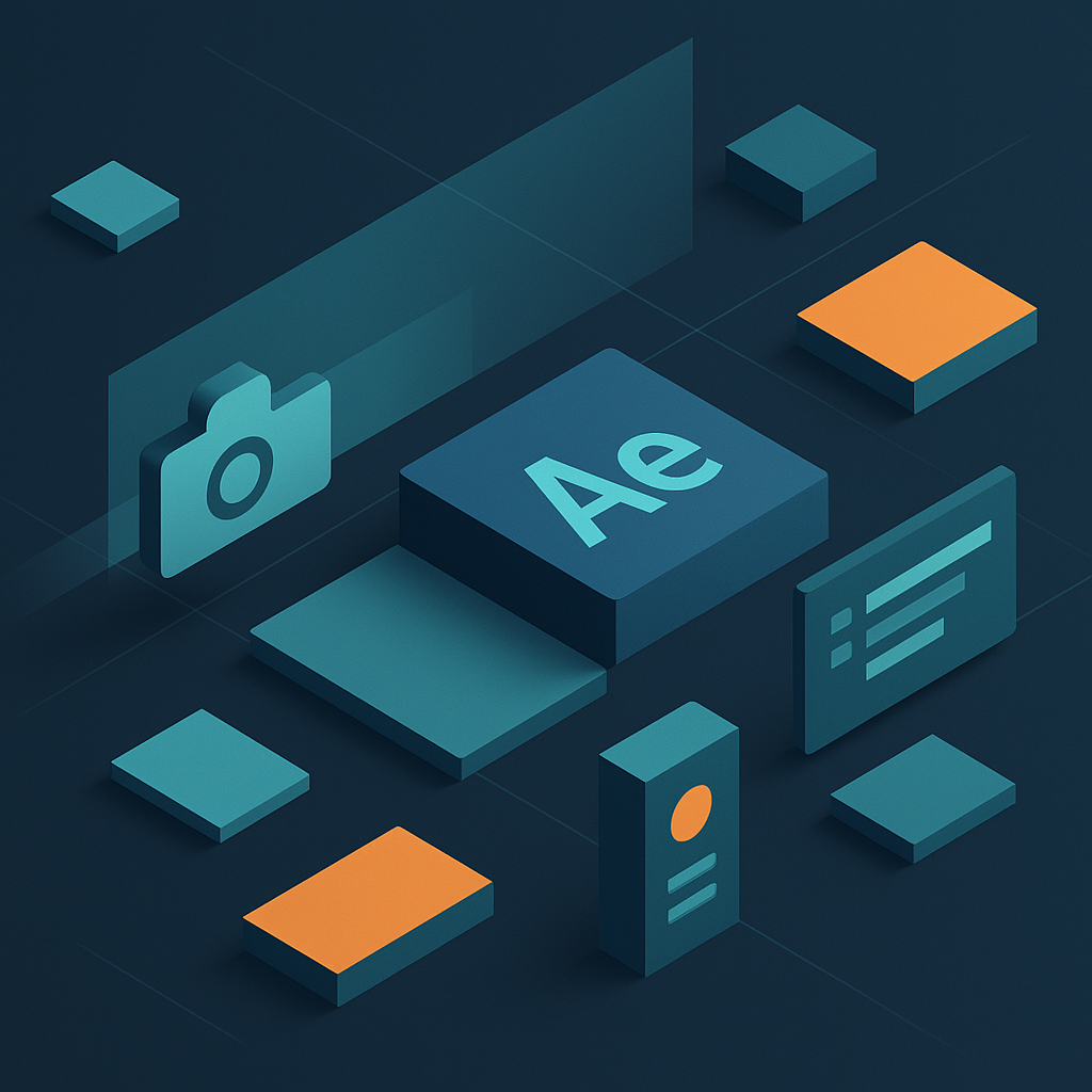
To create 2.5D isometric motion graphics in After Effects, you build (or import) flat artwork, arrange it in a controlled “fake-3D” space using 3D layers and consistent isometric angles, then animate with camera moves, parallax depth, and carefully shaded lighting so the scene feels dimensional without becoming full 3D. The workflow is less about brute-force modeling and more about discipline: a reliable isometric grid, predictable rotations, smart layer parenting, and animation choices that respect the illusion.
In practice, 2.5D isometric work lives in a sweet spot. You get the graphic clarity of 2D design-crisp shapes, readable icons, bold color-while borrowing just enough from 3D-depth stacking, camera motion, light falloff-to make everything feel tactile. After Effects is a natural home for this because it’s already built around compositing and motion: you can turn 2D layers into 3D layers, arrange them along the Z-axis, and use camera movement to amplify the effect. And when you add a parallax setup (foreground drifting faster than background), you’ve basically handed your viewer a subtle depth cue that reads instantly.
This article walks you from the fundamentals (what “2.5D isometric” actually means) to a robust, production-friendly workflow: setting up grids, building objects from shape layers, faking thickness, animating in isometric space, using camera and lights without breaking the illusion, and exporting in formats that hold up on the web and in video. It’s written for the real world: the world where deadlines exist, clients change their minds, and your machine has opinions about how many layers it’s willing to preview.
Watch After Effects motion design examples
📋 Table of Contents
What is 2.5D Isometric Motion Graphics?
2.5D isometric motion graphics is a design-and-animation approach where you create the appearance of 3D depth using mostly 2D assets. The “2.5” is doing a lot of work here: you’re not fully modeling and rendering in a 3D engine, but you’re also not staying strictly flat. You’re cheating-beautifully-by stacking layers, offsetting them in Z-space, and animating them so they behave like they inhabit a coherent world.
Isometric adds a specific visual rule: instead of realistic perspective (where lines converge toward a vanishing point), isometric projection keeps parallel lines parallel. It’s that classic “angled top-down” look you’ve seen in product diagrams, city maps, and tech explainer videos. Because isometric doesn’t shrink objects with distance the way perspective does, it’s incredibly readable. That readability is why it’s everywhere in UI/UX explainers and SaaS marketing: the viewer can parse complex systems quickly.
When you combine 2.5D with isometric, you get a powerful hybrid: a world that feels dimensional and navigable, but still behaves like a clean infographic. After Effects supports this style well because it lets you place layers at varying distances along the Z-axis to simulate depth, then enhance the illusion with camera moves such as zooms and pans. And because you can convert 2D layers into 3D layers, you can keep your assets lightweight and editable.
Difference Between 2D, 2.5D, and 3D Motion Graphics
2D motion graphics lives on a flat plane. You animate position, rotation, and scale in X and Y (and rotation around Z), and everything reads like a poster that learned to dance. Depth is implied through design tricks-overlaps, shadows, size changes-but the scene doesn’t truly exist in 3D space.
2.5D motion graphics is where you start using depth as a real organizational axis. In After Effects terms, you can turn layers into 3D layers and move them along Z. You can also use a camera, which changes how layers relate to each other in space. The most recognizable 2.5D cue is parallax: foreground layers move faster than background layers, which simulates depth and movement. As one common description puts it, “2.5D animation… is a technique that combines 2D and 3D elements to create a sense of depth and movement,” often using parallax scrolling as the workhorse.
3D motion graphics is full 3D: models, materials, lights, and a camera in a true 3D renderer (Cinema 4D, Blender, Unreal, etc.). You get real perspective, self-shadowing, reflections, and all the physics of light-plus the complexity and render time.
Isometric can exist in all three categories, but it’s most popular in 2D and 2.5D. In 3D, you can render an isometric camera, but many teams prefer 2.5D because it’s faster to iterate, easier to art-direct, and keeps everything sharp and graphic.
- Choose 2D when you want maximum simplicity, minimal setup, and a bold graphic feel.
- Choose 2.5D isometric when you want depth, camera movement, and layered complexity without a full 3D pipeline.
- Choose 3D when you need true volumetric lighting, complex geometry, or physically accurate camera behavior.
Benefits of Using 2.5D Isometric Style
It explains complex ideas without visual chaos. Isometric layouts let you show systems-networks, workflows, infrastructure-like a diagram that breathes. You can animate relationships (data moving, components connecting) while keeping the “map” readable.
It’s fast to art-direct. Because most assets are still 2D, you can change colors, labels, shapes, and iconography quickly. If a client asks to “make it more friendly,” you’re not re-texturing a 3D model; you’re tweaking shape layers and gradients.
It plays nicely with After Effects. After Effects is a popular tool for creating 2.5D animations because it’s built for compositing layers, animating properties, and integrating typography. You can create 2.5D scenes by importing 3D layers or by turning 2D layers into 3D layers, then arranging them at varying distances along Z to simulate depth.
It scales from minimal to elaborate. You can make a single isometric icon pop with a simple shadow and a 10-degree camera move, or build an entire isometric city with traffic, signage, and looping life. The style is modular, which is a polite way of saying you can keep adding pieces until the deadline says “no more.”
It’s friendly to multi-format delivery. Isometric scenes can be reframed for 16:9, 1:1, 9:16, and banner crops because the projection is stable and the geometry is consistent. That stability is gold when your deliverables multiply.
How to Set Up an Isometric Grid and Workspace in After Effects
If isometric animation has a secret ingredient, it’s not a plugin-it’s consistency. The grid is your referee. It keeps angles honest, spacing predictable, and objects aligned so the viewer’s brain doesn’t start whispering, “Something’s off.” The goal is to create a workspace where you can build quickly without constantly second-guessing perspective.
After Effects isn’t a vector design tool first, so many artists design the isometric layout in Illustrator or Figma, then animate in AE. But you can absolutely build isometric directly in AE using shape layers-especially if you set up guides and precomps thoughtfully. Either way, the grid is the backbone.
Creating an Isometric Grid Guide
An isometric grid is typically based on 30° angles (with verticals staying vertical). In classic isometric projection, the three axes are separated by 120°; visually, you’ll often work with two diagonal directions (30° up-left and 30° up-right) plus a vertical axis. In 2D design terms, that means your “ground plane” is made of diamond shapes.
Option A: Build a grid inside After Effects (no external tools).
- Create a new composition at your delivery size (for example, 1920×1080).
- Add a new Shape Layer and create a single line (Stroke only, no Fill).
- Set the line’s rotation to 30°. Duplicate it across the comp using Repeater (Add > Repeater) and adjust Transform: Repeater position to create evenly spaced parallel lines.
- Duplicate the whole line group and rotate it to -30° to create the crosshatch.
- Optional: add a third set of vertical lines if you want a denser reference for height alignment.
- Lower opacity, lock the layer, and set it as a Guide Layer (Layer > Guide Layer) so it won’t render.
Option B: Import an isometric grid from Illustrator. This is often faster and cleaner. Create a grid in Illustrator, export as AI, import into AE as a composition (retain layer sizes), then set the grid layer to Guide Layer. The advantage is you can match your design grid exactly to the artwork you’re animating.
Option C: Use AE’s built-in grid as a starting point. View > Show Grid and View > Snap to Grid can help, but it’s orthographic, not isometric. Use it for general spacing, not for angle fidelity.
Regardless of method, enable Snapping (the magnet icon) and consider using Guides (View > Show Guides) for key anchor lines-like the “horizon” of your isometric world or the baseline of a platform.
Configuring Composition Settings for Isometric Design
Isometric animation benefits from a stable foundation: consistent pixel density, predictable frame rate, and enough padding for camera moves. You don’t want to discover, halfway through, that your camera drift reveals the edge of your background because you built everything too tightly.
Recommended comp settings (general-purpose):
- Frame rate: 24 fps for cinematic motion, 30 fps for UI/tech content, 60 fps if you need ultra-smooth (but expect heavier previews).
- Duration: Build longer than needed; you can trim later. For explainers, 20-60 seconds is common per scene sequence.
- Resolution: Design at target resolution or higher if you expect crops. For social, you may build a “master” at 2160×2160 and then create delivery comps.
- Color management: Use a consistent working space (Rec.709 for most video). If you’re mixing web and broadcast, keep an eye on gamma shifts.
Safe camera padding: If you plan camera pushes and pans (which significantly enhance the 2.5D effect), build your background and midground wider than the frame. A simple rule: if you expect a 10% push-in, build at least 10-20% extra space around the edges.
Layer organization: Create a folder-like structure using precomps: BG, MG, FG, FX, UI, Text. Isometric scenes can become layer-heavy quickly; naming is not optional if you value your future happiness.
Importing or Creating Assets for Isometric Layout
You have two main asset strategies: design externally (Illustrator/Figma) and animate in AE, or build natively in AE using shape layers. Many professionals do a hybrid: core shapes from Illustrator, details and animation-friendly parts as AE shapes.
Import tips for Illustrator assets:
- Import AI files as Composition – Retain Layer Sizes to keep anchor points manageable.
- Convert layers to shape layers (Right-click > Create > Create Shapes from Vector Layer) when you need path animation, trim paths, or repeaters.
- Keep strokes consistent. Illustrator strokes can behave differently when converted; test early.
Building directly in AE with shape layers: Shape layers are surprisingly powerful for isometric work because you can parametrize them. A single “tile” can become a reusable component with slider controls for width, height, and color. If you build a library of tiles, walls, and roofs, you can assemble scenes like LEGO-clean, modular, and easy to revise.
Texture and shading approach: Isometric often uses flat shading: three faces (top, left, right) with three related values. Decide on a shading system early-e.g., top = 100% base color, right = 85%, left = 70%-and stick to it across the scene. That consistency is what makes the world feel coherent even when it’s stylized.
How to Create 2.5D Isometric Objects and Scenes in After Effects
Creating isometric objects in After Effects is mostly about constructing believable “forms” from simple planes. You’re not sculpting; you’re assembling. Think in faces: top plane, left plane, right plane. Once those planes are grouped and parented correctly, you can animate them as if they’re a single object, and the illusion holds.
There are two common routes: fake it in 2D (using shape layers and skewed faces) or use AE’s 3D layers to position planes in space. The best workflow often combines both: build clean faces in 2D, then place them in 3D space for camera parallax and depth stacking.
Using Shape Layers to Build Isometric Objects
Shape layers are the workhorse for crisp isometric graphics because they remain resolution-independent and easy to tweak. Start with the simplest building block: an isometric “tile” (a diamond) that represents a unit of ground.
Build an isometric tile:
- Create a shape layer with a rectangle.
- Rotate it 45° to form a diamond.
- Scale it non-uniformly in Y (e.g., 50-60%) to match isometric proportions.
- Set Fill color and add a subtle stroke if your style calls for it.
From that tile, you can extrude a block by adding side faces. Duplicate the tile twice, then offset points (or use separate parallelogram shapes) to create left and right faces. Assign each face a shade based on your lighting direction.
Use precomps as “objects.” Once you’ve built a block, precompose it and name it something like Block_01. Inside the precomp, keep faces on separate layers (Top/Left/Right) so you can animate highlights, shadows, or subtle squashes without rebuilding.
Repeaters for cities and patterns. Isometric scenes love repetition: windows, tiles, server racks, shelves. Shape layer Repeaters can generate these quickly. For example, build one window shape, then use a Repeater to create a grid-adjusting the transform offsets to match your isometric angles.
Trim Paths for “drawing on” construction. Isometric lines and outlines can be animated elegantly with Trim Paths. If you’re doing explainer-style builds (roads drawing in, wires connecting), Trim Paths gives you that satisfying “assembly” motion while staying clean.
Applying 3D Layer Options and Custom Rotations
Here’s where 2.5D earns its keep. After Effects lets you toggle any layer to 3D (the little cube icon). Once in 3D, you can move it along Z, rotate around X/Y/Z, and view it with a camera. This is the foundation of parallax and depth staging: “Layers are arranged at varying distances along the Z-axis to simulate depth.”
Two reliable strategies for isometric in AE 3D:
1) The “camera-isometric” strategy (common and intuitive). Keep objects mostly facing the camera (so text and icons stay readable), but place them at different Z depths. Then set the camera angle so the world reads isometric. This is great for UI scenes, dashboards, and diagrams.
2) The “object-isometric” strategy (more literal). Rotate the world (or a parent null) so that your planes align to isometric angles. A typical setup is to rotate a parent null around Y and X to approximate isometric view (often around Y = 45°, X ≈ 35.264° for true isometric). Then you build objects aligned to that rotated space. This is powerful, but it requires more discipline with parenting and camera choices.
Use a master “ISO_RIG” null:
- Create a 3D Null named ISO_RIG.
- Parent all isometric objects to it.
- Apply your isometric rotations to the null, not to each object.
This keeps the scene adjustable. If you later decide the angle should be slightly steeper, you change one control instead of 200 layers.
Keep text in 2D (or face the camera). Isometric worlds are lovely until your labels become trapezoids. A common technique is to keep text as 2D overlays or use expressions to make text layers always face the camera (billboarding). This preserves readability while the environment moves.
Shadows and contact cues. Even in a stylized scene, a soft contact shadow grounds objects. You can fake it with blurred ellipses on the ground plane, or use AE lights and “Cast Shadows” if you’re working with 3D layers. Lighting and shadows help increase realism in 2.5D animations-used gently, they add depth without turning your graphic style into a murky render.
Utilizing Puppet Tool and Expressions for Depth
The Puppet Tool is often associated with character rigs, but it’s also a sneaky way to add organic depth to otherwise rigid isometric assets. If your scene is too perfect, it can feel sterile-like a diagram that refuses to be friendly. Puppet pins can introduce micro-flex: a cable that subtly sways, a flag that flutters, a plant that breathes.
Puppet Tool use cases in isometric scenes:
- Cables and pipes: Add pins along the path, animate a gentle wave.
- Paper, screens, or panels: Add a slight bend during transitions to make motion feel physical.
- Characters (simple): Even basic “icon people” can nod or shift weight with minimal rigging.
Expressions for procedural depth: Expressions help you keep depth relationships consistent and reduce manual keyframing. A simple example is automated parallax: link a layer’s X movement to its Z position so closer layers move more during a camera pan. This echoes the classic parallax principle where background layers move slower than foreground layers.
Example expression concept (parallax multiplier):
- Create a Null named PARALLAX_CTRL with a Slider called Strength.
- For each layer, compute a factor based on Z (or a custom “Depth” slider).
- Offset Position by the camera move multiplied by that factor.
You don’t need to be an expression wizard to benefit. Even a few targeted links-like tying shadow opacity to object height-can make the scene feel more dimensional and cohesive.
See a SaaS explainer workflow in After Effects
How to Animate 2.5D Isometric Motion Graphics in After Effects
Animation is where isometric either becomes magical or betrays itself. The illusion is fragile: move things in a way that contradicts the grid, and the viewer feels the wobble. Move things with intention-respecting axes, easing, and depth-and the scene suddenly feels like a tiny world you could reach into.
The trick is to think like a stage director. Your isometric set is built from layers; your camera is your audience; your motion is choreography. You’re not just moving objects-you’re guiding attention through space.
Animating Position, Rotation, and Scale in Isometric Space
Move along isometric axes. In an isometric world, “left-right” on screen is not the same as “east-west” in the world. If you slide a car straight horizontally, it may look like it’s drifting off the road. Instead, animate motion along the grid lines: 30° diagonals and verticals. You can do this by constraining movement with guides, or by using a parent null rotated to match the axis and animating along its local X.
Use nulls as axis handles. Create two nulls: AXIS_LEFT rotated -30° and AXIS_RIGHT rotated +30°. Parent objects temporarily to the axis null that matches their travel direction, animate the child’s X position, then unparent if needed. It’s a practical way to keep motion “on the rails.”
Scale with intention. Scaling in isometric can feel like a camera zoom if the object is meant to stay on the ground plane. If you want an object to “approach,” consider moving it in Z (with camera) rather than scaling it. If you do scale, pair it with a slight position shift and shadow adjustment so it doesn’t look like it’s inflating.
Rotation is a seasoning, not a main course. Isometric objects usually don’t spin freely like they’re in zero gravity. If you rotate, do it around logical pivots (hinges, turntables) and keep angles consistent with the style. A subtle 5-10° “settle” rotation can add life without breaking the projection.
Staggered timing sells complexity. When multiple elements move, avoid perfect synchrony. Let the background start a few frames earlier, let foreground elements overshoot slightly later, and you’ll get a richer sense of depth. This is where 2.5D shines: layered motion implies layered space.
Using Camera and Lights to Enhance Depth
Camera movement is the great amplifier. Even modest camera moves-slow push-ins, gentle pans-can significantly enhance the 2.5D effect. Because After Effects works within 3D space, you can orchestrate these moves with a camera and let parallax do the heavy lifting.
Camera setup tips:
- Use a 2-node camera (with a point of interest) for smooth, controllable moves.
- Animate the camera with a parent null (e.g., CAM_RIG) so you can separate translation from subtle rotations.
- Keep moves slow unless you want a dramatic reveal. Fast camera moves can expose the “cardboard cutout” nature of 2.5D layers.
Depth staging with Z positions: Place background layers farther in Z, midground near 0, and foreground closer to the camera. Then, as the camera pans, the relative motion difference creates parallax: background layers drift slower than foreground layers, simulating depth. This is the core of pseudo-3D.
Lights: use sparingly, stylize deliberately. Lighting and shadows can add realism, but they can also wreck a clean graphic look if overdone. Consider these approaches:
- Fake lighting in design: Use three-face shading (top/left/right) and avoid AE lights entirely. This keeps everything consistent and fast.
- Hybrid lighting: Use AE lights only for subtle shadow casting (soft, low opacity) while keeping face shading designed.
- Full AE lighting: Works best when your layers are true 3D planes and you want dynamic shadow movement. Expect more render time and more troubleshooting.
Shadow discipline: If you cast shadows, keep the shadow direction consistent with your shading system. Also watch shadow softness: in a stylized isometric scene, overly realistic shadows can look like they belong to a different project.
Adding Motion Effects Like Easing and Secondary Animation
Isometric motion can easily become “slidey”-objects gliding around like they’re on an invisible air hockey table. Easing is your antidote. Use the Graph Editor to shape velocity so motion has intention: accelerate, coast, decelerate, settle.
Practical easing patterns:
- Fast out, slow in for UI-like transitions where the object snaps into place with confidence.
- Slow out, slow in for calm, premium-feeling moves (product, finance, healthcare).
- Overshoot and settle (small, controlled) for playful scenes-icons, characters, bouncy elements.
Secondary animation adds life. If a platform rises, let the shadow lag behind by a few frames. If a box lands, let it compress subtly (scale Y down a touch, then rebound). If a sign pops in, let it swing 2-3 degrees and dampen. These tiny echoes make the world feel physical.
Motion blur: yes, but tasteful. Motion blur can make movement feel smoother, but too much can muddy crisp isometric lines. Enable it selectively-often on foreground elements and camera moves, not on fine linework.
Texture movement (micro-parallax). A subtle grain overlay that drifts slowly can add depth without changing the geometry. Keep it extremely light; it should feel like atmosphere, not noise.
Which Plugins and Scripts Enhance 2.5D Isometric Workflow?
You can build 2.5D isometric motion graphics with stock After Effects, no problem. But plugins and scripts can remove friction-especially when you’re doing this often, or when the scene complexity climbs. The best tools don’t “do the art” for you; they handle the repetitive scaffolding so you can focus on design and motion.
Think of enhancements in three categories: rigging/automation (faster setup), animation quality (better easing and control), and pipeline (import/export and layer management).
Recommended Plugins for Isometric Animation
Animation and easing tools:
- Flow (or similar easing managers): Save and apply custom easing curves quickly across many layers.
- Motion tools suites (various): Helpful for overshoots, bounce presets, and quick timing offsets.
3D and layer depth helpers:
- Element 3D (Video Copilot): If you want actual 3D objects inside AE without leaving the app. Not required for isometric 2.5D, but useful for hero objects.
Style and finishing:
- Shadow/lighting helpers: Plugins that generate long shadows or manage multiple shadow layers can speed up stylized shading workflows.
Choose tools based on pain points. If you’re spending your life in the Graph Editor, get easing management. If you’re drowning in layer offsets, get automation. If you’re trying to force AE into being a 3D renderer, consider whether a real 3D tool might be the better long-term choice.
Scripts to Automate Grid and Object Creation
Scripts are the quiet heroes of isometric production. A good script can generate an isometric grid, distribute layers along an axis, or rename and color-label a hundred layers in seconds. Even if you don’t use a dedicated “isometric script,” a handful of general utilities can make your workflow feel ten times calmer.
Useful script capabilities to look for:
- Grid generators: Create 30° line grids, adjustable spacing, guide-layer output.
- Distribute/align in 3D: Even spacing along X/Y/Z, align to camera, align anchor points.
- Precomp and cleanup: Batch precompose, trim comps to content, remove unused items.
DIY automation with essential properties: You can also create your own “mini system” without scripts: build a master object precomp, expose key controls (colors, sizes) as Essential Properties, and duplicate instances. This gives you template-like behavior while staying native.
Using Expressions for Advanced Motion Control
Expressions are where you can make isometric motion feel smart rather than manual. They’re especially useful for keeping relationships consistent: shadows that respond to height, parallax that responds to depth, and camera-driven offsets that keep multi-layer objects glued together.
High-value expression ideas for isometric scenes:
- Depth-based parallax
-
Link layer movement to a “Depth” slider so you can art-direct parallax without constantly moving layers in Z.
- Auto-shadow opacity
-
As an object rises (Y or Z), reduce contact shadow opacity and increase blur. It’s a simple cue that reads as height.
- Billboard text
-
Keep labels facing the camera so they stay readable even when the scene rotates or the camera arcs.
- Looping secondary motion
-
Add gentle, randomized drift to background details (fans spinning, lights blinking) using loop and noise functions.
Expressions also help performance indirectly: fewer keyframes, fewer opportunities for inconsistent timing, and easier global adjustments. When a client asks, “Can the whole scene feel a bit more dynamic?” you can increase one slider instead of re-animating everything.
What Are Common Challenges and How to Solve Them?
Isometric 2.5D looks clean, but it’s deceptively strict. The style forgives almost nothing: a slightly wrong angle, an inconsistent shadow, a parallax move that doesn’t match depth-your viewer may not know what’s wrong, but they’ll feel it. The good news is that most problems have reliable fixes once you know what to watch.
Below are the issues that show up most often in real projects, plus practical ways to solve them without throwing your comp into the ocean.
Maintaining Consistent Perspective and Depth
Challenge: Objects look like they belong to different worlds. One building feels steeper, another feels flatter; shadows disagree; spacing doesn’t align to the grid.
Solutions:
- Lock your grid early. Decide on your isometric angle system (30° diagonals, verticals) and build everything to it.
- Use a shared shading palette. Define top/left/right face values and reuse them. If your light direction changes, change it everywhere.
- Parent to an ISO_RIG. If you’re using 3D rotations, apply them at the rig level so every object inherits the same projection.
- Audit with overlays. Temporarily enable your grid guide and check key alignments (roads, edges, object bases).
Depth consistency tip: If you’re arranging layers along Z to simulate depth, keep a simple “depth scale” (e.g., BG at -2000, MG at 0, FG at +800) and stick to it. Random Z values create random parallax, which reads as accidental.
Avoiding Flat or Unnatural Animation
Challenge: The scene looks like layered stickers sliding around. Motion feels floaty, weightless, or too linear.
Solutions:
- Add contact cues. Shadows, small bounces, and slight compressions on impact suggest weight.
- Use easing intentionally. Avoid default linear keyframes for almost everything. Shape velocity in the Graph Editor.
- Introduce secondary motion. Small follow-through on signs, cables, and UI elements makes the world feel responsive.
- Use camera movement to create depth. Even a subtle push-in can make layers feel spatial. Camera movements like zooms and pans significantly enhance the 2.5D effect because parallax becomes visible.
Reality check: Not everything should move. Strategic stillness makes motion feel purposeful. If every element wiggles, nothing feels important.
Optimizing Performance When Working with Many Layers
Challenge: Previews crawl, your fan sounds like it’s trying to take off, and you start bargaining with the universe.
Solutions:
- Precompose modular groups. Buildings, vehicles, and repeated clusters should live in precomps. Collapse transformations only when needed.
- Use proxies. For heavy precomps, render proxies or use low-res placeholders while animating.
- Turn off motion blur during blocking. Enable it only for final previews and render.
- Reduce 3D light/shadow complexity. AE’s 3D shadows can be expensive. If your style allows, fake shadows with blurred shapes.
- Shy and label layers. It doesn’t speed the renderer, but it speeds you-less time hunting, fewer mistakes.
Performance-friendly design choice: If you’re building a huge isometric environment, consider a “matte painting” approach: keep distant city blocks as a single flattened layer with minimal parallax, and reserve true multi-layer depth for foreground hero areas.
How to Export and Optimize 2.5D Isometric Motion Graphics
Export is where good work can quietly lose its shine-through banding gradients, crushed blacks, jittery motion, or bloated files that take forever to load. Because isometric scenes often rely on clean lines and subtle shading, you want an export pipeline that preserves clarity while staying practical for delivery.
The right settings depend on where your animation lives: web landing page, YouTube, in-app UI, broadcast, or a social platform that will recompress your file with all the tenderness of a hydraulic press.
Choosing the Right Export Settings for Web and Video
For video platforms (YouTube/Vimeo/presentations): H.264 is still the default. Export a high-quality master (ProRes or DNxHR), then compress to H.264 for delivery. This two-step approach preserves quality and gives you a clean archive.
For web (autoplay loops, landing pages): You’ll often choose between MP4 (H.264/H.265) and animated formats like WebM or Lottie (if it’s vector-based). Isometric work with lots of flat color can compress well, but gradients and subtle noise can increase bitrate quickly.
Key settings guidelines:
- Bitrate: Use VBR 2-pass when possible for better quality at smaller sizes.
- Keyframe interval: Around 2 seconds is common for streaming; adjust based on platform.
- Render at Maximum Depth: Helpful if you have gradients; test for banding.
- Use Maximum Render Quality: Enable if you have scaling/rotation; it can improve edges but costs time.
Frame rate consistency: Export at the comp frame rate unless you have a specific reason not to. Changing frame rate at export can introduce uneven motion-especially noticeable in smooth camera moves.
Best Formats for Preserving Quality and Motion
Master exports (editing and archiving):
- Apple ProRes 422 / 4444: 4444 if you need alpha (transparency), 422 for standard masters.
- Avid DNxHR: Great cross-platform alternative, especially in editorial pipelines.
Delivery exports:
- H.264 (MP4): Widely compatible, good quality-to-size ratio.
- H.265 (HEVC): Smaller files at similar quality, but compatibility varies.
- WebM (VP9/AV1): Strong for web, especially if your site supports it.
Transparent overlays: If you need alpha for compositing over video or UI, ProRes 4444 is common. For web alpha, options are more limited; sometimes you’ll use WebM with alpha depending on browser support, or redesign to avoid transparency needs.
Vector delivery (special case): If your isometric animation is largely shape-based and you need it lightweight and scalable, consider a Lottie workflow. That said, complex effects (blurs, 3D layers, certain masks) may not translate cleanly, so plan for it early.
Tips to Reduce File Size Without Losing Visual Integrity
1) Simplify gradients and avoid subtle noise unless necessary. Noise is a compression enemy. If you love texture (and many of us do), keep it minimal and consider using a static texture rather than animated grain.
2) Watch thin lines. Fine strokes can shimmer after compression, especially on social platforms. Slightly thicker strokes or a tiny bit of blur (very tiny) can reduce flicker.
3) Use limited color palettes thoughtfully. Isometric style often uses flat colors-great for compression. But large flat areas can show banding if you also use gradients. If banding appears, add a subtle dither (again: subtle).
4) Pre-render heavy sections. If your comp is complex, pre-render intermediate layers to a visually lossless codec, then assemble and export. This reduces the risk of AE re-calculating expensive effects at final render.
5) Trim dead time and optimize loops. For looping isometric scenes on the web, every extra second costs. Design loops that are short, seamless, and visually satisfying-like a conveyor belt, blinking UI, or gentle camera drift.
6) Test on the actual platform. Social apps and ad networks re-encode aggressively. Export a test, upload privately, and inspect: look for banding, crushed shadows, and jitter in camera moves.
Conclusion
Once you’ve built a reliable 2.5D isometric workflow in After Effects, you can start thinking beyond “how do I make this look isometric?” and into the more interesting question: what kind of world am I building, and how does it behave? That’s where the style really pays off-when your scene has rules (light direction, motion language, depth hierarchy) and then uses them to tell a story with clarity and charm.
A useful next step is to create your own isometric motion kit: a personal library of tiles, walls, shadows, icon rigs, camera presets, easing curves, and texture overlays. Treat it like a living toolbox. Every project adds a new piece-an elevator animation, a data-flow line style, a “pop-in” transition that feels just right-and over time you stop starting from scratch. You start from your system.
And if you want your work to feel especially polished, study the unglamorous details: how long it takes the eye to read a label, how much parallax is “enough,” how a shadow should soften as an object lifts, how camera movement can guide attention without stealing the scene. These are small decisions, but isometric is a style that rewards small decisions. It’s architecture: the beauty is in the structure you don’t notice-because it simply feels right.