
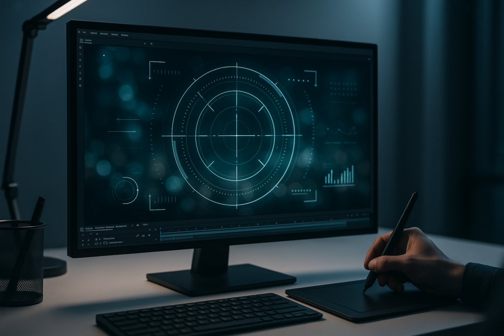
To make HUD elements in After Effects, you build clean vector shapes (usually with Shape Layers), style them with strokes/glows, animate them with keyframes and helpful expressions, then composite them over footage-often with motion tracking so the HUD feels “attached” to the scene. The real trick isn’t one magic effect; it’s a workflow: design like a UI artist, animate like a motion designer, and composite like a VFX artist.
HUDs-heads-up displays-live in that delicious space between “interface” and “illusion.” They can be subtle: a single targeting reticle that breathes as a character aims. Or they can be loud: a dense sci‑fi diagnostic overlay that looks like it’s reading your soul. Either way, After Effects is an ideal playground because it’s built for vector graphics, procedural animation, and compositing.
If you want a classic reference point, Video Copilot has a well-known tutorial called “Creating HUD Elements in After Effects” (hosted at videocopilot.net). It’s a great example of how far you can go with core tools and a solid design sense. This article expands that idea into a modern, practical, step-by-step guide you can adapt to your own projects as of 2026-08-24.
Watch After Effects HUD-style UI animations
📋 Table of Contents
What are HUD Elements in After Effects?
Definition and purpose of HUD elements
A HUD (Heads-Up Display) element is a piece of on-screen interface graphics-text, shapes, icons, meters, reticles, charts-layered over video or a rendered scene to communicate information. In real life, HUDs are used in aircraft, vehicles, AR headsets, and industrial systems. In motion design and VFX, they’re storytelling tools: they can show a character’s biometric readout, a drone’s target lock, a hacker’s scanning UI, or a “future dashboard” that doesn’t exist but feels like it should.
In After Effects specifically, HUD elements are typically created with vector-based shape layers and text layers, then animated and composited over footage. The goal is to look precise and intentional. HUDs shouldn’t feel like random lines floating around; they should feel like they belong to a system-one with rules, hierarchy, and purpose.
Good HUD design answers questions the viewer didn’t know they had: What matters here? Where should I look? What’s the state of the scene? Even when the data is fictional, the visual language can be convincing-because the motion, spacing, and typography behave like real interface design.
Common types of HUD elements used in video projects
HUD elements come in families. Once you recognize them, you’ll start seeing the same building blocks across films, games, music videos, and tech ads. Here are common categories you can build in After Effects:
- Reticles and targeting UI: crosshairs, brackets, lock-on rings, “tracking” boxes, aim assists.
- Readouts and telemetry: coordinates, altitude/speed, temperature, heart rate, system status labels.
- Progress and scanning elements: loading bars, circular progress rings, sweep scans, radar-like rotations.
- Graphs and diagnostics: waveform monitors, bar charts, line graphs, “signal strength” indicators.
- Maps and navigation: grid overlays, minimap circles, route lines, compass ticks.
- Frames and callouts: corner brackets, bounding boxes, leader lines pointing to objects.
- Abstract tech texture: micro text, hash marks, tiny glyphs, dotted matrices-often decorative but useful for density.
Most “futuristic HUDs” are just combinations of these pieces, arranged with a clear hierarchy: primary info big and bright, secondary info smaller and calmer, and decorative noise kept under control (or at least pretending to be under control).
How to Prepare After Effects for Creating HUD Elements
Setting up composition settings for HUD design
Before you draw a single line, set your composition up so your HUD behaves predictably. HUD work is all about crisp edges and consistent motion-two things that get messy when comp settings are an afterthought.
Start with a main comp that matches delivery:
- Resolution: 1920×1080 (HD) is fine, but 3840×2160 (4K) gives you extra sharpness for thin strokes and tiny text.
- Frame rate: 24 fps for cinematic, 30 fps for broadcast/online, 60 fps for game-like smoothness. Choose based on the footage you’re compositing onto.
- Duration: long enough to cover the shot; add a few seconds “handle” for transitions.
- Color management: if you’re compositing into a color-managed pipeline, keep AE consistent (especially if your footage is log or wide gamut).
Also decide early: is this HUD a single shot overlay, or a reusable package? If it’s reusable, build modular precomps (reticle, readout, scanner, etc.) and assemble them in a master HUD comp. Your future self will send you a thank-you note.
Finally, make a habit of naming things. HUD projects can explode into dozens (or hundreds) of layers. A layer called “Shape Layer 37” is how you end up bargaining with the universe at 2 a.m.
Recommended workspace and panel layouts
After Effects lets you work in any workspace, but HUD design benefits from a layout that keeps the essentials visible:
- Timeline large enough to manage many layers and keyframes.
- Character & Paragraph panels for typography tweaks (HUDs are often text-heavy).
- Align panel for quick, precise placement.
- Effects & Presets panel for fast styling (glows, blurs, color controls).
- Graph Editor accessible-HUD animation lives and dies by easing.
If you’re building lots of vector shapes, keep the Contents section of shape layers manageable by twirling down only what you need. Consider using the Essential Graphics panel if you plan to turn your HUD into a template with editable controls (especially useful for teams or repeat clients).
One underrated habit: dock a small Preview panel and get comfortable with RAM previews in short loops. HUD animation is full of micro-movement-tiny offsets, flickers, and sweeps-that you can’t judge from still frames.
Importance of using shape layers and vector graphics
HUDs want to be crisp. They want to scale. They want to rotate without looking like a JPEG from 2009. That’s why Shape Layers are your best friend: they’re vector-based, resolution-independent, and designed for strokes, trims, dashes, and procedural animation.
Yes, you can import Illustrator artwork. In fact, that’s a great approach for complex icons or when you want to design a full UI layout in a vector tool. But even then, many artists convert or rebuild key components as AE shape layers because:
- Shape strokes can be animated with Trim Paths in seconds.
- Dashes, line caps, and joins are easy to adjust.
- You can add repeaters, wiggles, and expressions directly.
- Everything stays editable in the timeline.
In other words: shape layers aren’t just “cleaner.” They’re faster once you learn them, and HUD work rewards speed because you’ll iterate a lot-nudging spacing, changing line weights, rebalancing hierarchy-until it feels right.
What Tools and Features in After Effects Help Create HUD Elements?
Using shape layers to build HUD components
Most HUD components can be built from a small set of primitives: rectangles, ellipses, polygons, and paths. In After Effects, you’ll use:
- Rectangle Tool / Ellipse Tool / Polygon Tool (set to Shape, not Mask).
- Pen Tool for custom lines, brackets, and callouts.
- Stroke (inside the shape layer) for line weight and color.
- Fill sparingly-HUDs often rely more on strokes than filled areas.
Once the base shape exists, the “HUD magic” comes from shape operators:
- Trim Paths: reveals strokes like they’re being drawn or scanned.
- Repeater: duplicates shapes in radial or linear patterns (perfect for tick marks).
- Offset Paths: creates outlines/inlines and layered rings.
- Merge Paths: combines shapes into more complex geometry.
- Wiggle Paths / Zig Zag: useful for stylized signals (use with restraint).
Build with intention: a ring isn’t just a ring; it’s a ring with a thickness that matches your type weight, with tick marks aligned to a grid, with spacing that implies engineering rather than decoration.
Utilizing effects like strokes and glows to enhance visuals
HUD styling is where many designs either become deliciously cinematic-or accidentally become a neon sign. The goal is controlled glow, subtle depth, and readable contrast.
Useful effects and approaches include:
- Glow (built-in): stack two glows-one tight, one wide-for a more realistic bloom.
- Drop Shadow (subtle): helps separate HUD from bright footage without heavy outlines.
- Gaussian Blur on duplicates: creates soft halos; blend with Add/Screen.
- Levels/Curves: dial in intensity so whites don’t clip and colors don’t wash out.
- Gradient Ramp or 4-Color Gradient: gentle color shifts can make flat UI feel dimensional.
- Tint or Tritone: quick palette control across multiple layers.
A practical layering trick: keep a “Clean” HUD layer (crisp strokes, no blur), then duplicate it into a “Bloom” layer (blur + glow + Add). The clean layer preserves sharpness; the bloom layer adds atmosphere. This avoids the common beginner mistake: glowing everything until it’s unreadable.
Also consider blending modes. HUDs often look best with Screen, Add (Linear Dodge), or Overlay depending on footage. But always check on both dark and bright areas-your HUD should survive the whole shot, not just the “nice” parts.
Animating HUD elements with keyframes and expressions
Keyframes are your bread and butter: position slides, scale pops, rotations, opacity fades. But HUDs benefit from motion that feels procedural-like a system updating in real time. That’s where expressions shine.
Common HUD animation patterns:
- Micro drift: tiny movement that suggests a live display (subtle wiggle on position/rotation).
- Data ticks: numbers that increment, bars that fill, dots that blink in sequence.
- Scan sweeps: rotating lines, traveling highlights, radar sweeps.
- State changes: “idle” to “lock” to “alert” using color and rhythm changes.
Expressions let you automate these patterns so you don’t keyframe every blink. Even simple expressions-like looping a rotation or posterizing time-can make a HUD feel like a machine rather than a slideshow.
That said, expressions are seasoning, not the meal. A HUD with perfect expressions but weak timing still feels off. Spend time in the Graph Editor. Give moves a touch of overshoot. Let elements settle. Machines can be elegant.
Applying precompositions to organize complex HUD designs
Precomps are how you keep your sanity. A HUD is often a stack of mini-systems: a reticle system, a text readout system, a scanning system, and some decorative texture. Precompose each system, then assemble them in a master comp.
Benefits of precomposing:
- Clarity: you can collapse complexity and focus on one module at a time.
- Reuse: drop the same reticle precomp into multiple shots and tweak it once.
- Global styling: apply a final glow/color grade to the master HUD rather than every layer.
- Performance: pre-render heavy modules if needed.
A clean structure might look like this:
- HUD_MASTER
- HUD_Reticle
- HUD_Readouts
- HUD_Scanner
- HUD_Icons
- HUD_NoiseTexture
- HUD_ColorAndGlow (adjustment layer)
Inside each precomp, keep layers labeled and grouped (via shy layers, color labels, or guide layers). Your goal is to make the project readable at a glance-because you will come back to it later, and you will have forgotten everything. That’s not a flaw; it’s a law of physics.
How to Design Basic HUD Elements Step-by-Step
Creating circles, lines, and geometric shapes
Let’s build a foundational HUD module: a circular reticle with tick marks and a rotating sweep. This is the kind of element you can reuse endlessly.
- Create a new Shape Layer and add an Ellipse. Disable Fill, enable Stroke (start with 2-4 px depending on resolution).
- Duplicate the ellipse and scale it slightly smaller for a double-ring look. Keep stroke weights consistent.
- Add tick marks:
- Create a small rectangle (thin and tall), no fill, stroke on (or fill on if you prefer solid ticks).
- Use Repeater to duplicate it around the circle.
- Set Repeater copies (e.g., 24, 36, 60) and adjust rotation to distribute evenly.
- Add a sweep line:
- Draw a line with the Pen Tool (a simple path from center outward).
- Set stroke cap to Round for a nicer end.
- Optionally add a small circle at the end as a “scanner head.”
Now you’ve got geometry. But geometry alone is just drafting. The HUD vibe comes from proportion and alignment. Use guides and grids. Align to the comp center. Keep consistent spacing between rings. If you add a third ring, make it intentionally different (dashed, thinner, partial) so it reads as hierarchy, not clutter.
Pro tip: embrace partial circles. Full rings are easy; partial arcs look more “designed.” Create arcs with Trim Paths or by splitting shapes into segments. Those missing gaps create rhythm-and rhythm is what makes UI feel engineered.
Adding text and numerical data displays
Text is where HUDs become believable. Even nonsense text can feel real if it follows typographic logic: consistent font, consistent sizing, consistent alignment, and a clear information hierarchy.
Start with a font choice. HUDs often use clean sans-serifs, condensed faces, or mono fonts. The best choice depends on tone:
- Clinical / aerospace: clean, slightly condensed sans-serif.
- Hacker / terminal: monospaced, grid-aligned.
- Luxury tech: modern geometric sans, generous spacing.
Build a data block like this:
- Create a Text Layer with a label (e.g., “TARGET ID”). Use small caps or all caps for UI flavor.
- Duplicate it for a value line (e.g., “A7-19C”). Make the value larger or brighter than the label.
- Add a thin divider line (shape layer) between groups.
- Use the Align panel and consistent margins. HUD text should look “typeset,” not eyeballed.
For numerical displays, consider adding subtle animation: a quick roll-in, a flicker, or a count-up. Even a tiny opacity jitter (5-10%) can imply an active feed. But don’t overdo it-if everything flickers, nothing feels special.
A practical readability rule: if your HUD is meant to be read, test it at the size it will be viewed. Zoom out to “Fit.” If it becomes a shimmering hairball, increase font size, reduce detail, or add a soft shadow/solid backing plate at low opacity.
Incorporating icons and symbols into HUDs
Icons are the spice rack: a few well-placed symbols can make the interface feel complete. But icons also introduce stylistic risk-because inconsistent icon styles scream “template collage.”
Best practices for icons in HUDs:
- Keep stroke style consistent: if your HUD uses 2 px rounded strokes, your icons should too.
- Prefer vector icons: import from Illustrator/SVG or rebuild as shape layers.
- Use icons as anchors: place them near key readouts to guide the eye.
- Don’t over-label: either the icon communicates, or the text does-both can be redundant.
A simple method: design a small icon set (3-8 icons) that shares the same grid and stroke weight. Then reuse them throughout. Repetition is not laziness in UI-it’s consistency, and consistency reads as “real system.”
If you’re integrating third-party icons, normalize them: convert to outlines, unify stroke widths, and scale them to a shared bounding box. A HUD is a choir; you want the voices in the same key.
Choosing color schemes and styles for futuristic look
“Futuristic” doesn’t mean “cyan glow everywhere,” though cinema has certainly tried. A strong HUD palette is usually limited and intentional-often one primary color plus one accent, supported by neutral whites/greys.
Common HUD palette approaches:
- Cool tech: cyan/teal + white, with deep navy shadows.
- Military/industrial: desaturated green/amber + off-white.
- Medical/biometric: clean white + soft blue + red alerts.
- Luxury sci-fi: minimal white lines + subtle gradient accents.
Design your states. A HUD that never changes color feels dead. Create at least three “modes”:
- Idle: calmer, dimmer, fewer animated accents.
- Active/Scanning: brighter highlights, moving sweeps.
- Alert: warm accent (amber/red), faster pulses, more contrast.
In After Effects, it helps to centralize color control. Use a Color Control effect on a null or adjustment layer, then link shape/text colors via expressions (or keep it manual but organized). When the client says “make it slightly greener,” you’ll be done before they finish the sentence.
How to Animate HUD Elements in After Effects
Animating properties like position, scale, and rotation
HUD animation is often about reveals and responses. Elements appear, lock, update, and disappear. To animate these convincingly, focus on timing and easing more than flashy moves.
Core property animations to master:
- Position: subtle slides (10-40 px) feel like UI panels docking into place.
- Scale: small pops (95% → 100%) with easing suggest activation.
- Rotation: slow continuous rotations for background rings; quick snaps for lock-on moments.
- Opacity: fast fade-in (4-8 frames) plus a slight overshoot in brightness (via glow intensity) can feel “powered on.”
Use the Graph Editor to avoid robotic motion. UI animation often benefits from fast-in, slow-out or a gentle overshoot. If you want a “mechanical” feel, keep easing tighter and more linear. If you want “premium tech,” use smoother curves and longer settle times.
A handy technique: animate in layers. First, bring in the big structure (rings, frames). Then the details (ticks, labels). Then the micro-text and decorative noise. This staged reveal makes complexity feel intentional rather than chaotic.
Using trim paths to create dynamic line animations
If HUD animation had a mascot, it would be Trim Paths. It’s the simplest way to make lines draw on, arcs sweep, and rings assemble themselves like a machine booting up.
Workflow:
- Select a shape group with a stroke.
- Add Trim Paths.
- Animate End from 0% to 100% (or animate Start/End to create a moving segment).
Use Trim Paths in a few classic ways:
- Write-on reveal: End 0 → 100 for lines and arcs.
- Traveling dash: keep a short segment visible by animating Start and End together.
- Segmented rings: split a circle into multiple groups, each trimming in with slight offsets.
To avoid the “everything draws on the same way” look, vary timing and direction. Some elements can draw clockwise, others counterclockwise. Some can pop in with opacity instead of trim. Variety is what makes a system feel complex-even when it’s built from simple parts.
Also explore Dashes in Stroke settings. A dashed line with animated Offset can feel like data flowing along a path. Combine that with a subtle glow and suddenly your line is doing something, not just existing.
Applying opacity and motion blur for smoother transitions
Opacity is the quiet hero of HUD animation. Most interface elements don’t teleport into existence; they fade, flicker, or ramp up like a display warming up. You can mimic this with layered opacity animation:
- Base layer: quick fade-in (0 → 100 in 6-10 frames).
- Highlight layer: brighter duplicate that spikes then settles (0 → 100 → 30).
- Noise/flicker: a subtle opacity jitter for 10-15 frames at the start.
Motion blur can help rotating sweeps and fast transitions feel less “computer perfect.” Enable motion blur on the layers that move quickly (sweep lines, sliding panels). Don’t blanket-enable it for everything-thin text with motion blur can become unreadable. Be selective.
Another smoothing trick: add a tiny amount of Directional Blur to fast-moving glow layers only. This keeps the crisp UI readable while the bloom feels energetic.
Using expressions for automated and interactive animations
Expressions are how you turn a HUD from a hand-animated graphic into a living system. Here are a few practical expression patterns you can adapt (written conceptually-exact implementation depends on your setup):
- Looping rotation: a ring rotates continuously without keyframes (time-driven rotation).
- Randomized flicker: opacity varies slightly using a seeded random function.
- Wiggle with limits: subtle position wiggle constrained to a few pixels.
- Auto-counting numbers: a slider drives a text layer that displays an integer value.
- Responsive lock-on: when a “Lock” checkbox is enabled, color shifts and pulse speed increases.
A clean way to manage this is to create a Controls Null with Slider/Checkbox/Color Control effects:
- Slider: “Scan Speed”
- Slider: “Glow Intensity”
- Color Control: “HUD Primary”
- Checkbox: “Alert Mode”
Then link properties to those controls. This gives you one cockpit to fly the whole interface. It’s also how you make reusable HUD rigs: drop into a new comp, tweak a few sliders, and you’ve got a new look without rebuilding everything.
If you want a classic inspiration for procedural HUD thinking, the Video Copilot tutorial “Creating HUD Elements in After Effects” is worth studying-partly for techniques, partly for mindset. It shows how far you can go when you treat HUD elements as modular graphics you can recombine.
How to Integrate HUD Elements into Video Projects
Exporting HUD elements with transparent backgrounds
If your HUD will be composited elsewhere (Premiere Pro, Resolve, another AE project), export with alpha transparency. Common options:
- QuickTime ProRes 4444 with alpha (great quality, larger files).
- PNG sequence with alpha (excellent for pipelines, easy to replace frames).
- WebM with alpha (useful for web/real-time contexts, if supported in your pipeline).
Before exporting, check:
- No background solids accidentally visible.
- Glows aren’t clipped (leave padding around the design).
- Motion blur looks correct at full resolution.
If you’re delivering to an editor, include a “preview” H.264 version too. Editors love being able to quickly audition options without decoding heavy alpha codecs.
Compositing HUDs over footage effectively
Compositing is where you sell the illusion. A HUD pasted on top of footage looks like… a HUD pasted on top of footage. A HUD that interacts with the shot looks like it belongs.
Key compositing techniques:
- Blend modes: Screen/Add often work, but test against highlights.
- Light wrap (subtle): helps integrate HUD edges into bright backgrounds.
- Color matching: tint the HUD slightly toward the scene’s dominant color temperature.
- Depth cues: add slight blur if the HUD is meant to be “in the world” and the camera focus shifts.
- Occlusion: mask parts of the HUD behind objects when appropriate (e.g., a character walks in front of the overlay).
Add small imperfections. Real displays aren’t perfect vectors floating in vacuum. Consider:
- Very subtle noise
- A faint scanline texture
- Occasional micro flicker (rare, not constant)
- Slight chromatic aberration on glow only
The trick is restraint. The viewer should feel the interface, not notice the effect stack.
Using motion tracking to sync HUD with moving objects
If the camera moves or the object moves, your HUD should move with it-otherwise the illusion collapses instantly. After Effects gives you several options:
- 2D Track Motion: good for planar-ish movement (screens, walls, simple shots).
- 3D Camera Tracker: great for moving camera shots where you want HUD elements anchored in space.
- Mocha AE (planar tracking): excellent for surfaces, especially when there’s perspective change or partial occlusion.
Basic 2D tracking workflow:
- Track a high-contrast feature near where the HUD will sit.
- Apply the track to a Null object.
- Parent the HUD precomp to the Null.
- Adjust position/scale offsets as needed.
For perspective, use corner pin (often via Mocha) or attach the HUD to a tracked plane. If you want a holographic “floating in space” HUD, use 3D camera tracking and place the HUD as a 3D layer in the scene, matching camera perspective.
Finally, don’t forget motion blur consistency. If the plate has motion blur, your HUD should mimic it-either via AE motion blur, directional blur, or by matching shutter angle settings. This is one of those details viewers can’t name, but they feel immediately.
See a map-style HUD widget animation in After Effects
What Are Common Challenges When Making HUD Elements and How to Avoid Them?
Maintaining readability and clarity in HUD design
The biggest HUD sin is illegibility. If your design is meant to be readable, treat it like real UI: contrast, hierarchy, spacing, and typographic discipline.
Ways to protect readability:
- Use hierarchy: one primary focal element, then supporting info.
- Control glow: glow should support edges, not erase them.
- Separate from background: subtle shadow, darker backing plate at 10-25% opacity, or local contrast adjustments.
- Limit type styles: one or two fonts, consistent weights, consistent tracking.
Test your HUD in motion and at realistic viewing size. A HUD that looks gorgeous at 200% zoom can become hair-thin spaghetti at “Fit.” If it fails that test, increase stroke widths and font sizes, simplify detail, or reserve micro-text for areas where it won’t compete with the subject.
Also consider accessibility in a broad sense: colorblind-safe contrasts and avoiding relying solely on red/green differences for states. Even in sci‑fi, humans are still watching.
Avoiding overly complex or cluttered HUDs
Clutter happens when every idea makes it into the comp. The cure is editing-ruthless, kind editing. A believable HUD doesn’t show everything; it shows what the system wants you to notice right now.
Strategies to reduce clutter:
- Design in modules: build clusters of information, not scattered fragments.
- Use negative space: empty space is what makes “tech detail” look intentional.
- Limit decorative noise: micro-glyphs are seasoning; too much ruins the dish.
- Animate in phases: reveal details only when needed (scan mode, lock mode, alert mode).
A practical test: blur your comp (mentally or literally). Do you still see a clear focal point? If everything is equally bright and equally busy, the viewer’s eye has nowhere to land.
Another test: screenshot your HUD and show it to someone for three seconds. Ask what they noticed. If they say “uh… lines,” you need stronger hierarchy.
Optimizing performance for smooth playback
HUD comps can get heavy: many shape layers, multiple glows, blurs, motion blur, and expressions. Smooth playback matters because you need to judge timing precisely.
Performance tips:
- Use fewer glow stacks: apply glow at the precomp or master level when possible.
- Pre-render heavy modules: especially complex scanners or noise textures.
- Shy layers and collapse groups: not performance-related directly, but keeps you efficient.
- Reduce motion blur during design: toggle it on for final checks.
- Keep expressions efficient: avoid overly complex per-frame calculations on many layers.
Also watch out for tiny details at 4K: very thin strokes can cause shimmering (temporal aliasing). Slightly thicker strokes, subtle blur, or consistent alignment to pixel grids can reduce flicker-especially for horizontal/vertical lines.
If your HUD must be razor-thin, consider rendering at higher resolution and downsampling, or use techniques like continuous rasterization where appropriate. The goal is a clean image that doesn’t crawl when compressed.
Where to Find HUD Templates and Resources for After Effects
Sources for free and premium HUD templates
Templates can be a shortcut, a learning tool, or a starting point you heavily customize. The best use of templates is not “drag, drop, done,” but “dissect, learn, rebuild better.”
Places to look:
- Video Copilot tutorials and resources-especially their tutorial section, including “Creating HUD Elements in After Effects” on videocopilot.net.
- Adobe Stock for AE templates (often well-structured for Essential Graphics).
- Envato Elements / VideoHive for large HUD packs and modular UI kits.
- Motion Array for stylized HUD overlays and transitions.
- Free communities (forums, GitHub scripts, small creators) for niche UI components.
When choosing a template, evaluate:
- Is it built with shape layers (editable) or pre-rendered footage (limited)?
- Are colors and timing easily adjustable?
- Is typography consistent and licensed for your use?
- Does it match the tone of your project (military, medical, playful, sleek)?
Templates are also a great way to learn naming conventions and project organization-assuming the template author is tidy. If they aren’t, treat it as an archaeology exercise.
Using plugins and scripts to enhance HUD creation
You can build excellent HUDs with native After Effects tools alone, but scripts and plugins can speed up repetitive tasks-especially when you’re iterating or building lots of variations.
Helpful categories:
- Shape and rigging helpers: tools that generate lines between layers, automate nulls, or create parametric shapes.
- Animation utilities: easing packs, overshoot tools, keyframe assistants.
- Text tools: number roll scripts, type-on controls, CSV/JSON-driven data (for real telemetry-style projects).
- Tracking/compositing tools: planar tracking (Mocha), cleanup helpers, color matching tools.
If you’re building HUDs professionally, consider developing a small personal toolkit: a few reusable precomps (reticles, bars, labels), a control-null rig, and a consistent palette system. Over time, you’ll stop “starting from scratch” and start “assembling systems,” which is exactly how real interface design works.
One final creative note: HUD design is as much about taste as technique. Watch real UI motion (apps, dashboards, aircraft displays), then translate the logic into sci‑fi language. Your HUD will instantly feel smarter-because it’s borrowing from systems that actually have to work.
Conclusion
Once you can build and animate HUD elements, you’ve unlocked a surprisingly versatile skill: you can create brand “tech overlays” for product videos, sports-style analytics graphics, music visualizers, title sequences, and even data-driven explainers. HUD technique is really just structured motion graphics-clean vectors, disciplined typography, procedural movement, and thoughtful compositing.
To keep growing, try giving yourself small challenges: design a HUD that uses only two stroke weights; animate an entire interface with no position keyframes (only trims and opacity); build a “mode switch” rig with one checkbox that flips the whole design into alert state; or recreate a real-world instrument panel as a futuristic overlay. Each constraint teaches you control-and control is what makes a HUD feel like it belongs to a believable machine.
And when you need a shot of classic inspiration, revisit the Video Copilot tutorial on Creating HUD Elements in After Effects. Not because you should copy it, but because it reminds you of the core truth: the best HUDs aren’t made of effects. They’re made of decisions.