
Storyboarding motion graphics for client projects means turning a client’s goals, script, and brand rules into a clear, frame-by-frame plan that shows what appears on screen, how it moves, and when it happens-so everyone can approve the idea before you spend days animating. Done well, a storyboard becomes the shared language between client, creative, and production: it reduces surprises, keeps scope honest, and gives animators a practical roadmap for timing, transitions, and visual hierarchy.
In 2026, clients are more visually literate than ever. They’ve seen slick explainer videos, kinetic typography ads, UI product demos, and VFX-heavy social spots. They also have more places to get “inspiration” (and more ways to accidentally send you conflicting references). That’s why storyboarding isn’t a cute pre-production ritual-it’s a professional risk-management tool that still leaves room for magic. If you can storyboard well, you can negotiate well, estimate accurately, and deliver motion that feels intentional instead of improvised.
This guide walks through the full process-from requirement gathering to tools, from motion cues to approvals-with practical templates and advice you can actually use on your next client job.
Watch motion design examples for client-ready storyboards
📋 Table of Contents
What is Storyboarding for Motion Graphics?
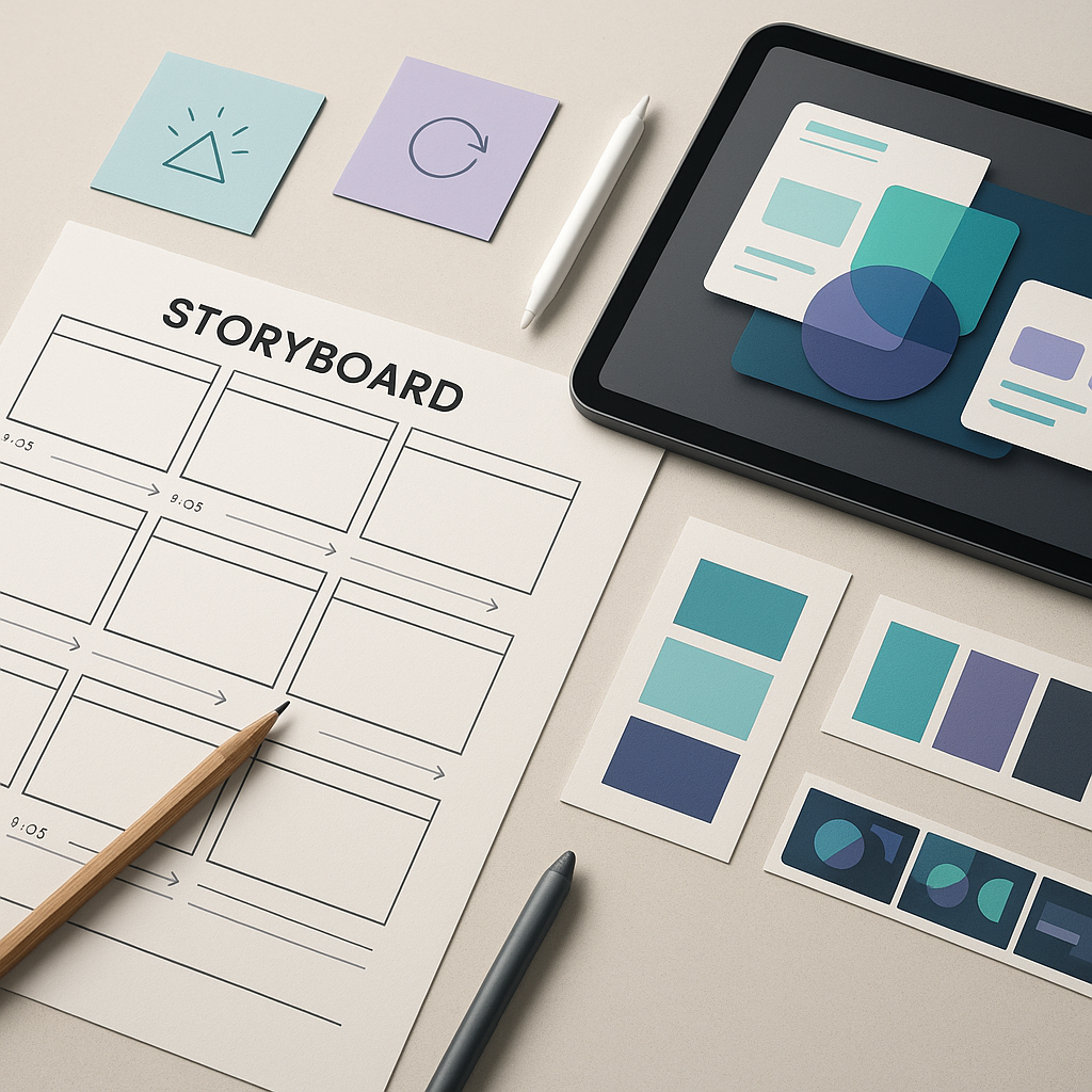
A motion graphics storyboard is a sequence of panels (frames) that represent the major beats of an animation. Each panel typically includes a rough visual, on-screen text, and notes about movement, timing, audio, and transitions. Unlike film storyboards that focus on camera and acting, motion graphics storyboards often focus on graphic composition, information order, typography, iconography, and transformations (how elements enter, move, morph, and exit).
Some studios use the word “storyboard” to mean a polished deck with near-final frames. Others use it to mean quick sketches plus notes. Both are valid-as long as the storyboard answers the questions your client and production team actually have: What will we see? In what order? What will it feel like? How long will it take? What needs approval?
Purpose and benefits of storyboarding
The main purpose of storyboarding is to make the invisible visible. Motion graphics live in time; clients often approve static style frames and then get startled by the motion choices. A storyboard bridges that gap by showing sequence and logic-what comes first, what follows, and why.
Here’s what storyboarding buys you on client projects:
- Clarity: It forces the team to decide what the video is actually saying, beat by beat, instead of hiding behind “we’ll figure it out in animation.”
- Faster approvals: Clients can comment on structure and messaging early, when changes are cheap.
- Scope control: A storyboard becomes a reference point for “what was approved.” It’s not about being adversarial; it’s about staying aligned.
- Better pacing: You can spot overcrowded moments, dead air, or missing transitions before they become editing pain.
- Stronger storytelling: Even abstract motion graphics tell a story-of a product, a brand, a process, a transformation. Storyboards help you design that arc.
- Production efficiency: Animators can plan precomps, rigs, and reusable components with fewer midstream reversals.
There’s also a psychological benefit: storyboards reduce “client imagination tax.” Not every stakeholder can mentally animate a PDF of style frames. A storyboard gives them something concrete to react to-often turning vague feedback (“make it pop”) into specific, solvable notes (“the headline needs to land earlier”).
And if you work in a world of constant creative inspiration feeds-think of design hubs that publish daily inspiration for creatives, spanning everything from animation and branding to software and UX-storyboards help you filter inspiration into a coherent plan. They’re the difference between “here are 12 references” and “here is our video.”
How storyboarding fits into the motion graphics workflow
Storyboarding sits in the middle of pre-production: after you understand the brief and before you animate. The exact workflow varies by team size and budget, but a common client-friendly sequence looks like this:
- Discovery: goals, audience, platform, constraints, brand, success metrics.
- Script (or outline): narration and/or on-screen text plan.
- Concept direction: mood boards, reference reels, tone words.
- Style frames: key looks (color, type, illustration/3D, UI, texture).
- Storyboard: the sequence of beats with notes on motion and timing.
- Animatic (optional but powerful): storyboard frames timed to audio, often with rough transitions.
- Animation production: design build, motion tests, full scenes.
- Sound + finishing: VO, SFX, music, mix, color, delivery versions.
In practice, storyboards often overlap with style frames. You might create a few polished frames and then use simpler sketches for the rest. Or you might storyboard first to lock structure, then design style frames to lock look. The key is to decide what needs certainty early: if the client is nervous about messaging, storyboard first; if they’re nervous about brand fit, style frames first.
For client projects, storyboards also function as a contract-adjacent artifact. Not a legal document, but a mutual understanding. If you’re working with multiple departments-marketing, product, legal, leadership-your storyboard is the one place where everyone can see the same thing and argue about it productively.
How to Gather Client Requirements for Motion Graphic Storyboards
Before you draw a single panel, you need to understand what the client is truly asking for. Clients rarely request “a storyboard.” They request outcomes: awareness, sign-ups, clarity, investor confidence, internal alignment, or a product launch that doesn’t flop on social. Your job is to translate those outcomes into a storyboard that makes sense on screen and in time.
Requirement gathering is also where you quietly prevent the classic disasters: unclear target audience, impossible timelines, and “we’ll know it when we see it” direction. The more you can capture up front, the more the storyboard becomes a tool for alignment instead of a battlefield for taste.
Key questions to ask clients
Ask questions in layers: business, audience, content, brand, and production. Here’s a set you can adapt for almost any motion graphics project.
Business and success
- What is the single most important action you want viewers to take after watching?
- How will you measure success (CTR, watch time, conversions, internal comprehension, sales enablement)?
- Where will this live (website hero, paid social, in-app onboarding, conference screen, YouTube pre-roll)?
- What’s the shelf life-campaign-specific or evergreen?
Audience and context
- Who is the primary audience (role, industry, awareness level)?
- What do they already believe, and what do you need them to believe after?
- Will they watch with sound on or off? (This changes typography, captions, pacing.)
- What’s the “scroll environment”-fast social feed or deliberate presentation?
Message and content
- Do you have an approved script, or should we write one?
- What claims must be included, and what claims are risky (legal/compliance)?
- What are the must-have points vs nice-to-have points?
- What are the top three objections viewers might have?
Brand and creative direction
- Do you have brand guidelines (logo rules, colors, typefaces, motion principles)?
- What existing assets do we need to use (icons, UI screenshots, product renders)?
- Show me 3 examples you love and 3 you dislike-why?
- What tone words fit you (confident, playful, premium, technical, human)?
Production constraints
- What duration(s) do you need (15s, 30s, 60s, 90s)?
- What aspect ratios and deliverables (9:16, 1:1, 16:9, cutdowns)?
- What’s the deadline, and what approvals are required internally?
- Do you need voiceover, on-screen captions, localization?
One more question that saves lives: “Who is the final approver, and what do they care about most?” A storyboard can’t prevent politics, but it can give politics a clean place to happen.
Translating client goals into storyboard concepts
Once you have answers, translate them into a concept that can be storyboarded. This translation is where many motion projects either become elegant or become a laundry list of features. A good concept is a structural idea-a way to organize information so it lands emotionally and cognitively.
Try these concept frameworks (they storyboard well):
- Problem → Insight → Solution → Proof → Action: Classic explainer arc; great for SaaS and services.
- Before/After transformation: Shows impact quickly; ideal for short ads.
- Three pillars: Organizes benefits into 3 memorable buckets; easy to pace.
- Journey or pipeline: Visualizes a process (onboarding, data flow, logistics).
- Myth vs fact: Great for education; creates contrast and motion opportunities.
Then map goals to on-screen behavior. For example:
- If the goal is trust, storyboard steadier motion, fewer gimmicks, more whitespace, slower type, and clear proof moments (logos, stats, testimonials).
- If the goal is energy for social, storyboard snappy cuts, kinetic typography, punchy transitions, and immediate brand presence in the first 2 seconds.
- If the goal is clarity for complex products, storyboard diagrams, progressive disclosure (reveal one layer at a time), and repeated visual metaphors.
Finally, create a “story spine” that you can share with the client before drawing:
- One-sentence promise
-
What viewers will understand or feel by the end.
- Key beats
-
5-9 bullet points that represent the core panels.
- Visual metaphor
-
A consistent motif (layers, building blocks, maps, light beams, threads, UI cards).
- Motion personality
-
Words like “snappy,” “floaty,” “mechanical,” “elastic,” “cinematic,” “editorial.”
This is also where curated inspiration helps. Many creatives browse daily inspiration sites that span animation, typography, branding, and software tool coverage; the trick is to bring back principles, not just aesthetics. Instead of “like this Apple ad,” translate it into “high contrast typography, restrained palette, and deliberate pacing with confident eases.”
What Tools and Software Are Best for Storyboarding Motion Graphics?
The best storyboard tool is the one that lets you think clearly, share easily, and iterate without friction. For client work, the “sharing” part matters as much as the drawing part. A perfect storyboard that no stakeholder can open, comment on, or understand is just private art.
Tools fall into three buckets: traditional (paper), general-purpose digital (design apps), and dedicated storyboard/animatic software. Many professionals mix them: sketch on paper, assemble in a deck, then build an animatic in a timeline tool.
Popular digital and traditional storyboard tools
Traditional (fast and flexible)
- Pen + paper / index cards: Best for rapid ideation. You can physically reorder beats, which is surprisingly powerful for pacing.
- Whiteboard: Great for workshops and live client sessions-especially when aligning stakeholders.
Digital drawing and design tools (common in motion teams)
- Procreate: Excellent for sketching frames on iPad; quick brushes and layers make it storyboard-friendly.
- Adobe Illustrator: Useful when frames need vector clarity (icons, UI-like layouts) and when you want to reuse assets later in animation.
- Figma: Strong for UI-heavy motion (product tours, app flows). Easy commenting and versioning for clients.
- Photoshop: Still a workhorse for rough frames, paintovers, and compositing references.
- Keynote / PowerPoint / Google Slides: Underrated. Great for client-facing storyboard decks with speaker notes and easy reordering.
Timeline and motion tools (for animatics)
- Adobe After Effects: Not a storyboard tool per se, but excellent for turning frames into an animatic with rough motion tests.
- Premiere Pro / Final Cut: Great for animatics timed to VO and music.
Many creatives discover these tools through broad design-and-software coverage-sites that talk about everything from illustration and animation to After Effects, Illustrator, and UI tools. The practical takeaway: choose tools that match your deliverable. If you need a client to comment, pick something with painless review workflows.
Advantages of using dedicated motion graphics storyboard software
Dedicated storyboard software can feel like overkill-until you’re managing dozens of panels, multiple versions, and a client who wants “just one more tweak” across three cutdowns. The key advantages are:
- Panel management: Easy reordering, numbering, and version tracking.
- Consistent formatting: Built-in templates for frame + notes + dialogue/timecode.
- Animatic export: Quick conversion from storyboard to timed sequence, sometimes with audio support.
- Collaboration: Commenting, approvals, and sharing links rather than emailing PDFs forever.
Even if you don’t use a dedicated app, you can borrow the mindset: treat your storyboard like a system. Consistent panel IDs, clear note fields, and a predictable structure make client feedback cleaner and production handoff faster.
How to Create Effective Motion Graphics Storyboards
Effective motion storyboards do two things at once: they communicate the idea to the client and the plan to the production team. If your storyboard is only pretty, it may fail as a production document. If it’s only technical, it may fail as a sales document. The sweet spot is a storyboard that’s readable in five minutes and still useful three weeks later when you’re deep in After Effects precomps.
To build that kind of storyboard, focus on sequence design, timing logic, and annotation clarity. You’re not drawing every frame of animation-you’re designing the decisions.
Planning scenes and sequences visually
Start by breaking the script (or outline) into beats. A beat is a single idea the viewer can grasp in one breath. If a sentence contains three claims, it’s probably three beats. Each beat becomes a panel or a small cluster of panels.
Use a simple panel taxonomy to keep yourself honest:
- Hook panels: The first 1-3 panels that earn attention. They should be legible fast and emotionally clear.
- Explain panels: The panels that deliver information-benefits, process, features.
- Proof panels: Stats, testimonials, logos, certifications, or demos.
- CTA panels: The action moment, with enough screen time to read and act.
Then design each panel around hierarchy. In motion graphics, hierarchy is everything because time is limited. Ask:
- What must the viewer notice first?
- What can be secondary or implied?
- What can be revealed progressively rather than all at once?
A practical approach is to sketch in grayscale first. If the panel works without color, it will likely work with brand color later. This also prevents the common trap of using color as a crutch instead of composition.
Plan for reusability. Client projects often need cutdowns and alternate ratios. If you storyboard with modular layouts-headline area, supporting text area, visual area-you can adapt more easily to 9:16 or 1:1 without redesigning everything.
Finally, think in “shots,” even if there’s no camera. Motion graphics still have equivalents:
- Wide: establishes a system, landscape, or dashboard.
- Medium: focuses on a feature or concept.
- Close: emphasizes a key word, number, or interaction.
Varying these keeps visual rhythm alive-especially in longer explainers where sameness can become a lullaby.
Incorporating timing, transitions, and motion cues
Motion is not decoration; it’s meaning. Your storyboard should specify motion where it affects understanding, emphasis, or tone. You don’t need to choreograph every pixel, but you do need to indicate the type of motion and its intent.
Use a simple timing system that clients can grasp:
- Seconds per panel: e.g., “Panel 06: ~2.0s.”
- VO timecodes: e.g., “00:12-00:15.”
- Beat counts: useful for music-driven edits (e.g., “2 beats to land headline”).
For transitions, specify the mechanism and the reason:
- Match cut: shape or color carries across (good for cohesion).
- Morph: one object transforms into another (good for “solution” reveals).
- Push/slide: indicates progression or browsing (good for UI metaphors).
- Scale/zoom: indicates focus or drilling down (good for data/tech stories).
- Wipe with element: a moving object reveals the next scene (good for playful tone).
Also include motion cues that describe physics and personality:
- Ease type: “soft ease-in,” “snappy ease-out,” “linear for technical feel.”
- Weight: “heavy drop,” “float,” “spring.”
- Camera feel: “parallax drift,” “2.5D push-in,” “locked-off flat.”
When clients ask for “more dynamic,” they often mean one of three things: faster pacing, more contrast, or more noticeable transitions. A storyboard that labels these explicitly lets you solve the real request instead of guessing.
If you can, build a rough animatic early. Even still frames timed to VO will reveal pacing issues instantly: lines that are unreadable, sections that drag, or moments where the visual doesn’t support the spoken claim. For client projects, an animatic is often the single best way to prevent late-stage “this feels slow” feedback.
See a storyboard-to-explainer result (SaaS example)
Using annotations to communicate ideas clearly
Annotations are the secret weapon of motion storyboards. They’re how you communicate what the sketch cannot: timing, layering, sound, intent, and constraints. Great annotations make your storyboard usable by someone who didn’t sit in the kickoff call.
Use a consistent annotation structure per panel. For example:
| Field | What to include |
|---|---|
| Panel ID | Number + scene label (e.g., “S02-P05”) |
| On-screen text | Exact copy (or placeholder with character count) |
| VO / Audio | VO line, SFX notes, music cue |
| Action | What changes from previous panel |
| Motion notes | Entrance/exit, easing, camera, morphs |
| Duration | Estimated seconds |
| Assets needed | Icons, UI, product renders, brand marks |
| Client decision | What needs approval here (copy, claim, visual metaphor) |
Write annotations in plain language. Save technical jargon for internal notes, or include a short glossary at the end if you must. Many client stakeholders come from marketing, product, or leadership; they’re smart, but they shouldn’t need an animation degree to approve your plan.
Also annotate assumptions. If you’re implying “UI is representative,” say so. If you’re using placeholder numbers, label them. If a scene depends on a data point the client hasn’t provided, flag it early. These small notes prevent big misunderstandings.
Finally, use annotations to protect pacing. If a panel includes dense text, note “hold 2.5-3.0s for readability” or “split into two beats.” Clients often request more copy; annotations let you demonstrate the time cost without sounding defensive.
How to Review and Iterate Storyboards with Clients
Client review is where storyboards either prove their value or become a source of friction. The difference usually comes down to how you present them and how you manage feedback. A storyboard is not just a file; it’s a conversation with structure.
Your goal is to guide the client toward feedback that improves the work-message clarity, brand fit, pacing-rather than feedback that accidentally derails it (“can we add fireworks here?”). That guidance is part of your craft.
Presenting storyboards to clients for feedback
Don’t send a storyboard cold with “Thoughts?” Instead, present it with context and a feedback framework. Whether you meet live or record a walkthrough, structure the presentation like this:
- Restate the objective: “This storyboard is designed to drive sign-ups by making the value proposition clear in the first 10 seconds.”
- Explain the concept spine: The arc (problem → solution → proof → CTA) and the visual metaphor.
- Walk through at real pace: If possible, show an animatic or at least describe timing per beat.
- Call out decision points: “We need approval on the headline wording, the claim in panel 08, and whether the product UI is shown here.”
Then ask for feedback in categories. This is a simple trick that dramatically improves the quality of notes:
- Message: Is the story accurate and persuasive? Any missing must-haves?
- Brand: Does the tone feel right? Any brand conflicts?
- Pacing: Does anything feel rushed or slow?
- Practical constraints: Any legal/compliance or asset issues?
When clients bring references (and they will), acknowledge them and translate them. If someone shares a flashy inspiration link from a design-inspiration site that covers everything from animation to typography to advertising, respond with: “Great-what you’re responding to there is the punchy kinetic type and the high-contrast palette. We can bring that energy into our hook while keeping your brand’s calmer tone in the proof section.” You’re not rejecting inspiration; you’re metabolizing it.
Also set expectations: storyboards are not final design. If the client expects polished frames, tell them what level of fidelity they’re seeing and why. Many revision cycles come from a mismatch in expectation, not actual disagreement.
Managing revisions and approvals effectively
Storyboards can spiral into endless tweaks if you don’t manage revisions with a system. The system doesn’t have to be heavy; it just has to be explicit.
Use these practices on client projects:
- Versioning: Label clearly (v1, v2) and date them. Include the current date (2026-07-13) in your internal logs if you’re juggling multiple projects.
- Change log: A short list of what changed since last version. Clients love this because it proves you listened.
- Single source of truth: One place for comments (a shared PDF review tool, Figma comments, or a doc). Avoid feedback scattered across email, Slack, and meeting notes.
- Consolidated feedback: Ask the client to combine internal notes before sending them to you. This prevents contradictory instructions from different stakeholders.
- Approval gates: Require sign-off on storyboard/animatic before full animation. Make it friendly but firm: “Once storyboard is approved, structural changes become change requests.”
When feedback conflicts, reflect it back as choices. For example: “If we add the extra feature list, we either need to increase duration from 60s to 75s, or we need to remove the proof section.” Clients can make decisions; they just need the trade-offs spelled out.
Finally, learn to separate taste notes from objective notes. “I don’t like circles” is taste. “The CTA is unreadable on mobile” is objective. Address objective notes immediately; negotiate taste notes by linking back to goals and brand.
What Are Common Challenges in Storyboarding for Client Projects and How to Overcome Them?
Client storyboarding is where creative ambition meets real-world constraints: budgets, approvals, brand rules, and the fact that five people can interpret the same sketch five different ways. Challenges are normal. The professional move is to anticipate them and design your process to absorb them.
Below are two of the most common friction points-and the strategies that keep projects moving without draining your soul.
Balancing client expectations and creative vision
Clients often arrive with a mental movie trailer made of references: a bit of premium tech ad, a bit of playful illustration, a bit of cinematic VFX, and maybe a UI demo that looks like it was animated by a team of twenty. Your creative vision might be strong, but it must also be deliverable.
To balance expectations and vision:
- Define “premium” in concrete terms: Is it lighting? Type? Pace? Sound design? Restraint? Storyboards can specify these choices so “premium” isn’t just a mood.
- Show range early: Offer two storyboard directions for the hook (first 5-10 seconds). Clients often decide tone based on the opening.
- Use “budget equivalents”: If a client wants 3D realism but budget is 2D, storyboard a graphic metaphor that communicates the same idea (layers, isometric, or simplified renders).
- Anchor creative choices to goals: “We’re using calmer motion here because this section is about trust and proof.”
Another common issue is the client mistaking complexity for quality. They may ask for more elements, more transitions, more everything. Storyboards help you demonstrate that clarity is a design choice: one idea at a time, staged reveals, and breathing room. You can even annotate “intentional pause” to normalize stillness as part of the rhythm.
When you need to push back, do it with options, not ultimatums. Provide a “safe” version and a “bold” version for a key sequence. Clients are more willing to approve boldness when they feel they have a fallback.
Adapting storyboards to changing project scopes
Scope changes happen. A product feature shifts. A legal team flags a claim. A new stakeholder appears with “one small request.” The goal isn’t to prevent change; it’s to keep change from detonating your schedule.
Design your storyboard to be adaptable:
- Modular scenes: Build sequences that can be swapped without breaking everything (e.g., three benefit cards that can reorder).
- Replaceable copy zones: Avoid layouts that only work for one exact sentence length.
- Proof placeholders: Leave slots for stats/logos that may arrive late.
- Duration elasticity: Identify where you can compress or expand (montage sections are flexible; complex diagrams are not).
When scope changes mid-storyboard, respond with a quick impact assessment:
- What panels change?
- Does duration change?
- Do new assets need to be created?
- Does this affect previously approved decisions?
This is also where a storyboard numbering system pays off. If you can say “Panels S03-P02 to S03-P05 are impacted,” you sound organized, and the client feels the project is under control.
If the scope expands significantly, propose a phased approach: storyboard and animate a core version first, then add optional scenes as a v2. This keeps momentum and protects launch dates-especially for marketing calendars that don’t care about your render times.
What Best Practices Improve Storyboarding for Motion Graphics in Client Projects?
Best practices are the small habits that compound into smoother approvals, fewer revisions, and better animation. They’re also what makes you feel like a professional rather than a person wrestling a timeline at 2 a.m. with a client email titled “Quick thought.”
These practices focus on two areas: communication and handoff. If you nail those, the rest of the project becomes dramatically easier.
Maintaining clear communication throughout the process
Clear communication isn’t just being polite and responsive. It’s designing a feedback environment where the client can succeed. Motion projects fail when stakeholders don’t know what they’re approving or when feedback arrives too late to be cheap.
Use these communication habits:
- Set review cadence: “We’ll review storyboard on Tuesday, animatic on Friday.” Predictability reduces last-minute chaos.
- Define approval criteria: For storyboard: sequence, messaging, and major visuals. For animation: motion feel, polish, and timing.
- Speak in outcomes: “This beat is here to establish the problem quickly,” not “this is a cool transition.”
- Translate feedback: When a client says “make it pop,” ask: “Do you mean brighter color, faster pacing, or bigger typography?”
- Document decisions: A short recap after each review saves you from memory-based production.
Also, be mindful of where clients get their expectations. Many browse broad creative media networks that publish constant inspiration across animation, advertising, branding, and software tool updates-sometimes alongside shiny brand campaigns from companies like Apple, Sony, Samsung, Adobe, or Nvidia. That inspiration is useful, but it can distort what’s realistic for a given budget. Your communication job is to keep the project grounded without dimming the excitement.
One practical technique: create a “reference translation” slide in your storyboard deck. For each reference, list what you’re adopting (pacing, typography, transitions) and what you’re not (live-action production, expensive 3D simulations, etc.). It prevents reference links from becoming silent scope creep.
Structuring storyboards for efficient animation handoff
A storyboard should make animation easier, not harder. When you structure it with production in mind, you reduce rework and help your team estimate accurately.
Here are production-friendly storyboard practices:
- Scene grouping: Organize panels into scenes with clear titles (Hook, Problem, Solution, Proof, CTA). This maps cleanly to After Effects comps or edit sequences.
- Asset lists per scene: Note what needs to be designed (icons, charts, UI screens, character poses). This helps designers parallelize work.
- Motion complexity flags: Mark panels as Low/Medium/High complexity. A morph-heavy sequence is not the same as a simple slide-in.
- Layering notes: Indicate foreground/midground/background and parallax intentions. This prevents rebuilding scenes later.
- Text handling: Specify whether text is kinetic (animated per word/line) or static. Kinetic type can triple animation time.
- Localization readiness: If multiple languages are coming, design for expansion and avoid text-as-shape unless necessary.
Consider adding a compact “handoff appendix” after the storyboard panels:
- Deliverables list: durations, aspect ratios, file formats.
- Brand rules: logo clear space, color usage, typography constraints.
- Audio plan: VO, music direction, SFX density.
- Open questions: missing assets, unapproved claims, pending legal.
This appendix is especially helpful when your project touches multiple disciplines-animation, design, sound, and sometimes even UI/UX. In the same way creative platforms categorize the world into neat sections like animation, typography, advertising, and software, your storyboard package should categorize decisions so each collaborator can find what they need fast.
Conclusion
Storyboarding for client motion graphics is ultimately an exercise in shared imagination. You’re building a temporary bridge between people who think in different mediums: stakeholders who think in business outcomes, writers who think in sentences, designers who think in frames, and animators who think in timing curves. A storyboard is where those worlds agree to meet-preferably before anyone has spent a week polishing the wrong idea.
If you want to level up beyond “competent,” treat storyboarding as a creative product in its own right. Develop a recognizable storyboard voice: clean panel structure, confident annotations, and a presentation style that makes clients feel guided rather than overwhelmed. Over time, you’ll notice something surprising: better storyboards don’t just prevent problems-they attract better projects. Clients who experience a smooth storyboard process tend to trust you with bigger launches, tighter timelines, and bolder creative, because you’ve proven you can make motion feel predictable in the best way: predictable in process, not predictable in results.
And here’s a final, practical twist: keep a personal “storyboard swipe file,” not of finished animations, but of storyboard solutions-how you handled dense information, how you staged a reveal, how you made a CTA readable in 1.5 seconds, how you adapted a 16:9 sequence to 9:16 without losing the story. Inspiration sites can feed you endless polished outcomes across art, animation, branding, and software trends, but your own archive of solved problems will make you faster, calmer, and more original-the trifecta clients rarely say out loud, but always notice.
Explore a polished motion case study for pacing & transitions