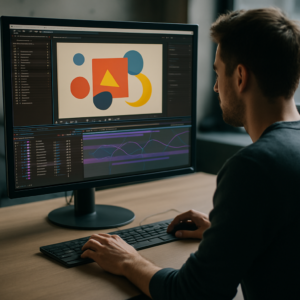
YouTube intros in 2026 are short, punchy identity markers that decide if viewers stay or swipe. Editors, motion designers, and creators need intros that feel fresh but are fast to produce. This guide breaks down trending YouTube intro styles, viral animation patterns, and concrete After Effects workflows so your next upload looks current and intentional.Explore intro templates
📋 Table of Contents
What trending YouTube intro styles really mean in 2026
Defining trending intros in 2026
Trending YouTube intro styles in 2026 are short branded sequences, usually 3–7 seconds, that set tone, niche, and expectations before the main content starts. They combine clean typography, subtle animation, and on-beat motion design instead of long logo reveals or loud stingers.
Why intros still matter
Audience retention graphs show that the first 5 seconds decide if viewers keep watching. A modern intro:
- Signals production quality and reliability
- Builds recognizable branding across episodes and playlists
- Helps viewers instantly know they are in the right place
- Makes your edits feel cohesive, especially in series formats
Who these styles are for
These 2026 intro trends are especially relevant for:
- Editors cutting recurring shows, faceless channels, or branded content
- Motion designers building reusable packages for creators and agencies
- Solo creators who want a studio-level look without full-time design support
Key characteristics of 2026-ready intros
- Short and skippable – 3–5 seconds is ideal for most niches
- Style-consistent – same color, type, and motion language across all uploads
- Audio-aware – animation timed to beats, impacts, or vocal cues
- Template-friendly – easy to batch-update text, thumbnails, and colors
How this sets up your workflow
Once you understand the role of the intro, you can design it as a modular system rather than a one-off animation. That mindset makes After Effects templates, presets, and reusable project files far more valuable, because they become the backbone of your channel identity rather than a single effect.
Understanding viral intro animation styles and formats
What makes a viral intro animation
A viral intro animation is not just visually loud. It is a tightly timed, highly legible sequence that matches the channels voice and hooks viewers emotionally or visually within seconds. Think of it as a motion logo plus mood board, compressed into a tiny time window.
Common viral intro formats in 2026
- Minimal text builds – clean type animating in with micro-movements and subtle motion blur
- UI-inspired widgets – intros built from panels and overlays similar to YouTube interface-style widgets that feel native to the platform
- Vertical-first layouts – designed to crop well for Shorts and Reels without reanimating everything
- Beat-driven kinetic type – words scaling and sliding to drum hits or bass drops
- Hybrid live-action + motion – quick cut of creator facecam with animated overlays and titles
Choosing the right style for your niche
Different channels naturally gravitate to different intros:
- Tech and finance – crisp, UI-based panel and widget layouts with subtle gradients and data-style motion
- Gaming and pop culture – punchy kinetic typography with energy, glow, and pixel or glitch accents
- Music and lyrics content – lyric-style builds similar to animated music visuals, but shorter and more logo-focused
- Education and productivity – soft, minimal lower-third expansions and clean type with calm easing
Intros for Shorts vs long-form videos
Viral intro animation for Shorts is often just 1–2 seconds, if used at all. Long-form videos can sustain 3–7 seconds. For many channels, the trend is toward:
- Using a micro intro or bumper at the very start of a Short
- Using a more developed intro after the hook in long-form content
- Building a single After Effects system that outputs both versions
Templates as a base for viral experiments
Instead of designing a new intro from scratch each time, many editors start from flexible motion templates and then iterate timing, color, and layout to find what resonates with their audience. Once data shows what works, they lock the style and roll it out across playlists.
Typical intro mistakes editors make in After Effects
Overshooting length and pacing
One of the biggest mistakes in YouTube intros is simply making them too long. Anything over 7 seconds usually spikes drop-off. Signs that the pacing is off include:
- Logo animation taking more than 3 seconds to fully appear
- Multiple slow transitions before the viewer sees any content
- Intro music that does not align with the first beat of the main track
Messy compositions and precomps
When intros evolve over months, they often become unmanageable. Common issues:
- Randomly named comps like “Comp 2” or “Final_v8_new_new”
- Nested precomps with duplicated animations that are hard to update
- Essential elements (logo, social handles) buried many levels deep
Poor keyframe and graph editor usage
Even good layouts can feel amateur if timing is off. Mistakes include:
- Linear keyframes everywhere, creating robotic motion
- Excessive Ease In/Out without checking the speed graph
- Un-synced easing between multiple elements, making motion feel random
Overusing heavy effects and plugins
Intros are reused hundreds of times, so performance matters. Problems:
- Stacked glow, blur, and particle effects on multiple layers
- Relying on niche plugins that break on other machines
- 4K comps with unnecessary motion blur and depth-of-field
No system for brand consistency
Another pain point is having each intro slightly different, which erodes brand recognition. Editors often:
- Change typefaces per project without a style guide
- Manually recolor each intro, leading to off-brand shades
- Forget to sync intro style with overlays and lower thirds
Checklist to avoid common issues
- Limit intro duration to 3–7 seconds and test retention
- Use a clear folder and comp structure for logos, titles, and backgrounds
- Polish motion with the graph editor and consistent easing presets
- Pre-render heavy elements if they do not change between videos
- Document font, color, and logo usage in a quick reference note inside the project
Picking the right intro style for each YouTube format
Matching intro style to content type
The same intro does not always work across tutorials, commentary, and cinematic edits. A smart decision flow looks like this:
- Tutorials and educational content – ultra-clear type, minimal motion, time budget of 3–5 seconds, intro can appear after a quick spoken hook
- Entertainment and vlogs – more personality, color, and rhythm, 4–6 seconds, often right at the start
- Cinematic and storytelling – slower build, but still short, integrating title cards into the first scene
Ad-friendly and sponsor-ready intros
If you run sponsorships, your intro should leave space for:
- A short sponsor slate or bug
- Clear logo lockup that can be reused in ad bumpers
- Visual cues for chapters and segment starts
Leveraging templates and motion systems
Using a library-based approach lets you adapt intro styles per format without breaking brand identity. Unlimited After Effects Templates Subscription models are popular among editors because they allow you to:
- Test several intro concepts quickly and keep the best performer
- Reuse animation systems for openers, lower thirds, and end cards
- Stay visually consistent across long-form episodes and Shorts
Learning from high-performing channels
Study how successful creators structure intros by watching their first 10 seconds on YouTube. Pay attention to:
- When the intro hits relative to the hook
- How long the logo is fully visible
- How motion and sound reinforce each other
Simple decision framework
When choosing an intro style for a new project, ask:
- What is the main emotion (trust, hype, calm)?
- Where will this intro appear (hook-first or cold open)?
- How often will this series publish (weekly, daily)?
- Do I need variations for Shorts, clips, and compilations?
By answering these, you can select a core animation system first and then adapt durations, aspect ratios, and layouts for each format instead of starting from zero every time.Get intros for every format
Building a practical After Effects intro template workflow
Start with the right project foundation
Before animating, lock your tech specs:
- After Effects version – choose a project file compatible with the oldest version you or your team uses, especially if collaborating worldwide
- Frame rate – usually 23.976 or 25 fps for cinematic, 30 fps for typical YouTube content
- Resolution – 1920×1080 for standard, 4K only if you really need it, plus vertical comps for Shorts
Organized comps, precomps, and naming
Treat your intro as a reusable system, not a single comp:
- Create a main comp like “Intro_Master_1080p”
- Use precomps for Logo, Main Title, Background, and Overlays
- Label layers by role and color-code them (e.g., text, controls, background)
Keyframe structure and timing
Plan your key events on the timeline:
- 00:00–00:10 – Quick hook or first sound beat
- 00:10–01:00 – Main logo and title build
- 01:00–01:20 – Accent details and exit transition into content
Keep keyframes grouped logically and use the graph editor to create consistent motion curves. Save your favorite ease setups as presets so other editors on your team can match the feel.
Performance and preview tips
Intros can be effect-heavy, so keep them responsive:
- Work in half-resolution unless checking pixel details
- Solo key layers while roughing in timing
- Use proxy footage or simplified artwork where possible
- Purging cache regularly when testing multiple variants
For extremely effect-driven looks like liquid or glass morphs, base your structure on a pre-optimized comp, similar in spirit to the setups found in projects like liquid-style animations.
Managing plugin dependencies
When building an intro template for broad reuse:
- Avoid rare third-party plugins unless absolutely necessary
- If using popular plugins, keep a no-plugins fallback version
- Pre-render heavy effects as MOV or PNG sequences for reuse
Customization controls for clients and teams
Make it easy for someone else to update the intro without breaking it:
- Create a dedicated “CONTROLS” comp or layer with effect sliders and color controls
- Expose key customization options: brand colors, title text, social handles, logo swap
- Use expressions and pick-whips to link multiple elements to the same control
Branding, typography, and color workflow
Introduce a simple hierarchy:
- One primary heading font and one secondary font for supporting text
- 1–2 brand colors plus a neutral gray or dark background tone
- Contrast-checked combinations to keep text legible on small screens
Adapting for multiple platforms
From a single core template, build variations for:
- Reels and Shorts – vertical 9:16 crops with bigger typography and minimal side details
- Mid-roll segments – shortened 1–2 second bumpers for chapters or sponsors
- Product promos – intros that highlight a product shot or CTA instead of a generic logo
Practical step-by-step checklist
- Define duration, fps, and resolution for your main intro
- Structure project with clear comps and color labels
- Block out timing with simple shapes and text first
- Refine easing and motion in the graph editor
- Add secondary details like light flickers, textures, and overlays
- Wire all key colors and texts to a single control panel
- Duplicate and adapt the master for vertical and short variants
- Save a clean template copy before customizing for specific clients or series
With this workflow, you can maintain one master intro system and repeatedly output fresh, niche-specific intros without redoing the whole animation every time.
Advanced techniques for consistent, scalable intro systems
Thinking in reusable systems, not shots
Once your base intro is built, treat it as a design system. That means:
- Using modular precomps for different segments or moods
- Designing transitions that can also work as scene openers
- Building reusable “animation motifs” such as wipes, slides, and pop-ins
Styleframes and visual benchmarks
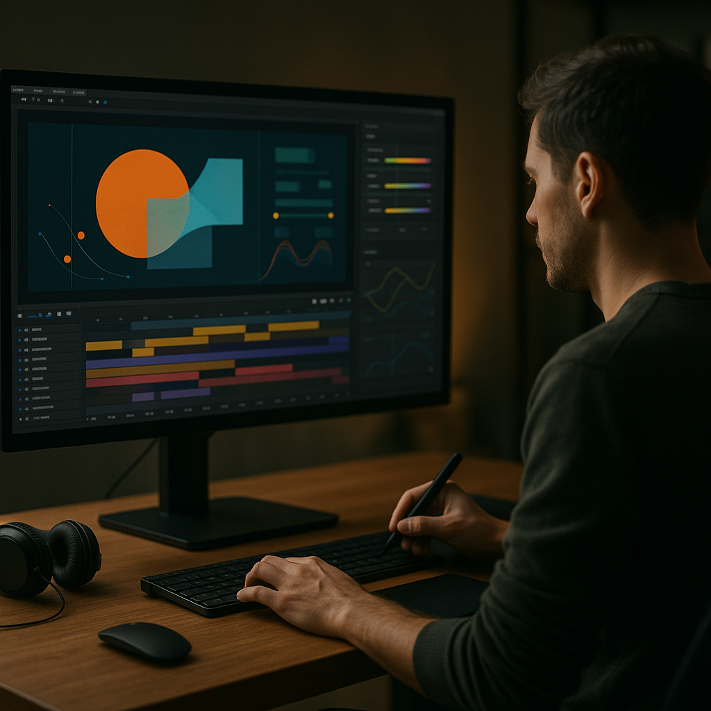
Create a set of 3–5 keyframes that represent the intro at different stages: first reveal, full logo, and exit state. These styleframes help new editors or collaborators understand how to match future elements like lower thirds or widgets. Visuals with layered UI panels, similar to editing dashboard layouts, make especially strong references.
Maintaining consistency across a full edit
To keep your intros aligned with the rest of your video:
- Reuse the same easing presets for intros, title cards, and lower thirds
- Keep one master color control that feeds intros, overlays, and end screens
- Store your intro, interstitials, and end cards in a single master project or motion package
Export, render, and delivery strategy
For most editors, the most reliable flow is:
- Render the intro as a high-quality transparent video (e.g., ProRes or similar codec with alpha)
- Drop that render into your editing tool of choice
- Only reopen After Effects when updating the master system
This keeps your NLE timeline light and avoids repeated heavy renders.
Dynamic Link and collaborative pitfalls
While dynamic linking between apps is convenient, it can slow down timelines in larger projects. To stay safe:
- Use dynamic link only during design and approval phases
- Exchange finalized intros as rendered assets for long-term projects
- Document the required fonts, effects, and version in a simple text note
Quality control before publishing
Before sign-off, run a quick QC pass:
- Check text readability on phone-sized preview windows
- Confirm the audio peak and perceived loudness of intro sound effects
- Verify that motion looks smooth at playback speed on mid-range hardware
- Rewatch the first 10 seconds to ensure the intro does not overshadow the hook
Scaling to multiple channels or brands
If you manage several channels or clients worldwide:
- Make a base template with neutral design language
- Duplicate and customize color, type, and logo for each brand
- Keep all variants in a single library, clearly labeled per client or niche
By treating your intro packages as living systems instead of one-off shots, you drastically reduce future workload while keeping your channels visual identity sharp and current.
Long-tail intro and motion design questions editors are asking
Common search intents around intros and viral animation
Editors and creators search in very practical terms. Here are frequent questions, with quick answers:
- Best length for a YouTube intro in 2026 – For most channels, 3–5 seconds; up to 7 seconds for cinematic or episodic content. Shorts often use 1–2 second bumpers or no intro at all.
- How do I make intros feel less templated – Customize timing, audio hits, colors, and small layout details. Replace stock icons with unique shapes. Swap in motion motifs from other sequences, like patterns used in a music-inspired animation, to inject personality.
- Do I need a different intro for each series – Keep one core animation system, then adjust titles, palette accents, and background textures per series so that everything still feels like the same brand family.
- How to sync intros with music beats – Place markers on your audio layer, then align key actions like logo pops and text slides to those markers. Use the Dope Sheet or timeline zoom to line up hits frame-accurately.
- Are logo stings outdated – Long logo-only stings are fading out, but short, integrated logo beats that merge quickly into content are still very effective, especially when combined with kinetic type.
- How often should I update my intro style – Typically every 12–18 months or when you significantly change your content direction. Smaller tweaks (color shifts, new textures) can happen more often without confusing viewers.
- Can I reuse intro animations for ads – Yes. Shorten the intro, keep the strongest 1–2 seconds, and use that as the opening beat for pre-roll ads or sponsored segments. Make sure any music licensing covers ad usage.
Answering these questions inside your own workflow documentation helps clients and collaborators understand why your intros look the way they do and how to keep them consistent over time.
Trends to watch and final steps for your 2026 intro strategy
Emerging visual trends for 2026
Across niches, certain patterns are appearing in trending YouTube intro styles for 2026:
- Soft gradients and blurred light passes instead of harsh glows
- Minimal UI-inspired overlays that reference the platform layout
- Micro-animations that feel tactile and snappy without being noisy
- Subtle nods to real-world textures, like glass, plastic, or paper
These looks pair well with concise, readable typography and clean logo treatments.
Actionable next steps for editors and motion designers
- Audit your channels first 10 seconds across several videos and note retention behavior.
- Define one master intro system that can output multiple durations and formats.
- Set a clear style guide for type, color, and motion that applies to intros, titles, and end screens.
- Save a clean template version of your best-performing intro for future updates.
Why a system beats one-off shots
Building a reusable intro framework in After Effects means every future video starts from a stable, polished baseline. You spend less time rebuilding similar animations, keep branding consistent, and focus more on story and pacing. Over months of uploads, this adds up to cleaner motion, faster editing sessions, and more predictable, professional results on every channel you manage.
Once that system is in place, testing new visual trends or formats is low-risk: duplicate, iterate, and ship a new variation without disturbing the master. That is the most sustainable way to stay on-trend with YouTube intros while protecting your schedule and output quality.Upgrade your intro workflow
Conclusions
Trending YouTube intro styles in 2026 reward editors who think in systems: short, on-brand, reusable motion setups that adapt to any format. With organized After Effects projects, clear style rules, and a smart template workflow, you can ship intros that feel current, load fast, and stay consistent across every upload, client, and channel you handle.
FAQ
How long should a YouTube intro be in 2026?
Aim for 3–5 seconds for most channels and under 2 seconds for Shorts. Only go longer if the intro is tightly integrated with storytelling and retention is strong.
What makes an intro feel modern instead of dated?
Clear typography, restrained effects, subtle gradients, and precise timing to audio beats feel current. Avoid long 3D logo spins, heavy lens flares, and slow reveals.
Do I need different intros for YouTube Shorts and long-form?
Use one core intro system but output separate durations and layouts. Shorter, punchier variants work better for Shorts, while long-form can sustain slightly longer builds.
How can I keep intro templates editable for clients?
Expose key settings in a control comp, name layers clearly, avoid rare plugins, and document fonts and colors. This lets clients update text and logos safely.
Should I render my intro or keep it live-linked?
For reliability, render a high-quality file with alpha for regular use and keep the original After Effects project only for periodic design updates or new variations.
How do I test if an intro is hurting retention?
Upload a few videos with the new intro, then study the first 10 seconds in audience retention analytics. If viewers drop before the content starts, shorten or simplify it.