
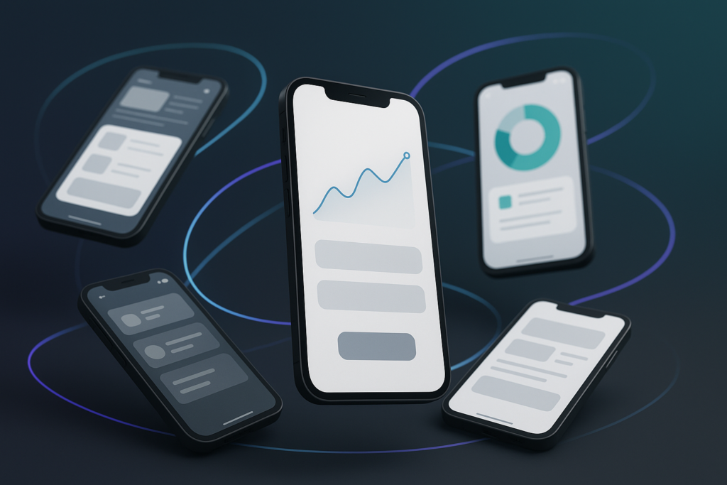
The best After Effects templates for app promo videos are the ones that let you showcase your UI clearly, move fast without looking generic, and adapt to your brand (colors, typography, pacing, and tone) without a wrestling match in the timeline. In practice, that means choosing templates built around device mockups and screen replacements, with clean typography controls, sensible animation timing, and export-ready versions for the platforms you actually use (App Store previews, Google Play, TikTok, Instagram Reels, YouTube, product pages, and pitch decks). The rest of this guide breaks down what to look for, where to find reliable options, how to customize them like a pro, and what mistakes quietly ruin otherwise good promos.
📋 Table of Contents
What Are After Effects Templates for App Promo Videos?
After Effects templates for app promo videos are pre-built project files (usually .aep or packaged projects) designed to help you create a polished promotional video without animating everything from scratch. They typically include animated scenes, text layouts, transitions, and placeholder areas where you drop in your app screens (static screenshots or screen recordings), then tweak colors and copy to match your product.
Think of them as a well-designed stage set: the lighting cues, camera moves, and scene changes are already choreographed. Your job is to cast the right “actors” (your UI screens), write the lines (your benefit-driven text), and choose the costume palette (brand colors and fonts). The result is a video that looks intentional and modern-without spending a week building the same phone mockup animation for the hundredth time.
Most app promo templates fall into a few familiar styles: sleek device mockups with floating UI, kinetic typography with screen cut-ins, “story” sequences for vertical platforms, or feature-by-feature explainers. Many include multiple versions (horizontal/vertical/square) and controls via Essential Graphics, which makes them friendlier for teams that don’t live in After Effects every day.
What Features Define Effective App Promo Templates?
An effective template is not the one with the most fireworks-it’s the one that makes your app feel easy, desirable, and trustworthy in the first five seconds. The strongest templates are built around clarity: clean compositions, legible type, and motion that guides the eye exactly where you want it.
Look for templates that offer:
- Smart screen placeholders (drop zones for screenshots or video) with perspective, corner pinning, and device masking done correctly.
- Readable typography with adjustable font sizes, line spacing, and safe margins for mobile viewing.
- Modular scenes so you can reorder, delete, or duplicate sections without breaking the entire project.
- Brand controls (global color controllers, font controls, logo slots) rather than hunting through fifty precomps.
- Reasonable render performance-because a template that takes 4 hours to render a 20-second video is a template you’ll stop using.
- Multiple aspect ratios or at least a layout that adapts gracefully to 9:16, 1:1, and 16:9.
Also pay attention to the “invisible” features: consistent easing curves, timing that leaves room for comprehension, and transitions that don’t distract from the UI. The best templates feel like a confident product demo, not a magic trick.
Finally, an app promo template should respect the reality of UI footage: screens are often high-contrast, text-heavy, and packed with tiny details. Templates that add heavy blur, aggressive shake, or overly stylized overlays can accidentally sabotage the very thing you’re trying to show.
How Do Templates Improve Video Production Efficiency?
Templates improve efficiency by turning a blank timeline into a structured system. Instead of designing motion language from scratch-camera moves, scene pacing, text reveals, device framing-you start with a proven framework and spend your time on what actually sells the app: the narrative and the UI.
In practical terms, templates save time in at least four ways:
- Faster iteration: you can test different hooks, taglines, and screen sequences without rebuilding animations.
- Consistency: your videos look like a series (same motion style, same type system), which is helpful for ongoing campaigns.
- Team handoff: marketers can update text and screenshots with minimal After Effects expertise when templates use Essential Graphics well.
- Platform scaling: many templates include versions or guides for multiple formats, so you’re not reinventing the layout for every channel.
Efficiency isn’t just speed; it’s also fewer mistakes. When device masks are already aligned and transitions are already polished, you avoid the small alignment errors that make a promo feel “almost professional.” Templates reduce the amount of “almost.”
What Are the Benefits of Using After Effects Templates for App Promo Videos?
The biggest benefit is simple: templates help you look expensive on a realistic budget. A strong app promo video needs rhythm, clarity, and visual confidence. Templates give you those fundamentals immediately, which is why they’re popular with startups, agencies, indie developers, and in-house teams that need results yesterday.
Another major benefit is creative momentum. Starting from zero can be paralyzing-especially when you’re trying to communicate an app’s value in 15-30 seconds. Templates provide a “default story structure” (intro hook → feature highlights → social proof or benefit → call to action), and that structure nudges you toward a coherent edit.
Templates also help you standardize your brand presence. If your app updates frequently, you’ll likely produce multiple promos: new feature announcements, seasonal campaigns, paid ads, onboarding snippets, investor demos. A template system makes those outputs feel related-like they belong to the same product family-while still letting you vary the message.
On the technical side, templates can reduce risk. Many are built with export-friendly settings, safe margins, and pre-optimized animation techniques. You’re less likely to discover late in the process that your text is cropped in vertical format or that your UI looks soft after scaling.
And there’s a quieter benefit: templates teach you motion design by osmosis. When you open a well-made project, you can study how the author structured precomps, used controllers, and handled easing. Over time, you’ll start borrowing those habits for your own custom work.
Explore app promo motion projects
What Types of After Effects Templates Work Best for App Promotions?
“Best” depends on the app, the audience, and the platform. A meditation app needs calm pacing and soft transitions; a trading app might need crisp data visuals; a game wants energy and punch. Still, certain template categories consistently perform well because they align with how people evaluate apps: quickly, visually, and with a bias toward anything that feels effortless.
Below are the template types that tend to work best for app promotions-and why.
Templates Focused on UI/UX Showcasing
UI/UX-focused templates are built to make screens the hero. They typically feature device mockups, clean backgrounds, and subtle motion that frames the interface rather than competing with it. If your app’s design is a selling point (and in 2026, it usually is), these templates are the safest bet.
Choose UI/UX templates when:
- Your interface is visually polished and you want viewers to trust it instantly.
- You need to demonstrate flows (onboarding, checkout, booking, editing, messaging).
- You’re making App Store / Google Play preview-style videos where clarity matters more than spectacle.
The best UI/UX templates also support gesture cues-tap ripples, swipe hints, cursor or finger animations-so viewers understand what’s happening without narration. But those cues should be subtle; a giant bouncing hand icon can make a premium app feel like a tutorial from 2012.
Look for templates that allow both static screenshots and screen recordings. Static screenshots are great for crispness and fast edits; recordings are better for showing microinteractions and transitions inside the app. A flexible template lets you mix both.
Animated Screens and Transitions
Templates in this category lean into motion: screen tiles that slide and stack, parallax device moves, kinetic transitions between features, and quick punch-ins on key UI elements. They’re excellent for short-form ads where you need to communicate multiple benefits fast.
Used well, animated transitions do more than decorate-they create a sense of progress. Each transition feels like a chapter break: “Now here’s the next reason you’ll want this.” The viewer’s brain gets little moments of reset, which helps them follow a dense message.
However, these templates require discipline. If every transition screams, nothing is heard. A good rule is to pick one “signature” transition style and let it repeat with variation. Repetition builds familiarity; familiarity builds trust; trust builds installs.
Also consider whether the transitions are edit-friendly. Some templates are gorgeous but fragile: remove one scene and the entire chain breaks. Prefer templates where each scene is self-contained, with clearly labeled in/out points and minimal dependencies.
Templates with Customizable Text and Graphics
Many app promos fail not because the visuals are bad, but because the message is vague. Templates with strong text systems-headlines, subheads, bullet callouts, feature labels-help you deliver a crisp value proposition. This is especially important for apps that solve “invisible” problems (workflow, security, finance, productivity) where the benefit needs words, not just pretty screens.
Great text-and-graphics templates usually include:
- Kinetic typography with adjustable timing so you can match your voiceover or music beats.
- Icon packs or shape layers for feature callouts (speed, privacy, sync, AI, offline mode).
- Charts or data widgets (when relevant) that can be simplified for legibility.
Be cautious with templates that rely on trendy buzzword aesthetics-glitch overload, hyperactive scribbles, “too much” grain-unless it matches your brand and audience. A finance app with chaotic glitch transitions is like showing up to a board meeting on a skateboard: memorable, sure, but not for the reason you want.
Where to Find Reliable After Effects Templates for App Promo Videos
Reliable templates come from places that do two things well: curation and support. Curation means the marketplace filters out broken or poorly organized projects. Support means you can get help when something doesn’t render, a font is missing, or a plugin dependency wasn’t obvious.
It’s also worth acknowledging a very real modern problem: links rot. You click a promising template page and-nothing. The internet shrugs. If you’ve ever landed on a dead page that tells you “The page you are looking for can’t be found,” you know the feeling. Good marketplaces handle this gracefully by steering you back to useful places-Homepage, Marketplace, Help Center-so you can keep moving instead of rage-refreshing.
Top Marketplaces and Resources
Here are common places professionals use to source After Effects app promo templates. Availability and licensing details vary, so treat these as starting points and always read the specific listing terms.
- Envato Elements: subscription model with a large library; good for teams producing many videos.
- VideoHive: pay-per-item marketplace; useful when you need one specific template without a subscription.
- Motion Array: subscription library with templates, stock, music, and plugins; convenient for end-to-end production.
- Adobe Stock: integrates with Adobe tools; often higher baseline quality, but selection can be narrower.
- Artlist (templates where available): more known for music/SFX, but some ecosystems bundle motion assets.
- Independent creators: some motion designers sell directly via Gumroad/Ko-fi/shops; quality can be excellent, but vet carefully.
When browsing, search using terms that match your goal, not just “app promo.” Try combinations like:
- “mobile app promo clean”
- “UI showcase device mockup After Effects”
- “app promo vertical stories 9:16”
- “SaaS app explainer AE template”
- “App Store preview template After Effects”
And if a link fails-again, it happens-don’t waste time. Use the marketplace search, or go back to the site’s Marketplace section. Many sites explicitly suggest trying alternative options when a page isn’t available, with messaging along the lines of “Looks like our signals got crossed! How about we try something different?” It’s not poetry, but it’s a useful reminder: keep the workflow moving.
Benefits of Using Templates from Trusted Sources
Trusted sources typically provide better project hygiene: organized folders, labeled comps, consistent naming, and documentation. That matters because app promos often involve last-minute changes-new screenshots, updated pricing, revised tagline-right before launch. A messy template turns every change into a scavenger hunt.
Another benefit is clear licensing. Reputable marketplaces state whether you can use the template in ads, client work, monetized YouTube videos, or app store listings. They also clarify whether redistribution is prohibited (it almost always is) and whether you can reuse the asset across multiple projects.
Finally, trusted sources are more likely to keep downloads and updates available over time. While no one can guarantee a page won’t disappear, established platforms usually have better account-based access, version history, and support channels-often through a Help Center link-when something goes wrong.
Should You Purchase or Use Free After Effects Templates for App Promo Videos?
You should purchase templates when the promo video is tied to revenue (paid acquisition, app launch, investor demo, store listing) and you need reliability, support, and licensing clarity. Free templates can be fine for internal prototypes, quick experiments, or learning-but they often cost you time in hidden ways: missing assets, broken expressions, outdated After Effects versions, or unclear usage rights.
That said, “free” isn’t automatically bad and “paid” isn’t automatically good. The smart approach is to match the template source to the stakes of the project and your tolerance for troubleshooting.
Comparing Quality and Customization Options
Paid templates tend to offer better customization because they’re designed to reduce support requests. You’ll often see global controllers, Essential Graphics panels, and modular scenes. The animations are usually smoother, the typography more considered, and the device mockups more accurate.
Free templates, on the other hand, can be a mixed bag:
- Some are genuine community contributions-clean, simple, and useful.
- Some are “lite” versions meant to upsell a paid pack.
- Some are outdated projects that break in modern After Effects versions.
Customization is where free templates often pinch. You might find hard-coded colors on dozens of layers, fonts that aren’t included, or pre-renders that can’t be edited. If you’re trying to match a brand system, those limitations can become deal-breakers.
A practical test: before committing, open the project and try three edits-change the primary color, replace one screen, and update a headline. If any of those actions feels like defusing a bomb, that template is not “free.” It’s just charging you in hours.
Licensing and Usage Rights
Licensing is the unglamorous part of motion design, which is exactly why it gets people into trouble. For app promos, you often need rights for:
- Commercial advertising (paid social, display, pre-roll).
- Store listings (Apple App Store, Google Play).
- Client work (if you’re an agency or freelancer).
- Broadcast or events (trade shows, pitch decks, presentations).
Paid marketplaces usually provide a license framework with clear do’s and don’ts. Free templates might come with ambiguous terms-or no terms at all. If you can’t find licensing information, treat it as “not licensed” until proven otherwise. When in doubt, use a trusted marketplace listing with explicit usage rights or contact the creator.
Also remember that a template is only one piece of the legal puzzle. Your music, sound effects, fonts, and device frames may each have separate licenses. A template that includes “free music” doesn’t automatically grant you commercial rights everywhere.
How to Choose the Best After Effects Template for Your App Promo Video
Choosing the best template is less like shopping for a pretty poster and more like choosing a kitchen: you want something that looks good, but you also need it to function under pressure. The best template for your app is the one that fits your workflow, your assets, your brand, and your distribution plan-without forcing you into awkward compromises.
Use the criteria below to evaluate templates quickly and confidently.
What Factors Affect Template Compatibility?
Compatibility is where many projects quietly go off the rails. Before you fall in love with a preview video, check the listing details and confirm:
- After Effects version: Templates may require a minimum version (e.g., 2023+). Using older versions can break expressions or Essential Graphics.
- Plugins: Some templates require third-party plugins (Element 3D, particular transition packs, etc.). If you don’t have them, you may not be able to render.
- Fonts: Many templates use premium fonts that aren’t included. If the template relies heavily on that font’s look, substitutions can change the vibe.
- Footage requirements: Does it need 4K screen recordings? Specific device aspect ratios? Transparent PNGs? If you only have screenshots, choose a template that supports them.
- Hardware constraints: Heavy 3D and motion blur can be brutal on laptops. If you’re on limited hardware, prefer lighter, 2D-focused templates.
Also consider the edit environment. If your team uses Premiere Pro for assembly, you may prefer templates that integrate via Motion Graphics Templates (.mogrt) or at least export cleanly as ProRes with alpha for compositing.
Finally, compatibility includes message compatibility. A template designed for a flashy gaming montage may not suit a healthcare app that needs calm authority. The wrong tone is a compatibility issue too-just not one After Effects can warn you about.
How to Evaluate Template Customizability?
Customizability determines whether the final video looks like your brand or like “that template everyone uses.” The key is to find templates that provide control without complexity.
Here’s a quick checklist:
- Global color controls: one controller to update primary/secondary/accent colors across the project.
- Font controls: easy replacement of fonts and consistent text styles (H1/H2/body).
- Logo placement: a dedicated logo comp with safe margins and optional reveal animations.
- Scene duration flexibility: ability to extend a scene without breaking animations (time remapping or protected regions).
- Replaceable device frames: iPhone/Android/tablet options if your app is cross-platform.
Open the project (if you can preview a demo file or screenshots of the project structure) and look for signs of care: organized precomps, labeled controllers, and a “Read Me” layer or documentation. A template that respects your time will announce itself.
Also check whether the template uses pre-rendered elements. Pre-renders aren’t evil-they can improve performance-but they reduce flexibility. If the most important parts (device angles, backgrounds, major transitions) are baked into video files, you may struggle to make it feel unique.
How Does Template Style Impact Audience Engagement?
Style is not decoration; it’s communication. The motion style you choose tells viewers what kind of product you are before they read a single word. Crisp, minimal animations suggest reliability and polish. Playful bounces suggest friendliness. High-contrast neon suggests energy or nightlife. Slow fades suggest calm and premium.
Engagement is also about cognitive load. App promos work best when the viewer can understand the UI at a glance. If the template’s style includes constant camera spins, heavy distortion, or ultra-fast cuts, viewers may feel entertained but not informed-and installs usually follow understanding, not confusion.
Match style to funnel stage:
- Top-of-funnel ads: bolder motion, faster pacing, clear hook text, quick benefits.
- Store listing videos: clearer UI, slower pacing, fewer effects, more real screens.
- Landing page hero video: premium feel, strong brand alignment, moderate pacing, no “trend fatigue.”
One more nuance: style should support trust. If your app handles money, health, or identity, your template should feel stable. Overly chaotic motion can subconsciously signal risk. You can still be modern-just modern like a well-designed dashboard, not modern like a strobe light.
How to Customize After Effects Templates to Match Your App Brand
Customization is where templates stop being templates and start being marketing assets. The goal is not to hide the template’s origin through sheer complexity; it’s to make the motion language feel like it naturally belongs to your app’s design system.
Approach customization in layers: first brand identity (colors, type, logo), then content (screens and copy), then polish (sound, timing, microinteractions). Each layer compounds the sense that the video was made specifically for your product.
Adjusting Colors, Fonts, and Logos
Start with the brand basics. If your app has a design system, use it. If it doesn’t, this is a good moment to create a lightweight one for video: primary color, secondary color, background neutrals, and a type pairing.
Best practices for updating visuals:
- Use global controllers when available. If not, create your own color control null and link key colors via expressions to avoid missing layers.
- Choose video-safe typography: fonts with good x-height and clear shapes. Thin weights can look elegant but may shimmer on compression.
- Respect spacing: templates often have carefully tuned margins. When you swap fonts, re-check line breaks and safe areas.
- Logo animation restraint: a subtle reveal usually feels more premium than a complex 3D spin-unless your brand is explicitly playful.
Also consider accessibility. High-contrast text improves comprehension on mobile, especially in bright environments. If your brand colors are subtle, you can still stay on-brand by using neutrals for readability and reserving brand accents for emphasis.
Finally, update any default icons or generic shapes. Many templates include placeholder icons that look “stock.” Replacing them with icons from your product (or a consistent icon set) is a small change with a big payoff in perceived originality.
Replacing Screenshots and Video Clips
Your UI screens are the proof. Treat them like product photography: crisp, intentional, and curated. Don’t dump in random screens; choose a sequence that tells a story.
A practical workflow:
- Map your narrative: hook → problem → solution → key features → outcome → call to action.
- Capture screens intentionally: use the same device frame style, consistent time of day (if relevant), and realistic data.
- Prefer real content: “John Doe” and lorem ipsum can make an app feel unfinished. Use believable names and examples.
- Keep text legible: if your UI has tiny labels, consider zoom-ins or highlight callouts rather than hoping viewers squint.
If you use screen recordings, stabilize the experience:
- Record at high resolution (ideally native device resolution) and avoid compression during capture.
- Keep gestures smooth and deliberate; redo takes if you mis-tap.
- Trim dead time. Waiting for a screen to load is realistic, but realism is not the same as persuasion.
Also watch for platform-specific UI differences. If you show iOS in one shot and Android in the next, viewers may not mind-but the video can feel inconsistent. If your app is cross-platform, consider making two versions or choosing a neutral device mockup style that doesn’t scream one OS.
Adding Voiceover and Sound Effects
Sound is the fastest way to make a template feel custom. Many templates look similar visually, but the moment you add tailored voiceover and thoughtful sound design, the piece becomes yours.
Voiceover tips for app promos:
- Write for the ear: short sentences, concrete verbs, fewer clauses.
- Lead with the outcome: “Book appointments in under 10 seconds,” not “Our app offers an intuitive booking flow.”
- Match pacing to edits: leave breathing room so the viewer can actually see the UI you’re talking about.
Sound effects (SFX) should support interaction cues: soft taps, swipes, subtle whooshes for transitions, gentle UI pops for reveals. Avoid overusing loud risers and impacts unless your brand is high-energy. A calm productivity app with dubstep drops is… a choice.
Music selection matters too. Choose tracks with a clear beat structure so you can align transitions naturally. If your template has pre-timed beats, either pick music that fits or adjust the template timing-don’t force a mismatch. The viewer may not articulate it, but they’ll feel the awkwardness.
See a SaaS explainer-style After Effects promo
How to Optimize Your App Promo Video Template for Different Platforms
Optimization is where good promos become effective promos. The same video can perform wildly differently depending on aspect ratio, pacing, captions, and compression. A template might look perfect in a 16:9 preview window and then fall apart in a 9:16 feed where UI elements are suddenly too small.
Plan for platform outputs early. Ideally, choose a template that already includes multiple formats, or build a master version with adaptable layout logic.
Adjusting Aspect Ratios and Resolutions
The three most common aspect ratios for app promos are:
- 16:9 (YouTube, websites, presentations)
- 9:16 (TikTok, Reels, Shorts, Stories)
- 1:1 (some feed placements, legacy social formats)
When adapting a template, don’t just “crop and pray.” Instead:
- Recompose key scenes so the UI remains large enough to read on a phone.
- Adjust text size and line breaks for vertical formats; what fits in 16:9 often becomes microscopic in 9:16.
- Use safe areas: many platforms overlay UI (captions, buttons, profile icons). Keep critical content away from edges.
Resolution choices should balance clarity and workflow. For most ads, 1080p outputs are standard. If your UI has fine detail or you plan to crop in post, consider working in 4K and exporting down. Just remember that higher resolutions increase render time-especially with heavy motion blur and 3D layers.
Also be mindful of scaling UI recordings. If you upscale low-resolution screen captures, they’ll look soft, and no amount of sharpening will make them truly crisp. Capture high-quality screens from the start.
Understanding Platform-Specific Requirements
Platforms differ in how they autoplay, how they compress, and what viewers expect. A template that works for a landing page may need modifications for social feeds.
Key considerations:
- Autoplay without sound: many viewers will see your video muted first. Use on-screen text or captions to carry the message.
- Hook speed: social platforms reward immediate clarity. Put the benefit in the first 1-2 seconds.
- Caption placement: if you add subtitles, ensure they don’t cover UI elements you’re demonstrating.
- Compression resilience: fine gradients and tiny text can band or blur. Use solid backgrounds, higher contrast, and avoid ultra-thin type.
- Duration norms: ads often perform better when concise; store previews may need a little more breathing room.
If you’re producing App Store or Google Play listing videos, check the latest guidelines before export. Requirements change over time, and you don’t want to discover at upload that your video has the wrong dimensions, codec, or duration. Build a simple export preset library in Media Encoder so your team can output consistent files.
Finally, consider localization. If your app is global, templates with easy text replacement and flexible layout will save you enormous time. Design with expansion in mind: German and Portuguese strings often run longer than English, and your template should accommodate that without breaking the layout.
What Are Common Mistakes to Avoid When Using After Effects Templates?
Templates can make you faster, but they can also make you careless. The most common mistakes happen when teams treat templates as finished videos rather than as frameworks. The result is a promo that looks polished yet oddly ineffective-like a well-designed sign pointing in the wrong direction.
Avoid the pitfalls below to keep your promo clear, credible, and conversion-friendly.
Overloading with Excessive Effects
It’s tempting to use every effect a template offers. If there’s a glow slider, someone will push it. If there’s a camera shake toggle, it will be toggled. The problem is that app promos are not music videos; they’re demonstrations with persuasion layered on top.
Overloading effects causes three issues:
- UI becomes harder to read (blur, glow, distortion, rapid motion).
- Message becomes unclear (viewers remember the transition, not the benefit).
- Brand trust drops (too much “wow” can feel like you’re hiding something).
A better approach: pick one or two tasteful accents (a soft gradient background, a subtle shadow, a consistent transition style) and let the UI do the talking. If you want a “premium” feel, slow down slightly and use restraint. Premium is often just confidence at a lower volume.
Also watch your timing. Many templates are cut to a generic pace that may not match your content. If your UI has important details, extend shots. If your message is simple, tighten them. The viewer should never feel rushed and confused at the same time.
Ignoring Template Compatibility
Compatibility problems don’t always show up immediately. You might open the project, everything seems fine, and then you render and discover missing fonts, broken expressions, or a plugin watermark. Or you export to a platform format and realize the template’s text is outside safe areas.
To avoid this:
- Confirm After Effects version requirements before purchase or download.
- Check for plugin dependencies and decide whether you can replace them with native effects.
- Do a short test render early (5-10 seconds) to catch issues before you’ve customized the entire project.
And keep your sourcing workflow resilient. Sometimes a template link simply won’t work-pages get moved, removed, or temporarily unavailable. If you hit a dead end that says the page can’t be found, don’t stall the project. Use the site’s Marketplace search, return to the Homepage, or consult the Help Center if you need access to a previous download. The goal is continuity: your production schedule shouldn’t depend on one fragile URL.
Neglecting Branding Consistency
This is the silent killer of template-based promos. If your app’s brand is minimalist but your video uses bubbly fonts and neon gradients, viewers experience a subtle mismatch. They may not consciously notice, but they’ll feel the disconnect-and distrust grows in that gap.
Brand consistency includes:
- Color: use your brand palette intentionally; avoid random accent colors from the template.
- Typography: match your app/website fonts or choose close equivalents with similar tone.
- Motion language: if your app feels calm, avoid frantic motion; if your app feels playful, avoid stiff corporate wipes.
- Copy voice: align on tone (friendly, authoritative, witty, direct) and keep it consistent across scenes.
Consistency also means consistency with reality. Don’t show features that aren’t shipped. Don’t show UI states that don’t exist. App promos are promises, and promises are remembered.
One more detail: keep your CTA (call to action) aligned with the platform. “Download now” works in ads; “Try it free” may work better for SaaS-style apps; “Join the waitlist” is honest for pre-launch. A template might include a generic CTA-replace it with one that matches your growth strategy.
Conclusion
Once you’ve picked a strong template and customized it well, the next step is to treat your app promo as a living asset-not a one-and-done export. Build a small system around it: a folder of updated screens, a shortlist of music tracks that match your brand, a caption style guide, and a set of export presets for every platform you use. That way, when your app ships a new feature (or your paid ads need fresh creative because frequency fatigue is real), you can produce new variations in hours, not days.
It’s also worth running lightweight tests. Create two versions that differ only in the first three seconds: one hook that leads with the outcome (“Save 2 hours a week”), and one that leads with the mechanism (“AI automatically sorts your receipts”). Use the same template, same scenes, same CTA. Let performance data pick the winner. Templates are perfect for this kind of disciplined experimentation because they keep everything else consistent.
Finally, keep your sourcing and project management tidy. Save local copies of template packages, document licenses, and note which After Effects version you used. If a marketplace page disappears and greets you with a polite “signals got crossed” message, you’ll be glad you weren’t relying on a single link to reconstruct your production pipeline. A great app promo isn’t just good motion-it’s a repeatable process that stays calm even when the internet doesn’t.