YouTube in 2026 is more competitive than ever, and editing style has become as important as the idea itself. This guide breaks down the best YouTube editing styles 2026, how viral looks are built in After Effects, and how to keep your workflow fast, flexible, and on-brand across an entire channel.Explore templates now
📋 Table of Contents
What the best YouTube editing styles 2026 really means
The phrase best YouTube editing styles 2026 is less about copying trends and more about understanding how YouTube audiences watch videos now. In 2026, viewers skim, jump chapters, and binge shorts and long-form content in the same session. Editing style is the glue that keeps them watching from hook to end card.
What is a YouTube editing style
A YouTube editing style is the combination of pacing, transitions, typography, sound design, graphics, and color that makes a channel feel distinct. It answers questions like:
- How fast are cuts and jump cuts?
- How often do we show text callouts or memes?
- Are transitions aggressive and glitchy, or minimal and cinematic?
- Do graphics feel playful, corporate, or cinematic?
Why editing styles matter in 2026
In 2026, thumbnails and titles get the click, but editing style keeps the watch time. YouTube’s algorithm still rewards retention, session time, and viewer satisfaction. Clean, intentional motion design helps with:
- Clarifying complex information using lower thirds, diagrams, and UI mockups.
- Keeping pace high without feeling chaotic.
- Making shorts and long videos feel like one unified brand.
- Reusing assets across multiple platforms with minimal extra work.
Who this is for
This guide is built for:
- Editors who cut in Premiere or similar and finish motion in After Effects.
- Motion designers building reusable systems for YouTube clients.
- Solo creators who want to look pro without reinventing style every upload.
- Agencies that need consistent looks across multiple YouTube channels worldwide.
How this connects to After Effects workflows
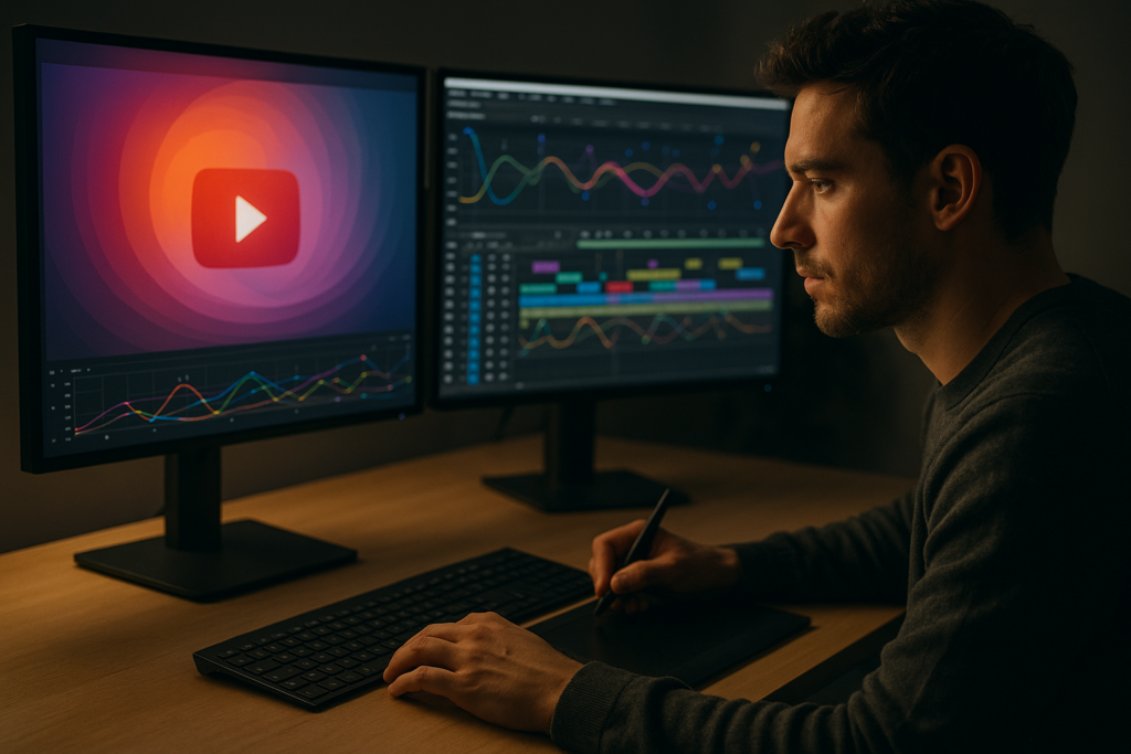
Most modern YouTube styles lean heavily on motion graphics: animated titles, playful transitions, UI overlays, and subtle particle or light effects. After Effects remains the backbone for this, especially when combined with reusable project files, style guides, and prebuilt sequences that can be dropped into any timeline.
Breaking down the viral editing style for 2026
The phrase viral editing style in 2026 covers several distinct looks rather than one formula. Each is tuned for attention, retention, and clarity on both desktop and mobile feeds.
Core traits of a viral editing style
- Hook-heavy first 5 seconds – Fast text callouts, punch-in zooms, and bold transitions.
- Layered information – B-roll, screen capture, and animated overlays running at the same time.
- Micro-transitions – Tiny camera moves, subtle scale changes, and motion blur to avoid static frames.
- Reactive text and graphics – Lyrics-style subtitles, emoji-inspired icons, and waveform-synced beats.
Popular viral styles you see on YouTube and shorts
- Commentary / streamer look – Jump cuts, zooms, full-screen memes, animated chat popups, and stylized alerts.
- Educational explainer – Clean infographics, animated bullets, smooth transitions between chapters, and minimal color palettes.
- Cinematic vlog – Slower pacing, filmic transitions, letterboxing, and camera-move-inspired motion graphics.
- Product and app demos – UI mockups, animated cursors, map or payment overlays, and polished call-to-action cards.
Connecting styles with practical templates
Different viral looks often lean on different motion systems. For example, a creator building tutorials around tools might reuse a pack of widget-style overlays, similar to how a Google Meet-style call UI overlay can frame screen recordings without redesigning from scratch each time.
Location or travel creators often use animated map graphics with pins and routes to quickly set context, a workflow that can be supported by something like a reusable map overlay animation project file.
For channels focused on personal finance or fintech, modern card UI motions are popular, with floating cards, split scenes, and swipe transitions. A sequence similar to a digital card showcase animation lets editors maintain a premium look while changing only logos, colors, and text.
Vloggers and lifestyle channels may prefer dashboard or car-inspired visuals, quick stat overlays, or slick progress meters, akin to the feel of a sleek dashboard-style UI animation that adds motion without overwhelming the footage.
Finally, channels optimizing watch time around playlists and recommendations can use animated widgets, such as a stylized YouTube-inspired video card overlay, to keep viewers visually guided toward the next video.
Common After Effects mistakes that kill modern YouTube styles
Once you understand the main 2026 styles, the next step is spotting the mistakes that quietly ruin them. Most issues come from workflow, not creativity.
Timing and pacing problems
- Over-cutting – Jump cuts every second without breathing room makes videos feel frantic instead of energetic.
- Under-cutting – Long static shots with no motion, especially in talking heads, cause instant drop-off.
- Off-beat animations – Keyframes that almost sync to the beat but do not quite hit create an uncanny, unpolished feel.
Graph Editor and easing misuse
- No easing at all – Linear keyframes make titles and transitions feel robotic.
- Overly aggressive curves – Extremely steep speed graphs lead to stuttery or unreadable text moves.
- Inconsistent curves – Different easing styles in each comp break the sense of a unified channel look.
Motion blur mistakes
- Motion blur on everything – Blurring small text or fast transitions can smear readability.
- Mismatched shutter angles – Changing motion blur settings between comps creates jarring differences when cuts happen.
- No context-based decisions – UI overlays, for example, often look better with subtle or even no blur.
Messy compositions and precomps
- Unlabeled layers – Hard to debug when a client asks for a quick change an hour before upload.
- Deep precomp chains – Precomp inside precomp inside precomp makes edits slow and confusing.
- Random resolutions – Mixing 1080, 4K, and vertical comps without a plan causes scaling artifacts and soft graphics.
Heavy plugins and slow renders
- Overuse of heavy effects – Glow, noise, and 3D lights on many layers quickly bog down previews.
- Plugin-only logic – Relying on a specific third-party plugin for core style elements makes collaboration difficult.
Checklist for cleaner 2026 YouTube edits
- Use a consistent fps and resolution preset per series.
- Define 2–3 easing curves and reuse them across animations.
- Keep one comp for global text styles and color controls.
- Limit heavy effects to hero moments instead of every cut.
- Label and color-code layers and precomps by function.
Choosing the right style and when to lean on templates
With the pitfalls clear, the next step is picking a style that matches the content type and production realities. Different YouTube formats benefit from different editing decisions.
For shorts and vertical content
- Pacing – Aggressive cuts, large subtitles, and quick transitions.
- Motion – Fast, snappy moves, punch-in zooms, and reaction overlays.
- Graphics – Big text, bold color blocks, and quick emoji-like icons.
For long-form education and tutorials
- Pacing – Mid-tempo, with room for explanations and diagrams.
- Motion – Smooth, minimal, but always something happening every few seconds.
- Graphics – Step-by-step callouts, lower thirds, and on-screen bullets.
For cinematic vlogs and storytelling
- Pacing – Mix of calm and energetic segments with intentional transitions.
- Motion – Camera-move-driven: parallax, subtle text reveals, lens-inspired transitions.
- Graphics – Minimalist titles, location tags, and chapter markers.
For brand, product, and SaaS content
- Pacing – Confident, not rushed; focus on clarity.
- Motion – Clean UI animations, card flips, progress bars, and cursor moves.
- Graphics – Consistent brand fonts, color, and grid-aligned layouts.
When templates become the smarter option
In 2026, channels publish across long-form, shorts, and often multiple languages. Building each graphic from scratch is rarely realistic. Prebuilt After Effects projects and systems help you:
- Lock in a channel-wide style once and reuse it for months.
- Hand off edits between team members while keeping consistent motion.
- Test new formats quickly without overhauling design.
Many editors now blend their NLE with After Effects in a layered workflow: rough cut in the editor, then batch-send key sections to After Effects where template-based overlays, transitions, and animated titles are applied. The goal is not to look generic; it is to free time for creative decisions instead of redoing utility graphics.
Leveraging YouTube-native structure
Playlists, chapters, and end screens can all be visually supported by a consistent motion graphics language. Since so much audience discovery still happens on YouTube itself, editing styles that clearly highlight chapters, timestamps, and recommended videos naturally increase session time, which in turn boosts performance.
Template based workflows for modern YouTube styles
Once you have chosen your style family, templates and reusable systems keep execution fast and uniform. Think of this as building a library of motion building blocks for 2026, not one-off animations.
Project setup and compatibility
Start by checking:
- After Effects version – Confirm that any project or template you use works with your installed AE version.
- Frame rate – Match templates to your main sequence, usually 23.976, 24, 25, or 30 fps. Mixing fps can cause jittery motion.
- Resolution and aspect ratio – Plan for 16:9, 9:16, and 1:1 variants. Use master comps with nested precomps that can be repurposed for shorts.
Keyframe organization and precomps
- Global control layers – Use one layer with Expression Controls for global colors, logo visibility, and stroke widths.
- Named precomps – For example: “LowerThird_Main,” “Title_Pack_01,” “Transition_Push_Left.”
- Segmented purposes – Separate typography, background, and accent animations to avoid overcomplicating a single comp.
Naming conventions that save hours
Agree on a format such as: YT_Style_Element_Type_Version. For instance:
- YT_Edu_LowerThird_v2
- YT_Vlog_Intro_Title_v1
- YT_Short_Subtitles_Karaoke_v3
This helps both solo creators and teams quickly find the required element.
Performance and preview tips
- Adaptive resolution – Preview at 1/2 or 1/4 resolution when testing motion, then switch to full only for quality checks.
- Region of interest – Solo only the area or layer stack you are adjusting.
- Proxies for heavy media – For 4K or higher, create proxies before sending to After Effects, especially for talking head masters.
- Disk cache hygiene – Regularly clear or relocate your cache to a fast SSD to avoid stutters.
Plugin dependencies and safe alternatives
Many viral looks use third-party plugins for glows, light sweeps, and distortion. Where possible:
- Check whether the project has a plugin-free fallback setup.
- Use native effects (Gaussian Blur, CC Radial Fast Blur, Transform, Turbulent Displace) for lighter setups.
- Avoid building core channel identity around a single uncommon plugin that collaborators may not own.
Customization workflow
Think of each template as a toolkit, not a locked animation.
- Colors – Link core UI elements and text to a limited number of global color controls for rapid theme swaps.
- Typography – Set a master text style comp with font families and sizes for titles, subtitles, and captions.
- Transitions and timing – Use marker-based systems so you can quickly align transitions to specific beats or word hits in the dialogue.
Use cases by content type
- Reels and shorts – Use bold title cards, kinetic subtitles, and fast micro-transitions. A dual-edit layout, similar in spirit to the pacing structure in split-screen style sequences, can keep vertical edits dynamic.
- Product promos – Rely on UI or card-style animations for features, pricing, and key benefits. Motion should support clarity, not overshadow the product.
- Lyric-style or meme-heavy content – Lyric-inspired subtitles and beat-synced text popups, comparable in energy to a dynamic lyrics motion sequence, help match speech cadences and music.
- Cinematic edits – Favor slower transitions, filmic overlays, and clean text reveals; templates can still provide reusable title and chapter animations.
Practical checklist for each new series
- Decide the main fps and resolution for the series.
- Create or choose one intro, one lower thirds system, and 2–3 transition types.
- Set global color and font controls in one master comp.
- Test on both mobile and desktop at different brightness levels.
- Document the style in a one-page reference so others can match it.
Advanced techniques to keep YouTube edits consistent and efficient
Once your base systems are working, the next level is long-term consistency: every new upload should feel fresh but unmistakably from the same channel.
Reusable animation systems
- Styleframes first – Design 3–5 key frames representing your intro, mid-video chapter, and end card, then build animation around them.
- Modular transitions – Short, reusable animation segments that can be time-stretched without breaking easing.
- Master control comps – Governing color, logo, and basic typography for the entire series.
Consistency across an entire series or season
- Use the same easing curves and motion language for all titles.
- Reserve special transitions for recurring segments (Q&A, sponsor segment, chapter breaks).
- Limit how many different lower thirds designs you use; variety comes from content, not constant redesign.
Quality control passes
- Readability pass – Watch with sound off and ensure all on-screen information is understandable.
- Rhythm pass – Scrub through the timeline, checking that motion happens at predictable yet engaging intervals.
- Brand pass – Confirm color and typography stay consistent with your channel identity.
Export and render considerations
- Render queue basics – Use an intermediate high-quality codec from After Effects, then encode to final delivery (like H.264) in your NLE or dedicated encoder.
- Alpha workflows – Export graphic elements with alpha when you need to place them over edited footage in another app.
- Audio handling – Keep final audio mixing in the NLE when possible and avoid heavy processing in After Effects.
Dynamic link and project weight
- Use Dynamic Link for specific, short sections (intros, graphic clusters) instead of entire hour-long episodes.
- Regularly collect files and archive older versions to prevent project bloat.
- Pre-render heavy segments that you reuse across videos, such as sponsor bumpers or recurring graphic sequences.
Scaling your workflow worldwide
For teams publishing to multiple languages and regions worldwide, keep language-specific text in separate precomps while reusing the same motion system. This supports fast localization while keeping the viral editing style intact.
Long tail questions around YouTube editing styles in 2026
Editors and creators search for highly specific answers when dialing in their 2026 YouTube style. Here are common intents and brief responses.
- Best fps for YouTube videos 2026 – 24 or 25 fps for cinematic or talking head, 30 fps for gaming and high-motion, and 60 fps for niche gaming or sports content.
- How to make my YouTube videos look more modern – Simplify fonts, use consistent color palettes, add subtle camera moves, and avoid outdated effects like heavy lens flares or overused glitches.
- What is the best editing style for educational YouTube channels – Clean, minimal motion; legible typography; and a rhythm of visual reinforcement every 3–5 seconds through diagrams or callouts.
- How to create a viral editing style in After Effects – Focus on strong hooks, beat-synced motion, kinetic subtitles, and repeatable transitions instead of random effects on every cut.
- Is it better to edit YouTube videos in Premiere or After Effects – Use your NLE for main editing and After Effects for titles, graphics, and complex motion sequences that you reuse.
- How many templates should I use per video – A small, consistent set (intro, lower thirds, a couple of transitions, end screen) is better than a new look for every segment.
- How to keep shorts and long videos visually consistent – Use the same color, font, and basic motion language; build vertical-friendly variants of your title and lower third systems.
- Do I need 3D for modern YouTube edits – Usually not. 2.5D, parallax moves, and layered flat graphics are enough for most channels.
Bringing it all together for your 2026 YouTube style
The best YouTube editing styles 2026 are clear, consistent, and optimized for retention. They mix strong hooks, readable motion graphics, and pacing tuned to the content type. A viral editing style is not about spamming effects; it is about building a recognizable motion language that viewers instantly connect with your channel.
For editors and motion designers working in After Effects, the most reliable path forward is system thinking: reusable templates, clean naming, and a small set of carefully designed animations that scale across shorts, long-form uploads, and sponsors. This keeps your workflow fast while letting you focus on story and performance instead of rebuilding graphics on every deadline.
With a solid style foundation, your channel can evolve confidently through 2026, adapting trends without losing identity and shipping content on schedule worldwide.
Conclusions
Locking down a modern 2026 YouTube editing style is less about chasing trends and more about building a clear, reusable motion system. With thoughtful pacing, smart After Effects workflows, and a compact library of well-structured templates, you can deliver consistent, binge-worthy videos while keeping production lean and flexible for every new idea.
FAQ
What is the best YouTube editing style in 2026 for beginners?
A clean, minimal style with simple lower thirds, light motion on titles, and consistent colors works best. Focus on pacing and clarity before advanced effects.
How do I create a viral editing style in After Effects?
Design strong hooks, kinetic subtitles, and reusable transitions. Sync motion to music or voice beats and keep graphics consistent across videos for recognition.
Do I need advanced plugins to get a modern YouTube look?
No. Native After Effects tools plus smart use of blur, displacement, and shape layers can create polished results. Plugins are helpful but not required.
How many motion templates should I use per YouTube series?
Typically one intro, one lower third system, two or three transition types, and one end screen are enough for a cohesive, professional series look.
What resolution and fps should I use for YouTube in 2026?
1080p or 4K at 24, 25, or 30 fps is standard. Keep the same fps across your series and ensure templates match your main timeline settings.
How can I keep my channel style consistent across editors?
Use shared template projects, a written style guide, master control comps for color and fonts, and clear naming conventions for all motion elements.