Text is usually the first thing viewers read and the last thing clients judge. Learning how to master text animation AE means getting cleaner motion, faster turnarounds, and more consistent results across every edit you deliver, from social reels to high-end brand videos.Explore text animation plans
📋 Table of Contents
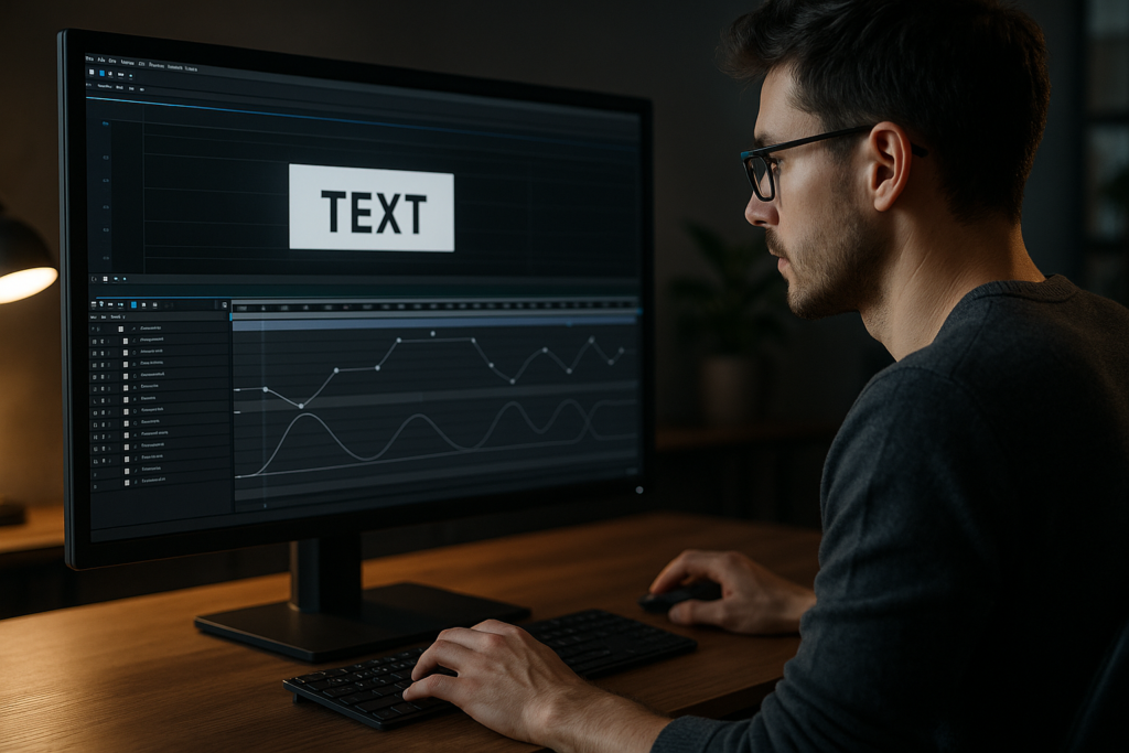
Text animation basics in After Effects
To understand how to master text animation AE, you first need to see text as more than words on screen. In motion design, text is a design element, a storytelling tool, and a timing reference for the whole edit.
What text animation in AE actually is
Text animation in After Effects is the process of animating any text property over time: position, scale, opacity, rotation, tracking, baseline shift, color, and more. You control these changes with keyframes, text animators, and the Graph Editor, often combining several properties to create a cohesive move.
Why it matters for editors and motion designers
- Readability: Good text animation gives viewers enough time to read while still feeling dynamic.
- Rhythm: Text hits can drive the pacing of your entire cut, matching music beats or dialogue.
- Branding: Typography style and motion language communicate brand voice as clearly as logos or colors.
- Hierarchy: Well-animated text guides the eye to key information in the right order.
Core building blocks you must know
- Keyframes: The basic time markers defining where a property starts and ends.
- Interpolation: Linear vs. eased motion, refined later with the Graph Editor.
- Text animators: AE’s built-in system that lets you animate by character, word, or line without manual duplication.
- Precomps: Grouped layers that let you keep timelines clean and reuse sequences.
Who benefits most from mastering text animation
- Video editors who need clean lower thirds, titles, and subtitles for client work.
- Motion designers building full-screen typography, lyric videos, or kinetic type pieces.
- Content creators producing reels, shorts, and YouTube graphics with consistent branding.
Once you are comfortable with these basics, you can move into advanced typography animation systems that are fast to edit, easy to reuse, and reliable under deadlines.
Advanced typography animation styles and use cases
Advanced typography animation is about building systems, not one-off shots. You are designing rules for how your text should enter, live, and exit across a whole project, regardless of format or platform.
Core styles of advanced typography animation
- Kinetic type: Words move in sync with beats, lyrics, or voiceover. Think bold moves, rapid cuts, and animated backgrounds. A good example is a music- or lyric-driven layout like the ones in modern lyric widget templates.
- Clean UI-style motion: Subtle position shifts, fades, and masks inspired by app interfaces. Ideal for product explainers and tech brands.
- Cinematic titles: Slow, polished reveals with elegant easing, blur, and depth cues. Often used in trailers and high-end openers.
- Social-first typography: Bold, legible, vertical-safe layout designed for reels and shorts where the phone screen is small and attention is short.
Animation variations you should have in your toolkit
- Per-character reveals (scale, position, opacity, rotation).
- Word-by-word on and off for subtitles, quotes, and hooks.
- Line-based slides for multi-line paragraphs and list items.
- Mask-based wipes for crisp, design-led transitions.
- Texture or distortion passes for stylized, music-video style motion.
Matching styles to content
- Music and lyrics: Aggressive, rhythmic moves; multiple type scales; frequent cuts. Look at complex layouts similar to performance-driven lyric animations.
- Corporate or fintech: Restrained motion, tight grid alignment, and UI-inspired reveals, similar to dashboards or payment widgets you might see in finance interface animations.
- Product explainers: Friendly but precise movement with tooltips, callouts, and labels that must stay readable.
System-thinking for advanced typography animation
- Define a default entrance, default hold, and default exit for each text role: title, subtitle, body, captions.
- Create reusable animation presets or animation controllers for these roles.
- Keep timing relationships predictable so you can cut to music and edit text content late in the process.
By approaching advanced typography animation as a modular system, you can build libraries of title styles and widgets that plug into any timeline and feel consistent from project to project.
Common text animation mistakes and how to avoid them
Even experienced editors run into the same text animation problems in After Effects. Fixing these issues can immediately upgrade your typography work without adding complexity.
Timing and pacing issues
- Text appears too late or exits too early: Viewers cannot read comfortably, especially on mobile. Aim for at least 2–3 seconds of legible screen time for short phrases.
- Everything animates at the same speed: Without contrast in timing, the piece feels flat. Mix slower hero titles with snappier minor elements.
Graph Editor misuse
- Overdone ease: Extreme bezier handles create unnatural, jerky moves.
- Inconsistent curves: Different layers with random curves break visual cohesion.
- Linear motion for everything: Feels mechanical and cheap. At minimum, easy ease your keyframes, then refine critical shots in the Graph Editor.
Motion blur and overshoot problems
- Motion blur always on: Great for big moves but can muddy small text, especially at small sizes.
- Too much overshoot: Bouncy titles can make serious brands feel unprofessional. Reserve big overshoots for playful or music-driven projects.
Messy compositions and precomps
- No layer naming: Titles, subtitles, and captions become impossible to manage.
- Random precomps: Precomps nested without logic lead to confusion when clients request changes.
- Text baked into raster elements: Avoid embedding important text directly into renders; keep it editable where possible.
Performance and workflow pain
- Unused heavy effects: Glow, grain, and displacement on every text layer kill preview performance.
- Large comps at 4K for social: Overkill if the final is only 1080×1920 vertical.
- No organization: No color labels, no folder structure, and no master controls make revisions slow and error-prone.
Checklist to keep your typography animation clean
- Name text roles clearly: H1_Title, H2_Subtitle, Body_Copy, Caption.
- Use consistent keyframe easing for each role.
- Keep motion blur only where it supports the move.
- Limit heavy effects to final, key moments.
- Group related text in logical precomps with clear labels.
Catching these pitfalls early frees you to focus on creative choices rather than firefighting late in the project.
Choosing the right typography animation strategy for each edit
Different edits demand different motion strategies. Learning how to master text animation AE means knowing which approach fits social content, ads, YouTube videos, or cinematic pieces.
Social reels and shorts
- Goal: Grab attention instantly, work without sound, and stay readable on small screens.
- Strategy: Big bold type, short phrases, fast but clear reveals, and strong contrast against the background.
- Workflow tip: Build reusable vertical-safe layouts that keep main text within safe areas.
Ads and product spots
- Goal: Deliver a clear message in 6–30 seconds, aligned with branding.
- Strategy: Use 2–3 hero text moves plus subtle supporting animations. Over-animating distracts from the offer.
- Workflow tip: Lock typography hierarchy early: headline, supporting line, CTA line.
YouTube and long-form content
- Goal: Maintain attention over time and improve clarity for chapters, explainer segments, and lower thirds.
- Strategy: Design a library of recurring elements (chapter titles, callouts, lower thirds) that share timing and easing.
- Workflow tip: Use a consistent lower-third system similar to UI-style widgets you might find in projects like dynamic video widgets.
Cinematic and brand films
- Goal: Emotional impact and polish over pure information density.
- Strategy: Slower titles, elegant movement, and careful use of blur, depth, and parallax.
- Workflow tip: Build styleframes first to define type scale, spacing, and color, then animate with minimal changes to the design.
When to rely on templates and systems
For repetitive formats (weekly shows, series, recurring ads), creating or using text animation templates is faster and more consistent than building from scratch each time. Quality templates mirror professional setups seen in advanced tutorials on the official After Effects help center, helping you study real-world setups while delivering client-ready work.
Once your strategy matches your content type, templates and well-structured projects become the backbone of a reliable, repeatable typography workflow.Browse typography-ready templates
Template-based workflows and practical text animation checklists
Templates are most powerful when you treat them as systems, not shortcuts. A thoughtful setup lets you drop in text and footage, adjust controls, and stay confident that timing, easing, and style will hold up across multiple edits.
Project and version compatibility
- Check AE version: Confirm which After Effects version the project targets and whether features like per-character 3D or newer effects are used.
- Match frame rate: If your main edit is 23.976 but the template is 30 fps, choose early which standard to follow before editing keyframes.
- Set resolution from the start: 1080p, 4K, or vertical 1080×1920 — scaling later can impact sharpness and layout.
Smart composition and layer organization
Think in terms of reusable modules:
- Global controls comp: One place to adjust colors, fonts, and timing multipliers.
- Role-based precomps: Separate precomps for titles, lower thirds, and captions.
- Clear naming: Use labels like 01_Title_Main, 02_LowerThird, 03_Subtitles to keep navigation fast.
Many modern widgets, like compact layouts similar to map-style info widgets, follow this modular logic to stay flexible.
Keyframe structure and timing controllers
Instead of manually offsetting dozens of keyframes, use structured systems:
- Anchor keyframes: Place core keyframes at logical beats (e.g., frame 0 for entrance, frame 20 for on-state, frame 30 for exit).
- Offset by layers or characters: Use text animator range selectors or layer offsets to create natural stagger.
- Timing controls: Add expression sliders that globally slow down or speed up animation without breaking curves.
Performance-conscious settings
- Preview at half resolution unless you are checking fine type details.
- Use region of interest when refining small sections.
- Pre-render complex effects used behind text (like heavy particle or glass distortion passes) to image sequences, then reimport.
- Enable motion blur selectively only where moves are large or fast.
Plugin dependencies and safer alternatives
- Identify required plugins: Before starting, check if third-party tools are needed.
- Plan fallbacks: For shadows, blur, and glow, try native effects first so projects are portable.
- Keep text editable: Avoid baking typography into plugin-heavy precomps unless absolutely required.
Customization workflow for text animation
Approach customization like an editor:
- Step 1 – Input copy: Replace placeholder text, respecting line breaks and approximate character counts.
- Step 2 – Adjust timing: Nudge keyframes to align with music or dialogue beats.
- Step 3 – Brand alignment: Swap fonts and colors based on brand guidelines while keeping hierarchy intact.
- Step 4 – Polish motion: Fine-tune easing and overshoot in the Graph Editor for hero moments only.
Use cases across formats
- Reels and shorts: Fast hooks, bold words, and tight loops.
- Ads and product promos: Clear hierarchy and concise CTAs.
- Cinematic edits: Slower titles, minimal motion, and atmospheric backgrounds.
- Widgets and overlays: UI-style bars, counters, and labels similar to compact designs like battery info widgets.
Practical pre-delivery checklist for any text-heavy template
- All text layers correctly spelled and aligned.
- Motion feels consistent between scenes.
- Fonts and colors match brand references.
- Text is readable on phone-sized previews.
- Template scales gracefully to the required aspect ratios.
Once this checklist feels natural, you can rely on template-driven typography animation for fast, repeatable, and professional-looking results across recurring series and campaigns.
Advanced systems and long-term typography workflows
Once your basic template workflow is solid, the next step is to think in terms of long-term systems that efficiently support multiple episodes, campaigns, or clients.
Building reusable animation systems
- Master comps for each text role: Create one master hero title, subtitle, and lower third comp that all other variants reference.
- Global style controls: Centralize colors, stroke widths, blur intensity, and shadows with adjustment layers or expression-linked sliders.
- Pre-made motion patterns: Store reusable in/out patterns, such as slide-up with fade, type-on, or scale-and-settle.
Ensuring consistency across a whole edit
- Limit yourself to two or three core animation styles in a project.
- Use one easing family (e.g., softer curves for corporate, snappier for music-driven content).
- Keep font sizes and line spacing proportional between scenes.
Quality control for typography animation
- Watch at 1x, 0.5x, and 2x speed to catch timing issues.
- Preview with motion blur off, then on to ensure legibility.
- Check on phone and laptop to verify readability in real scenarios.
Export, render queue, and pipeline considerations
- Use intermediate codec exports from AE
- Beware of overly nested comps that slow renders, especially if multiple instances of heavy effects are used.
- Dynamic Link carefully: For heavily animated typography, pre-render complex sequences rather than relying on live links to editing software for final export.
Keeping projects lightweight and future-proof
- Archive fonts and references alongside project files.
- Remove unused precomps, layers, and media before archiving.
- Document basic usage notes (e.g., which sliders control timing, which layers are safe to edit).
Scaling your system to multiple brands
Once your animation system is dialed in, you can clone it for other clients just by swapping typography and colors. For example, a bold, card-based lower-third system could support anything from gaming edits similar to layouts in game HUD-style widgets to clean corporate explainers with just a few style changes.
Over time, you will build a personal library of typography animation systems you can repurpose worldwide, making you faster and more reliable across any work you take on.
SEO-friendly motion design questions about text animation
Editors and motion designers often ask similar questions when they begin focusing on how to master text animation AE and advanced typography. Addressing these quickly can save hours of trial and error.
- How do I keep text readable on mobile? Use high-contrast backgrounds, limit line length, and preview at phone size. Avoid overly thin fonts for small captions.
- What is the best duration for animated titles? For short content, 2–4 seconds on-screen is a good starting point. Longer explainers can hold key text slightly longer if the animation is subtle.
- Should I animate every line of text? No. Use motion strategically. Hero lines can animate in more dramatically; supporting text can use lighter, simpler movement or even stay static.
- How much motion blur should I use? Apply it to bigger or faster moves only. If the type becomes hard to read, reduce blur or simplify motion.
- Is it better to animate by character, word, or line? It depends on the message. Per-character is dynamic but can feel busy; per-word or per-line is calmer and often better for serious or corporate content.
- Do I need plugins for advanced typography animation? Not necessarily. Most professional-level text motion can be achieved using native text animators, mattes, and a bit of Graph Editor work.
- How do I match text to music beats accurately? Add markers on the timeline for important beats, then align keyframes or layer in/out points to those markers.
- What aspect ratio should I design for first? Choose the platform that matters most for the project. Many editors now design for vertical or square first and adapt to widescreen later.
Thinking about these questions up front will help you design text animation systems that are not only visually strong but also practical for real-world editing timelines and client expectations.
Bringing it all together for consistent, pro-level text animation
Mastering text animation in After Effects is less about flashy tricks and more about building reliable systems. Start with timing, hierarchy, and readability; then layer on advanced typography animation styles that match your content and brand tone.
Use templates and structured projects to speed up repetitive work, keep motion consistent, and protect quality under tight deadlines. When your text animation is clean, predictable, and easy to reuse, every new edit becomes faster to build and easier to revise.
With a solid, template-friendly workflow, you can deliver polished typography for social content, ads, and cinematic pieces, giving clients and audiences worldwide a higher level of clarity and visual polish on every project.
Conclusions
Text animation becomes powerful when it is systematic. By refining timing, hierarchy, and template-based workflows, you gain speed and consistency across every project. The more you think in reusable typography systems, the easier it becomes to adapt to any brand, platform, and client brief while keeping motion clean, legible, and confident.
FAQ
What is the fastest way to master text animation in After Effects?
Focus on a small set of reusable text styles, study the Graph Editor, and practice building simple templates you can reuse across multiple projects.
Do I need advanced plugins for professional text animation?
No. Native text animators, mattes, and solid Graph Editor work are enough for most professional typography systems used in client projects.
How can I keep my text animation projects organized?
Use clear naming for roles, color labels, global control layers, and logical precomp structures, and remove unused assets before archiving.
What are the best settings for social media text animations?
Design at 1080×1920 or square, keep fonts bold and high contrast, limit line length, and ensure each phrase is readable in 2–3 seconds.
How do I choose easing for typography animation?
Pick one easing family per project and apply it consistently. Softer curves suit corporate work, while snappier easing fits music and high-energy edits.
How can I reuse text animation across different clients?
Build neutral systems with global style controls. Swap fonts, colors, and spacing for each client while keeping timing, easing, and structure the same.